
TypeTalk is a regular blog on typography. Post your questions and comments by clicking on the Comments icon above.
Q. You write a lot about good typographic practices. Any advice on what not to do, typographically speaking?
A. There are a number of poor typographic practices that can easily slip into your work. Here are five “don’ts” to avoid:
1. Don’t use tabular figures for non-vertical text.
Tabular figures share the same total width (glyph plus spacing) so that they align vertically when you set columns. But in other situations, tabular figures can create terribly uneven spacing (especially around the 1s), so proportional figures are a better choice because they have much more even spacing.

Many OpenType fonts include both tabular and proportional figures. Unfortunately, these options often go unnoticed, in part because tabular figures are the default figure style in the majority of text fonts. Check your font for the available figure styles, and select the style most appropriate for your layout. If a font doesn’t have proportional figures, manually adjust the spacing of tabular figures by kerning.
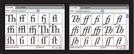
2. Don’t use the long s ligature as an f ligature.
Many historically inspired OpenType fonts, such as Caslon, Bodoni, and Garamond, contain a wide assortment of ligatures, some of which look like an f ligature without the right side of the crossbar. These are actually long s ligatures that were commonly used for sl, sh, si, st and ss combinations centuries ago. If you mistakenly use these as f ligatures, you’ll misspell every word they’re in.
3. Don’t use the space bar or default tab settings for paragraph indents.
The sordid typographic truth is, many designers create paragraph indents with the space bar. Not only can this be tedious and time-consuming, but it’s extremely inefficient, especially when you want to change the indent for an entire document.
InDesign, QuarkXPress, and other design software have First Line Indent features that take only seconds to set. You can change indents throughout an entire document just as quickly.

If you’re in a word-processing program, you can use the tab, but set the indent manually to a chosen measure. The default setting (usually half inch) may be too deep for your column width.
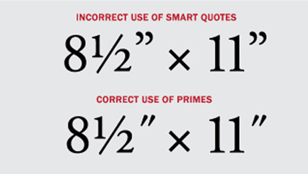
4. Don’t use smart quotes for measurements.
When typing quotes or importing text with quotes, most design software defaults to the (usually) typographically correct smart quotes. Unfortunately, the software also converts measurements containing inch and foot marks (also known as primes), which is typographically incorrect. Review your document carefully, and convert smart quotes in measurements to inch and foot marks.

Read more on this topic in the True Primes section of a past TypeTalk.
5. Don’t forget to proofread your work.
Check for major typographic faux pas, such as stray hyphens in reflowed text; double word spaces within words and between sentences; inappropriate hyphen, en and em dash usage; and spelling and grammatical errors. While you might not view the latter as part of your job, spotting errors saves your client embarrassment and makes you a more valuable professional.
Love type? Want to know more? Ilene Strizver conducts her acclaimed Gourmet Typography workshops internationally. For more information on attending one or bringing it to your company, organization, or school, go to her site, call The Type Studio at 203-227-5929, or email Ilene at in**@***********io.com. Sign up for her e-newsletter at www.thetypestudio.com.
This article was last modified on August 2, 2021
This article was first published on August 10, 2011
Commenting is easier and faster when you're logged in!

Recommended for you
TypeTalk: Font Sizing Guidelines Part 1, Design Characteristics
Q Are there any guidelines for selecting fonts for use at a range of sizes? A. I...

Free WhatTheFont for the iPhone
WhatTheFont has long been available online for people who need to identify a cer...

InFocus: April 2017
A bewitching bouquet of InDesign-related goodies, just in time for spring.