TypeTalk: Ellipsis Etiquette

TypeTalk is a regular blog on typography. Post your questions and comments by clicking on the Comments icon above. If Ilene answers your question in the blog, you’ll receive one Official Creativepro.com T-Shirt!
Q. What is the proper way to insert an ellipsis in print and in email?
A. First, let’s clear up the terminology, which can be confusing:
ellipsis: a set of three evenly spaced dots that indicates an omission or a pause in text
ellipses: the plural form of the above
ellipse: an oval shape
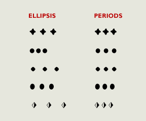
To add the ellipsis punctuation mark to text, hit Option-semicolon (Mac) or Alt-0133 (Windows). You can also create an ellipsis by typing three periods. The advantage of this method is that you can alter the spacing of the dots using tracking, which is particularly useful when a font’s ellipsis appears too tight or too open. In most fonts, the ellipsis is made from three periods, but the spacing of these periods can vary from font to font (Figure 1).
Figure 1. The actual ellipsis character (left) may vary from an ellipsis you create with three periods (right). From top, the typefaces are Adobe Jenson Pro, TypeCulture Alphatier, ITC Adderville, MT Bernard Condensed, and MT Festival Titling.

In email, it’s safer to stick with three periods rather than the actual ellipsis to avoid the possibility of the ellipsis character turning into nonsense during transmission.
Confused about whether to add spaces around an ellipsis? Read about it in “Ellipsis Confusion.”
Love type? Want to know more? Ilene Strizver conducts her acclaimed Gourmet Typography workshops internationally. For more information on attending one or bringing it to your company, organization, or school, go to her site, call The Type Studio at 203-227-5929, or email Ilene at in**@***********io.com. Sign up for her e-newsletter at www.thetypestudio.com.
This article was last modified on January 8, 2022
This article was first published on September 4, 2008
Commenting is easier and faster when you're logged in!
Recommended for you

InDesign Magazine Issue 105: Designing Books
We’re happy to announce that InDesign Magazine Issue 105 (January 2018) is...

TypeTalk: The Best of 2013
In the world of fonts, January is a month of lists. Whether they’re called Best...

Wood Type Museum Urgently Seeks Donations
The Hamilton Wood Type & Printing Museum, which hosts the largest collection...


