

TypeTalk is a regular blog on typography. Post your questions and comments by clicking on the Comments icon above. If Ilene answers your question in the blog, you’ll receive one Official Creativepro.com T-Shirt!
Q. What is an ambigram?
A. It’s a typographic or calligraphic design, word, or arrangement of letters that can be read from more than one direction or orientation.
Ambigrams come in many forms. The most common ambigrams are symmetrical, and include rotational (upside-down), bilateral (viewed in a mirror or from behind), chain (continuous words, such as in a circle or a spiral), and totem (vertical and mirror-image symmetry). Less common are asymmetrical ambigrams, which have more complicated characteristics.
You can see ambigrams on book covers, movie titles, logos, album covers, tattoos, jewelry, and motion graphics. Some are very legible, while others are more decorative in nature.
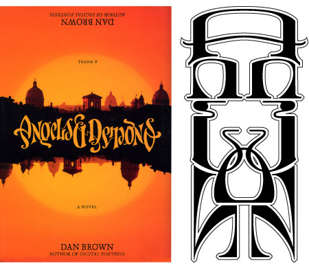
The master of this art is John Langdon, who designed one for the cover of the first edition of Dan Brown’s Angels & Demons, as well as many for the movie and Web site.
The work of John Langdon. On the left, the cover of the first edition of Angels & Demons, by Dan Brown. The ambigram on the right (Ann & John) was done for friends.
Langdon did this ambigram on spec for the city of Philadelphia in 2000.

More by John Langdon.
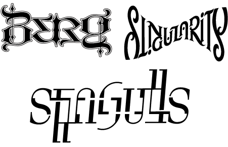
This ambigram was designed by Mark Simonson for a tattoo. Simonson says, “Ambigrams are partly luck, partly skill. I feel lucky it turned out as well as it did. I hate to think of someone permanently dyeing their skin with a design that didn’t quite work.”

This article was last modified on May 15, 2023
This article was first published on May 6, 2009
Commenting is easier and faster when you're logged in!

Recommended for you

TypeTalk: Measure for Measure, Typographically Speaking
TypeTalk is a regular blog on typography. Post your questions and comments by cl...

The Typography & Design of Alexander Isley
I’ve been a huge fan of designer Alexander Isley ever since I saw his presentati...
The Paper That Changed Type Design
John Baskerville is known best as the man who, in the mid-18th century, created...