


Earlier this week I posted a story on the radical (and widely panned) rebranding undertaken by the University of California. Here are a couple more recent rebrandings by major corporations for your consideration.
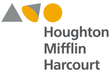
Houghton Mifflin Harcourt
The historic publisher of Curious George and Lord of the Rings recently ditched its colophon, which had evolved over a century, featuring a horn-blowing boy riding a dolphin.

The logo (like the company) actually traces its roots back to the mid-1800’s when Riverside Press, subsidiary of Houghton Mifflin, first used a colophon with a boy blowing pipes on a river bank.

The new logotype keeps nothing from the historic design. It features three shapes to illustrate ideas of curiosity and discovery, as a triangle morphs into a cone and then a circle.
Comcast
The largest provider of video, Internet, and phone service in the U.S. is also the owner of NBC Universal. To highlight this fact it tossed the red crescent it had used since 1999.

The new logo features NBC peacock over a thin half-rounded sans serif font.

Taken together, the two companies’ efforts offer quite a contrast in approaches to rebranding. Houghton, like the University of California, abandoned long-standing tradition in favor of an entriely new approach. Comcast chose to leverage the power a classic icon (while ditching the letters NBC) and refreshing it with a new font.
What do you think?
This article was last modified on January 6, 2023
This article was first published on December 13, 2012
Commenting is easier and faster when you're logged in!

Recommended for you

TypeTalk: Text Fonts versus Display Fonts
Q. How can I tell the difference between a text font and a display font? Are the...

How to Create an Effective Product Label
Product labels describe a product as well as help it to stand out from comp...

Track Down Obscure Glyphs in InDesign
There are many characters that don’t appear on standard keyboards. Here’s how to...