

This tip was sent to Tip of the Week email subscribers on July 10, 2014.

Sign up now and every week you’ll get a new InDesign Tip of the Week and Keyboard Shortcut of the Week, along with roundups of new articles at InDesignSecrets and CreativePro, plus exclusive deals sent right to your Inbox!
Just scroll all the way down to the bottom of this page, enter your email address, and click Go! We’ll take care of the rest. Now, on with the tip!
If you’ve ever made a gradient that went from a color to black in a print document, you might have been less than excited about the results. Take the example below, see how it gets drained of saturation as it goes from red to black?

That’s because the black end of the gradient was created with the black swatch, which yields just pure black ink. So for half the gradient you get a warm charcoal gray effect.
Instead, you can get a much “richer” effect by adding black to the red. In other words, use rich black for the black end of the gradient.
To do this, start by making both ends of the gradient the same color (in this case, red).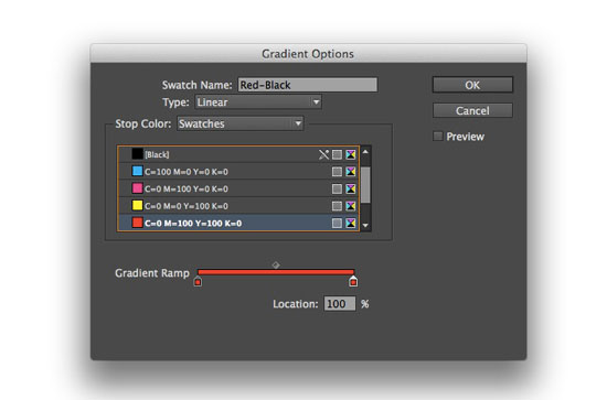
Then with the second gradient stop selected, switch the Stop Color from Swatches to CMYK, and drag the black ink slider all the way to 100% and click OK.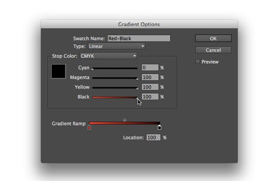
Now your gradient won’t be so gray!
Also, to stay on your printer’s good side, make sure the total ink amount in the rich black gradient stop doesn’t go over the limit for your intended output. Not sure what your total ink limit is? Ask your printer! They’ll be glad to tell you.
This article was last modified on July 8, 2021
This article was first published on July 21, 2014
Commenting is easier and faster when you're logged in!

Recommended for you

20 Tips From CreativePro Week 2020
Erica Gamet shares her favorite tips from an unprecedented online event.
Tip of the Week: Locking Items
This tip was sent to Tip of the Week email subscribers on December 11, 2014. Sig...

InDesign Magazine Issue 145: Designing with Gradients
Issue 145 has articles on designing with gradients, page numbering, InDesign's h...