Tip of the Week: Using Optical Margin Alignment

With this InDesign tip for using Optical Margin Alignment you can create improve the appearance of columns of text by moving punctuation outside the column edge.

This InDesign tip for using optical margin alignment was sent to Tip of the Week email subscribers on July 14, 2016.

InDesignSecrets Tip of the Week

Sign up now and every week you’ll get a new InDesign Tip of the Week and Keyboard Shortcut of the Week, along with roundups of new articles at InDesignSecrets, plus exclusive deals sent right to your Inbox!

Just scroll all the way down to the bottom of this page, enter your email address, and click Go! We’ll take care of the rest. Now, on with the tip!


Punctuation at the margin of a text frame can make the left or right sides of a column appear misaligned.

indesign tip optical margin alignment off

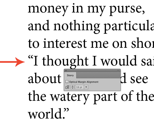
Fix that by turning on InDesign’s Optical Margin Alignment: Select the story, choose Story from the Type menu, and check the Optical Margin Alignment box in the Story panel.

indesign tip optical margin alignment on

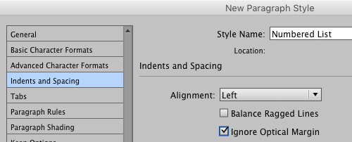
To turn off optical margin alignment for certain types of paragraphs (bullets and numbered lists, for example), choose the Ignore Optical Margin option in your Indents and Spacing paragraph style options.

indesign tip ignore optical margin alignment

Bookmark
Please login to bookmark Close

This article was last modified on July 25, 2019

Comments (12)

Leave a Reply

Your email address will not be published. Required fields are marked *

  1. Jared Shapiro

    Crynch: I don’t get resistance, no. I freelance for a lot of small publishers, and none of them use it in their House Styles or books. I did find it useful for poetry books. Those tends to look better with OMA.
    Thanks, Crynch and Nigel; this has been very enlightening. Nigel, your tutorials are fantastic on Lynda.com.

  2. Nigel French

    You’re welcome, Jez.
    If you change your units (Preferences>Units and Increments) the gutter width will be in points (or inches, or mm, whatever you’ve chosen). A quick way to do this is to right click on the intersection of the rulers, top left.

  3. With Optical alignment, the the number you add the leading space or the font size? Silly question but thought I would check?

    1. Nigel French

      Start with the font size, but you may need to adjust this according to your taste.

      1. Thanks Nigel… Love your tutorials by the way. I have started working more with grids too and it does take a lot of the guess work out positioning. Though did struggle a bit one what gutter size to have in relation to Point size? Is there any preference setting that can change the gutter to point size, or is it a case of working out say 14pt leading would need 4.93889mm for gutter space for this to relate? Sorry probably should ask this question on a related blog :>

  4. A little more history on the use of OMA in Canada from a typesetter who worked for most of his career in newspapers: ‘…when I left [Pacific Press] in 2009, we were still using XPress 3.2 since we were QPS and upgrading was VERY expensive. I don’t think that XPress had the option of optical margins; if it did, we certainly didn’t use it. The switch to InDesign happened after I left. Not sure if optical margins has been implemented and haven’t had a newspaper in months.’ I haven’t checked a local printed newspaper either but shall do so next time I see one.

    1. I checked four Canadian newspapers: Vancouver Sun, Vancouver Province, Globe and Mail, and National Post. None use OMA and G&M is now mainly setting rag right.

  5. Jared Shapiro

    First off… I love your tutorials on Lynda.com. You taught me just about everything I know about designing a book from scratch.
    My question is, where in the industry does one use optical margin alignment? I’m from Canada, and here and in the US I pretty much only see the straightened margins in books and magazines.

    1. Nigel French

      Hi Jared, I think it is ultimately a matter of preference. I see a lot of good-looking professional publications that don’t use OMA and presumably they’re doing so having considered the option. Personally, I think they would look better with it.
      Similar to what crych says, I think many of the art directors of today grew up in an age without OMA (or where it was extremely difficult to implement) and so got used to seeing columns of text without it. For me, it’s one of the easiest ways to dramatically improve the appearance of your text—especially if you’re using justified alignment.

    2. Jared, I’m in Canada as well and we use it at my organisation because I made sure it is our house style. I have found, however, that I need to watch that contractors turn it on. Have you had any resistance to using OMA? I recall, when it was first introduced in InDesign, reading a comment from a designer in Spain who said that the newspapers there preferred not to use it. I supposed at the time that years of looking at columns of type without hanging punctuation had made it seem normal to their eyes.

      1. Jared Shapiro

        I don’t get resistance, no. I freelance for a lot of small publishers, and none of them use it in their House Styles or books. I did find it useful for poetry books. Those tends to look better with OMA.

    3. David Blatner

      Jared, while the name of the feature is OMA, a lot of people call this “hanging punctuation.”
      See Ilene’s articles on the subject here: https://creativepro.com/typetalk-hung-punctuation-optical-margin-alignment/
      and
      https://www.fonts.com/content/learning/fontology/level-4/fine-typography/hanging-punctuation