

Article courtesy Fonts.com and its series, “For Your Typographic Information.”

Compared to the “old days,” today’s digital type technology gives users access to thousands of type designs with an ease that is nothing short of miraculous. Unfortunately, most digital typefaces only allow for one outline, or design, per character, not one design per point size as in metal type. This limitation means that today’s type designers often create typefaces with a particular size range in mind.
Is there any way to get more out of a design than its designer intended? Often, yes. Even though most typefaces are categorized (officially or unofficially) as either text or display designs, you can still expand the potential range of many typefaces by choosing wisely and making some minor adjustments as you set the type.
This article will look at how to use text designs at display sizes and vice versa. These pointers will help you get the most — and best — use out of your fonts.
Think Big: Using Text Fonts at Display Sizes
To successfully set a text design at large sizes, follow these guidelines:
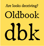
Figure 1. The same details that make ITC Oldbook look charmingly distressed at smaller sizes can appear forced and unnatural at large sizes.

Figure 2. Top: ITC Caslon No. 224 is an elegant, refined typeface at smaller sizes. Middle: When the same typeface is enlarged, the serifs and thin strokes appear thick and a bit clunky. Bottom: For large sizes, Big Caslon might be a better choice.
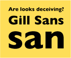
Figure 3. Gill Sans Heavy translates very well from text sizes to large-scale display use.
Think Small: Using Display Fonts at Text Sizes
Display faces, which are designed to work best in larger settings, can sometimes (but not always) be used successfully in smaller sizes. Here are some guidelines that will help you achieve the best results:
Bear in mind that not every display font will be a good choice for text-sized treatment (Figure 4). Be especially cautious with formal scripts and calligraphic fonts, which vary in their ability to survive “downsizing.” Many lose readability at small sizes, with design features that grow busier and fussier the smaller they get.
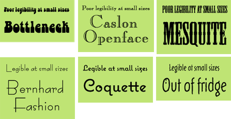
Figure 4. In this assortment of display fonts, three don’t translate well to small sizes, and three do.
Similarly, connecting scripts can be problematic at small sizes: The “shrinking” process can make them look tight and lose readability, and their spacing can’t be opened up to compensate. Proceed with extreme caution.
The key to making the transition from large to small is to engage both your brain and your eye in making an intelligent decision. Be sure to create and print out samples in the specific sizes and typefaces you’re considering before making your final font selections. In short: always look before you take a typographic leap!
For Your Typographic Information and fy(t)i are trademarks of International Typeface Corporation. Copyright © 2003 International Typeface Corporation. All Rights Reserved.
Ilene Strizver, founder of The Type Studio, is a typographic consultant, designer and writer specializing in all aspects of typographic communication. Read more about typography in her latest literary effort, Type Rules!, published by North Light Books.
This article was last modified on January 10, 2022
This article was first published on October 30, 2006
Commenting is easier and faster when you're logged in!

Recommended for you
Design How-To: Turn One Photo Into a Thousand Images
You can subscribe to “Before & After Magazine” in PDF or Print....

Design + Data Summit 2023 Agenda Released
If you work with data, you can’t afford to miss this exciting, brand-new event!

Looking Forward to CreativePro Week 2024
Our Editor in Chief shares his thoughts about the amazing agenda for CreativePro...