


Monospaced fonts are faces in which each character has the same width. The most famous of all, of course, is the faux-typewriter style Courier (or Courier New or some other version of Courier). But you wouldn’t really use that, would you? (Well, perhaps in a cheezy direct mail piece that you wanted to look typewritten… but not in a book or magazine or anything professional-looking.)
Instead, if you need a monospaced font — for writing code or something like that — you want to try something else. Here is a list of some of the most common monospaced fonts (in other words, the ones that I had sitting on my computer because of the Mac OS or MS Office or who knows what):

Notice that every line has the same length because each of these has the same “pitch” — that is, the number of characters that will fit in an inch. At 12 points, these fonts are all 12 pitch.
When Olav Martin Kvern designed Real World InDesign (he did version 1.5 by himself; I came onboard for version 2, if I recall), he knew he’d need a good monospaced font for code samples (scripting, XML, and that kind of thing). His excellent choice: TheSansMonoCondensed, designed by Berlin-based Dutch type designer Luc(as) de Groot, and sold by LucasFonts and elsewhere.
It has so much going for it… it’s condensed, which just looks better; it has a higher pitch, so you can fit more text on a line; it comes in eight weights (plus italic versions of each), so it’s really versatile; and it’s cool-looking. Here’s a selection:

I will admit that the folks at LucasFonts were kind enough to give us a copy of the OpenType version of the font family recently, but Ole and I have have been recommending this font for years and their generosity didn’t change that.
So, the next time you’re in the mood for mono, check it out.
This article was last modified on December 20, 2021
This article was first published on July 16, 2010
Commenting is easier and faster when you're logged in!

Recommended for you

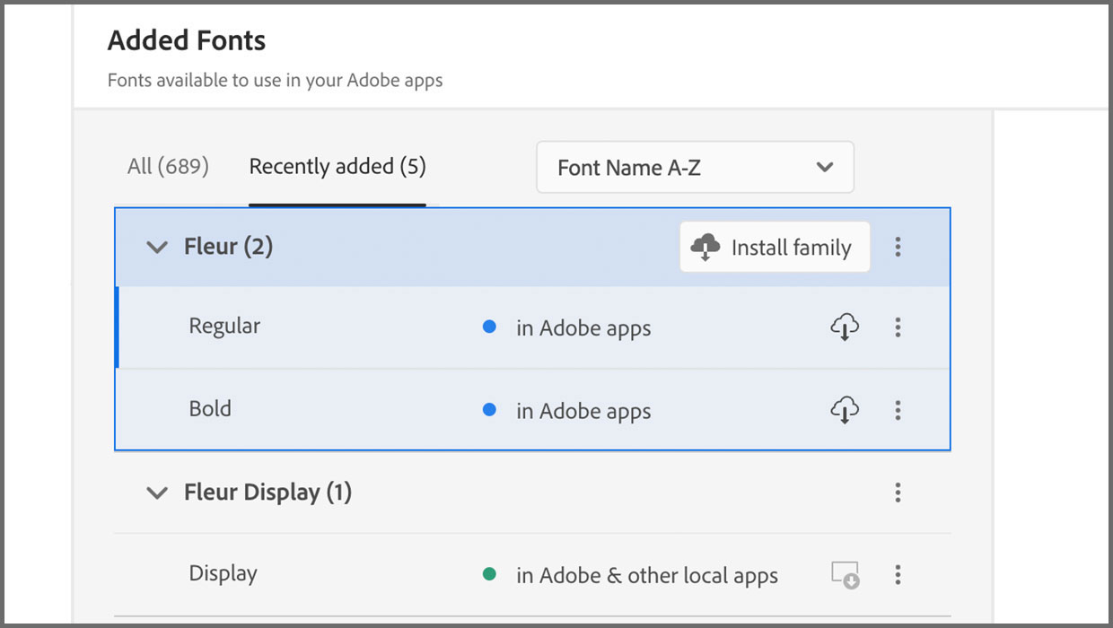
Added Fonts: The Confusing New Change in Adobe Fonts
Learn about Added Fonts in Creative Cloud, which can only be used in Adobe apps...

Introducing Between: A New Typographic Triumvirate from Monotype
Between might seem like an odd name for a typeface – until you learn what is beh...