The Vernacular Typography Project
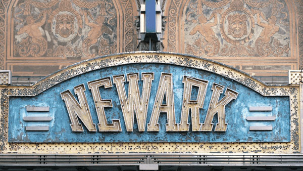
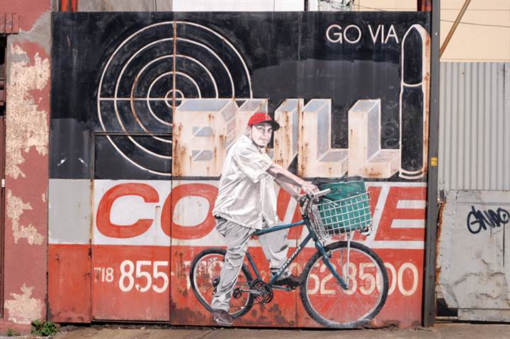
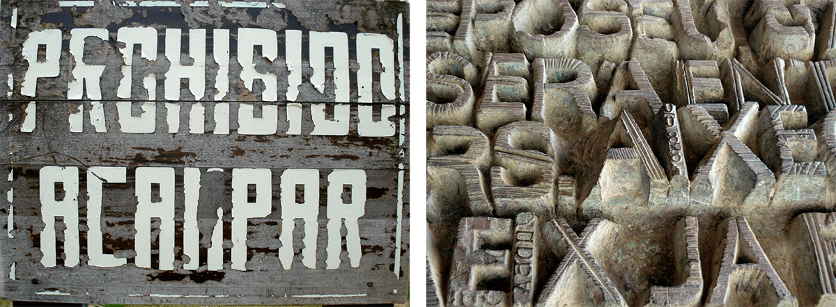
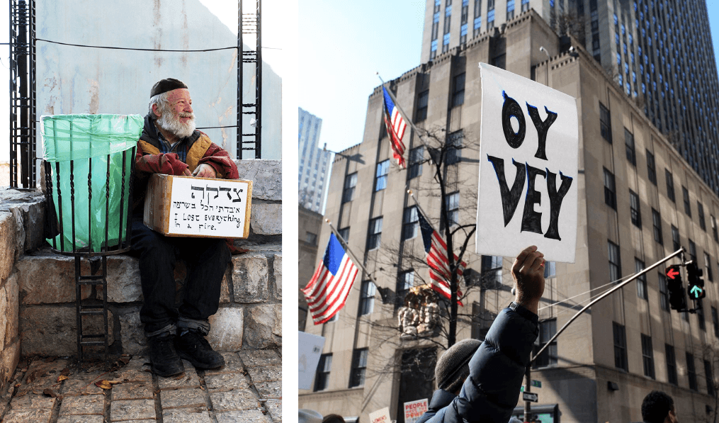
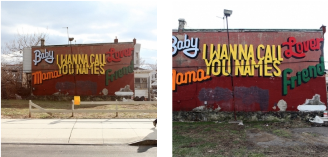
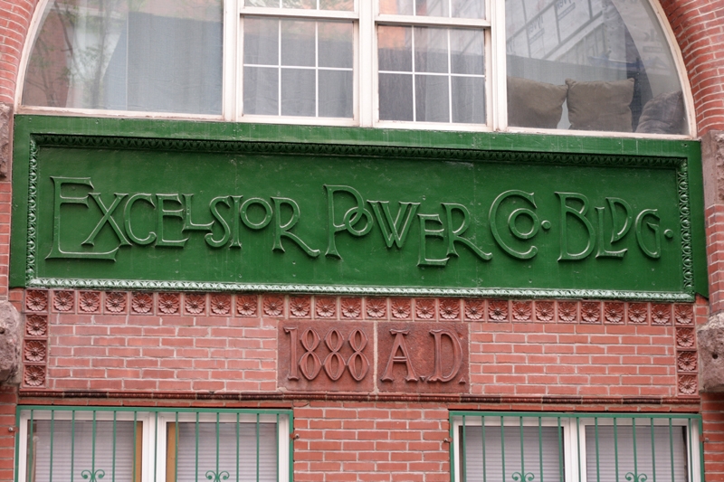
Wherever you go – from around the corner to around the world – examples of local, “vernacular” typography and lettering can be seen in storefronts, street and address markers, circuses and carnivals, posters, billboards, graffiti, and a lot more. This vanishing art consisting of handwriting, hand lettering, as well as commercially typeset images is an important form of urban communication.
Graphic designer and photographer Molly Woodward took notice of this fading visual expression, and created her Vernacular Typography project to help preserve and document it. Vernacular Typography began as a collaborative effort with local typographers and sign makers to document, map, and preserve these fragile remaining examples of a representative cultural art form that is being swept away by the uniformity of corporate advertising.
When asked what got her started, Molly says, “I studied Graphic Design at RISD, but even before I knew what design and typography were, I was magnetized to signs, both for their aesthetic appeal and for their ability to capture a sense of time and place. Vernacular Typography began as a way to organize and share the photographs of signs and letters I saw on my travels.” 
Over the past 15 years, Molly has assembled a growing visual archive of these vanishing examples of vernacular lettering and streetscape elements. This archive contains over 10,000 images of found typography from all over the world. Some of the things you might see in the archives include vernacular cartography, ephemera, ?oaty pens, ticket stubs, numbers, letters, letterpress things, stuff found on the ground, stuff found in books, strange typography, books, and at least 17 other types of things. 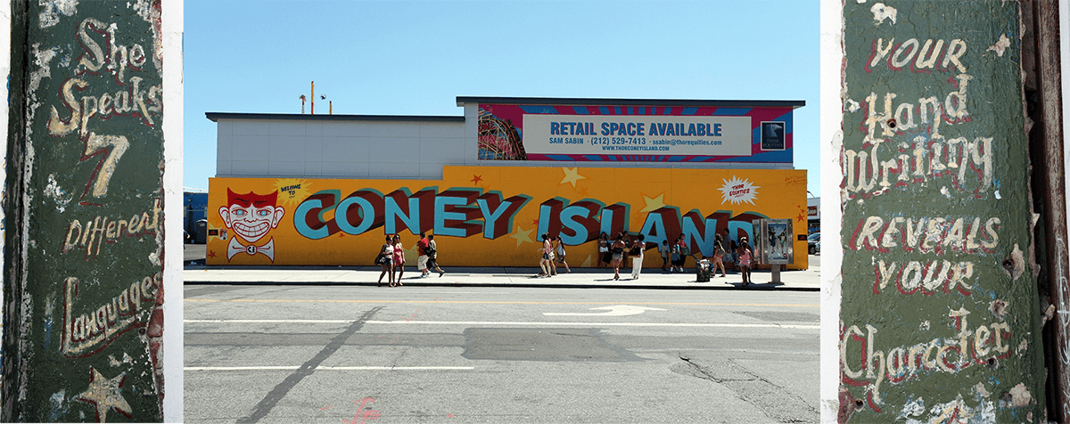
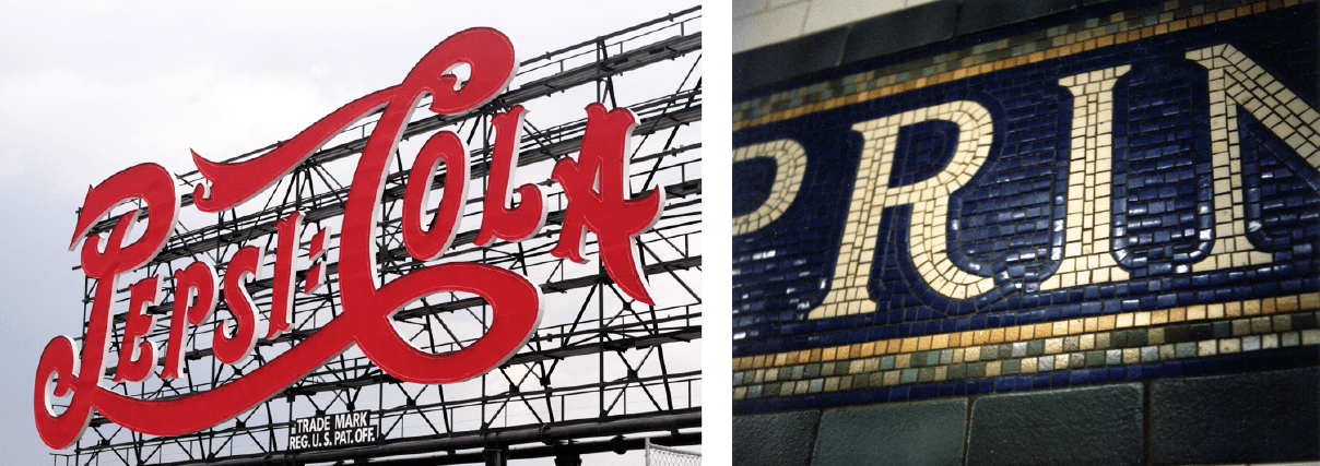
New Yorkers will recognize these two signs – one way above ground, and the other down below in the NYC Subway system.
Molly was happy to answer some questions on her experience with this project:
Was there a specific moment or situation that stimulated your passion for vernacular typography?
When I was 14, I went to Cuba for the first time. It was the first time I’d been outside of the U.S. (or the East Coast). The signs were different from anything I’d seen at home in Brooklyn. There was essentially no commercial advertising in the streets and the billboards along the highway, and painted on the sides of buildings were all political propaganda. When I came back home, I started noticing the signs here as well, but soon started to see the signs that I knew and grew up with were being either replaced or removed entirely. Documenting them was just a way to remember them before they disappeared altogether.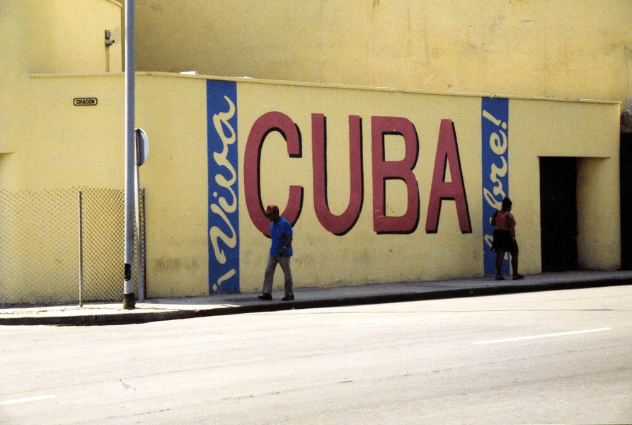
Do you have a favorite? …most challenging to photograph?
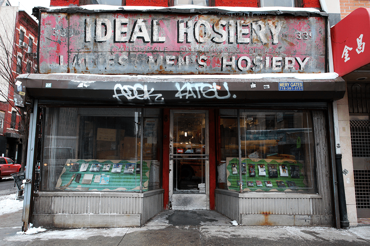
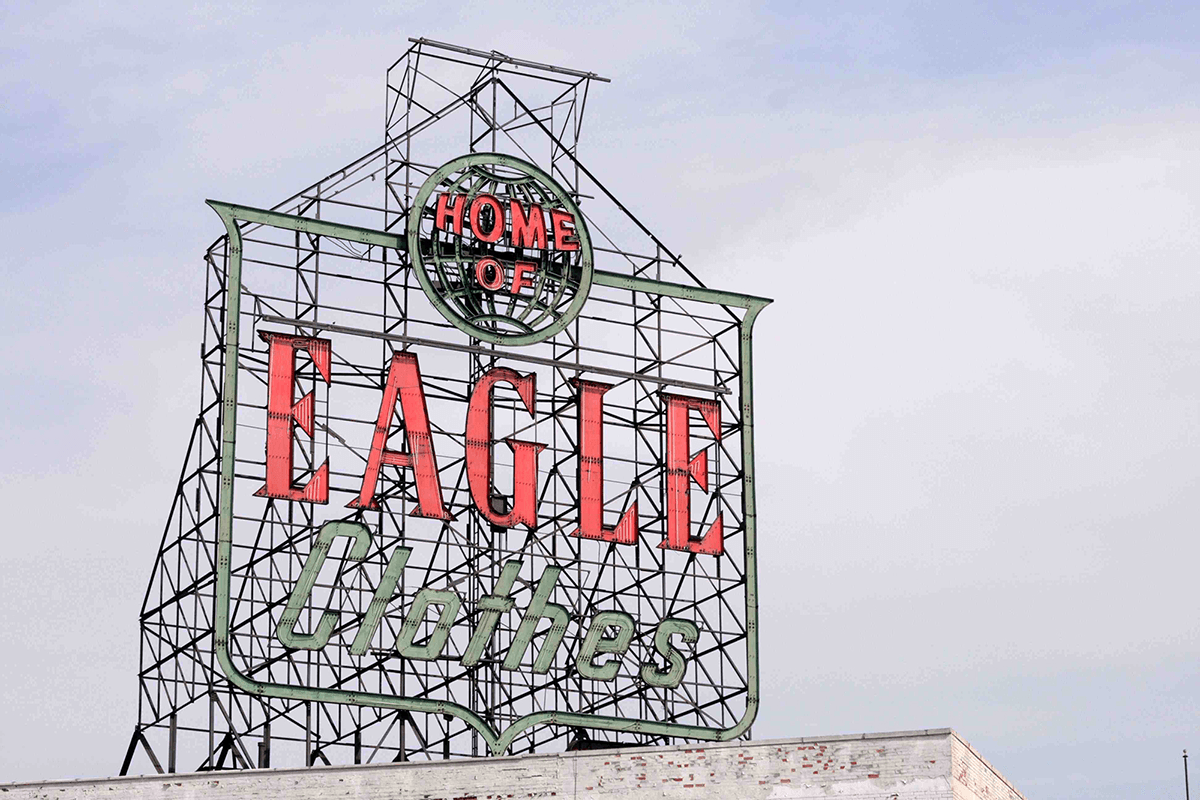
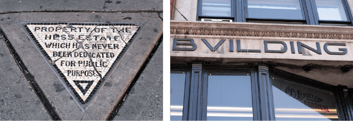
I have a few favorites – some that are still around that I check up on periodically, and some that have been removed and only live on in photos or memories. IDEAL HOSIERY on the Lower East Side is up there. The red, white, and black hand-painted sign used to wrap around the corner of the storefront, but every so often, it seems to lose another panel. The Eagles Clothes sign was one of my absolute favorite signs. It sat on a roof in what used to be an industrial area of Brooklyn. It was removed a few years ago so that the U-HAUL underneath could add a few levels. I went to photograph it before it was torn down, but found it had already been removed and the 18 foot tall letters were piled in a dumpster. Though I don’t get there very often, the large letters at Santa Maria Novella train station in Florence are also beautiful.
More than any one sign, though, my favorite aspect of the project has been hearing the stories inspired by signage. People from all over the world have contacted me to share their own photos or personal stories based on a photo of mine they’ve seen. Walking in Midtown with my grandmother a few years ago, I pointed out a fading Horn & Hardart sign along a wall. It then sparked a series of memories she’d never shared with me about going to the automat with my grandfather.
Each sign poses its own challenges for photography, especially in a dense, vertical city like New York where there are constant obstacles blocking a good view (cars, other people, trees, garbage piles, buildings, etc.). Sometimes signs will be gone literally overnight, so removal and lack of protection are probably the greatest obstacles. Once these types of signs are gone, they’re gone for good.
Any interesting stories?
Last year, the large overhead departure board in New York’s Penn Station was removed. Almost as soon as it came down, I heard commuters say how much they missed the flipping sound the board made when it updated – a feature the board didn’t actually have. I was interested in the way people romanticized a sign in a place that is anything but romantic, so I put together a short podcast about it here.
What do you think we as designers, as well as society as a whole, can learn from this vanishing art?
For designers, lettering found in the environment is a history lesson in the design and production of letterforms. Every city or town in the world is essentially an open-air museum or archive of signage and typography.
Aside from an aesthetic value, vernacular typography also serves as an identifiable marker of place, a way of orienting yourself in space. In a world where retail is rapidly homogenizing, sameness can be incredibly disorienting. When you see identical, standardized signs for global chains with no stake in local communities in every city, you lose a sense of where you are in the world. When places have a unique visual heritage based on local culture, it makes the experience of traveling to different cities that much more valuable and exciting.
Signs have an intended purpose, but they also have an emotional component that often gets ignored. They preserve history and can trigger memories. They are reminders of what came before and if we lose that visual history, we sever a valuable connection to the past.
The signs and letters that are disappearing from the urban landscape are by and large representative of small, local businesses, so beyond the typographic or historical value vernacular typography provides, they also connect us to independent shops (and the people that run them), which serve as neighborhood community centers.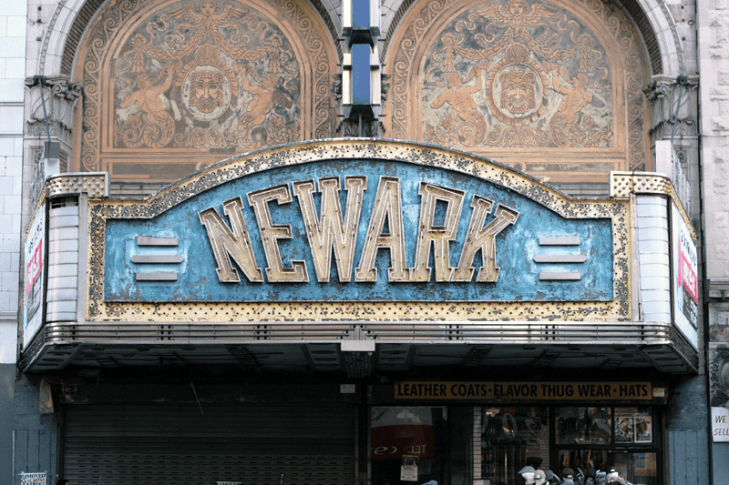

* * * * *
If any of these intrigue you, I urge you to take a closer look at the entire collection of fascinating and exciting images from this project at the Vernacular Typography website, as well as Instagram, Twitter, and the vernacular typography blog. I guarantee you never look at your neighborhood, or travels beyond, the same way again.
This article was last modified on June 20, 2018
This article was first published on June 20, 2018
Commenting is easier and faster when you're logged in!
Recommended for you

Fresh Fonts: Introducing DIN Next Slab
With scores of new typeface designs being released all the time, it is difficult...
Fonts on Friday: Crafty Handmade Fonts
What better time to round up new typefaces than on Friday. Not only is “Fo...

Aster Affects: a Collaborative Typeface for Hurricane Sandy Relief
SOTA, the Society of Typographic Aficionados, has organized a project to raise f...


