
The Trouble with Web Standards


Web standards hold the key to accessible, cost-effective web design and development, but you wouldn’t know it from surveying most big commercial sites. We’ll explore some of the reasons web standards have not yet been incorporated into the normative practice of all design shops and in-house web divisions, and are not yet obligatory components of every site plan or request for proposal. If you need help selling standards to your colleagues, this is for you.
Lovely to Look At, Repulsive to Code
In mid-2002, with six other new media designers, I served on the judging committee of the 8th Annual Communication Arts Interactive Awards, arguably the most prestigious design competition in the industry. The sites and projects submitted in competition were among the year’s most skillfully developed and designed.
We judges initially spent 10 weeks reviewing thousands of websites and CD-ROMs, narrowing the field to hundreds of finalists from which fewer than 50 would be selected as winners. The final judging took place in the Bay Area, where the seven of us were sequestered for a week. Until winners were chosen, we could not leave. At week’s end, we had chosen 47 winning projects and had thereby been released from bondage.
To celebrate the end of the judging (and with it, my newfound freedom), I met a San Francisco friend for dinner. The competition intrigued my pal, who knew a little something about web development himself.
My friend asked, “Did you take off points if the sites were not standards-compliant?”
I blinked. “None of them were standards-compliant,” I said.
It was a fact. Of thousands of submitted sites, not one had been authored in valid, structural HTML. Many of these sites were visually arresting (Figure 1) and skillfully programmed (Figure 2); several offered compelling, well-written content; and a few were startlingly original. But not one had a clue about valid structural markup, compact CSS, or standards-based scripting.

Figure 1. Team Rahal, Inc., one of the winners of the Eighth Annual Communication Arts Festival, is beautiful, impressive, and non-standards-compliant.

Figure 2. World Resources Institute, another visually striking competition winner, is cleverly programmed, but it, too, makes little use of web standards.
More than half the submitted sites had been developed entirely in Flash. Most of the rest worked only in 4.0 browsers, only in IE4, or only in Netscape 4. A few worked only in Windows. Of the hundreds of finalists, most of them lavishly (and expensively) produced, and each of them in its own way representing the industry’s best professional efforts, not one had the slightest use for web standards.
Little has changed since then. The 11th Annual Awards held in 2005 mostly featured wonderfully creative but non-standards-related stuff like the Borders GiftMixer 3000 (Figure 3).

Figure 3. Complete with the voice of “Hal,” from 2001: A Space Odyssey, the award-winning Borders GiftMixer 3000 offers a delightful way to buy Christmas presents, but no ho, ho, ho for web standards fans.
Common Goals, Common Means
The websites submitted to Communication Arts are wildly diverse in their creative and marketing objectives, but most share certain underlying goals — the same goals as your sites and mine. We all want our sites to attract their targeted audience, encourage participation, be easy to understand and use, and say all the right things about our organization, product, or service, not only in words but also in the way the site looks and works.
Most of us would like to get the best value for the money in our budgets. We want our sites to work for as many people and in as many environments as possible. We hope to avoid bogging down in browser and platform incompatibilities and to stay at least one jump ahead of the swinging scythe of technological change.
Most of us hope to create a site that will work well into the future without the continual, costly technological tinkering described in Chapter 2. We would rather spend our limited time updating content and adding services than recoding our sites every time a new browser or device comes along.
Standards are the key to achieving these goals. So why haven’t they taken the design community by storm?
Perception Versus Reality
For one thing, as with accessibility (see Chapter 14), many designers hold the mistaken belief that web standards are somehow hostile or antithetical to the needs of good graphic design. For another, those who create standards are not in the business of selling them; the visually pedestrian sites of the W3C (Figure 4) or Ecma hold little inspirational appeal for graphic stylists and consumer-oriented designers. Such sites’ lack of style does little to combat the myth that standards are antithetical to visual design. Only beautifully designed sites that use standards (Figure 5) can overturn that perception.

Figure 4. Delightful to hold but not lovely to look at, the W3C wraps its gifts in burlap. Contrast this pitiful word dump with Figures 1, 2, 3, and 5, which represent the sort of thing designers and other humans enjoy interacting with.

Figure 5. Kaliber 10000, an avidly read design portal, is constructed with valid XHTML, CSS, and the W3C Document Object Model (DOM). Although not the first to embrace these standards, K10k’s use of them is important, for it shows the design community that standards can support good graphic design.
Then, too, designers and developers who’ve taken the time to learn the Heinz 57 varieties of proprietary scripting and authoring might see little reason to learn anything new — or might be too busy learning JSP, ASP, or .NET to even think about changing their fundamental front-end techniques.
Those who depend on WYSIWYG editors to do their heavy lifting have a different reason for not using standards. Namely, they depend on WYSIWYG editors. Thus, unless they do a lot of extracurricular reading, they may be unaware that leading WYSIWYG editors now support standards. Many highly skilled developers use WYSIWYG tools like Dreamweaver, of course, but so do some semi-skilled workers who would be powerless to create even a basic web page if denied access to said tools.
Finally, it is only in the past few years that mainstream browsers have offered meaningful standards compliance. Many web professionals are so used to doing things the hard way, they haven’t noticed that browsers have changed. Let’s examine this last reason first.
2000: The Year That Browsers Came of Age
With the release in March 2000 of IE5 Macintosh Edition, the world (or at least that portion of the world that uses Macs) finally got more than a teasing taste of web standards. IE5/Mac supported XHTML, ECMAScript, nearly all of the CSS1 specification, much of CSS2, and most of the DOM. IE5/Mac was also able to display raw XML, although it’s not clear why anyone would want to do so. (Visit Bugzilla at https://bugzilla.mozilla.org/show_bug.cgi?id=64945 to see some of the approaches that uber-geeks have taken to address the problem of displaying raw XML in browsers.)
IE5/Mac: Switching and Zooming
IE5/Mac was so attuned to standards that it varied its display and performance according to the <!DOCTYPE> listed at the top of a web page’s markup — a technique called DOCTYPE switching, to be discussed in greater detail in Chapter 11. Put simply, with the right DOCTYPE, a page would display and function as web standards said it should. With an old or partial DOCTYPE (or none), the page would render in backward-compatible “quirks” mode, to avoid breaking non-standards-compliant sites — that is, to be kind to 99.9% of commercial sites on the web (Figure 6).
Figure 6. Hello, world, it’s IE5 Macintosh Edition, the first browser to get most web standards mostly right, and one whose innovations found their way into competitive products like Mozilla Firefox, Netscape 6+, and Apple’s Safari. Some of those innovations eventually even made their way into IE for Windows.
IE5/Mac also included a feature called Text Zoom (Figure 7) that enabled users to magnify or shrink any web text, including text set in pixels via CSS, thus solving a long-standing accessibility problem.

Figure 7. Text Zoom in the now-defunct IE5/Mac. At the touch of a command key or the click of a drop-down menu, users can enlarge (or reduce) the text on any web page, whether that text is set in pixels, points, centimeters, or any other relative or absolute unit. Images on the page are unaffected; only the text size is changed. Text Zoom found its way into Firefox, Safari, and other leading standards-compliant browsers — but not into IE/Windows.
Prior to IE5/Mac, only Opera Software’s Opera browser allowed users to shrink or magnify all web text, including text set in pixels. Opera did this by “zooming” the entire page, graphics and all — an innovative approach to the occasionally epic conflict between what a designer desires and what a user might need (Figures 8, 9, and 10).

Figure 8. Ourcommon, the design portfolio of Peter Reid, as viewed in Opera Software’s Opera browser at actual size.
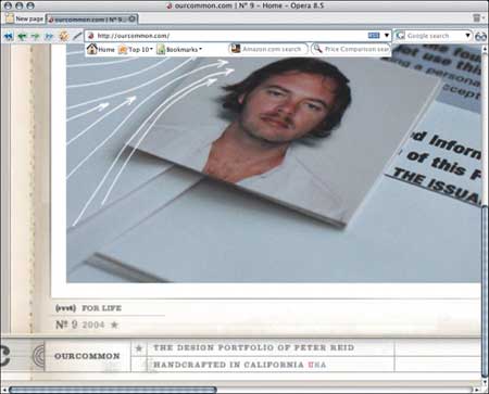
Figure 9. The same site magnified by 200% via Opera’s innovative Page Zoom feature.

Figure 10. The same site again, this time magnified by 500% via Opera’s Page Zoom. For designers, this Opera feature provides a way to more closely study a site’s visual elements without the hassle of first saving them as screen captures and then opening them in Photoshop.
Netscape’s Bold Move
A flood of standards-compliant browsers followed the release of IE5/Mac. Netscape 6 and its open source code parent Mozilla supported XML, XHTML, CSS, ECMAScript, and the DOM across all computing platforms. It, too, used DOCTYPE switching and offered Text Zoom, and it was designed from the ground up to be a fully compliant browser.
To achieve full standards compliance, at WaSP’s urging, Netscape had boldly junked its existing Navigator/Communicator 4.0 browser and every scrap of legacy code that had gone into it, restarting from a clean slate. Building a new browser from scratch took far longer than upgrading an existing browser. Netscape lost considerable market share during the years of Mozilla/Netscape 6 development — which began in 1998 but did not produce a commercial product until late 2000 (and arguably did not produce a viable commercial product until 2002).
These managers and engineers were not crazy. They obviously believed, as WaSP did, that the new browser would be finished in about a year. When one year became two and then three, the managers and engineers hung in there with a heroic, if increasingly baffling, determination to see the job through to the end.
Many companies would have abandoned such a project, shrugged their shoulders, and released a nonstandard 5.0 browser built on legacy code rather than sacrifice additional time and market share to a fiercely single-minded competitor like Microsoft. Although shareholders have every reason to disagree, Netscape’s management and engineers deserve our thanks for placing interoperability and the future health of the web ahead of short-term benefits and their own interests.
The Floodgates Open
Opera 6 came next — no DOCTYPE switching and no DOM, but fine support for most other standards. Opera eschewed DOCTYPE switching because, alone among commercial browsers, Opera had always sought to display pages according to W3C spec. Therefore, Opera’s makers saw no reason to offer a backward-compatible “quirks” mode. (Opera 5 and 6 did not support the standard W3C DOM, but Opera 7, released in 2002, does, and so, of course, do all successive Opera versions.)
Finally, Microsoft released IE6 for Windows, a browser that mostly caught up with its Macintosh product’s accurate CSS rendering; that offered strong support for XML, ECMAScript, and the DOM; and joined IE5/Mac, Mozilla, and Netscape 6+ in providing DOCTYPE switching. (On the browser’s release, the Windows-centric trade press finally noticed DOCTYPE switching and gave IE6/Windows the credit for it.)
IE6/Windows failed to implement Text Zoom, but Text Zoom, although highly desirable from the point of view of accessibility and user friendliness, is an innovation, not a standard. (The ability to resize text did not become a W3C standard until 2002, with the release of the sexily named User Agent Accessibility Guidelines. See https://www.w3.org/TR/UAAG10/guidelines.html#tech-configure-text-scale for details.) IE6/Windows got CSS fixed-attachment backgrounds wrong, and it also suffered (and still does) from a multitude of bugs. But its compliance was good enough to be worked with — or around.
None of these browsers was perfect, but each was a major achievement that demonstrated genuine commitment to interoperability via standards. No one, least of all The Web Standards Project, had believed these companies would come so far or do so much. With leading browsers finally attaining a kind of parity in their standards compliance, designers and developers were free to use CSS layout and other standards-based techniques.
2000-2001: The Standards Vanguard
A vanguard of designers and developers boldly began employing CSS layout and other standards-based techniques, including DOM-based scripting, prior to the release of IE6/Windows. Some did this by creating workarounds that forced IE5/Windows to render CSS accurately and turned off CSS in 4.0 browsers because said browsers could not render it accurately. Others took a layered approach, giving all browsers something to look at while reserving the “full” design for newer, more compliant browsers.
Too Little, Too Late?
The release of solidly compliant mainstream browsers was great news for web users and builders. But by the time the glad tidings arrived, many designers were convinced that web standards were a pipe dream, and others had ceased even trying to implement them correctly. It’s not hard to understand why. The perception was years in the making.
CSS: The First Bag Is Free
The CSS1 spec had been issued around Christmas of 1996. A few months later, IE3 debuted, including rudimentary CSS support among its features. CSS support (entirely missing in Netscape 3) gave Microsoft’s browser its first whiff of credibility at a time when Netscape Navigator dominated the web. IE3 supported just enough CSS to let you dump your nonstandard <font> tags and begin experimenting with margins, leading, and other rudiments of CSS layout. Excited by what they saw on Microsoft demo pages Prior to IE5/Mac, only Opera Software’s Opera browser allowed users to shrink or magnify all web text, including text set in pixels. Opera did this by “zooming” the entire page, graphics and all — an innovative approach to the occasionally epic conflict between what a designer desires and what a user might need (Figure 11) touting its new browser’s capabilities, many designers took their first plunge into CSS design — and soon came up gasping for air.

Figure 11. A page from Microsoft’s 1998 CSS gallery. Overlapping type and all other design effects were created entirely in CSS — no GIF images, no JPEGs. IE3 could display these effects; Netscape 3 (then the market leader) could not. The gallery’s CSS used incorrect values required by IE3’s imperfect CSS engine, and its overall standards compliance was nil, but the genie was out of the bottle. Having glimpsed what CSS might do, many of us never looked back.
IE3’s CSS support was a bold first step, but it was understandably buggy and incomplete. Those authoring CSS for the first time exulted in the creative freedom it offered but quickly bogged down in early IE bugs that could make a page unusable. For instance, under certain circumstances, images on a CSS-driven page would sit on top of text instead of alongside it. To get an idea of what this was like, place your hand on this paragraph and try to read it through your flesh. Unless you’re Claude Rains, you’ll have a tough time.
The workaround to this early CSS rendering bug in IE 3 was to place every image and paragraph in its own table cell, thus doubling the weight of your page while defeating the purpose of CSS (to control layout without tables and without excess bandwidth). Designers soon concluded that CSS was not ready for prime time — a determination that seemed reasonable given the absence of any CSS support in market-leading Netscape 3.
Bad Browsers Lead to Bad Practices
Then came the 4.0 browsers. Although still buggy and incomplete, IE4 greatly improved on IE3’s CSS support. Netscape 4 offered CSS for the first time in a last-minute implementation so broken and foul it set adoption of CSS back by at least two years.
To be fair, Netscape 4’s CSS support was far better than IE3’s had been. But while almost nobody today uses IE3, millions still use Netscape 4. Thus, many site owners feel compelled to support Netscape 4 — and mistake “support for Netscape 4,” which is a good thing, with “pixel-perfect sameness and identical behavior in Netscape 4,” which is a bad thing because it ties developers’ hands and forces them to write bad code and dumb markup.
The Curse of Legacy Rendering
Among Netscape 4’s chief CSS failings were legacy renderings and lack of inheritance.
Designed to abstract presentation from structure, CSS makes no assumptions about how elements are supposed to be displayed or even what markup language you’re going to use, although browsers and other user agents typically do make those assumptions. (Some modern browsers use CSS to enforce their assumptions and allow the designer’s style sheets to override them.) By default in most browsers, without CSS, the <h1> heading would be big and bold, with vertical margins (whitespace) above and below.
CSS lets you change that. With CSS, <h1> can be small, italic, and margin-free if it suits the designer to make it so. Alas, not in Netscape 4, which adds its default legacy renderings to any CSS rule the designer specifies. If the CSS says there shall be no whitespace below the headline, Netscape 4 will go ahead and stick whitespace down there anyway.
When designers applied CSS to standard HTML markup, they quickly discovered that IE4 mainly did what they asked it to do, while Netscape 4 made a mess of their layouts.
Some designers abandoned CSS. Others (sadly including me) initially worked around the problem by eschewing structural markup, using constructions like <div class=”headline1″> instead of <h1>. This solved the display problem at the expense of document structure and semantics, thereby placing short-term gain ahead of long-term viability and leading to numerous problems down the road. Said problems have now come home to roost.
I’ve long since abandoned the practice of wholesale document structural deformation, but a huge proportion of designers and developers still write junk markup in the name of backward compatibility with Netscape 4. This normative practice is fatally flawed, creating usability problems while stymieing efforts to normalize and rationalize data-driven workflows.
Content management systems, publishing tools, and visual web editors (a.k.a. WYSIWYG editors) developed during the 4.0 browser era are littered with meaningless markup that vastly increases the difficulty and expense of bringing sites into conformance with current standards or preparing legacy content for XML-driven databases. On large sites created by multiple designers and developers, each designer might use different nonstandard tags, making it impossible to gather all the data and reformat it according to a more useful scheme. (Imagine a public library where books were indexed, not by the Dewey Decimal System, but according to the whims of Joe, Mary, and various other cataloguers, each making up their own rules as they went along.)
Outside the realm of graphical browsers, structurally meaningless markup also makes pages less usable. To a Palm Pilot, web phone, or screen reader user, <div class=”headline1″> is plain text, not a headline. Thus, we buy or build content management systems that swap one set of tags for another when a single set of standard tags would serve. Or we force the users of Palm Pilots, web phones, and screen readers to view nonstructural markup and guess at our meanings.
We can thank Netscape 4 (and our own willingness to accommodate its failings) for miring us in this mess. No wonder those Netscape and Mozilla engineers kept working on the four-year-long Mozilla project. They really had no worth-while legacy product to fall back on.
Inherit the Wind
Netscape 4 also failed to understand and support inheritance, the brilliant underlying concept that gives CSS its power. CSS streamlines production and reduces bandwidth by enabling general rules to percolate down the document tree unless the designer specifies otherwise.
For instance, in CSS, you can apply a font face, size, and color to the body selector, and that same face, size, and color will show up in any “child” of the body tag, from <h1> to <p> and beyond — but not in Netscape 4.
Knowledgeable developers worked around the browser’s lack of support for inheritance by writing redundant rules:
body, td, h1, p {font-family: verdana, arial, helvetica,
sans-serif;}
In the preceding example, the td, h1, and p selectors are redundant because any compliant browser automatically styles those “child” elements the same way as the “parent,” body element.
Slightly less knowledgeable developers spelled out their rules in full, thus creating even more redundancy while wasting even more bandwidth:
body {font-family: verdana, arial, helvetica, sans-serif;}
td {font-family: verdana, arial, helvetica, sans-serif;}
h1 {font-family: verdana, arial, helvetica, sans-serif;}
p {font-family: verdana, arial, helvetica, sans-serif;}
… and so on. It was a waste of user and server bandwidth, but it got the job done. Other developers concluded that CSS didn’t work in Netscape 4 (they had a point) or that CSS was flawed (they were wrong, but the perception became widespread).
Netscape 4 had other CSS failings — enough to fill the Yellow Pages of a major metropolis — but these are enough to paint the picture, and they were also enough to delay widespread adoption of the CSS standard.
Miss Behavior to You
Along with CSS snafus, early browsers could not agree on a common way to facilitate sophisticated behavior via scripting. Every scriptable browser has an object model stating what kinds of behaviors can be applied to objects on the page. Netscape 4 sported a proprietary document.layers model. IE4 countered with its own proprietary document.all model. Neither browser supported the W3C DOM, which (to be fair to Netscape and Microsoft) was still being written. Developers who wanted to apply sophisticated (or even basic) behaviors to their sites had to code two ways to cover these two browsers. Supporting earlier browsers (backward compatibility) required more code and more hoop jumping, as described in Chapter 2.
Prior browsers could not even agree on a common scripting language. Early on, Netscape invented JavaScript, promising to release it as a standard so that other browser makers could support it. But for some years, despite their promise, Netscape held onto the secret of JavaScript, viewing it as a competitive advantage. (If Navigator remained the only browser that supported JavaScript, why would anyone develop for a less powerful competitive browser? So Netscape reasoned. In their place, Microsoft would likely have done the same. In fact, Microsoft did the same with their proprietary ActiveX technology.)
To compete with Netscape, Microsoft reverse-engineered JavaScript, changing it along the way as is inevitable in any reverse-engineering project. The resulting language worked like JavaScript, but not exactly like JavaScript — it was just different enough to louse you up. Microsoft called their scripting language JScript. Meanwhile, Microsoft also cooked up a separate technology they called ActiveX, which was supposed to provide seamless functionality in all versions of their IE browser but really only worked correctly on the Windows platform, where it is still used to do things like fill in for missing plug-ins.
JScript, JavaScript, ActiveX: In the name of cross-browser and backward compatibility, developers found themselves dancing with multiple partners, none of whom seemed to be listening to the same tune — and clients paid the piper in the form of ever-escalating development and testing costs.
Standardized Scripting at Long Last
Eventually, Ecma ratified a standard version of JavaScript that they modestly called ECMAScript. In time, the W3C issued a standard DOM. Ultimately, Netscape and Microsoft supported both — but not before years of hellish incompatibility had turned many developers into experts at proprietary, incompatible scripting techniques and object models and had persuaded many site owners that web development would always be a Balkanized affair. Hence, the “IE-only” site, the broken detection script, and in some cases the abandonment of web standards in favor of proprietary solutions like Flash.
By the way, Ecma (formerly ECMA, as in European Computer Manufacturers Association) is a bona fide standards body, unlike the W3C, which long labeled its technologies “recommendations” instead of calling them “standards.” Interestingly, following the publication of the first edition of this book, the W3C stopped calling its recommendations “recommendations” and started calling them “standards.” Confusing sites and bewildering labels are another reason standards have had difficulty achieving widespread acceptance on the modern web.
Confusing Sites, Bewildering Labels
Behold the CSS2 specification as presented by the W3C (Figure 12). CSS2 is a powerful presentation language created to facilitate the needs of designers, but you wouldn’t know it from gazing at this page. It’s about as inspiring as Fashion Week in the old Soviet Union.

Figure 12. The CSS 2 specification per W3C. An inspiring presentation language whose presentation here is anything but.
Ignoring a gnawing feeling of dread, you attempt to read and comprehend the spec in spite of its unappealing appearance. After all, the W3C is made up of scientists, not graphic designers. All that matters are the words, right? Twenty minutes into your reading experience, cross-eyed and weeping, you surf to an online computer store and buy Flash.
To be fair, not only is the W3C not in the business of graphic design, usability consulting, or information architecture, but it’s also not in the business of writing designer-friendly tutorials. The W3C site is a series of accurate technical documents created by leading thinkers and expert technologists — and that’s all it was ever supposed to be.
In “How to Read W3C Specs“, O’Reilly author J. David Eisenberg explains it this way: “When you seek answers, you’re looking for a user manual or user reference guide; you want to use the technology. That’s not the purpose of a W3C specification. The purpose of a ‘spec’ is to tell programmers who will implement the technology, what features it must have, and how they are to be implemented. It’s the difference between the owner’s manual for your car and the repair manuals.”
By definition, the W3C speaks to engineers, not the public. It’s not trying to explain or sell the standards it creates.
Unlike a corporation, the W3C is not reimbursed for its efforts when you use a web standard, and it discourages its member companies from patenting or charging royalties for web standards or components thereof.
Academics Versus Economics
Detached from the dog-eat-dog, dog-buys-other-dog’s-company-only-to-put-it-out-of-business world, the W3C inhabits a contemplative space where it can focus on the web’s potential instead of its competitive pressures. W3C activities are of geeks, by geeks, and for geeks, and its site reflects the group’s emphasis on science over style or consumer-friendly ease of use.
The trouble is, designers, developers, and site owners care greatly about style and care even more about consumer-friendly ease of use. On their own sites, they would never intentionally publish difficult, arcane text that confuses readers; never willfully stick their most important content in out-of-the-way places; and never deliberately present their content in an unaesthetic, nonbranded setting that encourages visitors to click the Back button.
Psychologically, people who care about branding, aesthetics, clarity, and ease of use and who spend their day struggling to bring these attributes to their own web projects are unlikely to believe that an amateurish-looking site filled with arcane technical documents holds the key to their future. So what do these people trust? They trust slick presentations from big corporations. (Hey, that rhymes.)
Consortia Suggest, Companies Sell
In the West, when we face a business or creative problem, we tackle it by opening a software application, and we look to market-leading corporations to deliver the products we need. Site owners check the health of their business by opening Microsoft Excel-formatted spreadsheets. Designers create logos in Adobe Illustrator and animations in Adobe (formerly Macromedia) Flash, and they prepare images and web layouts in Adobe Photoshop. For every problem, there’s a software category, for every category, a leader (probably Adobe).
Although pioneering web designers and developers learned to create pages in Notepad and SimpleText, many who came later relied on visual editing products (WYSIWYG tools) to handle their authoring chores. As proprietary scripting languages and incompatible object models made web design ever more complex, products like Dreamweaver and GoLive helped many pros create sites that worked while hiding the underlying complexities. How would you support multiple browsers? Push the right button, and the software would do it for you.
Today GoLive and especially Dreamweaver are far more compliant than previous versions (see “Web Standards and Authoring Tools” in Chapter 4), although they still require developer knowledge. And where do their users turn for knowledge? They turn to the attractive, well-written product sites that serve as online user manuals and foster the development of Dreamweaver and GoLive communities. We’ll have more to say about such sites in just a moment.
Product Awareness Versus Standards Awareness
As companies were striving to deliver “push-button easy” solutions to the problems of front-end design, the same thing was happening on the back end and in the middle. Proprietary publishing tools and database products from big brands like IBM, Sun, Lotus, and Microsoft and tough little companies like Allaire (later part of Macromedia, which is now part of Adobe) offered needed functionality at a time when standards like XML and the DOM were still being hammered out in committee.
You don’t build your car from scratch. Why build your website that way? Sign here, buy now, and if anything doesn’t work, we’ll fix it in the next upgrade. To deadline-driven developers, the pitch made sense, for the same reason it had once made sense to treat HTML as a design tool: namely, meeting client needs right now.
Thus, product awareness rather than standards awareness dominated the thinking of many web developers and especially of many web designers. For every designer or developer who checked out W3C specs, there were 10 who got their information from the websites of Netscape, Microsoft, Macromedia (Figure 13), Adobe (Figure 14), and other major (and smart) companies.

Figure 13. Like the W3C, Macromedia created invaluable tools for designers. Unlike the W3C, Macromedia sold these tools and worked hard to foster engagement with the design community and to speak that community’s language on its website. In 2005, Macromedia was absorbed by its former arch-rival, Adobe.
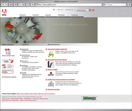
Figure 14. Adobe continually interacts with its users, finding out what they want most and changing its products accordingly. Like the rival it consumed, Adobe works hard to “speak designers’ language” on its website. Contrast this figure with Figure 4 and 12.
Unlike w3.org, these sites are created to serve consumers (professional designers and developers), to deepen the bond between company and customer, and to enhance the corporate brand. Thus, these sites tend to be well (or at least adequately) designed per corporate branding specs, and their tutorials are written and edited for easy comprehension by a professional audience.
Needless to say, such tutorials emphasize the efficacy of the company’s products. When companies mention web standards, it’s likely to be in passing or in connection with claims that their product is more compliant than a competitor’s. After all, the goal of such sites is to make you value the product you just bought and be eager to buy next year’s upgrade.
In short, many web professionals — designers and developers as well as their clients and employers — know quite a lot about proprietary solutions and quite a bit less about web standards. Nor do many realize, except perhaps tangentially, that aligning themselves exclusively with any single company or product line might lock them into an ever-increasing cycle of expense: from necessary upgrades to costly customization to training, consulting, and beyond. After all, that’s simply how business works.
One particular product deserves special mention, and it gets it directly below.
The F Word
Of all the competing proprietary solutions that corporations have tried to sell, none has succeeded as brilliantly as Flash (Figure 15). The product began as a humble plug-in called FutureSplash that allowed designers to embed vector-based graphics and animations on their pages.

Figure 15. Welcome to Flash! The Flash authoring environment might be rich, deep, and complex, but its creators do all they can to guide designers and developers by the hand as they begin to climb the product’s steep learning curves.
Designers paid little attention to FutureSplash, but Macromedia immediately recognized its potential. Macromedia bought the plug-in and its associated authoring tool, renamed it Flash, and rebuilt it into a richly flexible authoring environment driven by a powerful JavaScript-like programming language called ActionScript.
Macromedia also managed to foster a cult of Flash development — one that remains strong to this day. When Adobe bought Macromedia in 2005, although designers wondered how the two companies’ cultures could be made to mesh, nobody thought for a moment that Adobe would cease development of Flash, and the company never will.
The Value of Flash
While the incompatible scripting languages and object models of the 4.0 browsers wreaked havoc and drove up costs, Flash 4 and its powerful scripting language worked equally well in Navigator, IE, and Opera and nearly as well in Mac OS, Linux, and UNIX as it did in Windows. For many designers, it was adios to HTML and hello to Flash.
Spinning logos, tedious “loading” screens, and endless, unwanted “intros” initially gave Flash a bad name among users. But juvenile abuse of the new tool’s power eventually gave way to sophisticated user experiences created by the likes of Second Story [https://www.secondstory.com], the Chopping Block (Figure 16) and other high-end shops. Less talented and less innovative agencies hastily hopped on the Flash bandwagon, often producing far less engaging sites, but you can’t blame bad carpentry on the hammer and nails. Flash was eating the rich application space the way Microsoft’s browser was eating Netscape’s lunch.
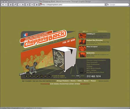
Figure 16. The Chopping Block is a New York City-based web and graphic design boutique whose high-end work is executed mostly in Flash.
Although appropriate to many projects, Flash was wrong for countless others that used it anyway, and Flash 4 suffered from woeful usability and accessibility problems that bothered users tremendously without seeming to be noticed by developers and clients. Among the product’s most vocal critics was Jakob Nielsen of the Nielsen Norman consulting group.
In 2002, Macromedia addressed its problems by greatly improving the accessibility and usability features of its upgraded Flash MX product and by hiring Nielsen as a consultant, thereby changing his tune. (If Microsoft and Netscape had shown the same smarts and hired their harshest critics, this author would be lolling about on a private beach instead of toiling at this book — but I digress.)
In capable hands, Flash facilitates rich interactive experiences that would be difficult to emulate using web standards — although web standards (with a pinch of Microsoft technology) have begun eating into Flash’s lead as today’s rich web application development environment of choice.
The Trouble with Flash
The principal problem with Flash is that it is inappropriate for many content and commerce sites. Yet developers use it in these inappropriate situations because Flash facilitates snazzy presentations that make clients feel they’re getting bang for their buck — and because, successful or not, Flash sites look good in the company’s portfolio.
News sites, portals, shopping sites, institutional sites, community sites, magazines, directories, and others that emphasize text or involve practical interactivity are still best served with XHTML, CSS, and other standards. Yet many developers sell Flash instead, not because it serves the project’s goals, but because they get off on it, and because the resulting work attracts new clients. It’s like ad agencies pushing work that will not sell a product but will win them awards. Not that ad agencies ever do that.
The Other Trouble with Flash
The other problem with Flash is that some designers are so enamored of it that they’ve forgotten how to use web standards — if they ever knew in the first place. As a result, one finds Flash presentations embedded in sites that work only in one or two browsers. The Flash files themselves would work in any browser that contained the plug-in, but the sites have been so miserably authored that many users are unable to access the Flash content. There are even Flash sites that require IE merely to load a Flash presentation. This is like demanding that you use a Zenith (and not a Sony) simply to access your cable TV feed.
When called upon to create a “traditional” standards-based site, these shops use the old methods whose problems we’ve described in this book, often turning the job over to their junior teams, so senior designers and developers can continue to focus on Flash projects. It’s as if the web has stood still since these shops discovered Flash.
XML, XHTML, CSS, and the DOM are not dull technologies for junior teams and beginners, but mature and powerful standards capable of delivering rich user experiences. I have no problem with shops that specialize in beautiful, usable, highly functional Flash work. I would just like to see the same care and attention paid to the other 90% of design and development. But I don’t have to sell you. You bought this book.
Compliance Is a Dirty Word
The other obstacle to widespread acceptance of web standards is the mistaken belief that standards will somehow diminish creativity, tie the developer’s hands, or result in lessened user experiences vis-á-vis old-school, proprietary methods. Where does this mistaken notion come from?
It might come from developers who tried using web standards in 4.0 and older browsers and were rightfully displeased with the results. But the days of poor standards compliance are gone.
The Power of Language to Shape Perceptions
The phrase “web standards” might be at fault. The Web Standards Project coined the phrase as an act of propaganda. We sought a set of words that would convey to browser makers exactly what was at stake — a set of words whose underlying ethical imperative would remind browser makers of their commitment to technologies they had helped to create and pledged to support. We needed a phrase that would convey to developers, clients, and tech journalists the urgent importance of reliable, consistently implemented, industry-wide technologies. “Recommendations” didn’t cut it. “Standards,” we felt, did.
We had no budget and few hopes, yet somehow we succeeded. Today, companies like Microsoft, Apple, Adobe, and Opera strive for standards compliance and brag of it as an expected and desired feature — like four-wheel drive. But although those companies “get it,” many in the design community do not. Some mistake “web standards” for an imposed and arbitrary set of design rules (just as some think of usability that way). It should be explained to these designers that web standards have nothing to do with external aesthetic guidelines or commandments.
If not the phrase, “web standards,” perhaps the word “compliance” might be at fault. Designers want to comply with their creative visions, not with a complex set of technological rules. They should be told that those rules have nothing to do with the look and feel of any site; they merely enable browsers to deliver what the designer has created. Likewise, clients want to comply with corporate or institution-driven site goals based on marketing requirements and user analysis. Again, web standards can only help by ensuring that sites work for more people on more platforms.
The Inspiration Problem
Designers and clients might be turned off by the lack of visual inspiration (sometimes bordering on hostility to design and branding) found on some sites that discuss web standards or brag about their compliance with one or more W3C specifications. We’ll encounter the same problem when we discuss accessibility. (Some accessibility sites are downright ugly, but the problem lies with those sites’ designers, not with accessibility, which carries no visual penalty. The same is true for web standards, even if the look and feel of the W3C website or of Ecma is unlikely to motivate designers to get busy learning about XML and CSS2.)
The Wthremix contest (Figure 17), launched in December of 2002, sought to generate some of that missing aesthetic interest.

Figure 17. The Wthremix contest launched in December 2002 challenged designers and coders to redesign the W3C’s website.
The founders explained their goals this way:
The W3C creates powerful standards and guidelines that make web development more rational and enhance user experience. Technologies like XML, CSS, XHTML, the DOM, and guidelines like the Web Accessibility Initiative can help us create more powerful sites that work better for all. But the W3C is composed of super-geeks, not consumer-oriented designers, developers, writers, and information specialists. As a result, the W3C’s powerful technologies and guidelines are trapped in a sprawling site that is less attractive and less usable than it might be. We wondered if the W3C’s website could be transformed into one that is better looking, better organized, better branded, and much easier to use and understand. Hence this contest.
The Contest: Wthremix is a design challenge for coders and a coding challenge for designers. Here’s the idea: Create a redesign of the W3C home page. Design an intuitive layout and navigation, organize the content with the user in mind, and create an aesthetic that reflects the importance and influence of the institution. Show us what you think the W3C home page should look like, how it should communicate to its users and, to make your point, use valid tableless XHTML and CSS, and meet WAI accessibility level 1.
Other Problems
Some might mistrust web standards because of bad experiences with buggy early versions of Gecko-powered browsers like Netscape 6 or because of bugs still unfixed in IE6 after five long years.
Others, intrigued by the promise of standards, might have converted a site from HTML to XHTML, only to discover that the layouts suddenly looked different in standards-compliant browsers. (That’s right: merely by switching from HTML to XHTML, making no other changes, your site might look different.) In Chapter 11 I’ll explain why that happens and the simple, quick fixes that can get your site back on course. But if you don’t know about those simple, quick fixes, you might be mistrustful of standards and might want to bury your head in the sand and persevere in the obsolete, nonstandard methods that used to work so well in yesterday’s browsers.
But don’t give in to the dark side. Although ignorance and prejudice are as rampant in web design as in any other human endeavor, web standards are here to stay — and this book is here to help.
© 2006 Pearson Education, Inc. Informit. All rights reserved.
This article was last modified on January 18, 2023
This article was first published on January 31, 2007
Commenting is easier and faster when you're logged in!

Recommended for you

Zevrix Solutions Releases BatchOutput 2.5 For Adobe InDesign
Zevrix Solutions announces the release of version 2.5 of BatchOutput, a powerful...

Holiday Gift Guide for Creatives
This fun guide has something for every designer on your holiday shopping list.

The Digital Art Studio: 5 Favorite Illustrator CC Features
If you’ve ever experienced a power outage, you’ve also likely found yourself ref...