The Path to Beautiful Tables, Part III: Working With Numbers

Step 3: Use lining n
umerals
In tables that feature lots of numbers—annual reports, statistical abstracts—stick with lining numerals. Lining numerals, sometimes called ranging numerals, are those familiar forms that base-align and all have the same height. Significantly, they also all have the same width, which allows them to stack neatly when set in columns. They are a monospaced subset in virtually all proportionally spaced text fonts.
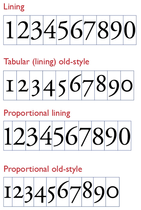
Some fonts also include alternative numeral sets, most commonly old-style numerals, sometimes called lowercase numerals. These vary in height, with some setting at x-height, and others featuring ascenders and descenders, as shown in Figure 4. Old style numerals are o.k. in tables with only a few numbers, but en masse, they can give a table a disorderly look and, more importantly, make numbers harder to read at a glance.
A hybrid, occasionally found in so-called “pro” OpenType fonts, are monospaced old-style numerals, which have the visual appeal of ascending and descending forms but stack neatly in columns. They may still be too active on the page for staid financial tables, but in moderation make a practical texture; alternative to lining figures.
Figure 4: Numerals come in many flavors. Best for tables are lining numerals, which all have the same set width. Old-style numerals generally have proportional widths, so they don’t align neatly in columnar settings. Even so-called tabular old-style numerals—which all have the same width—may be too busy-looking in a large table, adding unwanted texture that makes the numbers harder to scan quickly.
Even if you do choose to use old-style figures, consider using lining figures for any footnote symbols you may need. Old-style footnote figures can be very tiny and border on the illegible.
Step 4: Use figure spaces
Throughout this series, the focus has been on managing space, so it’s fitting to end on an invisible note.
A figure space is a fixed space that has the same width as the lining numerals in a typeface. It is a crucial complement when using lining or tabular numerals. It’s a boon for creating alignments in tables of the sort shown in Figure 5. In InDesign, you’ll find it in the Type/Insert White Space menu. If you create a lot of tables, use InDesign’s Edit/Keyboard Shortcuts to assign a shortcut to this handy space.
Figure 5: The hanging currency symbol is a hallmark of financial tables, and using figure spaces makes alignments like those shown here a snap. For every missing numeral, add a figure space. If you have to make up for missing commas, use punctuation spaces (Type/Insert White Space/Punctuation Space).
This has been a lot of stuff to digest, but tables are probably the most complicated typesetting tasks you’ll ever take on. And this series has only covered the broad strokes.
Fortunately, once you have a collection of basic styles in tow you can use them as a springboard for future tables. But more than creating a style archive, consider archiving whole tables as well to use as templates down the road. In a pinch, you can lift one wholesale out of your library, delete its cell contents, and “just add data.”
This article was last modified on January 6, 2024
This article was first published on September 11, 2013
Commenting is easier and faster when you're logged in!
Recommended for you

New Book: Type Form & Function
Rockport Publishers has released Type Form & Function by Jason Tselentis. It...

TypeTalk: When In Rome
TypeTalk is a regular blog on typography. Post your questions and comments by cl...

TypeTalk: Say What?
TypeTalk is a regular blog on typography. Post your questions and comments by cl...


