


Sofia Mohr
Sofia Mohr has been very busy the last few years. This Brazilian architect, who was born in São Brazil and currently lives in Santiago, Chile, traversed mediums and platforms, and designed six typeface families in two years: Café Brasil, Estampa, Amazônia, Hogar, Aromática, and Mohr, her namesake.
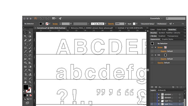
So how did this creative transition evolve? Sofia first took an interest in typography while studying architecture, although she admits that she always harbored warm feelings toward typography and graphic design. In 2013, she had an opportunity to attend a typography design program at the Universidad Católica de Chile and loved the experience. Her first font design, Café Brasil, was selected as part of the 2014 Latin American typography biennial, and was further accepted for purchase at various reseller sites. Overall, the type design received great feedback, motivating her to continue designing fonts and to consider typography as a full-time profession.
Sofia feels that an amazing font must incorporate a concept through its design process, although she admits that it can be difficult to do so. She believes that the initial idea is what coaxes a design through the creation process, yielding a more consistent result and providing the finished design with a much clearer purpose.
“My inspiration is usually related to my personal experiences. Being Brazilian and living in a different country (Chile) has always pushed me in trying to rescue aspects of my own culture, allowing me to feel closer to my origins. It might be the aroma of an espresso coffee, or the wildlife of the amazon rainforest, and even more personal experiences of my childhood, that I try to reinterpret through typeface design.
The first font I did was Café Brasil, specially done as part of my design diploma at the Universidad Católica de Chile. This work was then selected as part of the 2014 Latin American typography biennial, receiving great feedback overall, motivating me to continue learning and consider font design as a full-time profession.
Part of that learning process has been through calligraphy, which demands a long hand-made process, helping me incorporate a more personal touch to what I do. This method was especially important in fonts like Amazônia, my first brush pen script font, requiring a wild organic stroke.”
Café Brasil is a typeface designed to represent coffee, and conceived especially for use in packaging, branding, logos, and menus. Based on the shape of a coffee bean, Café Brasil has delicate details and ligatures that represent the liquid, foam and steam of a good cup of coffee. Cafe Brasil was chosen to be part of the main exhibition at the Tipos Latinos 2014. 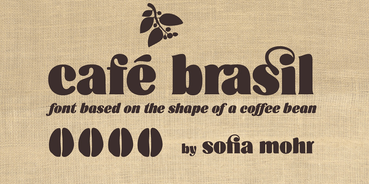

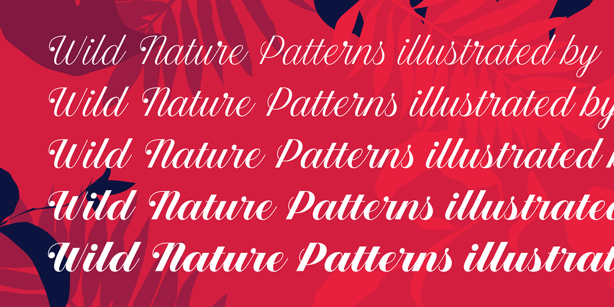
Estampa Script is a five-weight script family with high contrast between thick and thin strokes, and teardrop terminals that are reminiscent of Didone typefaces. These elements are the main features of the font, and give it a very strong character. Estampa Script is well suited for clothing, interior design, branding, packaging, advertising, and publishing. 
Amazônia is a multidisciplinary design project that joins calligraphy, illustration, and web design with the whole purpose of education and creating an awareness of the threatened wildlife in the Brazilian Amazon. The main element of this project is Amazônia Script, a type design inspired in the exotic wildlife of the Amazon. Completely draw in brush pen by So?a, it’s a versatile font that contains 763 slightly rugged and condensed glyphs, with fast and curved strokes, swashes (for capital and lowercase letters) and alternate characters. It also includes a decorative variant; Amazônia Life, developed with designer Sebastian Aguila, which contains 52 endangered animal dingbats, each containing an alternative variant drawn especially for usage with dark backgrounds.


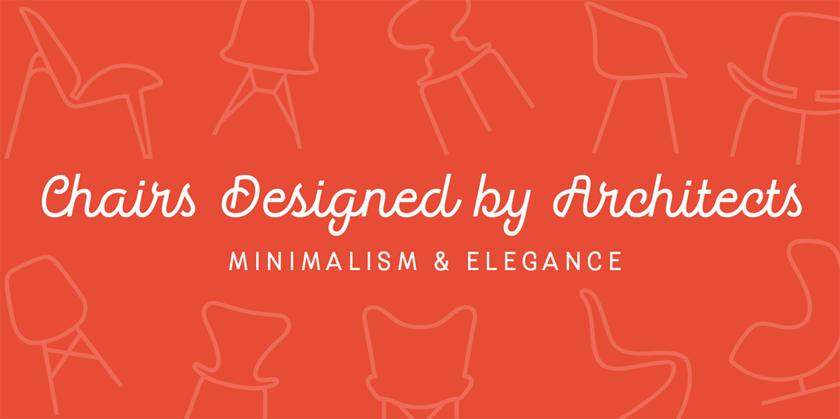
Hogar is the result of merging Sofia’s architecture background and her love for typography, which inspired her to create a system of fonts based on interior architecture design, furniture design and, especially, the love she feels for her home. The system comes with a monolinear style in sans and script versions, each including five weights with italics that share similar proportions and other design details. Hogar includes a sans with script gestures and a script with sans shapes. Additionally, there is a set of monolinear dingbats, including some furniture designs by well-known architects. 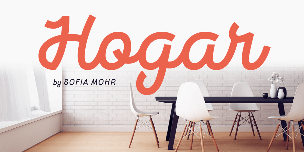

Aromática is a rounded typeface with a clean, simple look reminiscent of those strokes found in handwriting, while providing readability and functionality. Aromática consists of seven fonts: a monolinear script version, a sans serif in five weights ranging from extra light to bold. It also contains a patterns font, inspired by aromatic herbs and spices, which is the perfect companion to the script and sans faces.


Mohr, Sofia’s newest and largest release, is a neutral, versatile, and contemporary font based on some characteristics found in humanist sans serif typefaces. Mohr’s features, together with its design characteristics, make it suitable for a wide range of applications – from display usage to small text. The Mohr family comes in three versions: Normal, Alt and Italic, each with nine font weights, from thin to heavy, resulting in a total of 27 fonts. Mohr also includes initial and terminal swashes in most of the uppercase and lowercase characters. This gives the font a unique personality, and provides a greater range of uses such as branding and packaging.


* * * * *
All of Sofia’s designs are published by LatinoType, a Chilean digital type foundry that is dedicated to creating and promoting typography that is both aesthetically pleasing and highly functional in any graphic design setting. Established in 2007, LatinoType is operated by a trio of graphic designers and typographers in their own right – Miguel Hernández, Luciano Vergara, and Daniel Hernández – all of whom are on an unstoppable mission to support the careers of fellow typographers while striving to put Latin America on the map of global typography.
This article was last modified on June 6, 2018
This article was first published on June 6, 2018
Commenting is easier and faster when you're logged in!

Recommended for you
Create Fonts in Illustrator CC With Fontself
Fontself Maker, the result of a 2015 Kickstarter campaign, is an Illustrator plu...

Filtering and Finding Fonts in Adobe Apps
Is there anything worse than diving into a new design project and getting stuck...

Scanning Around with Gene: The Islands and Bridges of Stencils
Anyone who has redecorated a child’s room or has a fondness for blue-and-white c...