
To create visual appeal or harmony designers combine related elements, such as colors, shapes, textures and so on. While the visuals deliver the sense of balance, symmetry, and equilibrium, they must follow a particular pattern that converges everything to a focal point.
The notion of harmony is also rooted in the design law of Aesthetic Usability that states people “often perceive aesthetically pleasing design as design that’s more usable.” In short, the designs that appear beautiful are assumed to be functional. So, is there a foolproof way that helps designer create visually satisfying design? The Golden Ratio can certain help. With this article, I’ll try to help you understand the Golden Ratio, how it informs design, and where it can be applied.
What’s the Golden Ratio
The Golden Ratio – basically a mathematical principle denoted by phi (?) – has been used for thousands of years. It has been thought that early Egyptians used it to construct the pyramids of Giza. Greek sculptor and mathematician, Phidias (500 B.C. – 432 B.C.) applied phi to the design of the Parthenon.
Similarly, Plato considered it the universal binder of mathematical relationships. Euclid (the father of geometry) linked the Golden Ratio to the structure of a pentagram.
From Da Vinci and Michelangelo to Salvador Dali, artists, sculptors, mathematicians, and architects began using this universally accepted notion of balance in their work.
So, how did they use phi?
The Golden Ratio (aka the Golden Section or the Golden Mean) is a special number (1.618…) found by the division of the Golden Rectangle into a longer and shorter part. It can simply be calculated as follows: the sum of longer part (A) when divided by the shorter part (B) is equal to the sum of both parts (A+B) divided by the longer part (A) , i.e. ? or 1.618…, leading to infinity.
The shapes exist in the ratio of 1:1.618 and can be represented by the formula shown in the figure below.

The Golden Ratio is often linked to the Fibonacci sequence, where each successive number is the sum of the previous two numbers. Starting from zero, the sequence goes as 0, 1, 1, 2, 3, 5, 8, 13, 21, 34, 55, 89, 144,… and the list goes on and on. When put in the same formula for the Golden Ratio, the numbers from the sequence give the sum close to phi.
The Divine Proportion
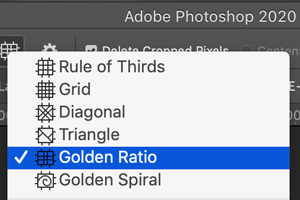
Graphic designers can use the Golden Ratio and the dimensions derived from it to construct appealing designs. They can simply multiply or divide an element’s size with 1.618 to get the ideal dimensions for a design element or use the Golden Spiral to guide the layouts in their designs of all types. Adobe Photoshop and Lightroom both offer crop overlays with the Golden Spiral and Golden Ratio to help you compose an ideal image.
How To Use Golden Ratio In Graphic Design
You might be thinking that using the Golden Ratio will slow you down or restrict your creativity in some way. But in reality it gives you the opportunity to make your design fly. Here are a few examples of how it can be used in various types of design and tips on getting started.
Logo Design
When you need to come up with a logo design, consider employing the Golden Ratio. It can help you instantly recognize and create patterns that will establish harmony.
![]()
Image: Twitter/RabiaaIqbal
Tip: You can take main shapes from the Golden Ratio. This will help to maintain harmonious proportions. Then, combine the shapes and align them using a grid. You can also determine the height, width, placement, size and even length of the logo elements. Just remember to start with just one Golden Ratio and take the proportions from it. Using more than one will clutter your design.
The best examples come from the Twitter, Apple, and Pepsi logos that effortlessly maintain the proportions of harmony. Each of these uses a single spiral and takes proportions from it to create the shapes that make up the logos.

Web Design
Web designs created with the Golden Section emphasize the aesthetics and quality of visual hierarchy. Several sites are designed using the golden proportions to create meaningful experiences for the users while adding the enhanced sense of charm.
For instance, 2ndSTREET uses Golden Ratio for its homepage, which presents a conceptual view of the clothing articles. When you visit the website, you see the traditional website layout with the A and B sections clearly differentiated. The reason it looks strongly compelling is the progressive design with its golden grid system for a dynamic layout.

Source: 2nd Street
Another example is that of Harvard Film Archive. With the headline to the right and occupying a larger part of the space, smaller proportions are used to highlight the CTAs. The reason it satisfies the eye lies in the breathing space between the content. It demonstrates that a site can have an exceptional layout using the Golden Mean.
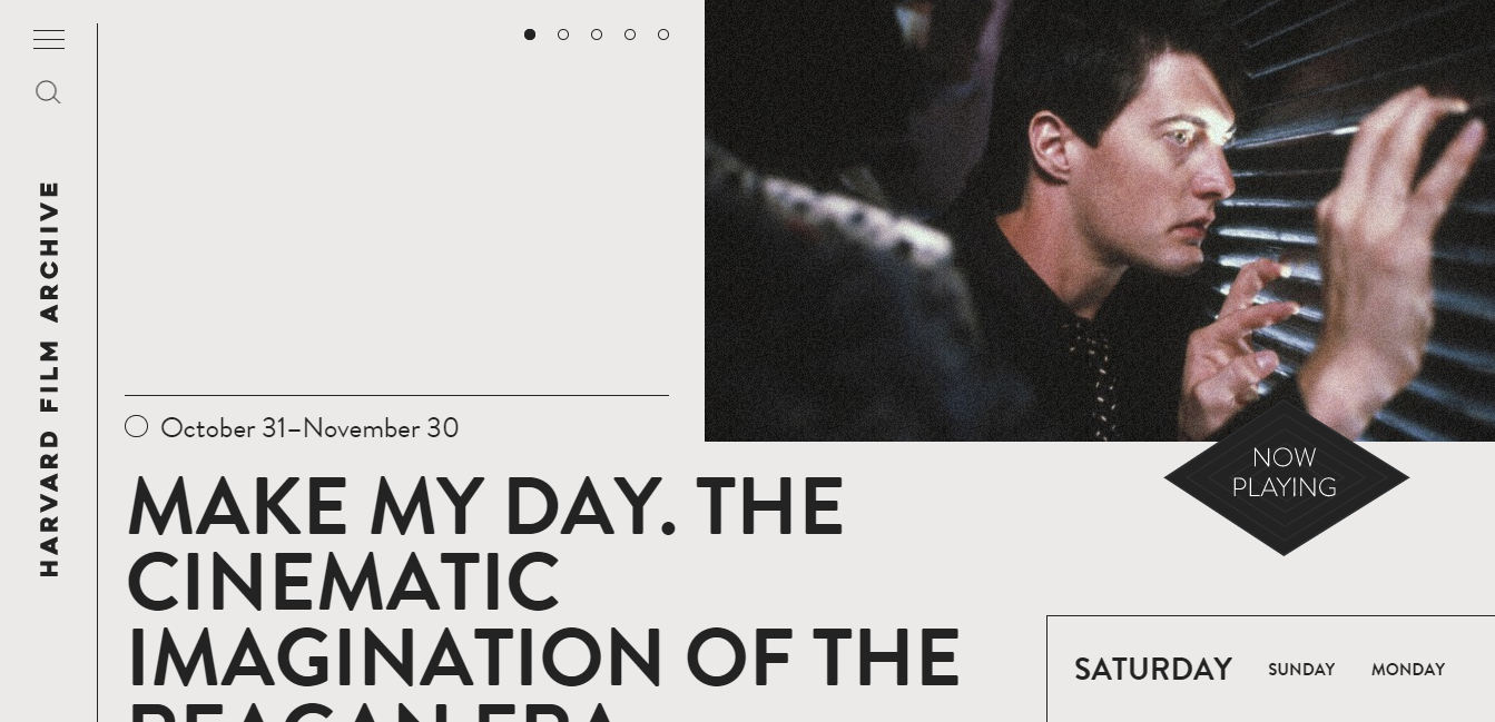
Source: Harvard Film Archive
Print Design
Like the feasibility it offers in digital media, the Golden Ratio goes works with print design as well. The symmetry and balance often goes unnoticed, but it creates an exceptional look. The viewer’s eyes are drawn to the center of the spiral, where the placement of the compositional model looks appealing and striking.
A good example of it is the book cover for The Help by Kathryn Stockett, designed using the Golden Ratio. The cover draws attention with perfectly fitting proportions.

Source: Wikipedia
Another example where the Golden Ratio spiral is highly involved is Feld Magazine. The small text and detailed content is concentrated toward the center of the spiral, directing the eye in a coiling manner.

Source: Canva.com
Photography
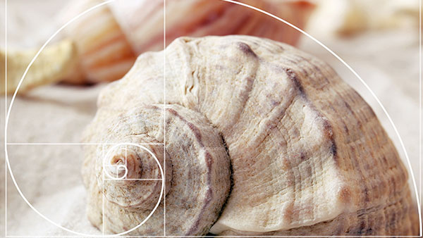
Professional images aren’t shot in a random manner. Photographers use the Golden Ratio and the Rule of Thirds for creation of aesthetic photographs. It helps concentrate attention towards specific elements of the image without losing the overall appeal.
Using the Golden Ratio, the image is split into unequal sections, where the picture is composed along lines and intersections. The ratio followed is 1.618 to 1. The spiral should be used to direct the viewer’s eye towards the important element, example of which is illustrated below.

Image: Flickr/John Lemieux
When using the Rule of Thirds, you split an image into 3 sections, horizontally and vertically, all in an equal proportion of 1:1:1. The subjects of the image along the intersecting points and lines create the composition for a perfect balance in the image. Here’s an example.

Image: SLR Lounge
Golden Ratio is All Around Us
When you become aware of it, you may start noticing that the Golden Ratio appears everywhere. It’s describes a natural and unconscious response that leads the eyes to find the point of appeal and focus. It’s a concept that has been used to prioritize content placement and hierarchy. Like the great masters, it’s best to use this overarching principle to guide your design work. As for the rest, just follow your eyes.
This article was last modified on October 21, 2020
This article was first published on January 13, 2020
Commenting is easier and faster when you're logged in!

Recommended for you

Ten Ways Dungeons & Dragons Has Made Me a Better Graphic Designer
I had always been curious about Dungeons & Dragons, but I didn’t start playi...

New Zealand Crowdsources New Flag Design
What if Twitter had been around in 1776 when the Founding Fathers asked Betsy Ro...
InDesign Magazine Issue 123: Nonfiction Design
We’re happy to announce that InDesign Magazine Issue #123 (July 2019) is no...