

The jarring ring of the telephone rattled through my office like a tin-lizzy bouncing down an ancient cobblestone street. Pixel, the cat, stirred on the windowsill.
The voice on the other end was one of my best friends, a top-flight artist whose clients are some of the biggest companies in the world. I knew instantly that this would be a hush-hush case.
I could hear the concern in his voice. “Read your email,” he whispered, “and call me back when you open my file. I’ll explain then what the problem is.”
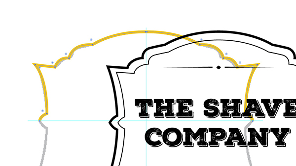
Wading through a stack of junk-mail messages, I quickly downloaded his file. Launching Adobe Illustrator, I saw the logo for a well-known company. (Since I don’t want to embarrass my friend, I’ve substituted the following imaginary logo in Figure 1.)

Figure 1: While the names have been changed to protect the innocent, this is an example of the type of logo that caused the problem.
I called him back. He picked up the phone on barely half a ring. If a voice could sweat, his was dripping. “Did you get it? Is it open?” I answered in my most soothing tones, “Calm yerrself, buddy. There’s nothing wrong with the logo.”
“But there is, there is! Select all the objects and look at the preview in the Transparency panel. The white elements are gone! Missing! And even worse, the file prints that way!”
Sure enough, when I selected all the elements in the logo, the Transparency panel gave me quite a start. Instead of the white elements, there was… nothing!
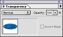
Figure 2: The Transparency panel displays a preview of the selected objects. Notice that the logo is missing the white elements.
I felt as if I’d been hit in the gut with my ancient G3 “Wallstreet” Powerbook. How could this happen? Elements don’t show in one place and disappear in another. Could it be another one of the infamous bugs in Illustrator Nine-point-Oh? Somehow I doubted it. I was about to tell him to trash the Illustrator preferences and rebuild his desktop when a light bulb clicked on. Suddenly, it all became clear to me — like the screen on an Apple Cinema Display.
“Hey, buddy, take a gander at what happens when you choose View > Overprint Preview. See, your white elements are gone from the screen.” The silence on the other end of the phone was deafening. Then my friend stammered out his questions. “Overprint Preview? What’s that? And why would someone turn on overprinting?”
That was just the beginning of the mystery.
Understanding Overprinting
Before I explain what effect overprinting had on my friend’s file, a little background is in order. Start with two overlapping objects, in this case a yellow oval and a cyan oval like those in Figure 3.

Figure 3: To understand knockouts and overprints, begin with two overlapping objects as they appear on screen.
In the ancient days, before computer graphics, instructions would be sent to the separator to set the cyan oval to either “knockout” or “overprint” the yellow oval. A knockout would mean that the cyan oval would act like a cookie cutter to knockout, or cut away, any objects underneath, as shown in Figure 4.

Figure 4: When set to knockout, the top oval causes any portion of the underlying objects to be discarded. This is the usual default for computer graphics programs.
When I first started teaching computer graphics, many of my students wondered if they could knockout images in computer programs. They thought they would have to do it themselves. Fortunately, computer graphics programs are set to automatically knockout objects from each other.
With the other approach — overprinting — the colors of the top object mix with the colors of the bottom object. So a blue oval set to overprint a yellow object would create a green area where the objects overlap, as shown in Figure 5.

Figure 5: When set to overprint, 100-percent cyan combines with 100-percent yellow to create a green.
These days, setting an overprint is relatively easy in vector programs such as Illustrator. You simply check the overprint option for either fill or stroke in the Attributes panel as shown in Figure 6.
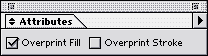
Figure 6: In Illustrator, you set overprint in the Attributes panel.
Although setting an overprint is easy, until recently there were only two ways to see the results you would get with an overprint setting. One way was to create film separations and print the file — hardly a quick and easy proof.
The other way was to open the Illustrator file in Photoshop as a CMYK image. The Photoshop file would show the image as it would print with separations. (FreeHand users needed to save the file as an EPS in order for Photoshop to open it.)
With Illustrator 9, though, Adobe has added an Overprint Preview. This allows you to see the effects of overprinting quickly and easily, in the Illustrator document. So when the blue oval is set to overprint, the results are visible right on the screen, as in Figure 7.

Figure 7: Illustrator’s Overprint Preview makes it easy to see the effects of setting an object to overprint.
Sadly, Macromedia FreeHand does not have a similar feature. The best FreeHand users can do is turn on the Redraw Preference setting for “Display overprinting objects.” This fills objects set to overprint with a series of small O’s, as seen in Figure 8. However, this only lets you know that overprinting has been applied; it doesn’t show you the effect of the overprinting. Another workaround is the time-honored tradition of saving the file as an EPS and opening it in Photoshop.

Figure 8: The small O’s in the fill indicates the FreeHand object has been set to overprint.
Confusions in Overprinting
Of course the real world isn’t quite so black and white (or yellow and blue). As soon as you deal with multiple colors, the rules regarding overprint get more complicated. Let’s keep the bottom object as 100-percent yellow. Now suppose the top object isn’t a plain 100-percent cyan, but also contains 20-percent yellow. What happens when overprinting is turned on? The answer is nothing. There is no overprinting effect at all. Figure 9 shows the results.

Figure 9: Adding 20-percent yellow to the top object negates the effect of overprinting.
Why? Well, the first thing you have to realize is that the top object cannot (absolutely NOT) add more yellow to the bottom object. (There is no such thing as 120-percent yellow.)
OK, most people can easily accept that. But then someone inevitably wonders why the 20-percent yellow in the top object doesn’t combine with the yellow in the bottom object to create an area filled with 100-percent yellow. After all, shouldn’t the overprint command indicate some sort of mixture?
I agree that this seems like it should work, and perhaps there were print shops in medieval days that would have interpreted an overprint command that way. But PostScript doesn’t! The way the PostScript language interprets overprinting is to turn it off if the two objects share a common color plate. Even microscopic amounts of yellow in the top object will turn off the overprinting command.
Overprinting and Process White
So what was the problem with my friend’s logo? With Overprint Preview turned on, the logo looked the same as it did in the Transparency panel — not a pleasant sight. See for yourself in Figure 10.

Figure 10: The logo shown with Overprint Preview turned on.
On closer examination, I saw that the white elements weren’t actually solid white. If they had been, Illustrator would not have allowed overprinting to be turned on. That’s because process white is not really a color. It’s actually an instruction to Illustrator to knockout 100 percent of whatever color is behind the object. So turning on overprinting is a set of conflicting instructions — knockout and overprint combined. If you don’t want the white knockout, you shouldn’t turn on overprinting. Just delete the knockout object.
However, the white elements in the logo were actually a very subtle gradient that changed from white to a light gray. And Illustrator does allow you to set an overprint to a gradient that contains process white.
To fix the problem, we simply selected the white elements and turned off the Overprint setting. However, one question still lingered.
Why did someone turn overprinting on to begin with? They couldn’t have missed the huge warning box that appears when you set an object with process white to overprint.
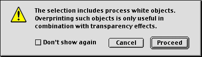
Figure 11: A warning box tries to stop you from setting objects with process white to overprint.
My friend really didn’t have a clue. His client had sent him the logo from its ad agency and he knew no one who could answer my question. My best guess lay in the shadows that had been applied behind the white elements. Perhaps someone mistakenly thought that turning on overprinting would help those shadows blend with the blue behind them. Bad choice: Those shadows are controlled by the Multiple blending mode setting, and overprinting has nothing to do with it.
Another successful case stamped “Solved.”
This article was last modified on February 16, 2023
This article was first published on July 10, 2001
Commenting is easier and faster when you're logged in!

Recommended for you

Using the Blend Tool in Adobe Illustrator
Illustrator provides many useful methods to create color blends including the Gr...
Create a Vintage Logo in Illustrator
Those artisanal logos are all the rage, aren’t they? You know the ones: th...