

My sister, Dr. Samantha Brody, is a naturopathic physician and author of Overcoming Overwhelm: Dismantle Your Stress from the Inside Out (Sounds True Publishing).
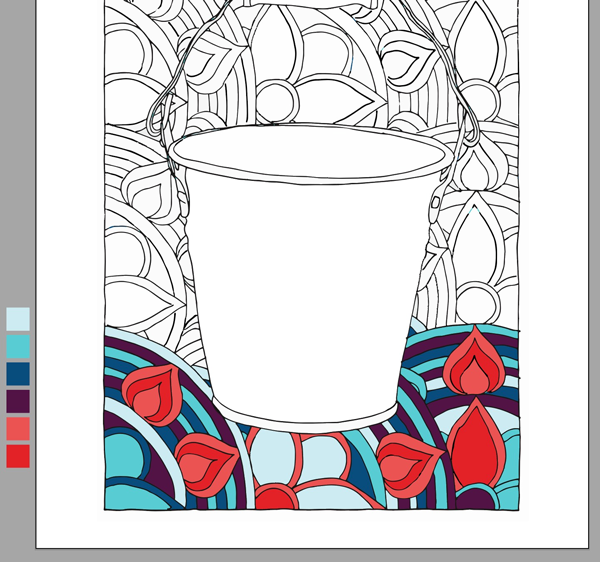
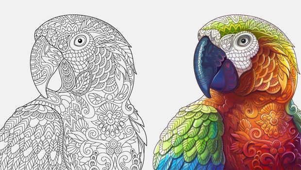
As a give-away in advance of the release of her book she commissioned illustrator Alison Jones to create illustrations for a PDF coloring-book, with Brian Buirge designing the layout. Months later when her book was complete, she realized that the color scheme that had been used for the cover of the coloring book didn’t match the color palette of her new book and website. As resident family image-fixer, my sister asked if I could swap in the new color palette for the old, and recolor accordingly, and could we do it quickly? I told her to send me the files.

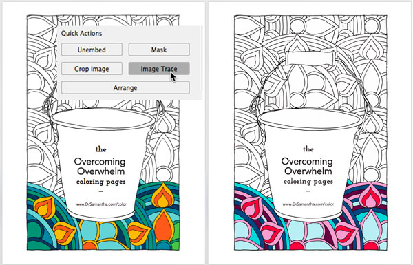
Although I’d assumed that the hard-edged and flat-colored illustration had been created in Adobe Illustrator, it turns out it was hand-drawn and colored, and then scanned as rasters and inserted into the coloring book layout. Because the new palette was completely different from the original, I knew it wouldn’t be just a matter of replacing this color for that throughout, and we’d need to mock up a few variations with the new palette colors applied to various objects. Although I could recolor in Photoshop, I felt that creating a few variations and changing them around would be much easier if I could convert the rasters into Illustrator objects so that I could just select objects or groups of objects and shift colors. In order to be able to do this, I would need first to convert the raster illustration into vectors using Image Trace.
Not every artwork is as ideally suited to this process, but if you have hard-edged raster art with flat colors, applying Image Trace in Illustrator should make it easier to experiment with different ways to shift colors.
Before starting the process of tracing an image, make sure that the raster art is high-enough resolution to appear fairly smooth at 100%, but not so high in resolution that it will significantly slow down the tracing process (this image was about as big as you’d want: 300ppi at about 6?×10?). Opening the raster file in Illustrator I duplicated the layer with the image. To be able to easily return to an earlier phase as I worked, I continued to duplicate layers (and meaningfully rename the layer) before altering the image to the subsequent phase.
With the coloring book cover image, I wasn’t exactly sure how many colors were in the original, but I guesstimated it was fewer than 16, so I started my explorations using the 16 Colors preset and then made any needed adjustments from there. To do this I selected the duplicate image, clicked the down arrow next to Image Trace in the Control panel, and chose 16 Colors from the pop-up list.

Once an image is traced, the Control panel reorders around your options, and provides quick access via a mini icon to the full Image Trace panel. In the Image Trace panel I clicked the Advanced black triangle to access the full panel.

I adjusted a few options including enabling “Overlapping (Creates stacked paths)” so that objects could more easily be adjusted if necessary.

Once I confirmed that this traced image contained all of the previous colors (by comparing it to the untraced version on a lower layer), I duplicated the traced layer, and clicked Expand in the Control panel to convert the traced duplicate into editable vector objects.
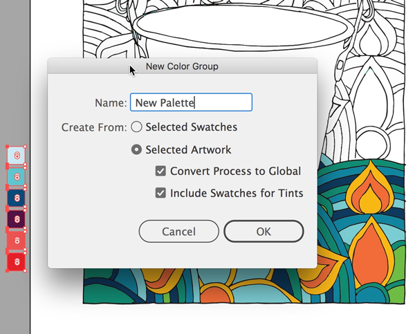
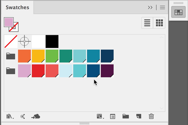
In order to convert the colors into swatches that could more easily be acted upon, with the expanded version selected, I opened the Swatches panel and clicked the New Color Group icon.

In the resulting dialog I then chose Selected Artwork, Convert Process to Global, and Include Swatches for Tints and named it “Original Colors.”

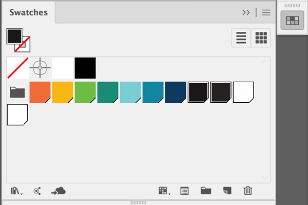
All the colors were extracted from the selection and saved as swatches within the “Original” swatches group in the Swatches panel. It turned out that these colors also included a few slight variations of blacks and whites that were artifacts from the scan. Shift-selecting the white and black swatches in the group, I clicked the Swatches Trash icon, leaving a clean set of only the colors used in the original cover for the coloring book.
There are many ways to bring a custom set of colors into Illustrator and swap one set for another, including sharing assets via the Creative Cloud, looking up Pantone colors, and using the Edit Colors/Recolor Art dialog. You can even double-click each global color to edit that color, which automatically updates all instances of that swatch. But in this specific instance, not all objects of the same original color would be replaced with the same “New Palette” colors. Also because the colors were going to be viewed either on screen, and printed on all matter of home printers, I opted to just use the RGB colors as they came into Illustrator to closely approximate my sister’s new color palette, and to manually swap in groups of colors for another and then continue change objects one at a time.
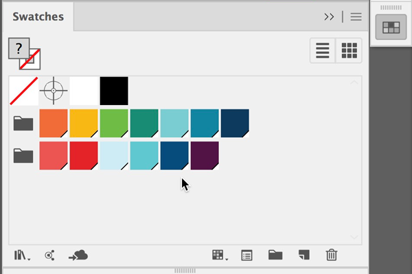
In Illustrator I opened the PDF file that included the palette my sister’s designer had created, then copied and pasted these new colors into the main document, alongside the original cover. With these colors still selected, I again clicked the New Color Group icon to name this second new color group “New Palette.”
I rearranged the New Colors to approximate as best I could the general hue and value range of the original.
One color at a time, I clicked on a color in the design and chose Select> Select Same Fill Color, and then clicked on the “most similar” value/hue color in the new palette set to change the colors.

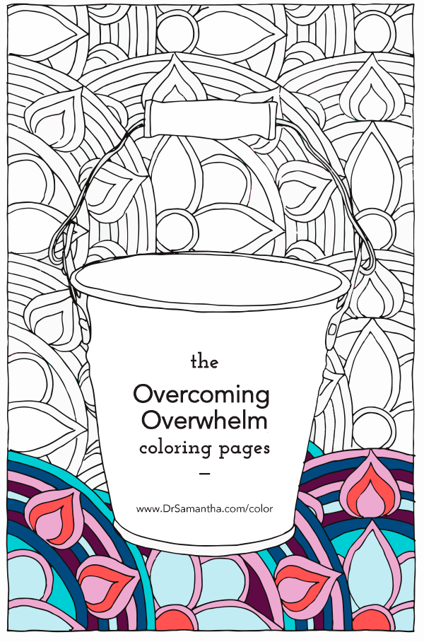
With the “new colors” applied for a first test, I sent a screenshot to my sister.
 She wasn’t happy with the result. I explained that I thought the biggest issue was likely that her new palette had fewer colors than the original. She asked me to propose an additional color we could use. I mixed a few palette options and we finally agreed on a new lighter mauve-like color to add to her new palette. With the new square selected I clicked the New Swatch icon to add it to the Swatches panel, and then dragged it into the New Palette color group.

I reworked how colors were applied with this larger palette, and sent a few more tests.

After a few last tweaks, we finally found a new recoloring that worked. I saved a copy of the image as an Adobe PDF, and in Acrobat I swapped in the new page for the original one.
This article was last modified on July 9, 2021
This article was first published on January 28, 2019
Commenting is easier and faster when you're logged in!

Recommended for you
Soft-Proofing: Benefits for the Graphic Designer
There is a very useful, but often overlooked, feature in Photoshop relating to c...
Live Paint in Illustrator
Illustrator’s Live Paint feature transforms the work of coloring graphics into p...
CreativePro Conference Speaker Spotlight: Bert Monroy, the Digital Art Pioneer
Welcome to our new series of posts called Speaker Spotlight, designed to highlig...