


More marvelous miscellanea for you to contemplate and click.
1. Being sensitive to the qualities of visual design is a double-edged sword. On one hand, you get to appreciate things like well-ordered grids, fine typography, and great use of line and color. The downside is that a poorly-kerned license plate might make you want to crash into the car in front of you on the highway. And of course, there are a million other designcrimes you might encounter each day. Buzzfeed’s video of “How To Piss Off A Designer In 40 Seconds” makes a valiant effort at cataloging the worst offenses. Briefly NSFW due to some naughty kerning at 0:36.
2. If you’re like most folks, you probably take your gadgets and gear for granted, not really understanding the amount of effort that went into making them. But one look at these videos from Sigma Global Vision on how they manufacture camera lenses, and you’ll never look at your gear quite the same way again. The devotion to craftsmanship is inspiring. And maybe a little intimidating; after watching the videos I’d sure hate to take lousy pictures with any of those lenses.
3. Typesetinthefuture.com is a new blog devoted to the fonts used in sci-fi movies. The first post was a tour de force analysis of type in Stanley Kubrick’s classic 2001: A Space Odyssey. And now a second post details the font usage in a much more recent (and nearly as mind-blowing) film, Moon.

4. The folks a Photojojo have come up with another awesome gadget for enhancing your iPhone photography efforts. The Galileo holds your iPhone either by itself or on a tripod and allows you to pan, tilt, and twirl the camera 360° with perfect smoothness and precision via apps for perfect panoramas and terrific time-lapses. Look ma, no hands!

5. Great ideas are often the result of boiling something down to its essence to reveal an entirely new perspective. Case in point: Arthur Buxton’s Colourstories, wherein the artist has taken popular children’s books like The Very Hungry Caterpillar, The Snowman, and Where the Wild Things Are, and reduced each page to five colors. The colors were then sequentially arranged to create charts that distill the stories down to their visual essence. The chart below is the colourstory for The Very Hungry Caterpillar. Think of it as post-literate reading.
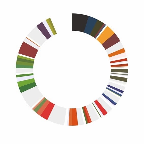
source: arthurbuxton.com
6. The Conference Paradox is a great piece from techonomy.com discussing the value of attending professional conferences, and how the knowledge and trusted connections you can make in person can never be truly duplicated in the purely digital realm. So true, as I’ve learned time and time again at shows like PEPCON and ADIM. Plus, there’s usually cookies.
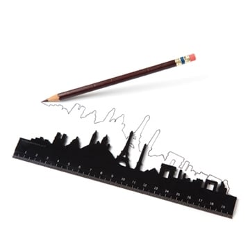
7. Love these skyline rulers from Monkey Business. For $9 you can make the mundane act of measuring an excuse to dream of your favorite city.
8. Peachpit.com has an excerpt from Tim Cooper’s book The Realistic HDR Image, offering 9 Pro Tips for Getting Better Results in the Field from Your HDR Images, including advice on the use of shooting modes, tripods, timers, file formats, and more.

9. Adobe’s Julienanne Kost has a new lynda.com course that I’ve already added to my playlist: The Art of Photoshop Compositing. The first chapter, including movies on how to tell a compelling story, and creating your own image bank, is free for anyone to watch.

10. And last but not least, a Kickstarter project for anyone who grew up with the low-res video games of the ’80s and ’90s (or just anyone who appreciates that 8-bit aesthetic): it’s called PIXEL V2: LED ART. It’s a 1024 pixel LED display that you can control from your smartphone or PC. It comes with 150 works of pixel art from artists around the world, and all kinds of creative poss
ibilites. Also check out ledpixelart.com for more info.
This article was last modified on February 21, 2014
This article was first published on February 21, 2014
Commenting is easier and faster when you're logged in!

Recommended for you

The Digital Art Studio: Rescuing Old Photos #1
As the representative digital professional in my family, I’m frequently tapped t...

TypeCon2011 Dates & Venue Set
The Society of Typographic Aficionados is thrilled to bring TypeCon2011: Surge t...
TypeTalk: Parts of a Character
TypeTalk is a regular blog on typography. Post your questions and comments by cl...