

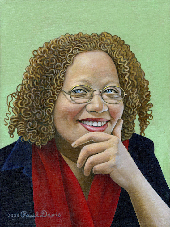
Gail Anderson, by Paul Davis
I have been a huge fan of Gail Anderson, the New York-based designer, writer, and educator, ever since her days at Rolling Stone magazine. Now a partner at Anderson Newton Design, Anderson has traveled a varied design trail since those days at Rolling Stone, but her work continues to encompass tremendous and wide-ranging creativity, combined with dynamic use of type, image, and color.
Her credentials are too broad to list in their entirety, but here are some of the highlights: From 2002 through 2010, Anderson served as Creative Director of Design at SpotCo, a New York City advertising agency that creates artwork for Broadway and institutional theater. From 1987 to early 2002, she worked at Rolling Stone magazine, serving as designer, deputy art director, and finally, as the magazine’s senior art director. And early in her career, Anderson was a designer at The Boston Globe Sunday Magazine and Vintage Books (Random House).
Anderson’s work has received awards from major design organizations, including the Society of Publication Designers, the Type Directors Club, AIGA, The Art Directors Club, Graphis, Communication Arts, and Print. In addition, her work has also been included in the permanent collections of the Cooper Hewitt Design Museum, the Library of Congress, and the Milton Glaser Design Archives at the School of Visual Arts. Anderson is the recipient of the 2008 Lifetime Achievement Medal from the AIGA, the 2009 Richard Gangel Art Direction Award from the Society of Illustrators, and has lectured extensively around the world.
Anderson is co-author, with Steven Heller, of Type Tells Tales, as well as dozens of other titles. She’s currently creative director at Visual Arts Press and a partner at Anderson Newton Design. She also teaches at the School of Visual Arts and serves on the Citizens’ Stamp Advisory Committee for the USPS. Anderson was kind enough to take the time out from her busy schedule to answer a few questions:
How did you develop your love of and expertise with typography? Was it from school or on-the-job?
I grew to love type while studying with Paula Scher at SVA (School of Visual Arts). My appreciation multiplied tenfold while working for Fred Woodward at Rolling Stone for over 14 years. The collection of typositor fonts we inherited was legendary, and we added dozens more classic typestyles over the next several years. Setting display type on the typositor made you really consider your decisions because you were asking someone (in our case, Rev. Jim) to set it for you, and it took serious time.
And then came the Mac, and everything changed.

Rolling Stone cover, 1997

Rolling Stone, 1995

Rolling Stone, 1995
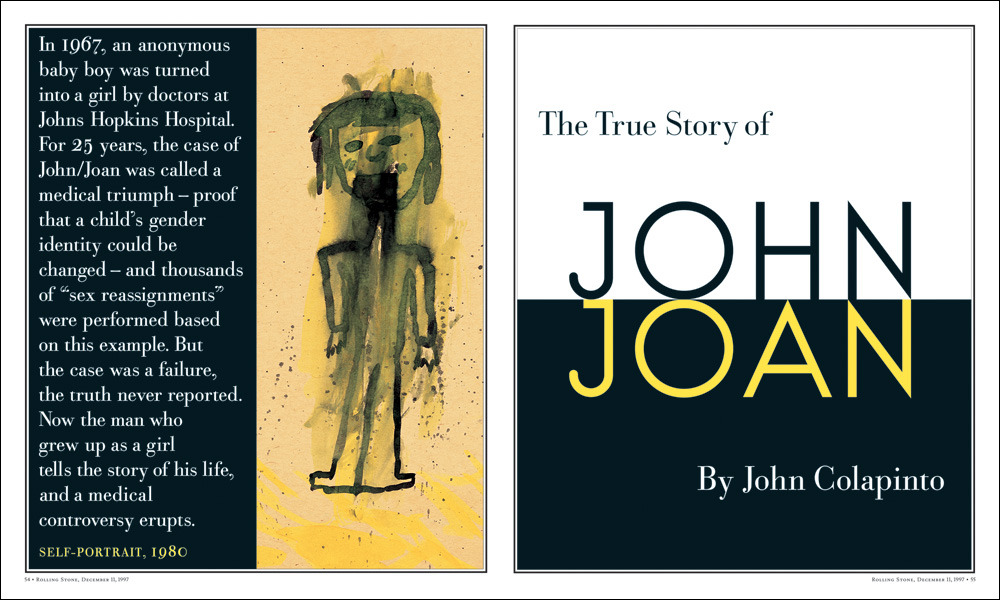
Rolling Stone, 1997

Rolling Stone, 1997

Rolling Stone, 1997

Rolling Stone, 1999

Rolling Stone, 2000
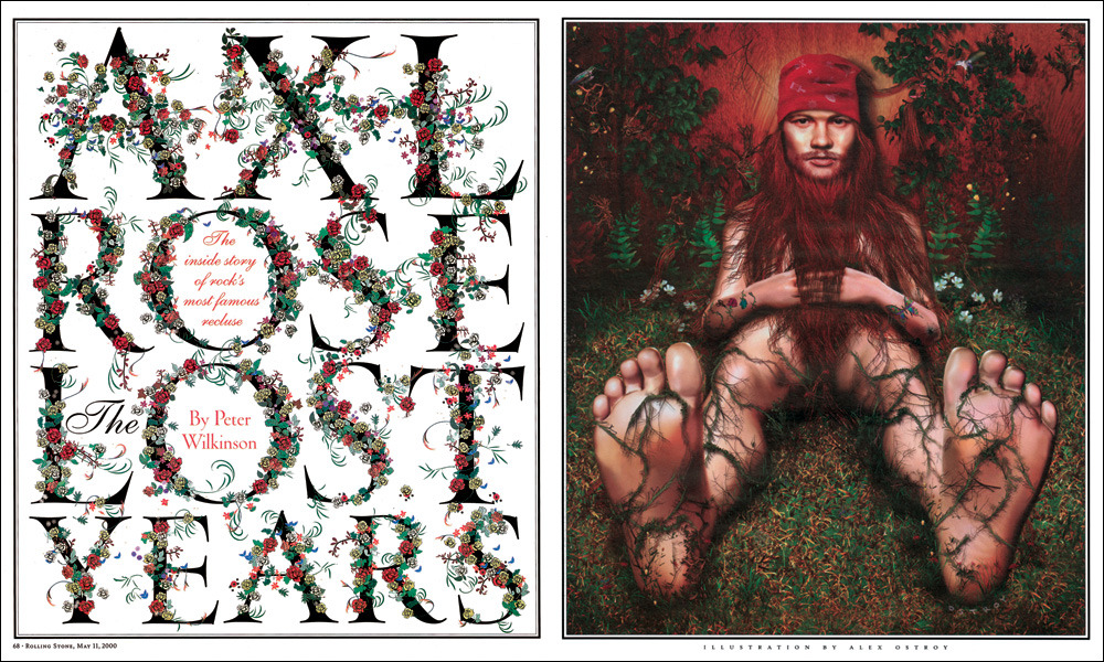
Rolling Stone, 2000
What has been your favorite kind of project: editorial, posters, book covers, etc? …and why?
There’s tremendous satisfaction in seeing your work on the newsstand, in subway stations, or in a bookstore. That never gets old. Right now, I’m really enjoying helping to create content at SVA, where I am the creative director at Visual Arts Press. It’s really fun to use the editorial side of my brain and to come up with stuff that appeals to prospective and current SVA students. And I’m able to keep my studio with my pal, Joe Newton, up and running, so I also have room to help come up with solutions for clients. Ultimately, I enjoy the puzzle of problem solving, whether it’s through design or writing, or both.
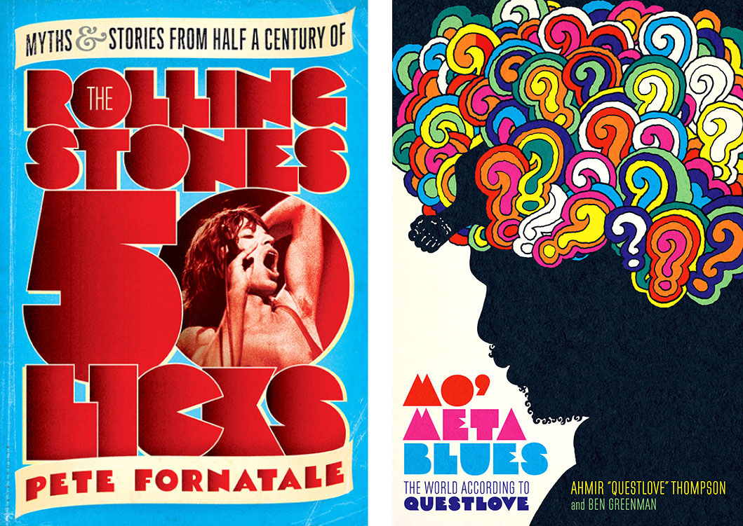
Rolling Stone book cover, 1997 (left), Mo’ Meta Blues book jacket, Anderson Newton Design, 2013 (right)
Where do you get your creative inspiration from?
I find that my best inspiration comes from collaboration; through hashing out both good and bad ideas with other people. I’m not disciplined enough to work on my own, and I guess I just prefer the interaction and learning that comes from being part of something. Inspiration can come from my students, who are so plugged into popular culture from all over the world. And right now as I’m typing, it can also come from just getting out of the city and staring at some trees. Even if I’m typing on my laptop, at least I’m typing in front of a mountain.

Outside the Box (entire book), Anderson Newton Design, 2015
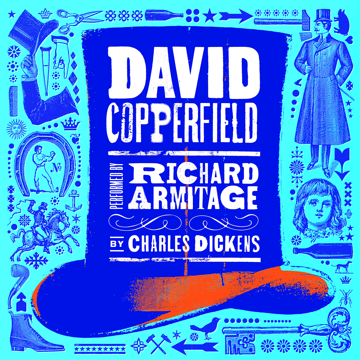
David Copperfield (audiobook cover), Anderson Newton Design, 2015
What was your most challenging or favorite job? Least favorite?
Sentimentally, my Rolling Stone years were so instrumental in my development as a designer and even as a grownup, and for that reason that was a pretty special time. But I think back to my Boston Globe Sunday Magazine days and am blown away by how life-changing those two short years were.
Working has gotten harder as I’ve moved farther away from being hands-on, but I really enjoy mentoring designers and watching them grow and succeed. And I love making suggestions and pushing people outside their comfort zones, even though I’m sure they chafe just a little when they hear me say, “What if we tried.” I can’t say I have a least favorite job (okay, I could, but I won’t). The job that was the hardest to leave was the Globe job in 1987 because I was leaving my mentor, Lynn Staley, my friends, my huge apartment, and the best roommate ever, Lucy Anderson (no relation, surprisingly). I had no idea that the Rolling Stone job would be seminal in my career. I just liked Fred when I met him and knew I wanted to work for him.

Thank You, We are Terrible, Anderson Newton Design, New York Times illustration, 2014
Any good stories from the trenches?
Rolling Stone: My dear friend, Lee Bearson, just emailed me to remind me of the night Geraldine Hessler, Lee, and myself drank our way through many containers of saki with the photographer Peter Beard. Peter was long gone when the rest of us woke up in the ladies room on Saturday morning and had to return to work that afternoon for a crazy weekend special issue closing. Or another night that Fred took us out to drink tequila shots. I think we woke up on his floor, and I ended up with his wallet. Not all of the RS stories involved drinking, but some of the good ones certainly do, especially when we were all in our 20s and 30s.
The Boston Globe: My friends and classmates, Richard Baker and Rena Sokolow, were at the Globe at the same time I was. Three New Yorkers, all in our early twenties. Our stories weren’t about partying. We were so serious about Design (with a capital D). We’d stay late and critique each other’s designs, fussing over small details and wondering why everyone else didn’t work all night, too. I had a cheap boom box that we’d pop a Prince tape into and dance across the countertops. Those were good times.
SpotCo: One afternoon, my little team of designers and I took a walk up to Times Square and I bought a bunch of Dave and Busters cards. We played arcade and video games like excited kids, and I remember thinking, this is really nice moment together. It’s important to get out of the trenches once in awhile and have some fun as a group, even if it’s just sharing burgers and some simulated racing games.
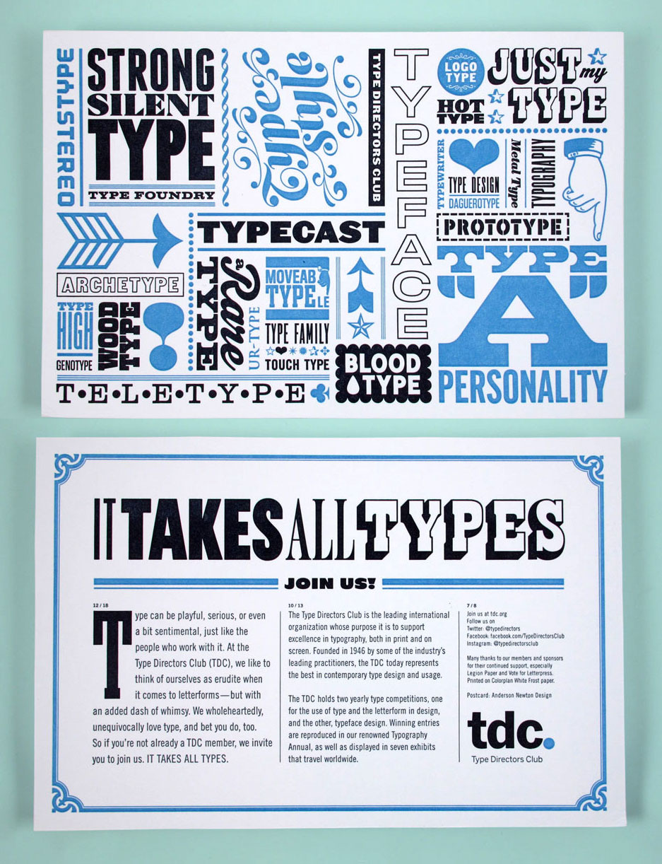
TDC promo, Anderson Newton Design, 2015
Do you have any advice for budding designers and type enthusiasts?
Take pictures of type on the street and on your travels. Buy books. Save everything. Designers are collectors—okay, hoarders. Take a class. Teach a class. Go on a safari. That’s on my bucket list.
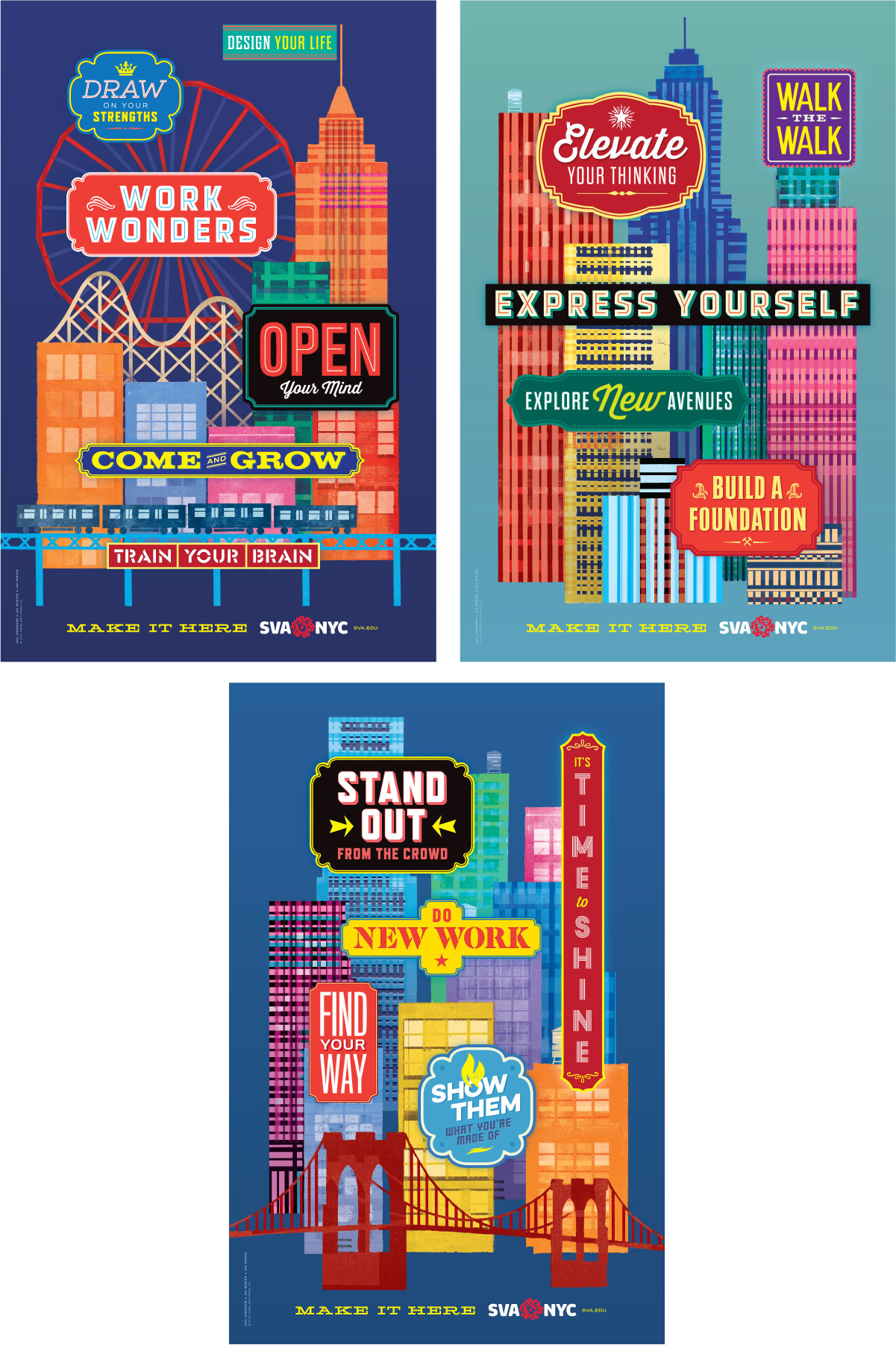
SVA subway posters, Anderson Newton Design, 2015

SVA Viewbook, 2016

SVA Viewbook interiors
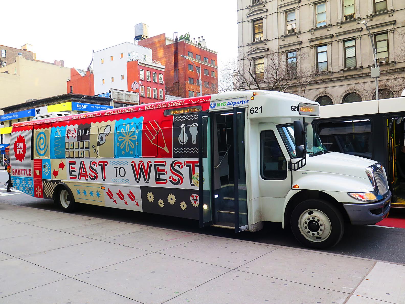
SVA Shuttle
This article was last modified on October 13, 2022
This article was first published on August 2, 2017
Commenting is easier and faster when you're logged in!

Recommended for you

InDesigner: Insight Guides
Pam Pfiffner examines how one publisher is tackling the problem of creating prin...

InReview: iziExport
Plug-in gives you a head start in moving content from InDesign to WordPress.

5 Ways Photography Skills Can Improve Your Graphic Design
For some, making the connection between photography and graphic design is pretty...