
In Part 1 of this three-part series on style sheets, we encouraged you to dispense with your one-pixel GIFs, font tags, and table-juggling techniques used to get your Web pages to look the way you envision them. Cascading Style Sheets (CSS) were created to augment HTML’s archaic and limited design capabilities, and with the release of the “4.0” browsers from Microsoft and Netscape (in 1999), support for CSS is growing, though by no means complete. In today’s article, we dig a little deeper into some of the style properties that are supported well by both major 4.0 browsers, and how to get at them in Adobe GoLive.
If you’re familiar with formatting palettes in QuarkXPress, Adobe InDesign, or Macromedia FreeHand, then you’ll feel comfortable with how CSS properties are presented in GoLive. There are, of course some differences, but here’s a guide to how to best utilize GoLive’s style properties.
Before we dive headlong into all of this, please remember that while most modern browsers support style sheets in some capacity, some do a better job than others. For a comprehensive listing of browser CSS support, check out WebReview’s incredibly helpful master compatibility chart.
Font Control From the Future
Veteran Web-heads have become accustomed to applying a series of font-element properties to our HTML text in order to gain some control over how type is displayed. The font face and size properties are used heavily to coerce type into something “respectable.” Veterans also know that often no manner of HTML tagging can apply the amount of control necessary to match their vision. The most annoying problem is that text appears different in size and formatting across operating systems and browsers. Using HTML to manage text is a bit like steering an oil tanker: You can specify a general direction and an approximate speed, but the rest is up to the ocean. Cascading style sheets offer the ability to tightly control the display aspects of HTML type. Although not a total panacea, using CSS will put you miles ahead of what standard HTML can do.
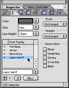
The first two tabs found in GoLive’s CSS Inspector deal with type controls. The first, the Font tab, allows you to set color, size, line height, and font family as well as style, weight, and decoration. This set of basic style controls seems to be widely supported by the major browsers, while much of the right column of controls is still on the to-do lists of browser developers. When using the weight properties, stick to bold, bolder, or normal. The number controls are not widely supported yet, but decoration, mostly used with anchor elements (<A>) to remove underlines in hyperlinks, can be used reliably when creating a hover set (more on this below).
One basic but useful bit of control offered by CSS is the ability to control the fonts used to display your pages and to easily arrange the order in which you choose to display them. For example, instead of the generic listing of “Verdana, Arial, Helvetica, sans-serif” order, you could decide that you want the browser to look for Optima first, then fall back on Arial, Helvetica, and Verdana if it’s not available. Changing the order of preference is as simple as clicking a button.
You set up a CSS font family just as you would a font face tag. Click the New button in the Font Family section and select the series of fonts in which you wish the style to appear.

Assigning a font family is as easy as creating a font set. You can even change the ordering of the fonts by clicking the up and down arrows next to the New button.
Theory of Relativity
Something that may seem trivial but is essential to the success of your style sheets is the form of measurement you choose when defining your styles. Although there are many from which to choose (pixels, picas, points, inches, etc.), only a few succeed in rendering correctly on multiple operating systems and browsers. Measurements can be broken down into two forms: absolute and relative.
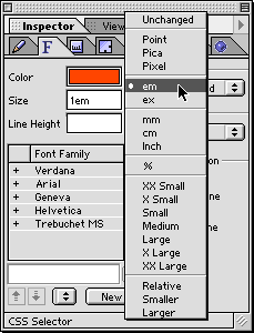
GoLive offers you a daunting amount of measurement options. Those absolute in nature are grouped in the beginning of the list, followed by measurements relative to user preferences.
An absolute form of measurement doesn’t rely on conditions or user preferences. It is implicitly fixed. Points, picas, pixels, millimeters, centimeters and inches are all considered absolute forms of measurement. Out of the bunch, pixels are the preferred unit to employ, as a pixel is a pixel no matter your OS, whereas many of the others choices either differ between operating systems or are just too awkward to use efficiently in most cases. Windows systems render HTML text larger than Macs by default (96 dpi vs. 72 dpi) because of their slightly higher standard screen resolution. While some newer Mac browsers have built in the ability to render type to mimic their Windows counterparts, simply using pixels assures your fonts will display consistently on any platform’s browser. The downside to this (yep, there’s always a downside) is that users lose the ability to adjust the size of the type within their browser. Since it is a fixed, absolute size, no matter how many times they click the “larger font” control, the type will remain at the size specified in your style sheet. Although you have gained complete control of the type size, this can result in some frustrated viewers who need to be able to adjust the size for their vision.
Relative forms of measurement allow for the specified object to size or position depending on the viewer’s browser and system settings, allowing you to specify a style you like but letting the viewer adjust the type size through the browser’s controls. Relative forms include em, ex, percentage, and smaller/larger. For type mavens, the “em” unit seems to be the up-and-coming favorite. “Em” is based on the width of the “m” character of the font face specified.
You may already use HTML to set table cells to a certain percentage width to stretch or shrink to fit the viewer’s browser window, but using style sheets to constrain percentages in concert with CSS control over the way fonts are displayed means your design will hold together better than straight HTML can offer.
This article was last modified on January 18, 2023
This article was first published on June 5, 2001
Commenting is easier and faster when you're logged in!

Recommended for you

Take Your Inner Child to the Letter Playground
Professional illustrator Nate Williams says that creativity comes from “cu...

Inspiration from the East: Taiwan
After my travels in Japan (Inspiration from the East: Japan) earlier this year,...

Masterfile Announces Radius Images – Its New Royalty-free Collection
Known throughout the world for its exceptional rights-managed images, Masterfile...