


If you’re looking for a little typographic inspiration, thoughts on the evolution of packaging design, or just some (pardon the pun) eye candy, head over to the Candy Wrapper Archive. There you can view the highlights of a collection of over 5000 candy bar wrappers, spanning from the 1900’s to the present.
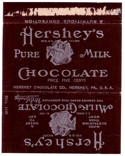
You can trace the simple look of a Hershey Bar from 1908 (“a nutritious confection”)
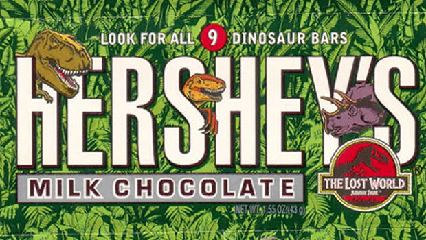
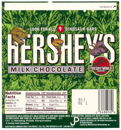
to the busy modern day promotional variations pairing the humble chocolate bar with anything from Jursassic Park to Spongebob Squarepants.
For some popular products, you can watch logos evolve over the decades.
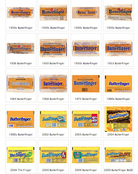
The Butterfinger logo seems to be on an endless quest to get more energetic, from its staid beginnings in the 1930’s.

It went on a diet in the ’60s.
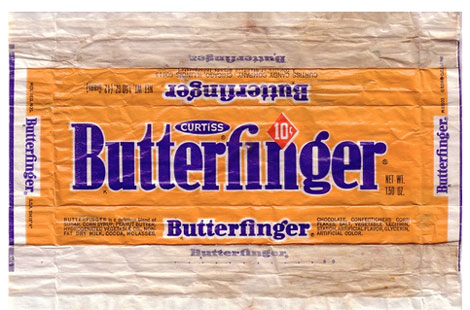
In the ’80s it started glowing and leaning forward.

In the ’00s it angled upward.

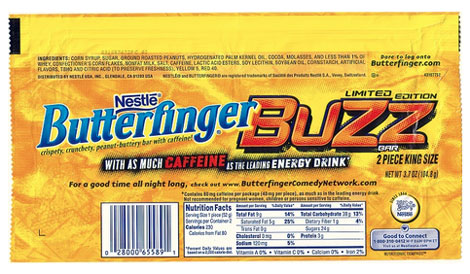
Until finally the product itself comes in a variation that’s “buzzing” with caffeine.
Lots more tasty typography at the Candy Wrapper Archive
This article was last modified on July 28, 2021
This article was first published on April 11, 2013
Commenting is easier and faster when you're logged in!

Recommended for you

TypeTalk: 10 Ways to Increase Readability and Create Inviting Text
Use these techniques to make text-heavy material more attractive and easily dige...

TypeTalk: Supersize My Font Families, Please!
Q. I notice an increasing number of font families containing an unusually large...

Creative Blöks: The Perfection Fairy
Each step you take on a creative path—whether you’re designing, drawing, or deve...