


What’s New in Typekit for You
And by “you,” I mean, “those of you with a Typekit subscription.” If you have a Creative Cloud subscription, you already have instant access to Typekit’s growing library of fonts, and subscriptions are available directly through Typekit as well.
Type foundries, both new and established, as well as new-to-Typekit foundry partners are being added all the times, so it can be hard to keep up. Below are just a few of the newish arrivals to the Typekit family. Let us know if any look like contenders for upcoming projects or just tell us your favorite new gem.
Heimat – Atlas Fonts
The Heimat collection is a massive collection of 108 fonts from one of the newest kids on the Typekit block: Atlas Fonts out of Berlin. Distinctive characteristics of this clean display typeface include a descender on the ‘y’ that goes its own way. Each family—Display, Sans, Mono, Didone, and Stencil—contains a variety of weights and styles, some ranging from light to extra bold and two with 72 fonts in the family!
Another new type partner joining the Typekit ranks is the Plau Foundry, based in Brazil. Their initial offering on Typekit features six typefaces, with Primot and Plau really standing out.
Plau – Plau Foundry
Plau’s namesake combines sharp edges (the z and the w come to mind), while other letterforms have an organic roundness to them (from the capital “r” to the lowercase “m” and “n”). There are twelve fonts in all, ranging from thin to black, each with a corresponding italic style.
Primot – Plau Foundry
Primot sports over 900 glyphs and conjures up images of holidays at the beach, fun food outings, and celebratory announcements. This stand-up—or vertical—brush script gathers its inspiration from Italian “gelaterias.” Primot features flowing connectors, swashes, and both initial and final letterforms to give it a more organic feel.

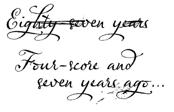
Olicana – G-Type
Olicana is a historical, hand-written font with multiple alternates, swashes, ink splotches, and even cross-outs. It takes full advantage of OpenType’s “as-you-type” ligatures to compete that organic, hand-crafted feel. Olicana contains three fonts—Smooth, Fine, and Rough—each with modern or ornate swash options. When combined, the elements of Olicana truly give the look of a piece painstakingly composed with quill pen in hand.
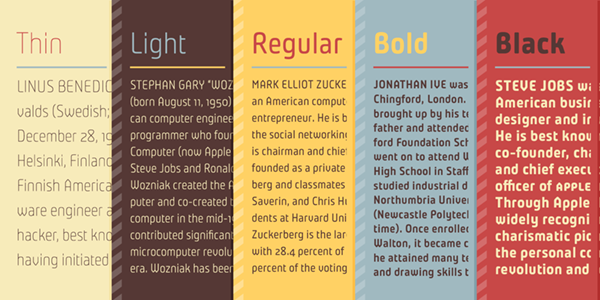
Ten Oldstyle – Adobe Originals
Ten Oldstyle was created as an addition to Ten Mincho from Adobe’s Japan-based type team. Robert Slimbach designed the Latin extension to accompany Ten Mincho. Slimbach explains that “Ten Mincho grew out of a rich calligraphic tradition of Japanese calligraphy, which is most often written with a pointed brush, I sought to imbue Ten Oldstyle with a comparable degree of calligraphic activity.” The typeface incorporates organic properties and calligraphic leanings, with slightly heavier-than-normal serifs. Ten Oldstyle comes in four weights: Regular, Semi, Medium, and Bold, each with an italic version. Ten Oldstyle was released as a standalone font once it was seen to be quite robust on its own.

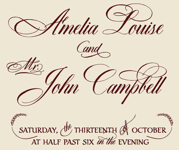
Dom Loves Mary – Debi Sementelli
Dom Loves Mary is script family with both a Pro and Text version. The Pro version contains glyphs with three different characters sets containing a handful of glyphs, ligatures, and over 100 special flourishes. The text font is designed to work with the scripts and offer balance to the other, but each works on its own as well. The coming together of these two fonts is almost as harmonious as the story behind the font’s origins. The font’s designer, Debi Sementelli, tells the story of the font’s namesakes.
In an effort to expand non-Latin offerings, Typekit offers up more non-Western centric fonts like Aisha from Rosetta and Nimbus Sans Devanagari from URW++.
Aisha – Rosetta
Aisha’s adaptation process went against the normal flow in the western typography world. That is, it was adapted TO a Latin orientation from the original Arabic. The result was a fluidity to the letterforms in both sets. There are four fonts in the Aisha family and they are available via the Typekit Marketplace for $60 each.

Nimbus Sans Devanagari – URW++
URW++’s Nimbus Sans Devanagari by designer Pria Ravichandran is a welcome addition to the Nimbus superfamily. It works best on signage and mobile usage, where visibility and legibility are key. The family contains four fonts, which are all offered as part of the Typekit subscription.
Geographica – Three Island Press
If you like old maps, then check out Geographica from Three Islands Press. Modeled on the handwriting found on British maps from the 1700s, the entire Geographica family is available for purchase in the Typekit Marketplace, with the Regular, Italic, and Hand Regular styles available as part of your Typekit subscription. The fonts contain discretionary ligatures, cartographic ornaments, and an uneven, organic feel. There are over 900 glyphs in the Hand Regular font alone.

Not just new to Typekit, but a new foundry altogether, XYZ Type brings three of their styles to the subscription plans. XYZ’s two type designers—Jesse Ragan and Ben Kiel—are not new to the type design game, however. Jesse co-founded Type@Cooper and Ben comes from House Industries.
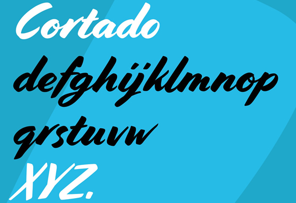
Cortado – XYZ Type
Cortado is a script with a hand-painted look and has been described by the designer as embodying “mid-century cool.” Cortado takes advantage of OpenType tech to allow for slight variations in repeated letters and automatic alternates.
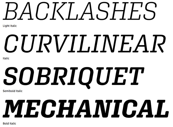
Aglet Slab – XYZ Type
Aglet Slab features rounded serifs that bend off the letters’ stems at either 90- or 45-degree angles. Whether using it for incorporation in a logo or for setting larger amounts of text, you’ll find the variety you need it its seven weights, which each feature an italic style.
This article was last modified on April 23, 2018
This article was first published on April 23, 2018
Commenting is easier and faster when you're logged in!

Recommended for you

Variable Fonts in InDesign
A concise Q&A guide to navigating InDesign 2020’s newest tool for type.

Learning Typography with Typekit Practice
The way that I feel about fonts and typography can be summed up by a quote from...