
I am a new gardener and this year I’m in the process of building raised square foot garden beds. Based on last year’s gardening results (no planning+months of hard work=no harvest), this year I want to do my best to have a well-planned garden with a plentiful harvest. Consequently, I have been researching and planning for months. Lately I’ve been deciding the exact location, type, and number of plants for my new garden boxes.
So one evening, with all my seeds, garden books, and planting guide spread out before me, I got out my graph paper and ruler and started drawing my new garden boxes. Less than 30 seconds in, I realized I drew the first garden bed both too small and in the wrong proportions. Clearly, graph paper was not going to give me the speed and control I needed and to which I have become accustomed.
So enter InDesign (of course)! I started by making a 4 × 8 table, with cells 1″ square. Slowly but surely (and after consulting my seed packets and books regarding the placement of every plant), I decided where everything was going to go (which took an hour or two).

The plain white table would have in itself would have been a great tool for my garden. But I honestly didn’t want to have to read each and every square every time. So I started color-coding.
 While the color-coding was definitely more helpful than plain white cells, I still wanted a greater degree of visual difference between the plants. In the above example, the strawberries and the tomato pants are represented by the same color of red; and the Marigolds and Carrots by the same color of orange. I tried making differences in between the shades and tints of each color, but since so many of the plants had red fruit and green leaves, I also wanted some sort of shapes to distinguish each type of plant.
The first one I tried was Snap Peas. I made a new cell style, called “Snap Peas,” changed the fill tint and added some dotted diagonal green lines. That was much improved!


 That worked so well, I decided to keep going with the rest of the plants. The key here is the thick diagonal lines and use of stroke styles for the diagonals.
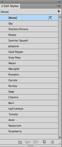
With many of the plants, the crossed diagonal lines worked great. For other plants (shallot, melon, summer squash, and potato), I just used a single diagonal line. Sometimes I added a gap color to the diagonal line, sometimes I did not. I varied the stroke styles, tint, and diagonal line thickness for every cell style. My goal was to visually represent each plant and its fruit. Here is the completed design. I’m pretty sure that once I get to planting, the location of some things will change. But updating my planting chart will be as simple as typing in the new plant name, and applying the correct cell style.

In the world of financial tables and other numeric tabular data, it’s probably rare that diagonal lines see much use. But when used as symbolic/graphical elements, diagonal lines (particularly when combined with stroke styles) can be very powerful.
Here is my blank Square Foot Garden Plan. Perhaps it will be useful to you, even if you don’t garden, but are just curious to see how each style cell was made.
This article was last modified on July 25, 2019
This article was first published on March 19, 2015
Commenting is easier and faster when you're logged in!

Recommended for you

Table Text Keyboard Shortcuts Stopped Working (and how to fix it)
The keyboard shortcuts for navigating through text stopped working… but only ins...

Making a Paperback Version of a Hardcover Book
A pair of publishing pros share their process for changing the format of a print...

5 Tips for Better Tables
Use these 5 quick tips to improve the appearance and usability of your InDesign...