

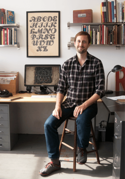
Jesse Ragan in his studio.
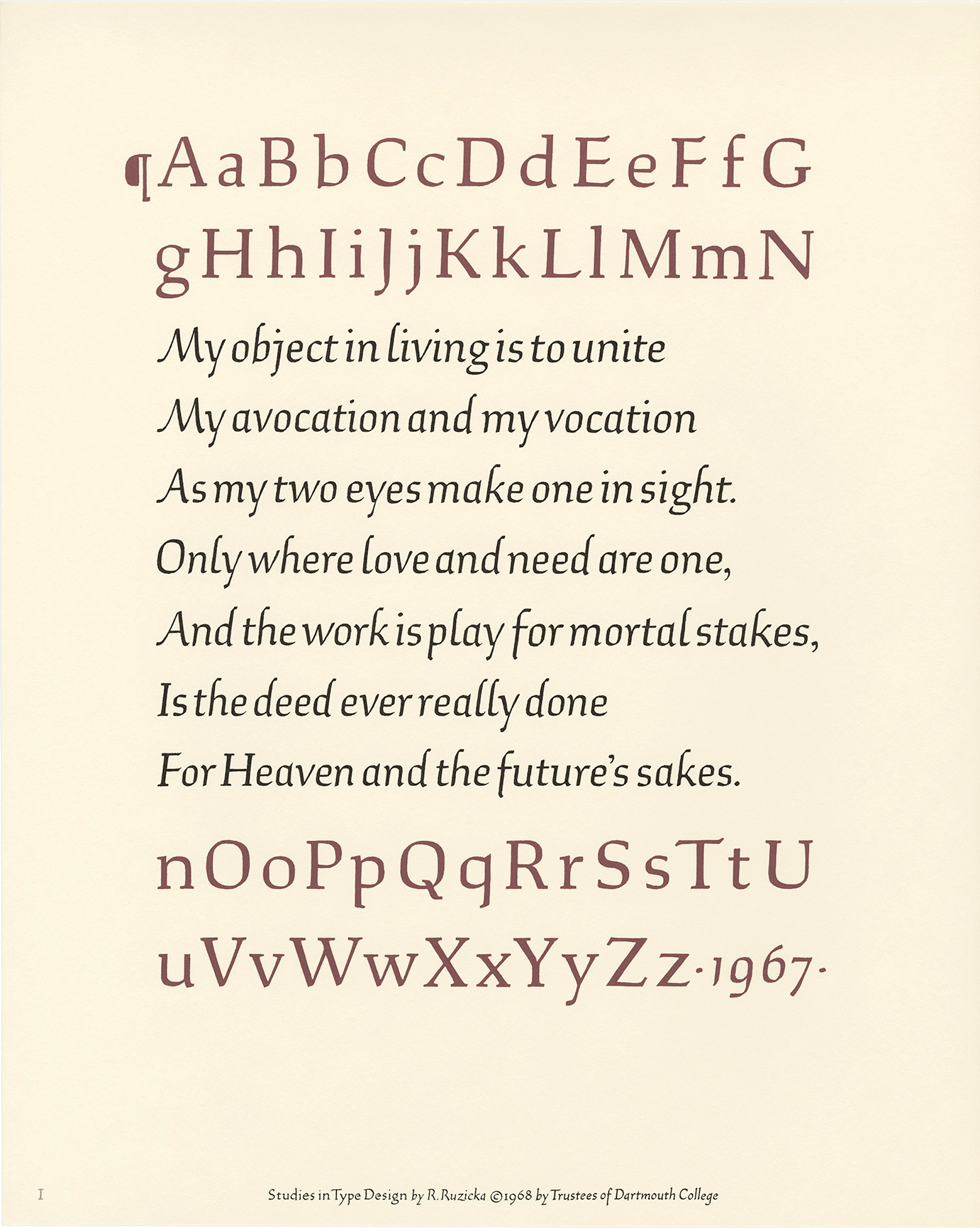
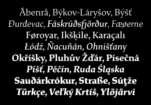
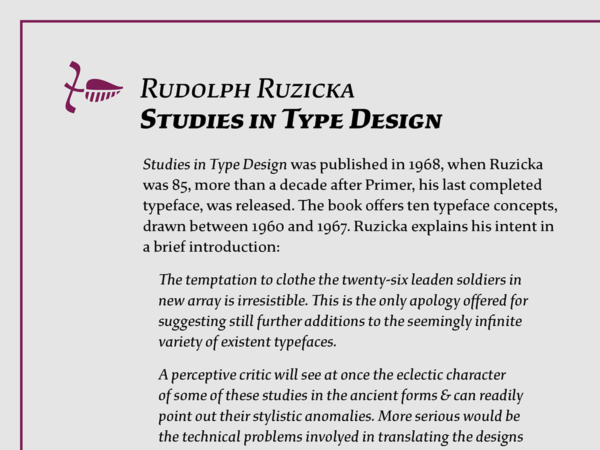
We often hear the proverb “there is nothing new under the sun.” While one might argue the point in today’s hi-tech world, sometimes blending the old with the new creates a third, improved entity, and the Study font family is one such creation. Independent type foundry XYZ Type has recently released Study, a new serif type family designed by Jesse Ragan. It is based on a hand-drawn alphabet published in 1968 by Czech-American designer and wood engraver Rudolph Ruzicka, found in his book Studies in Type Design (1968), but never previously completed as a functioning font.
Ruzicka’s signature lettering style – lively, rustic, and warm – demonstrates his affinity for Czech lettering and his expertise in wood engraving. Over several years, Ragan has extensively researched the Czech-American designer and illustrator’s body of work, including archives of unpublished drawings and correspondence. Ragan explains, “I approached Study as the culmination of a project Ruzicka started, adapting it as he would have to modern typography and technology. Since I was working from only a limited hand-painted alphabet, taking a deep dive into his life and work helped me find his authentic voice.”
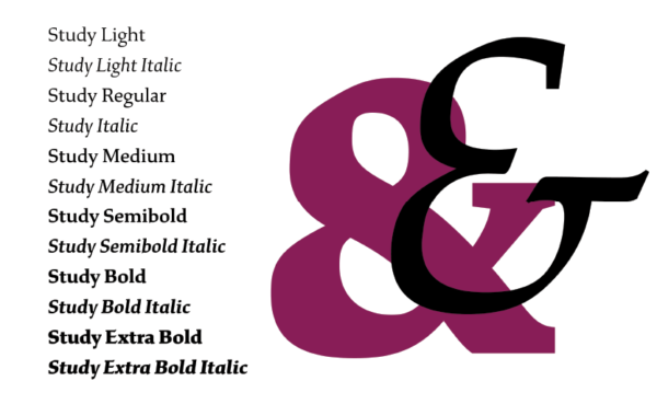
Ragan has beautifully developed Ruzicka’s original concept into a robust type family of twelve styles, each containing small caps, ligatures, fractions, and four kinds of numerals. In its final digital form, Study is an elegant blend of typographic structure with calligraphic details, both contributing to its charm.
We asked the designer about his inspiration, process, and future projects, and these are his replies:
How did you come up with your new typeface Study?
Study is actually something I started a long time ago, and which has been on the back burner for many years. It’s based on an alphabet from the book Studies in Type Design, hand-lettered by Rudolph Ruzicka. I had ?rst seen the book back in college and was really taken with it. He presented these stunning partly-?nished typeface concepts, and somehow they had never been turned into full fonts. I set out to make a digital version of this one back in 2009, as a self-directed project.
Over the years since then, I have picked it up every so often to continue work, but I was never fully satis?ed with what I had made. Then a very fortuitous project came along when the agency Original Champions of Design asked me to help them with type for Dartmouth College’s new identity. The university ended up underwriting development of Study (and their special version of it called “Dartmouth Ruzicka”), which focused my efforts and forced me to ?nish the design. They started using their proprietary version at the start of 2018, and now I’ve released Study publicly through XYZ Type, the foundry I run with Ben Kiel.
Do you focus primarily on historically based designs?
Not always. I work on a broad range of typefaces, and that’s part of what I love about the ?eld – being a bit of a chameleon and making drastically different typefaces. One family I released last year, Aglet Slab, is not based on any kind of historical source. Instead, it came out of addressing client requests that kept coming up, for a typeface that felt technological but still soft and approachable. I pitched early sketches of Aglet for several different logo lettering jobs, and although clients liked it, it was never the perfect ?t. So I decided to just run with the idea on my own as a retail release.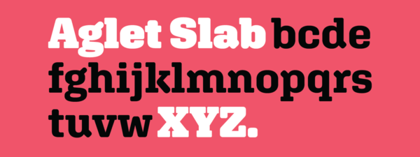
But I always come back to the fact that all typefaces are historically based. You can’t get away from the legacy of typefaces that have come before. If you draw a lowercase ‘a’ that looks completely unlike any other lowercase ‘a’, it will be completely illegible. So when in doubt, I always lean on historical precedents to justify my choices in a design. But of course, it’s important to me to ?nd some kind of novelty in every typeface I make – even if just by reassembling 200-year-old parts in a new way. If a typeface does nothing new, then what’s the point of doing all that work?
What made you want to work from a historical source in this case rather than starting from scratch?
The main reason was that I just really wanted to see this old concept ?eshed out and ?nished. It seemed crazy that this beautiful alphabet by Ruzicka was just sitting around collecting dust rather than being a living, breathing font that people could use as a tool in graphic design. So it felt a little bit like a rescue mission. But also, it was just a great learning experience working on something that was started by a designer I admire deeply. In trying to reverse-engineer his design decision-making, I’ve learned things that carry over to my other projects as well. I like to think of the project as a sort of posthumous mentorship.

What kinds of things did you learn?
I picked up little tricks from his examples, like how you can shorten the outer serifs on a character like ‘Y’ far more than you would expect without anyone noticing, which gives it much better spacing. But one of the biggest things I learned from reinterpreting his ideas was how to create the appearance of irregularity in a systematic way – how to build a strong foundation for a typeface and then create variety and interest throughout the character set without upsetting the rhythm. It was important to me to capture the warmth and humanity of his work in digital form, and that requires a lot of sleight of hand in the vectors.

Why did you decide to distribute independently rather than with a bigger foundry?
Ben and I started XYZ Type together in 2017, so we’re focusing on developing a small retail font collection together. I had been working freelance for about ten years prior to starting XYZ. In that time I did some contract projects for House Industries, which Ben art directed while he was full-time there. After he went out on his own, I asked him to help out on some of my own client work.
We were both in a place where we wanted to ?nish up some of our typeface ideas and sell them directly. Since we had a natural rapport it made sense to join forces and tackle the problem together, so we formed XYZ Type. Pooling our designs as one foundry means we’ll have a more robust library, and pooling our talents means our work will be stronger. It’s also great to have more structure and incentive around getting these self-motivated projects done.
What will be your next release?
Like most type designers I know, I have a bunch of other half-?nished typefaces that I want to get out. It’s tough to prioritize, since client work keeps coming in – which is great – but it interrupts my self-directed efforts. I do have a couple of other typefaces underway based on Rudolph Ruzicka’s work. There’s such a wealth of untapped source material there, and I’d love to get it out into the world. But my next release will probably be Aglet Sans, the companion to Aglet Slab. I’m hopeful for 2019 to be a good year for growing the XYZ Type library. (Ben has several new typefaces on the way as well!) Finishing typefaces always seem to take quite a bit longer than I expect, but maybe another client commission will come along to give me the kick in the pants I need to get these things done!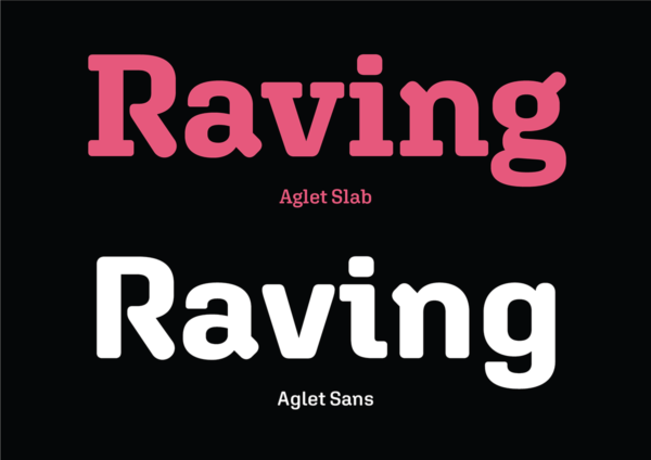
This article was last modified on January 15, 2019
This article was first published on January 15, 2019
Commenting is easier and faster when you're logged in!

Recommended for you

How To Select the Right Type for Any Job
One of the most important, and some would say the most challenging aspect of gra...

Font Fetish: Neutraface No. 2
Back in 2002, House Industries and Christian Schwartz released the Neutraface fa...

Annie Atkins: Graphics and Typography for Film
Annie Atkins has what many designers would consider a dream job – she creates gr...