
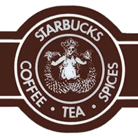
Did you know that Starbucks Coffee is just two months’ shy of turning 40? People change quite a bit in four decades, and so has the coffee giant’s logo. (See https://en.wikipedia.org/wiki/Starbucks#Logo for a quick history.) This was the original mark:

And this is its evolution, ending with the logo that will be in the company’s many stores in March of this year:

As the Gap fiasco showed, tweaking a logo is risky business. A critical public is apt to tear apart the efforts of even the most successful identity designers. Starbucks acknowledged this by posting a video on its site in which CEO Howard Schultz explains the logo’s evolution:
Schultz says that by dropping the words “Starbucks Coffee” from the logo, the company gains the “freedom and flexibility to think beyond coffee.” I can’t even imagine what it will try to dominate next.
What do you think of the new logo? Click the word “Comments” to join the conversation.
This article was last modified on December 14, 2022
This article was first published on January 6, 2011
Commenting is easier and faster when you're logged in!

Recommended for you

TypeTalk: The Typographic Expressions of Stefan Sagmeister
Stefan Sagmeister is an award-winning designer known for his bold, innovative wo...

Editor’s Picks for The Design + Marketing Summit 2024
Our Editor in Chief lists his must-see sessions for the Design + Marketing Summi...

How to Design an Amazing Portfolio
For a grpahic designer, the importance of a portfolio cannot be overstated. In f...