
Logo designs are one of those little things that can have a big impact. Do it right, and your design will go a long way; make one wrong move, it will not resonate with the intended audience.
Think of famous brands, like Nike, Apple, or McDonald’s. The first thing to flash across your mind is their logo –be it the swoosh (Nike), the bitten apple (Apple) or the golden arches (McD). Although Nike and Adidas both are the sportswear brands with a similar line of products, you can distinguish between Nike and Adidas shoes in a glimpse by identifying their logo mark.
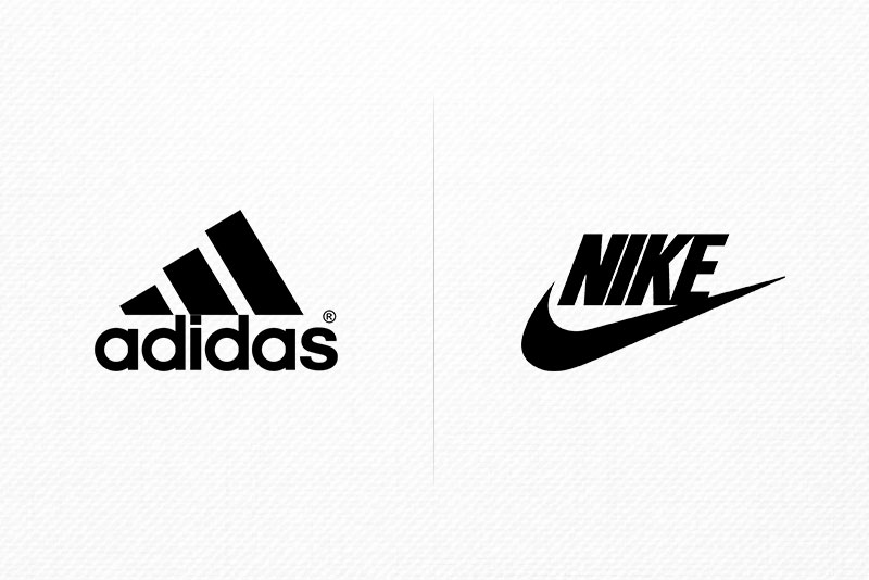
Adidas vs. Nike logo
A logo design is much more than the usual artwork. It is a meticulous balance of shapes, color, and words, each playing a certain role in the design. Color, for instance, boosts brand recognition. How does it do that? Just close your eyes and imagine the golden arches of McDonald’s in black, pink, or blue colors. Did you feel the difference?
Color variations of McDonald’s logo
Since the human mind perceives colors faster than shapes and words, the colors (when chosen right) get forever associated with a brand. Therefore, the brand loyalists may freak out on even the most subtle changes in the color scheme.
A Brazilian graphic designer, Paula Rupolo, swapped colors on famous brand logos. Here are the results…
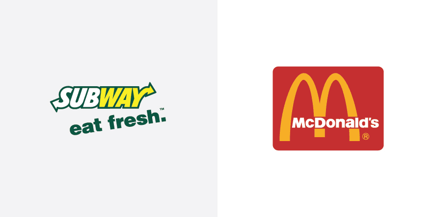
Subway vs. McDonald’s

Coca-Cola vs. Pepsi
Logos, Colors, and Everything In Between
Have you ever wondered why so many food chains such as Burger King, McDonald’s, Hardees, In-N-Out, Wendy’s, and so on, use the same clichéd combo of Red and Yellow?
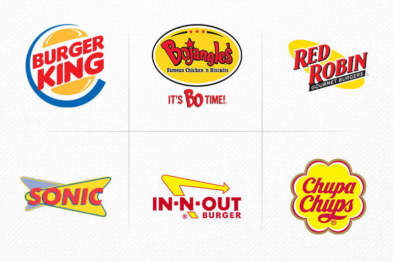
Red and yellow food logos
This is by no means accidental!
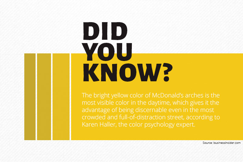
They want people to feel hungry. The color psychology explains the science behind color selection in popular fast food chain logo design; red evokes appetite, whereas yellow triggers happiness. Red and Yellow together work the magic and encourage people to walk in and feast on their favorite burgers, gourmet fries, or sandwiches.

What is chromophobia?
How Color Influences Human Mind?
The report Exciting Red and Competent Blue states that colors greatly affect the purchasing intent. The researchers exhibited two packages of the same design but with different colors to a group of undergraduate students. One packaging was in purple (representing sophistication), and the other was in red (representing ruggedness).
Observations showed that the participants who seemed sophisticated picked purple packaging, while those showing rugged personality traits picked the red colored product. Hence, the research concluded that buyers choose the brands that complement their personal identities.
Colors have more to do than creating visual effects. At the University of Leeds, there is a lab aimed at determining the effect of colored light on human behavior and psychology. Several researches have proved that the red light can increase the heart rate and blue light decreases it.
The significance of bright yellow in food industry
The Significance Of Color In Logo Design
Colors are an important constituent of a brand personality that induces familiarity and likability. They offer an intrinsic meaning which the brand subsumes.
You should carefully consider the purpose of color before choosing it for your brand. The color psychology plays a huge part in a brand’s success and explains which emotions each color triggers and how that influences brand perception.
Considering the significance of color in the logo, you cannot afford to overlook the impact each color makes—if you really want to get the most out of your next logo design.
RED

Logo designs in red
Since the red color reminds people of blood and fire, it signifies strong emotions like love, passion, excitement, and hunger (as stated above). On the other hand, red can also represent danger and rage.
YELLOW
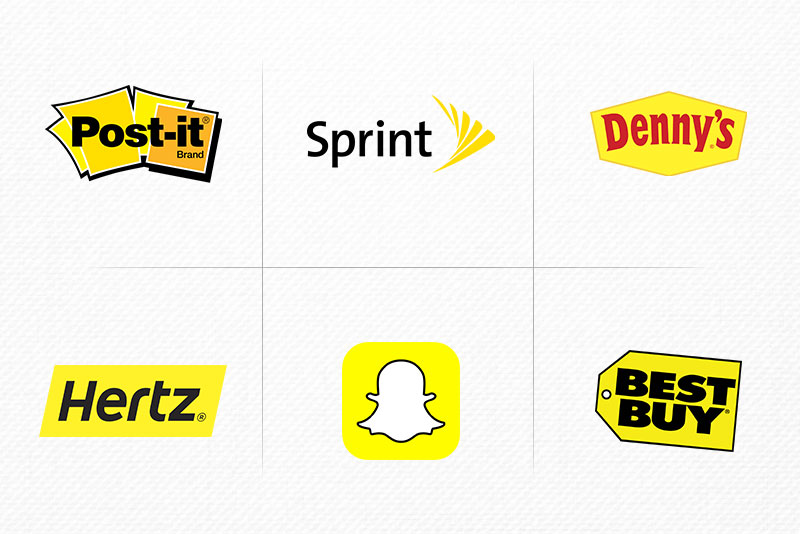
Logo designs in yellow
Being a cheerful color, yellow has the potential to grab attention and emanate vibes of optimism and friendliness. If your brand revolves around fun, affordability, and speed, you can choose yellow as your logo color.
ORANGE

Logo designs in orange
The combination of two primary logos (yellow and red), orange is an energetic color signifies freshness, excitement, determination, and warmth. It boosts energy and lifts the mood. It can serve as a great call to action and spark impulse buying.
PINK

Logo designs in pink
Japanese people consider pink as a traditional color of spring as it is the color of blossoming sakura. Many brands and businesses use this color to target the female audience as it represents femininity, romance, inspiration, pleasure, and sweetness.
PURPLE

Logo designs in purple
People see purple a royal and religious color. The best part of using purple is that even a pinch of purple in your logo can make it look regal and elegant. Purple is a popular choice of creative and marketing agencies.
GREEN

Logo designs in green
Green, one of the most pleasant colors, and it serves as the international color of peace and nature. Many companies use green to represent their eco-friendly nature. Banks and financial institutions also use green in their logo, as it represents money and trust.
BLUE
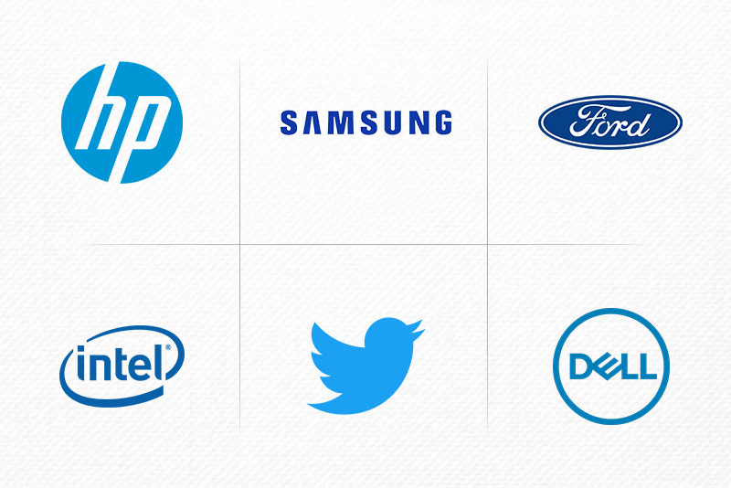
Logo designs in blue
This color reminds us of the sky and sea and elicits trust, comfort, clarity, and understanding. Usually, banks and B2B businesses have blue logos along with many social media platforms, like Facebook, Twitter, Skype, Pandora, LinkedIn, and so on.
BLACK
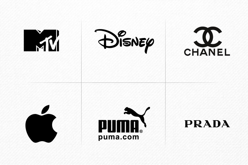
Logo designs in black
Not typically considered a color, black represents protection, luxury, prestige, power, and efficiency. In many cultures, especially those in Asian, black is the color of mourning and grief. Many high-end brands have black logos, such as Nike, Adidas, Michael Kors, Prada, Chanel, WWF, and Schwarzkopf.
BROWN

Logo designs in brown
This earthy color communicates serenity, warmth, and organic vibes. People also associate brown with coffee and chocolate. However, it communicates different messages for different brands. In the UPS logo, brown signifies timeliness and reliability. But in a brand like Hershey, the color elicits nostalgia.
WHITE

Logo designs in white
Just like black, white is also an outcast among colors. Still, white carries strong associations, including cleanliness, purity, and simplicity. Many designers creatively use white in their logos to make their design stand apart from the rest.

Colors influence our decisions and opinions
To Wrap up
The total impact of a logo may not depend solely on its colors, but they are the first thing that connects with your customers. Shapes, designs, and typefaces always register in our minds after the colors. So you have to be mindful when choosing logo colors. Consider color psychology, know how your targeted audience will respond to a certain color, and choose wisely. And remember, getting feedback from others before finalizing your design never hurts!
This article was last modified on April 21, 2019
This article was first published on April 21, 2019
Commenting is easier and faster when you're logged in!

Recommended for you

12 Typographic New Year’s Resolutions
The coming of a new year is a great time to take stock of our professional lives...

Ten Tips for New Web Designers
For those of you who may be less familiar with the details of web design it can...
