
Special Characters
Nigel French weighs in on how to locate those hidden gems on the Glyphs panel—and when to use them.

This article appears in Issue 94 of InDesign Magazine.
“Give me 26 soldiers of lead and I will conquer the world.” It’s an oft-repeated quote about the power of the printed word. Some attribute it to Benjamin Franklin, others to Karl Marx. Regardless of who said it, it makes a good point. To update it would diminish its power: Give me (up to) 65,536 Unicode characters … doesn’t have the same gravitas. But today that’s how many potential “digital soldiers” we have under our command. With such power at our fingertips, the challenge is how to harness it.
Back in the day (the 1990s and earlier) the recognized standard for font encoding was ASCII, which has a character set of up to 256 characters. Sounds like a lot, but by the time you add in uppercase, numerals, punctuation, and accented characters, you’ve quickly exceeded that number. To the rescue came OpenType fonts, which we’ve been using for most of this century. Based on Unicode, they have no such limitations. As well as being cross-platform, Unicode is a 16- (as opposed to 8-) bit standard that assigns numbers to the characters in a font. While no font comes close to having the maximum number of glyphs (216), those with expanded character sets include a full range of Latin characters, accented characters to support central and Eastern European languages such as Turkish and Polish, and Cyrillic and Greek characters. Obviously this makes multilingual typography much easier, but it also offers a sumptuous buffet of typographic delicacies like extra ligatures, real small caps, real fractions, oldstyle numerals, and contextual alternates, which can make your documents look more sophisticated.
your 2017 InDesign Conference registration! See the member benefits page for details.
Grokking and Grabbing Glyphs
Before OpenType we spoke of characters, and now we speak of glyphs. What’s the difference? The two terms are almost synonymous: every character in a typeface is represented by a glyph assigned to a Unicode number. While most characters are represented by a single glyph, certain characters may be represented by more than one—a default form and alternate form(s). This means that the same Unicode number may have a set of variations, with each variation assigned its own Glyph ID (GID) value. In the Glyphs panel, a triangle in the bottom right corner of the character square indicates alternate glyphs—click and hold to see the other glyphs assigned to that Unicode number. To find the specific GID number for the glyph, hover your cursor over the glyph to view the tooltip (Figure 1).

Figure 1: Revealing the GID and Unicode number for an alternate glyph.
InDesign offers several ways to input glyphs that are not on your keyboard. The Type > Insert Special Character menu offers a digested list of commonly used special characters like the copyright symbol and trademark symbol, as well as different dashes and quote marks. The OpenType options available in the Control panel and in Paragraph Style Options allow access to OpenType features. The Type Contextual Controls in InDesign CC 2017 allow convenient access to the alternate glyphs via a contextual drop-down menu (Figure 2).

Figure 2: Accessing the Type Contextual Controls.
But to see the full range of glyphs, you need the Glyphs panel (Figure 3), which also exists in a slightly dumbed down form in Illustrator and Photoshop.

Figure 3: The Glyphs panel
It’s easy to use: find the glyph you’re after, make sure your cursor is inserted in a text frame, and then double-click to insert the glyph into the text. But as invaluable as the Glyphs panel is, you may be left thinking that there must, in 2017, be a better way than visually sifting through rows and rows of glyphs to find the proverbial needle in a haystack.
There isn’t.
But there are things you can do to make it easier, like viewing a subset of the font (such as math symbols, ornaments, or currency symbols) or changing the view size of the glyphs. If you know what the glyph is called, you can search for it by name in the Search field. Or (less likely) you can search by Unicode number or Character or Glyph ID. One of the biggest timesavers is making a glyph set. That way you’ll have those glyphs you use often close at hand, rather than having to hunt for them repeatedly.
From the Glyphs panel menu, choose New Glyph Set, add a name, and click OK. Ctrl-click (right-click), and choose Add to Glyph Set from the contextual menu that appears.
Having made a glyph set, choose Edit Glyph Set from the Glyphs panel menu. As appropriate, deselect Remember Font With Glyph when you want to hold onto only the glyph itself and not the specific font (Figure 4). If a typeface doesn’t have that particular glyph, the glyph will revert to its original typeface.

Figure 4: Editing a Glyph Set. When you deselect Remember Font with Glyph, a U appears in the lower-left corner of the character box.
Note that you can make your own custom glyphs with IndyFont, a free InDesign script from Indiscripts. You can define any vector art as an OpenType font, which will thereafter show up in your type menu. See Scott Citron’s review in issue 55 for more details on Indyfont.
A limitation of the Glyphs panel is that while it lets you access all the available glyphs in a given typeface, it doesn’t help you find a font that contains a specific glyph like prime marks or the minus sign, which are available only in some fonts.
If you use a Mac, you can use the built-in Character Viewer utility (BabelMap is a free Windows equivalent) to do this.
To turn on the Character Viewer, go to System Preferences, and choose Keyboard. Click on the Keyboard tab, and select Show Keyboard & Character Viewers in Menu Bar. This adds the Input menu to the menu bar in the Mac Finder next to the date and time. Select Show Emoji & Symbols (Character Viewer in earlier versions of Mac OS) to open the utility (Figure 5).

Figure 5: The Character Viewer.
Select a glyph category in the left column to see the glyphs within that category. When you click on one of these glyphs in the middle area, its name appears at the upper right, above a list of the way that glyph is displayed in your currently installed fonts. Select one to see its name and a larger display in the upper right.
Double-click to insert the glyph into your InDesign document at the point of your cursor. You can also add it to your favorites.
You can customize the categories that appear in the Character Viewer. Click on the Action menu (gear icon) in the upper left, and choose Customize List.
Your Guide to Glyphs
So that’s how to access glyphs, but what about when to use them? To figure this out, let’s start by taking a look at some of the subsections in the Glyphs panel’s Show menu.
Small Caps
As you’re probably aware, small caps are the reduced-size version of the capital form. Specifically, they are at the x-height of the type and so do not, like regular caps, overwhelm the upper- and lowercase type they sit alongside. Small caps are mainly associated with serif typefaces and are nearly always roman. You can use them for acronyms, initialisms, and historical designations such as BC and AD and abbreviations like AM and PM. If you’re using drop caps to start an article or section, small caps provide a transition from a drop cap to the regular body text. For fonts that do not have unique glyphs for small caps, if you click the Small Caps button you’ll get synthetic small caps—that is, capitals scaled to the percentage specified in the Advanced Type preferences. These can look amateurish because the weight of their strokes (and not just their height) has been reduced, so they appear too light when set alongside text at the same size (Figure 6). So if your project makes extensive use of small caps, the availability of real small caps should influence your choice of typeface.

Figure 6: Small Caps. Top: OpenType small caps;
Bottom: “Fake” small caps at 70% of the full capitals.
Ligatures
Ligatures are two or more intersecting characters fused into one. They’re used to avoid collisions, most commonly between the finial of the lowercase f and the dot of the i or between the finial of the f and the ascender of the l (Figure 7).

Figure 7: Ligatures and discretionary Ligatures.
A: Ligatures disabled
B: Ligatures
C: Sans serif without ligatures
D: Discretionary ligatures
Ligatures are a response to a design problem and as such may not be necessary with sans serif typefaces, where there’s no danger of a character collision. Do you need them? First try setting the type without ligatures. If the characters collide, then turn on ligatures. If they don’t, well—if it ain’t broke, don’t fix it, especially since using ligatures may make the affected letter combinations appear more tightly set than the rest of your type. Ligatures can be turned on from the Control panel menu or, when applied via a paragraph style, in the Basic Character Formats.
In addition to the standard ligatures, certain typefaces may contain discretionary ligatures. These may be perfect for special occasions. The next time you’re working on something fancy like a wedding invitation, discretionary ligatures might be just the flourish you need.
Diphthongs are ligatures that visually represent the pronunciation of a combined vowel. The most common examples are æ or Æ and œ or Œ, such as in Cæsar, encyclopædia, mediæval, and œuvre. Their usage is considered archaic in modern English, especially American English—but they might look impressive in a logo treatment.
Ligatures can look odd in display type, so you may be better off kerning to avoid character collisions, or replacing the i with a dotless i. To type a dotless i, press Shift+Option+B or Shift+Alt+B. Or just type dotless i in the Glyphs panel search field (Figure 8).
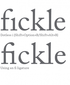
Figure 8: At display sizes, using a dotless i in place of an fi ligature makes it easier to equalize the spacing between the characters.
Fractions
You can access fractions through the OpenType menu in the Control panel or through the OpenType features in a paragraph or character style definition. While there are only a limited number of fractions listed in the Glyphs panel in the Numbers subset, if the typeface contains separate glyphs for numerators and denominators, you can make custom fractions of any value. Highlight the numbers you want to convert to fractions, and choose Fractions from the OpenType menu in the Control panel. Unfortunately, leaving this feature on will “fractionize” all numerals in your text, so it’s necessary to apply it on an as-needed basis.
If you’re not using an OpenType Pro font, fear not, you can still make your own fractions. The fraction script Proper Fraction by Dan Rodney converts the numerator to superscript and the denominator to subscript, and replaces the slash or virgule with a fraction bar or solidus (Option/Alt+Shift+1). For best results, in Advanced Type Preferences set the Super/Subscript size to 60%, the Superscript position to 33%, and the Subscript position to 0. No matter how you get your fraction, if it follows a whole number, no space is necessary before the fraction (Figure 9).

Figure 9: Fractions: The good, the passable, and the ugly.
In the Math Symbols group, along with the usual suspects, you’ll find such often overlooked characters as the multiplication sign (more symmetrical than a lowercase x) and the minus sign (slightly wider than a hyphen).
Ornaments
Sometimes referred to as fleurons, typographic ornaments were historically used to expand the typesetter’s palette. While some typefaces, like Chaparral Pro, contain playful ornaments, typically ornaments create an elegant feel—useful in a book cover, title page, or chapter opener, or in repetition to create a typographic wallpaper suitable for endpapers. Ornaments can also be useful as bullets or end marks. Some ornaments were designed to be used in multiples to make decorative frames; these days it’s a lot easier to achieve the same result using a custom brush in Adobe Illustrator.
Swashes
Some italic styles of OpenType fonts have fancy swash characters—you can check by opening the Glyphs panel and looking for Swash in the Show menu. Used sparingly—and never in all caps—they can add a flourish to your type. Where available, these are accessible through the Type Contextual Controls, the OpenType menu, and the Access All Alternates subset in the Glyphs panel. Typically, they’re used at the beginning of words or sentences and may be useful for a business card or invitation or, if you’re a pirate, to adorn your treasure map (Figure 10). Certain OpenType fonts also have lowercase swash characters called finials or terminal characters, intended for use at the end of a word or line.
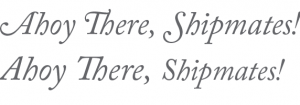
Figure 10: With (top) and without Swash characters applied to the first letter of each word.
Figures
The default figures in most typefaces are tabular lining figures, which have a fixed width so that they can be aligned in columns, and all have the same height (the cap height of the type). This makes them good for working with text in all caps, but they tend to stand out too much when combined with upper- and lowercase text. Proportional oldstyle figures are as tall as the x-height of your type and are, as their name suggests, proportionally spaced. They have a better type color in body text than full-height lining figures. Proportional oldstyle numbers 3, 4, 5, 7, and 9 have descenders, while 6 and 8 have ascenders (Figure 11).

Figure 11: Lining numbers (top) and oldstyle numbers.
Some designers love oldstyle figures; others regard them as an affectation. Even if you’re in the former camp, you should avoid using oldstyle figures alongside text in all caps, such as a headline. This creates a bumpy reading experience as the line of capital letters inexplicably switches to upper- and lowercase characters.
On the topic of numbers, I should mention the slashed zero. If you’re worried about your Os and your 0s looking too similar, putting a diagonal slash through the zeros should clear up any confusion. Choose Slashed Zero from the OpenType menu and that’s exactly what you’ll get—useful if your text includes a lot of code.
Contextual Alternates
Some OpenType faces (often scripts) have alternate characters designed to work better in certain letter combinations (Figure 12).

Figure 12: Mostra Nuova with (top) and without contextual alternates.
Choose Contextual Alternates from the OpenType menu, and as you type, the glyph to the left of your cursor may change according to the glyph that follows it, if there’s an alternate for that particular letter combination. You can also choose the alternates on a case-by-case basis using the Type Contextual controls or by choosing Alternates for Selection from the Show menu in the Glyphs panel.
Stylistic Sets
Stylistic sets tap into OpenType’s potential to provide whole sets of alternates that allow you to vary the character of the typeface. Rather than using the Glyphs panel with your preferred contextual alternate, you can automate the process by choosing the appropriate stylistic set. Stylistic sets have been around in InDesign for many years, but few typefaces take advantage of this feature, largely due to the fact that it has, until recently, been rather obscure and hard to access. InDesign CC 2017 improves things by giving a description of the stylistic set in the Show menu in the Glyphs panel (Figure 13).

Figure 13: Stylistic sets listed in the Glyphs panel’s Show menu (left) and in the OpenType menu indicating which sets have been applied to the selected text.
Like all OpenType features, stylistic sets can be incorporated into a paragraph or character style definition. Note that stylistic sets can be applied cumulatively. Currently, relatively few fonts take advantage of this capability. One that does is Thomas Phinney’s Hypatia Sans Pro (Figure 14). For more on using stylistic sets, check out Ilene Strizver’s article in this issue.

Figure 14: Stylistic sets. Thomas Phinney’s Hypatia Sans Pro has 14 stylistic sets, allowing you to choose between single or two-story as and gs, and whether or not you want the semi-serifs at the top of the vertical strokes.
Summary
This list of treasures available on the Glyphs panel is not exhaustive. Keep in mind that the features vary from typeface to typeface and there’s no typeface that will have them all, as some are mutually exclusive. As OpenType functionality becomes easier to understand and access in InDesign, type designers are increasingly building these features into their typefaces. As well as æsthetic considerations for choosing type, the number of available glyphs in a typeface will inform your choice of type.
Commenting is easier and faster when you're logged in!

Recommended for you

Get Your InDesign Content into Photoshop
David Blatner and Conrad Chavez share tips for using InDesign content in your Ph...
InStep: Highlighting Tables
Diane Burns shares a creative technique for drawing attention to important tabul...
Tip of the Week: Creating Automatic Run-in Headings with Numbered Paragraph Styles
This InDesign tip on creating run-in headings with numbered paragraph styles was...