
Spacing Type in InDesign
In the mission to create the best type possible, spacing is the key to success.

This article appears in Issue 9 of CreativePro Magazine.
As typographers and graphic designers, we’re here to serve the message and to serve the reader. We want to make the best type possible—not because it’s easy, but because it’s the right thing to do.
In this article, I’ll quickly get you into the better-type neighborhood with some fundamental methods of manipulating hyphenation and justification settings in InDesign (other programs will offer you similar controls). But before we get into the spacing, let’s start with some design decisions that you need to make to create the type that we’ll be working with. One parameter—line length (or measure)—can make the difference between type that people find inviting and type that discourages and repels your reader.
Optimal Line Length
A widely accepted figure for the optimal line length of running text is 65 characters. You may have read this before elsewhere, perhaps posed in different terms (like “2½ alphabets”).
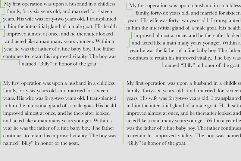
The text in Figure 1 serves as an example of what I would call a “mean-spirited” line length. Why? Your eyes physically have to move, making it tiring to read. As the end of one line gets increasingly far from the beginning of the next, you get increasingly likely to experience doubling, or reading the same line multiple times.
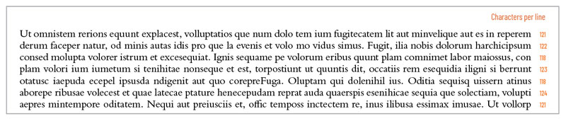
Figure 1. The text in this paragraph is approximately 120 characters per line, pushing toward twice the optimum line length of 65 characters and creating “mean-spirited” typography.
And lines with too many characters don’t look inviting. They’re difficult looking and off-putting. And that’s why you see long line lengths used in contracts and legal disclaimers—for type that someone doesn’t really want others to read.
We, on the other hand, want readers to read our text. More accurately, we want readers to want to read our text. That’s why it’s our responsibility to choose reasonable line lengths (measures) to let the text breathe easier.
The text in Figure 2 is closer to the optimum. The length of the lines is similar to the length of an average sentence (10 words, each an average of 5 characters, plus spaces and punctuation).
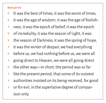
Figure 2. Ideally, each line of your type will be 10 words or so, or 65 characters. That’s similar to the length of an average sentence and provides good rhythm for comprehension.
The 65-character line provides good rhythm for comprehension. The process of reading this handful of words, pausing at the end of the line, and returning to the left margin and beginning anew with the next line echoes the way we speak and write.
Of course, some people use bigger words in longer sentences; some subjects demand that complexity. And some use smaller words in shorter sentences (think newspapers).
As a result, you’ll find there’s no such thing as one optimal line length that you can apply in all cases. It depends on the content and your readership.
So, before deciding on your line length, read the text. Analyze it. Consider your readers and what they need. And then design accordingly.
Alignment and Its Consequences
You have two options in designing long threads of text: justified type, which is flush to both the left and right margins, or flush-left (also called ragged-right) type, which is flush to the left margin but with each line ending unevenly on the right. Both justified text and flush-left (ragged-right) text have their pros and cons.
Let’s start with justified type (Figure 3). It looks neat. It fills the space. It looks rational.
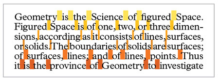
Figure 3. Paragraphs of justified text are both flush left and flush right, meaning the extra space falls between words and/or individual characters.
But that neatness and rationality comes at a price. To achieve justification, we (and our design software) must distribute extra space between words and/or individual characters. If this is not handled well, you’ll end up with spotty-looking paragraphs where wide-open word spaces isolate individual words like gravestones in a cemetery. Not to worry—we can fix that.
Flush-left, ragged-right type looks relaxed. It is a way to set type that ends up looking more rational than justified type. The word space remains consistent and so the rhythm remains consistent.
But the tradeoff for that rationality, rhythm, and consistency is the rag—that torn edge running down the right-hand margin. The rag has an unfortunate tendency to take on unusual shapes when the ends of subsequent lines align—generally, we can accept them and move on. But when the clusters of negative space on the right of your text column start drawing attention, that distracts your reader and should be fixed.
Hyphenate (Carefully)
Hyphenation is essential to good rhythm in justified text, and you need to keep in mind a handful of rules to get the best results. You can apply these rules for hyphenation in InDesign or other professional software (Figure 4).
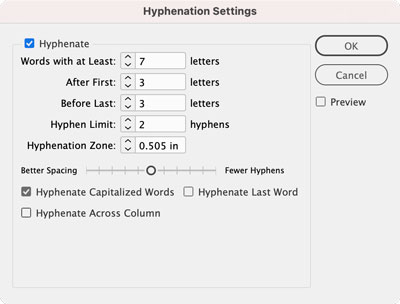
Figure 4. Here are my recommended default hyphenation settings for InDesign. I leave everything else as is (unless an editor insists on not hyphenating capitalized words).
Don’t hyphenate small words (anything less than seven characters); it produces bad results.
Leave a minimum of three letters before a hyphen and a minimum of three letters after a hyphen.
Don’t let stacks (or, as editors sometimes refer to them, ladders) of hyphens appear at the ends of more than two consecutive lines. A stack of three hyphens is remarkable. You don’t want remarkable.
Hyphenation for flush-left type is a different matter; technically, it shouldn’t even be necessary to hyphenate. But if the rag is being uncooperative, allowing the occasional hyphen might help even out the line breaks. For flush-left type, you can use the same hyphenation settings as you would for justified text but change Hyphen Limit to 1.
What About Flush Right and Centered Type?
So far, I have not talked about flush-right type or centered type. Both are settings suitable only for small amounts of text—for display type meant to be looked at, not blocks of text meant to be read. They’re difficult to read for extended amounts of copy and should be used sparingly.
Flush-right type and centered type are far more difficult to read than flush-left or justified type.
Tweaking Your Justification Settings
Let’s discuss how to produce smooth texture—and good rhythm—in your justified text with your software’s justification settings, which control the way space is distributed in justified text (and they affect flush-left text, but more on that in a minute).
In InDesign, you can access Justification settings via the Paragraph Style Options dialog box or the Control panel. The Justification settings appear in three rows (Word Spacing, Letter Spacing, and Glyph Scaling) and three columns (Minimum, Desired, and Maximum), as shown in Figure 5. To create the best-looking type you need to use them all—carefully.
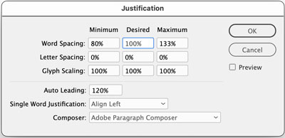
Figure 5. InDesign’s Justification settings dialog box
Word Spacing controls the flexible space between words. That’s the big gun, and in the early days of mechanized typesetting, that was the only gun. But these are modern times, and we’re using flexible, digital type.
Letter Spacing, the second row, allows us to subtract or add space between each letter on the line to supplement the work of the flexing word space. In the old-fashioned typesetting, this was referred to as alternate justification.
The third row, Glyph Scaling, allows us to uniformly change the width of the characters themselves to still further aid the flexing word space.
The three column heads (Minimum, Desired, and Maximum) represent the bounds of our actions.
Desired is how we want things to be in the best of all worlds. In Figure 6, I’ve set Word Spacing to 85%. In my work as a designer, I have nearly universally found default word spaces to be too wide. So, my go-to Desired Word Spacing is 85% of what the type designer intended.
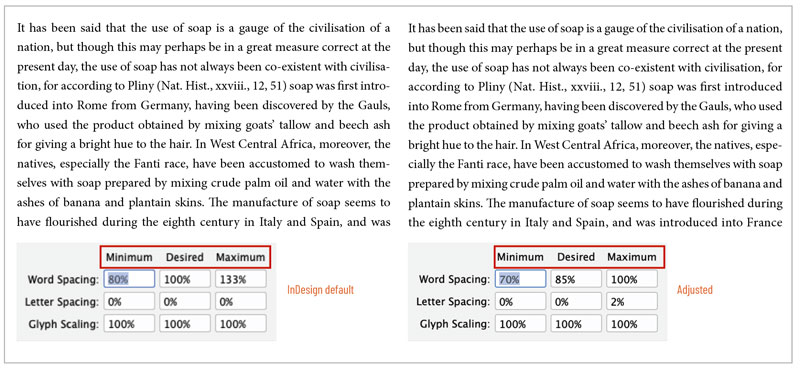
Figure 6. Maximum Word Spacing helps you avoid spotty lines of type.
I have no desire to change Letter Spacing, so I use 0%.
Similarly, I almost never want to change the width defined in Glyphs (indicated, like Word Spacing, as a percentage of what the type designer dictated). So, I typed 100% in the middle box of row three.
Tip: Remember that 100% in Word Spacing and Glyph Scaling settings and 0% in Letter Spacing represents the default settings as defined in the font that you’re using. These recommendations are merely good starting points. Your job is to get the type spacing you want for the typefaces you’re using in the design you’re making for the people who will be reading the text.
The Minimum value is the point below which you don’t want word spacing, letter spacing, or glyph widths to be reduced. The Maximum value is the upper limit of those three aspects of your type.
You can specify your Minimum Word Spacing quite small, and the word spaces will still be discernible. Go too small, though, and words will start to blend together. A good, conservative setting is 70%, although you may want to experiment with even smaller percentages.
Maximum Word Spacing of 100% keeps the word space from getting too wide and creating spotty lines of type.
In my opinion, you should avoid tightening Letter Spacing. Doing so can cause crowding in words and darken the texture of the text sporadically. However, adding a small amount of Letter Spacing via the Maximum box will usually go unnoticed and can improve your type texture (Figure 7).
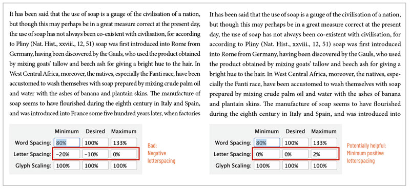
Figure 7. Tightening Letter Spacing can cause crowding in words, but adding a small amount can improve your type texture.
Modifying the width of characters via Glyph Scaling should, in theory, be taboo—in fact, I preached against it for years. But I’m now a modern human, and I’ve found (as you will) that it can dramatically improve type texture. The trick is to not overdo it. Two percent in either direction (98% Minimum and 102% Maximum) is all. Any more, and your secret won’t be a secret (Figure 8).
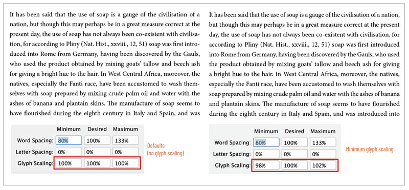
Figure 8. Modifying the width of characters via Glyph Scaling can be heresy for typographic purists, but can dramatically and invisibly improve type texture.
Best Settings for Non-Justified Type
You might not expect it, but your Justification settings also apply to non-justified type. Obviously, Maximum spacing settings will be irrelevant, but if you are setting ragged-right text, you need to pay attention to Minimum and Desired settings for your paragraphs.
Of the three options in the Desired column, I recommend changing only Word Spacing. The percentage that you specify for Desired Word Spacing is exactly what you will get (no flexing) all the time. Again, I recommend starting with 85% to tame the overly wide word spaces that are built into most fonts (Figure 9).
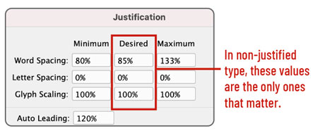
Figure 9. Good default justification settings for flush-left/ragged-right type
Kern, Baby, Kern
Kerning is the careful spacing between two glyphs of display type (type 14 point and above). In the Adobe apps, simply place your cursor between two characters, hold down the Option/Alt key, and press the Left and Right Arrow keys to open and close the space. You can adjust the increment in InDesign’s Units and Increments preferences and Illustrator’s Type preferences.
Kerning type is trivially easy to do, but it takes practice to do it well. You have to develop an eye for it. So, here’s a place you can practice: Method of Action’s Kerntype (type.method.ac), described as “a letter spacing game,” which scores how well you manually kern short words in large display fonts.
Once you’ve tired of that, read the amazing James Edmondson’s post about spacing on the blog of his foundry, the Oh No Type Company. Edmonson describes the three-letter approach to kerning, further explained by Ilene Strizver here.

Learn to kern with Kerntype.
The Case for Space
As we’ve seen in this article, if you want your audience to read your text, understand it, and enjoy the experience, you need to manipulate the spacing with care. When you get that spacing right you become a more effective designer and communicator, forging a stronger message through type.
Commenting is easier and faster when you're logged in!

Recommended for you
Macromedia Director 8.5 Enters the Third Dimension
It’s big, complex, and expensive, but Macromedia Director is unrivaled in...

Monotype Imaging Files For Initial Public Offering
Monotype Imaging Holdings Inc. today announced that it has filed a registration...

How to become an Adobe Certified Expert (ACE)
Keith, who has taken many more Adobe Certified Expert (ACE) exams than he cares...