
Futuristic Fonts
Andrea Leksen and Charles Fadem explore the realm of type that evokes space, technology, aliens, and the future.

This article appears in Issue 117 of InDesign Magazine.
Science fiction, by its very nature, intrigues creatives. It asks exciting questions about what the future may hold for us in technology, style, and exploration. And combining science fiction and movies can be even more exciting. Since the first sci-fi movie in 1902 (Le Voyage Dans La Lune by Gorges Milieu), the genre has redefined narrative and aesthetic expectations many times over. Every good sci-fi movie poster lets viewers know they can expect an adventure into the unknown. The poster is the first marker on the journey, and the typeface that inhabits it is, in a way, the first character in these fantastical, often futuristic stories.
We all know that fonts have personalities and evoke feelings. But what is it about a font that could make it feel futuristic?
The Evolution of Type
To see how type has evolved over the centuries, let’s look at futuristic type and the role that fonts have played in the science fiction genre by turning to the past.
The first movable type was derived from the handwritten letterforms of the day—blackletter (Figure 1). It didn’t take long after the advent of Gutenberg’s press for printers to start experimenting with more legible type than the high contrast of thin and thick strokes and ornate serifs that makes blackletter so easily recognized (but not so readable) as text type. The first upright roman letterforms that were cast in metal type were old-style serif typefaces that housed natural, rounded serifs with some definite humanist characteristics referencing handwritten letterforms. As printers explored methods to improve legibility on the letterpress, the serif became more refined, with square perpendicular serifs, longer brackets, and flat edges along the baseline. The modern serif carries even more extremes of the transitional serif, with higher contrast, no brackets,
and thinner, perfected serifs (Figure 2).
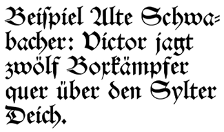
Figure 1. Blackletter, the opposite of “futuristic”

Figure 2. What passed for “modern” in the good old days
The sans serif font made its official entrance in 1816, when William Caslon IV published Two Lines English Egyptian in a type specimen book (Figure 3). However, it wasn’t until 1927 that Futura was released. And Univers and Helvetica were both released in 1957 (Figure 4), but it still took years for its peak in popularity to hit. Since then, type designers have continued to push the limits of simplicity and abstraction while maintaining legibility.

Figure 3. The humble introduction of the sans serif font

Figure 4. Increasing simplicity and abstraction of characters created a modern feel.
Enter Sci-fi
It is evident that the science fiction world gravitated toward the sans serif and ran with it—which makes sense from both an aesthetic and historical perspective. If you were to decide what the future of fonts might look like, it makes sense that you might start with the most modern approach and experiment with what might extend beyond current day, into the next generation.
Science fiction has been in the pop culture lexicon since Fritz Lang’s Metropolis in 1927 (Figure 5). While the title type in this film is a bit unique to the rest of the genre, it certainly mimics elements of the futurism movement through use of geometry and industry. The lengthy descenders (not to mention the imagery!) show a direct link to the booming horror film industry of the time.
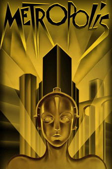
Figure 5. No warm, fuzzy nostalgia here; the jagged, dis-eased Metropolis image still packs an eerie punch.
The genre failed to distinguish itself in aesthetics until the 1960s, when Star Trek debuted on national television with its bold, colorful, mid-century take on the future, and jump-started the evolution of “futuristic” typefaces. Even today, in its current iterations, Star Trek typefaces evolve along with what we might call the aesthetics of the future. These aesthetics can be organized into three main science fiction subgenres:
- Space & Exploration
- Technology & Dystopia
- Sci-fi Horror & Aliens
Each of these subgenres has its own style and principles, and understanding the quirks of each is key to understanding “futuristic” typeface aesthetics.
Space & Exploration
Due to the popularity of Star Trek and Star Wars, the Space & Exploration genre is probably the most widely recognizable. This is a big part of the reason why, when someone just says the word “sci-fi,” images of spaceships and starfields come to mind. The aesthetic of the title type often reference cold war “space race” propaganda and certainly captivates the imagination of its audience.
Star Trek
While the original Star Trek logo references Russian Constructivist typography, it uses oblique type that points to the future. The right-leaning letterforms aid our left-to-right reading movement. Were they to lean to the left, it would feel as though someone put the brakes on! Not only do the letterforms lean forward, but the midline strokes slant as well, which adds even more momentum to the text (Figure 6). The future—at least in the Star Trek universe—is fast. Fast spacecraft, fast-forward thinking, looking into a new future which naturally needs fast letters that can keep up with the plot. The Star Trek movie titles have evolved with each new release, with the 2016 film directly referencing both the original television series logo and the original motion picture from 1979 (Figure 7).
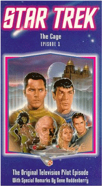
Figure 6.
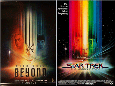
Figure 7. Star Trek 2016 release (left) and original motion picture (right)
Star Wars
The Star Wars logo kicks off the film series with awkward comic type that connects some of its letters clumsily (Figure 8a). The updated logo in the 1980 release takes cues from the original logotype and gives a more forward-feeling spin on it (Figure 8b). The 1980 setting connects the first and last letters in each word and, while it keeps a similar type treatment in future releases, the remaining versions clearly don’t successfully transfer the same connectedness, leaving letter extensions hanging (Figure 8c). See Yves Peters’ article to dig deeper into Star Wars typography.

Figure 8A. Star Wars 1977 release

Figure 8b. Star Wars 1980 release
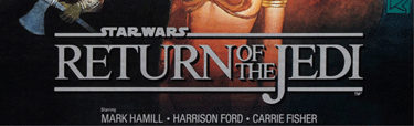
Figure 8c. Star Wars 1983 release
Technology & Dystopia
This subgenre is typically pessimistic, depicting the future gone wrong. It’s brimming with tales of the breakdown of society—often seen in plots where our own technological creations turn against us. It carries an aesthetic similar to pulp novels, with comic-like typography and various elements of speed. Blade Runner sports the oblique flair that generates a fast-forward movement into the future, not to mention the horizontal break through the letterforms that also gives an illusion of speed and intrigue (Figure 9). In the newer version released in 2017, the horizontal space is thinner (Figure 10), which feels a little quicker and more sophisticated compared to the more comic look of the 1982 release.
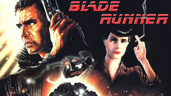
Figure 9. Blade Runner original release
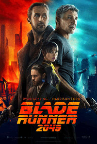
Blade Runner 2017 release
X-Files’ take on similar, isolated type reflects government paranoia and the danger of the unknown beyond that is prevalent in its storylines. The swirling X provides mystery, intrigue, and ambiguity to the otherwise isolated, clean type (Figure 11). This is an example of a “futuristic” typeface being used to represent a story told about the present day.
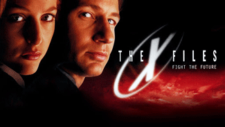
Figure 11. X-Files
Oblivion is a beautiful film directed and designed by Joseph Kosinski, who was trained as an architect and graphic designer. Like in many science fiction titles, part of the strokes are missing throughout the title typeface. In this film, these gaps could reference elements of society broken down over time (a common element in dystopian sci-fi) or pieces of the character’s memory that are missing (Figure 12) It also leaves space for our imagination to wonder what the future might look like and fill in the gaps on our own.

Figure 12. Broken… not broken… what’s (not) in there, or out there?
Sci-fi Horror & Aliens
The Sci-fi Horror & Alien genre does a splendid job of giving me the typographic willies! What is it about this type that gives you the creeps before even starting the movie? In a way, this subgenre is the reverse of the Space & Exploration subgenre. Instead of heroic explorers in epic, intergalactic conflicts, it focuses on the hostile, silent, and black isolation of space, and the monstrous beings that wait for us there. There’s no better example than Ridley Scott’s Alien, set in a bold, caps sans serif with a slight glow behind the E (Figure 13). They stepped it up a notch with Aliens, where the letters (particularly the I) has an eerie glow behind condensed, widely spaced letterforms (Figure 14). The glow certainly gives a nod to the future! There is something industrial and mysterious about it. And the widely spaced capital letterforms are a common sci-fi type setting. Setting the letters wide—particularly when they’re condensed—gives a sense of being very alone. Separated and isolated. It’s typographically creepy.
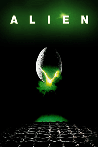
Figure 13. Alien
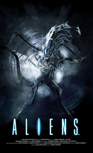
Figure 14. Aliens
Species uses all caps spaced out as well, but with a more organic, gory approach (Figure 15). The type ties in well with the image and still allows the letters to feel isolated in that feeling of the unknown.
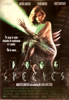
Figure 15. Species
So What’s Next?
We’ve seen how type can support and augment a visual story. Oblique, sturdy text veers into the future and feels fast and forward-thinking. Widely set letterforms feel isolated and alone. Squared type feels technological and industrial, referencing our technology boom that is imminently evolving. And altering the letterforms to create spaces leads to a sense of both alienation and potential.
The more abstract the type, the greater space left for us to imagine that there’s still something left to discover in the future. How far can we push the mystery and intrigue in typography while still maintaining legibility? The future will tell us.
Commenting is easier and faster when you're logged in!

Recommended for you

TypeTalk: Helvetica vs. Neue Helvetica
What is the difference between Helvetica and Neue Helvetica? First, a bit of his...
Jan Tschichold, Master Typographer of the 20th Century
Few have left deeper impressions on modern typography than Jan Tschichold, desig...

Working With Bulleted and Numbered Lists in InDesign
With a little care and effort up front, you can create great-looking numbered an...