
Last week I took a look at the artistic covers of vintage Fortune magazines and described how that publication set out to be the most lavish and eye-appealing publication in America. I promised to take a look at some of the advertising art that appeared in Fortune over the years, which is the subject of today’s installment.
Running full-page ads in Fortune was an ego play for many businesses — the direct marketing payoff was probably difficult to justify. But in industrial age, especially post World War II, many manufacturing firms showed off their size by placing ads in Fortune with some sort of social message. These ads tended to feature nearly full-page illustrations with minimal copy — almost all of today’s images took up the bulk of the 11-x-14-inch pages on which they appeared. I am presenting only the illustrations in this case as showing the full ad context would be difficult here. Click on any image for a larger version. (I will admit to losing track of these first two ads after I scanned them, so I don’t know what companies they represent, but I still like the art.)


These two illustrations are from the HH Robertson Company in 1948 and 1949 – they made a product called “galbestos.”


In many cases illustrations had a direct tie to the subject matter of the company, as in these ads from White trucks (1942), Mack trucks (1955) and Robertson Protected Metal (1942).


But just as likely, the illustrations were purely art for art’s sake, as in these ads for American Can Company (1968), Kaiser Aluminum (1951), and the Bundy Tubing Company (1951).


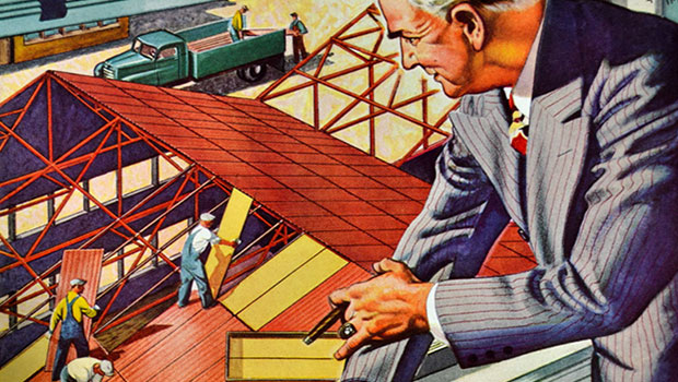
My favorites are the illustrations that show industry or business at work, as in these from The First National City Bank of New York (1955), Remington Rand, makers of the Univac computer (1955), and AL Stainless Steel (1955).


By the Sixties many of the illustrations were abstract, as in these from American Appraisal (1968) and the Government of Quebec (1968).


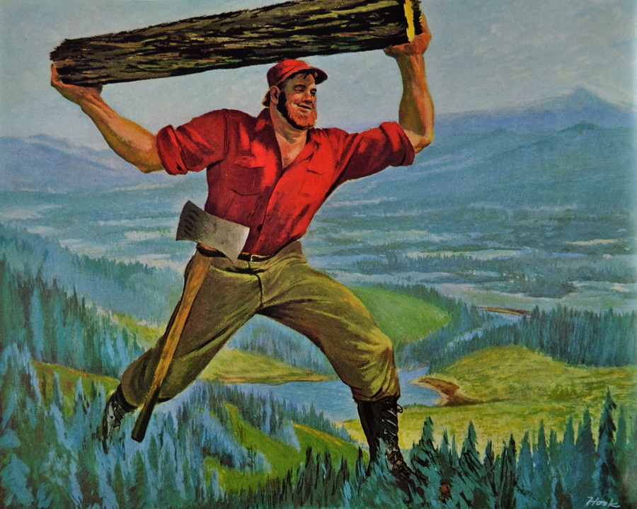
When I started working on this week’s installment, I had over 70 scans to choose from. By the time I whittled them down to the 24 you see here, I found that I was most attracted to illustrations from the Fifties. I guess that’s my era. Here are images from Raybestos (1951), Gilbert Paper (1955), Continental Can Company (1951) and the Container Corporation of America (1951).
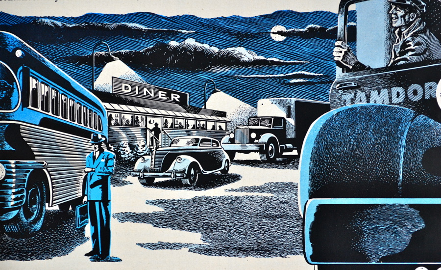


As is the case with most advertising art, these illustrations are mostly uncredited, so the artists remain anonymous. Here are images from The Travelers Insurance Company (1951), Moore-McCormack Shipping Lines (1955), and the Monsanto Chemical Company (1951).


And finally, two images I just happened to like, from Bower Roller Bearings (1955) and the Timken Detroit Axel Company (1951).

We seem to live in a photography era these days and you just don’t see as many original illustrations in advertising, especially business advertising. But in the heyday of Fortune magazine, the large pages and lavish full-color printing, provided a great canvas for artists of the time.
This article was last modified on March 1, 2021
This article was first published on February 24, 2012
Commenting is easier and faster when you're logged in!

Recommended for you

Tip of the Week: Move Text to a New Frame
This tip was sent to Tip of the Week email subscribers on September 25, 2014. Si...

"Made with FontFont" Explores the Typographic Revolution that Changed the Face of Design
FSI FontShop International announced the publication of “Made with FontFon...
AIGA’s Centennial Celebration Continues
AIGA turned 100 years old in 2014 and many institutions and publications are cel...