
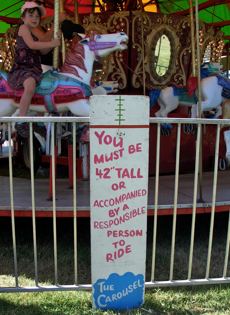
I love county fairs, not for the rides or the food, but for the wide diversity of graphics and typography. It’s a mish mash of slick carnival art and hand-made signs on chicken cages and science projects.
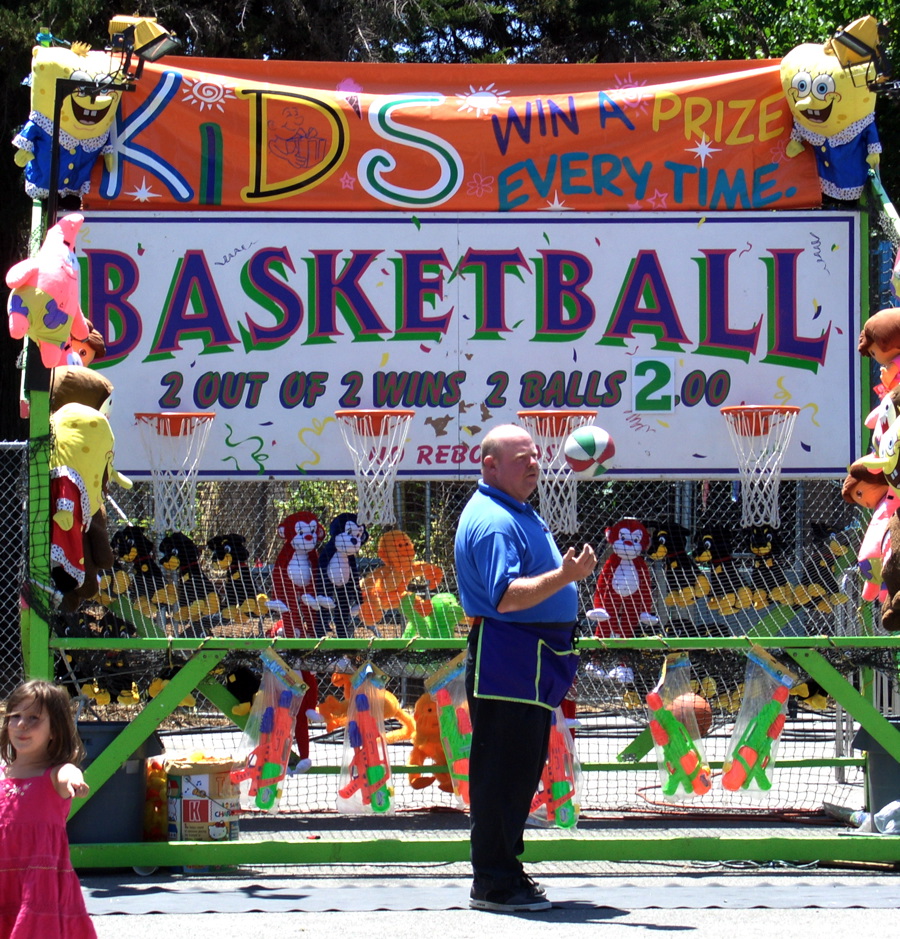
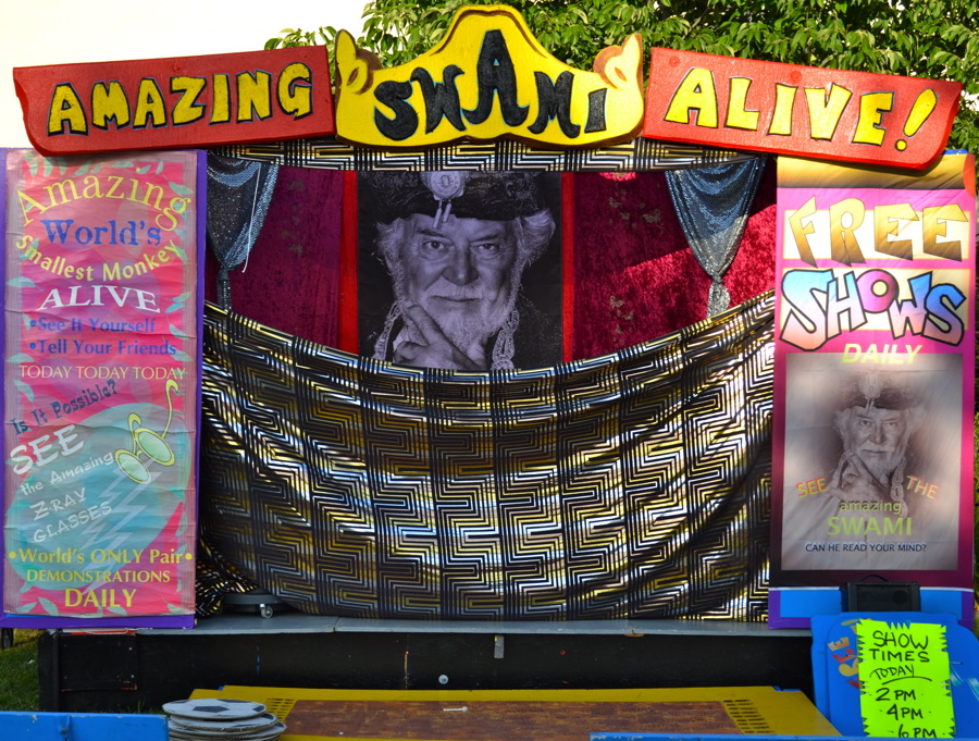
I noticed this year that computer graphics have made inroads, but the fair still has plenty of unique, hand-crafted efforts. Along with the local residents’ cookies, breads, and floral arrangements, there were plenty of examples of type gone wild. And you can always turn to the carnival midway for colorful type choices.
Today’s photos are from two California events, the San Mateo County Fair and the Sonoma-Marin Fair. Click on any image for a larger version.

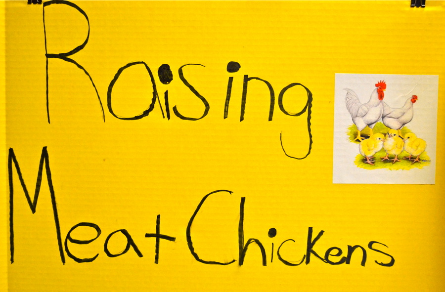
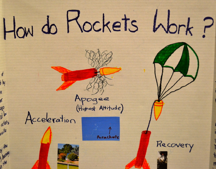
My favorites are the signs made by kids in support of animal husbandry or science. The girls seem to be particularly extravagant.

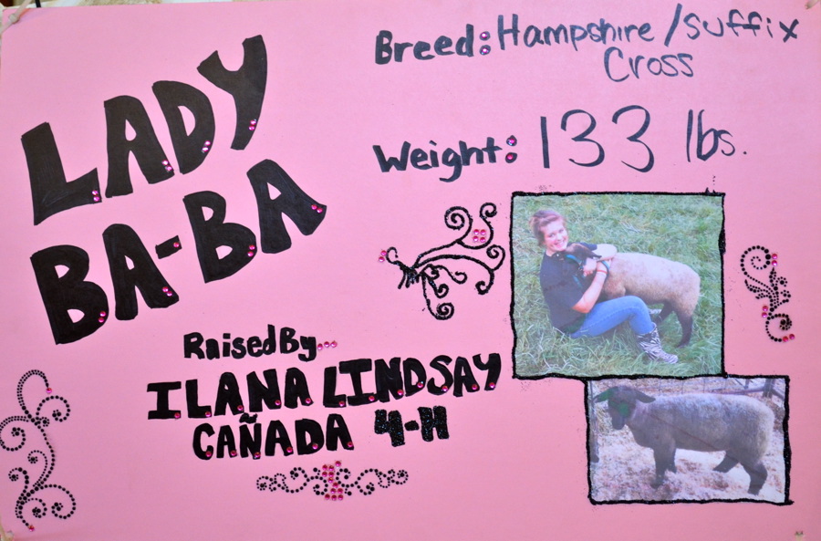
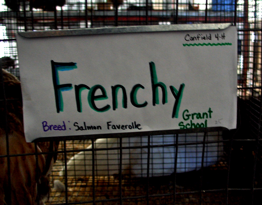
I never entered a project in a fair, so my experience with hand lettering was limited until my college years. I admire these kids’ efforts; the yarn-made-of-yarn sign is particularly nice.

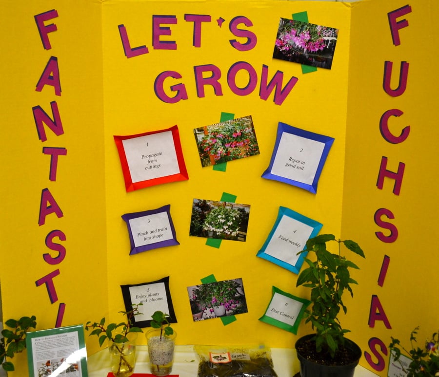
And local clubs and organizations pitch in with helpful displays on gardening, pest abatement, and the importance of recycling.
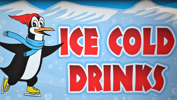
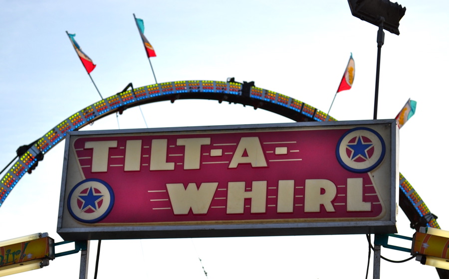
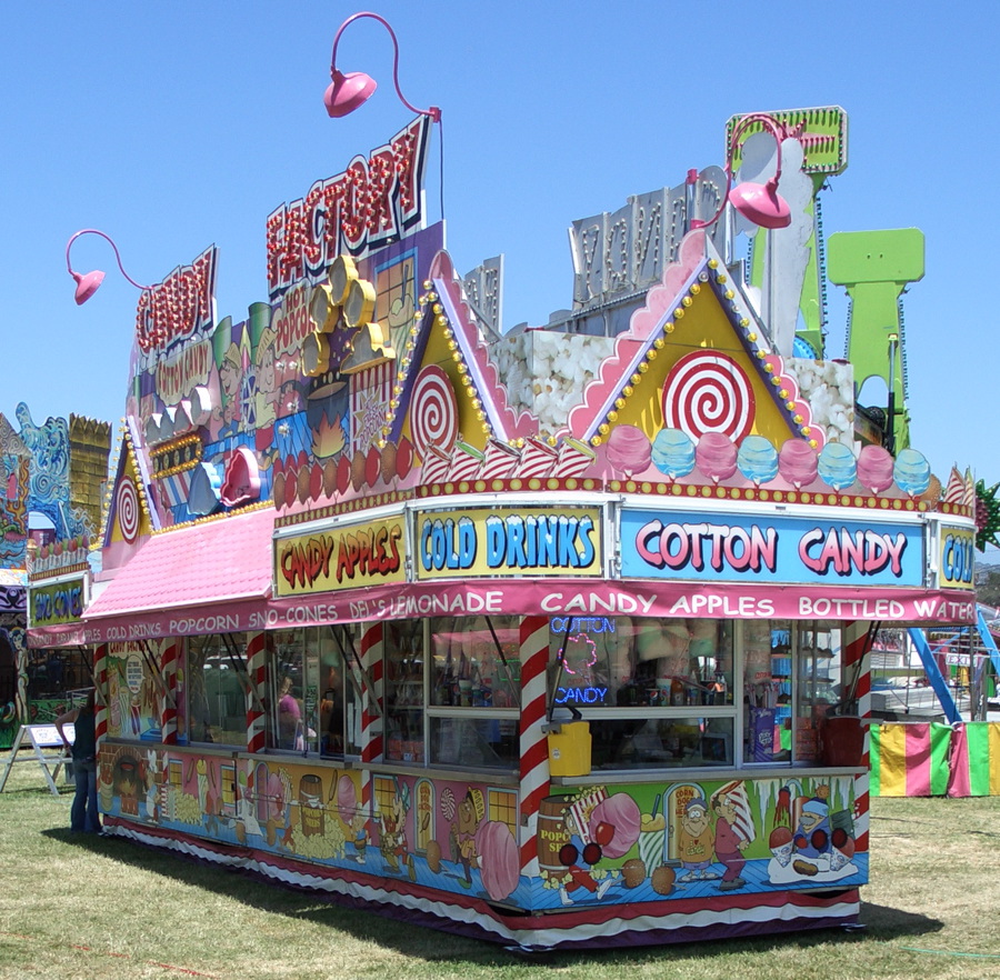
I was a little disheartened to see the influence of computer-aided design on the carnival and food stands—the slick Photoshop graphics don’t have the same personality as carnivals of yesteryear. But I did find a few, like these, that at least look old-fashioned.


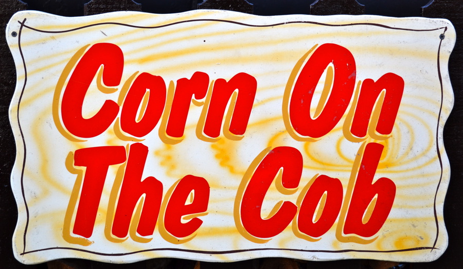
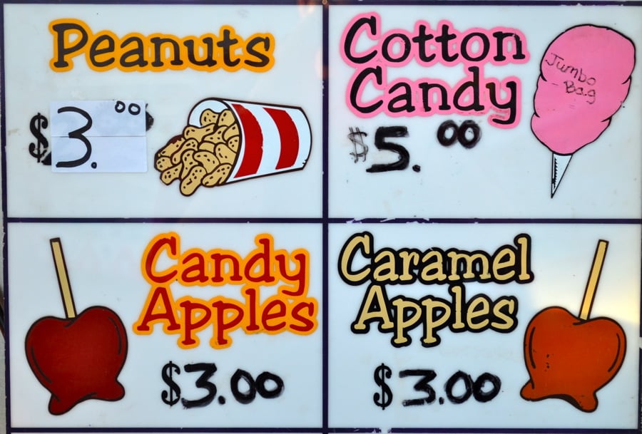
The variety of food substances at the fair could populate an entire column—things have gone ridiculously over the top. I still prefer the traditional items.

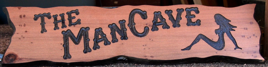
Every fair seems to have a routed-sign booth where you can order something clever for the front yard or the back of your camper.

Not all the modern signage is bad, but in general the computer has taken its toll on fair graphics, which would be wise to take a page out of the See’s Candy playbook: Keep the classic design elements that have worked for decades.
I always have fun at the fair and I celebrate the individuality and sense of place you can still find there. While I saw a lot of Helvetica, there was enough hand-drawn (or sewn, or glued) type to keep things interesting. And who can resist a slice of deep-fried cheesecake?
This article was last modified on May 15, 2023
This article was first published on July 8, 2011
Commenting is easier and faster when you're logged in!

Recommended for you

Like Futura? Try This Undiscovered Font
For decades, Paul Renner (1878–1956) was one of Germany’s leading designers. Bes...

TypeTalk: Times Roman vs Times New Roman
What is the difference between Times Roman and Times New Roman?

GO: A Kidd’s Guide to Graphic Design, by Chip Kidd
Mention the name Chip Kidd to most designers, and you will inevitably get a rais...