Scanning Around With Gene: PageMaker Memories from 6 to 72 Point

There is a Salvation Army store that happens to be on the way to my bank, both of which I visit quite often. Mostly I try to hit the thrift shop on my way to the bank so I don’t have a wallet full of cash when it comes time to decide if I really need another broken piano or backup VCR to my backup VCR. But this week I found a 98-cent gem that returned considerably more than my investment in valuable memories. The clerk, a young woman in standard red Salvation-Army garb, opened the blue box, flipped through the 5-1/4-inch floppy disks, and looked puzzled. “Is this some sort of computer thing?” she asked.
Indeed it was. An early boxed version of PageMaker for Windows/286, my less-than-a-dollar purchase was perhaps one of the most significant technology developments of all time. PageMaker laid the groundwork for everything we now take for granted in page layout and, to some degree, in illustration. And no matter how limited it turned out to be, many people working in the publishing and design field today busted their chops laying out yearbooks, student newspapers, and church bulletins in PageMaker.
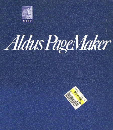
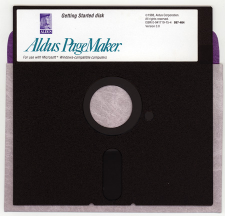
I know the Salvation Army tag in the above picture says $1.99, but it was half-price-every-other-Tuesday day, so I really only had to shell out 98 cents. Fortunately, even at half off, I didn’t have enough cash to also pick up a hulking Intel 286 Compaq ElGigantor with orange Hercules monochrome display so I could run this software. And yes, those are 5-1/4 inch floppy disks, of which there were 11 in the box.
These scans are all from the actual material in the box, which was version 3 and released in 1987. PageMaker 1.0 was first released for the Macintosh in 1985. I believe version 3 was the first version for the then-new Windows. Below are two images from promotional material included in the box. The first is for bitmap clip-art, and the second is for a small software utility from T-Maker that allowed you to rotate a bitmap image and change it to a slant. That was hot stuff in 1987, sort of like The Bangles or the movie La Bamba.
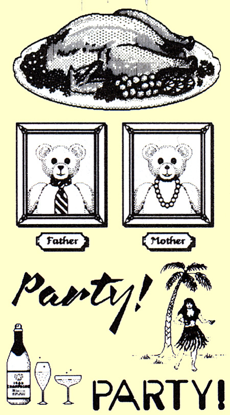
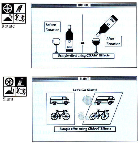
But for those of you who are young enough (or perhaps it’s fortunate enough) to have missed those early versions of PageMaker, suffice to say they were in many ways more akin to traditional typesetting than to modern desk-top software.
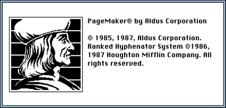
The real problem back then was lack of standards and stupid incompatible machines. I mean, when was the last time you had to think about whether a monitor was CGA, EGA, Hercules, Genius, or some proprietary display technology?
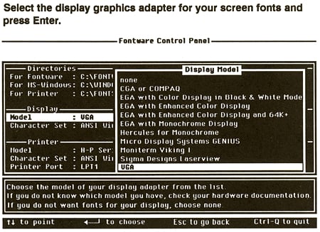
Because every display back then required a different screen font, it took a lot of set up to run PageMaker on your system — if it ran at all. Here’s a shot of the display set-up window.
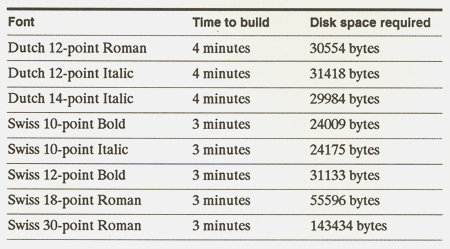
Here’s a chart estimating how many minutes it will take you to make a new display font for each size of each font you use in your document. That’s right, if you used a total of five sizes of Helvetica roman, and five sizes of Helvetica bold, there was 30 to 40 minutes of processing time before you could even start.
It worked pretty much the same way on the printer side of things in 1987. If you were lucky enough to have a printer with any fonts installed in it, you had to know what they were and have exact matches on your machine, or you were hosed. And if you expected to download fonts to the printer, you might as well bring along a good novel, since your printing times would be glacial.
Getting things to print was not a push-button effort back then. We once wrote a headline at Publish magazine that described common PostScript printing errors (which were, in fact, very common): “Some Day, My Prints Will Come.” Some day, indeed.
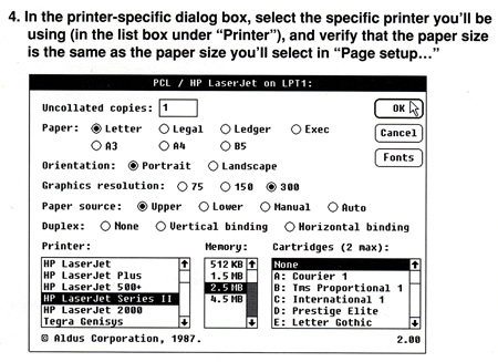
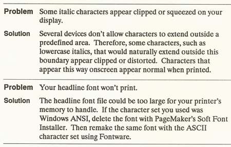
And God help you if you didn’t know how much memory was installed in your printer. As you can see below, the print dialog boxes in PageMaker were more demanding than many today. And below that, just a few Q&A items common to the day.
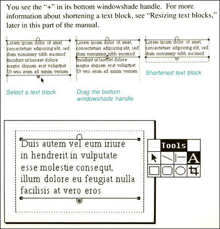
I wasn’t much of a PageMaker user — I could never get used to the window-shade way of controlling text boxes. In fact, the term “window shade” didn’t really catch on as a common tool and I can see why. When I think window shades, I think of those horrible nicotine-infused white roll-ups common to student apartments and over-perfumed grandmother houses. They never, ever work properly and I’ve actually been hurt to bleeding by window shades in my time. Not a good name for a reliable software tool. But some of you probably loved it.
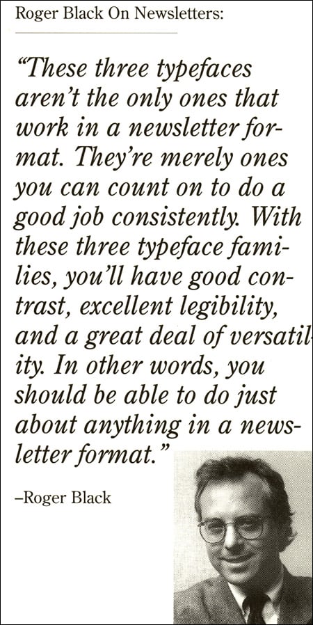
My favorite discovery in the PageMaker box, however, was an ad for one of Adobe’s very early type packages. It contained a “newsletter” font collection including Century OldStyle, Franklin Gothic, and ITC Galliard. Everything you might need to do a classic, well-designed newsletter. PageMaker may be dead and gone, but Roger Black lives on, only with considerably less hair.
I’d love to hear your PageMaker stories. Feel free to share by clicking on the word “Comments” at the top or bottom of this column, or by writing me at ge*******@*********ro.com.
This article was last modified on May 18, 2023
This article was first published on June 6, 2008
Commenting is easier and faster when you're logged in!
Recommended for you

Scanning Around With Gene: The Horse and Buggy Printer
Type designers and graphic artists tend to fall into two categories. You either...

Buying a Color Printer
There’s something compelling about seeing your work in print. That holds true ev...

Damn You, Art School
It takes more than a good education to succeed in a any field. It takes real-wor...


