

Anyone who has redecorated a child’s room or has a fondness for blue-and-white country décor has probably used stencils to add a border just below the ceiling line or on the front of an old clothes dresser. Cut-out stencils are still a viable way to easily repeat a simple pattern using brushes, markers, or spray paint. But you don’t see a lot of stencil lettering these days, thanks in part to easier ways of printing shipping labels and other identification tags.
However, for many decades wooden shipping containers, oil drums, burlap coffee bags, cigar boxes, tea containers and many other items were marked using metal or fiber-board stencils. This crude and somewhat limited printing technology proved challenging to the graphic artist, but in the right hands, attractive and fully functional stencil designs could be achieved.

Stenciling was a necessary part of most larger shipping departments through the 1960s, and was required by some carriers. A host of manufacturers made and sold stencil-cutters that worked somewhat like a large Dymo label maker, cutting letters out of stiff cardboard. Here is a model from a 1952 catalog of the Diagraph-Bradley Company in Herrin, Illinois. These machines made it cheap enough to cut a stencil for use on a single package shipment.

The “utility” stencil machines and the stencil guides many of us used in school as children favored thick lettering with obvious connecting cuts. In stencil language, the inside portions of letters or images are referred to as “islands” and the connecting cuts as “bridges.” Lettering guides from companies such as Stenso, below, were available in a variety of styles and sizes, but it took a clever person to paint-out the obvious bridges and come up with anything that looked halfway professional.

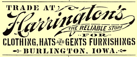
There is a great article from Jeffrey N. Levine on the Web site Larabiefonts.com (where you can download free stencil fonts) that details the history of the Stenso company and displays a huge collection of Stenso product packaging. Here is one image from that site:

But for companies that cared about branding, crude letterforms didn’t quite fit the bill. So an industry developed to make metal stencils that could be used on a variety of materials and that held enough detail to allow for some decent design.

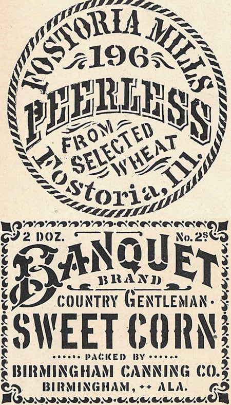
Companies such as Meyer and Wenthe in Chicago employed artist/engravers who would take a company logo and modify it for use as a stencil, adding appropriate bridges to all the various islands in the art. Many of these images come from the 1942 Meyer and Wenthe catalog.

For a brief while when I had my type shop I counted among my customers a company that used lasers to etch designs into wood products and make awards and premium gifts. This process also required a stencil, and it was often my job to paint in little white lines in the type or artwork to make sure everything was connected at some point. I can assure you that not only was this difficult, but choosing the right type style and modifying the artwork was an artistic challenge. Done well, you could barely tell a stencil had been employed. Done poorly and the item looked like something a fourth grader would create.
I’m sure there are still some illustrators out there who know how to create art and lettering that is connected but not obviously so. But the call for attractive stencils has certainly decreased, unless you count any resurgence that Martha Stewart may have stimulated.
Once in a while I’ll see a logo or package design that plays off of the stencil look and I almost always like them. If you’ve done any design work that takes its inspiration from the stencil era, I’d love to see it. Use the comment button below to provide a link, or you can email me directly at ge**@*********ro.com.
This article was last modified on May 18, 2023
This article was first published on April 25, 2008
Commenting is easier and faster when you're logged in!

Recommended for you
TypeTalk: Why Distorting Type Is a Crime
Ilene Strizver explains why not to distort type and what to do instead.

Understanding and Applying Small Caps
Small caps are a handy feature for type design, but make sure you're using real...

TypeTalk: Which Flavor of OpenType Is Best?
There are two kinds of OpenType fonts: CFF and TTF. Learn the difference and whi...