Scanning Around With Gene: Best in the West Graphics, 1970

In 1970 I was a freshman in high school. Although I wasn’t aware of graphic design as an art form, I was beginning to notice the effect design had on me as a consumer. Book jackets, billboards, record-album covers, and magazines were an important part of my life. In a few more years I would begin to appreciate the talent they represented.
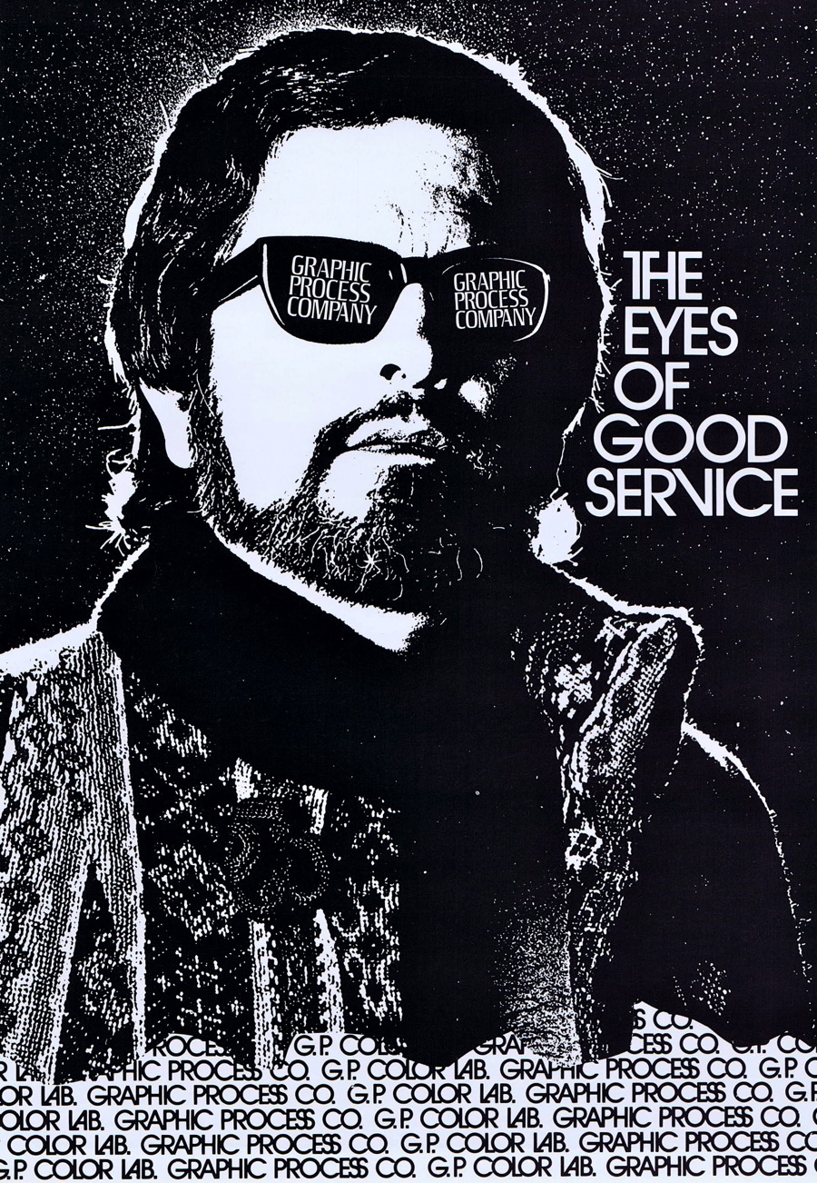
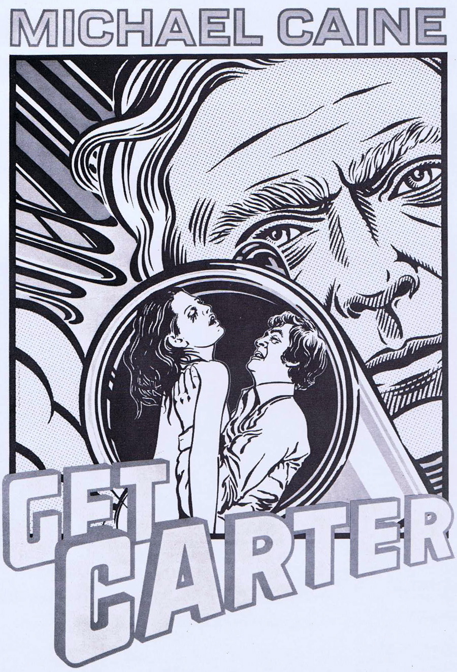
So though I was not part of the scene that today’s images represent, I feel a certain attachment to them, and I suspect some had an early influence on my eventual graphic aesthetic. All of today’s images are from the 27th Annual Portfolio of the Art Directors Club of Los Angeles — the “Best of the West” in graphic design. In 1970 when this annual was published, it was much more expensive to print in color, so the images are all reproduced in black and white. Click on any image for a larger version.


Art directing was a much different field back then, with more limits on what could be done technically. There were fewer typestyles available, and type was set by someone else who specialized in it. No computers, no Illustrator, no InDesign. Art “directing” was just that: directing others and compiling the results into a final work.


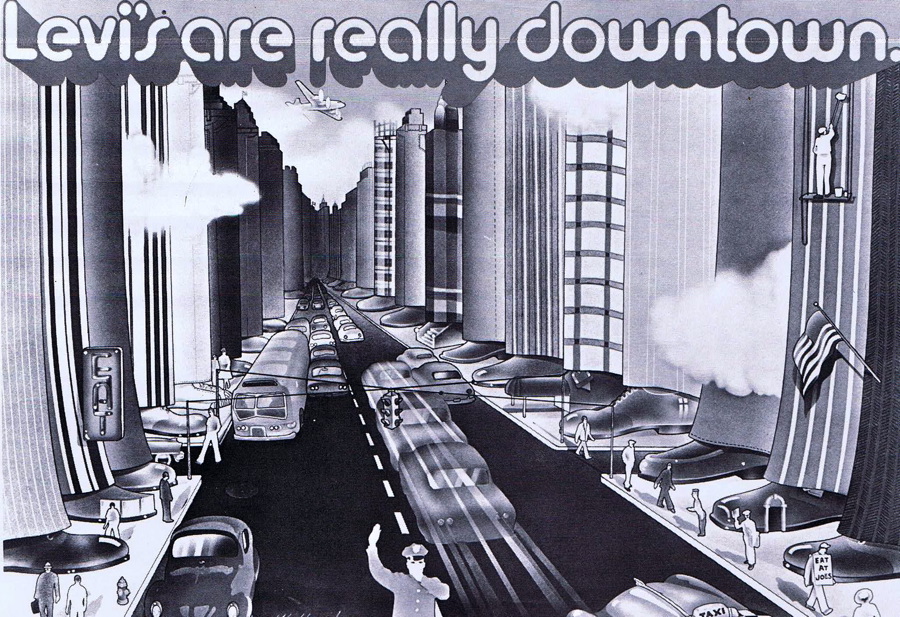
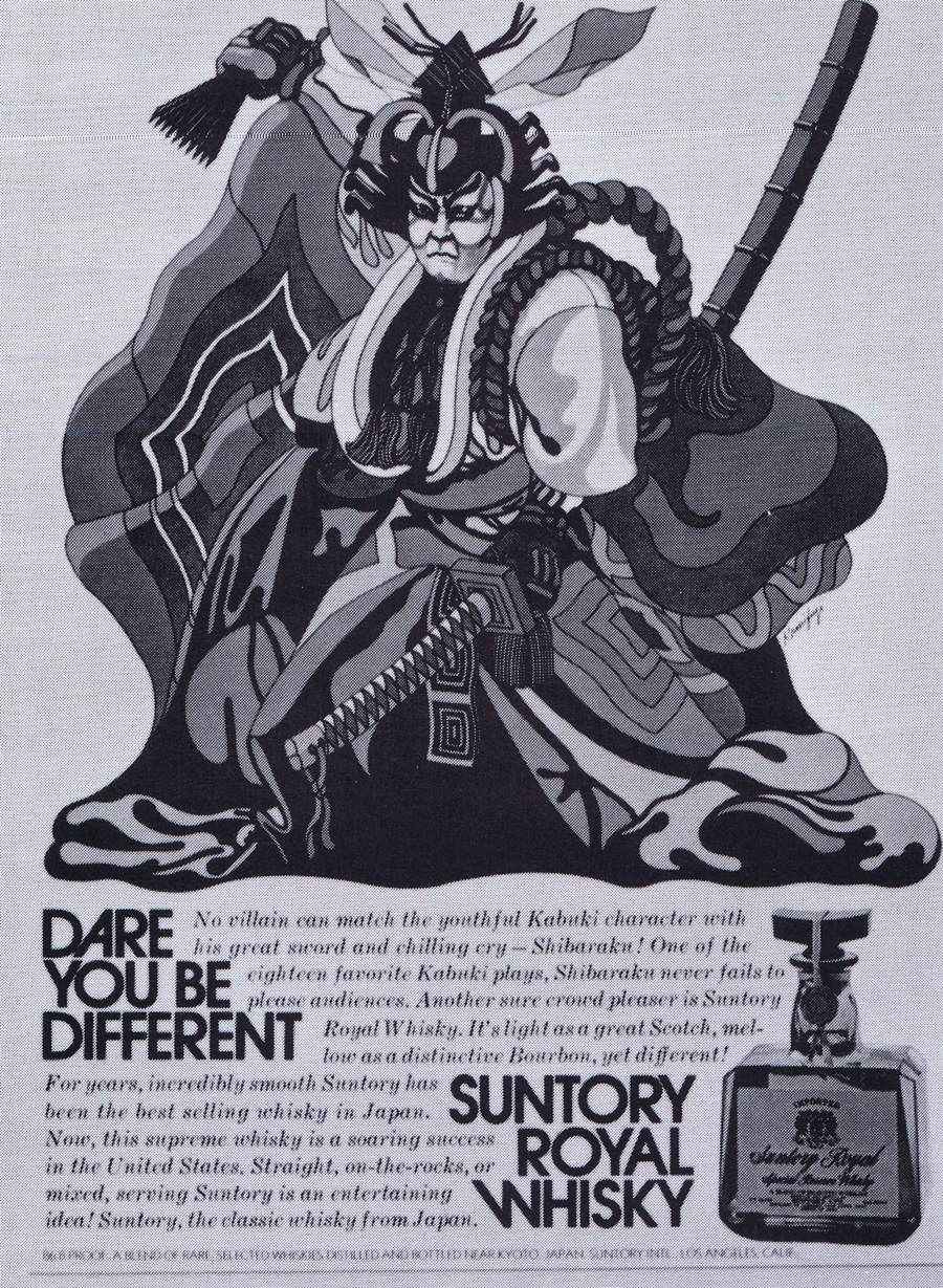
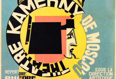
This collection of images reveals four of 1970’s trends. First was a cartoon-style of illustration that relied heavily on airbrush work.


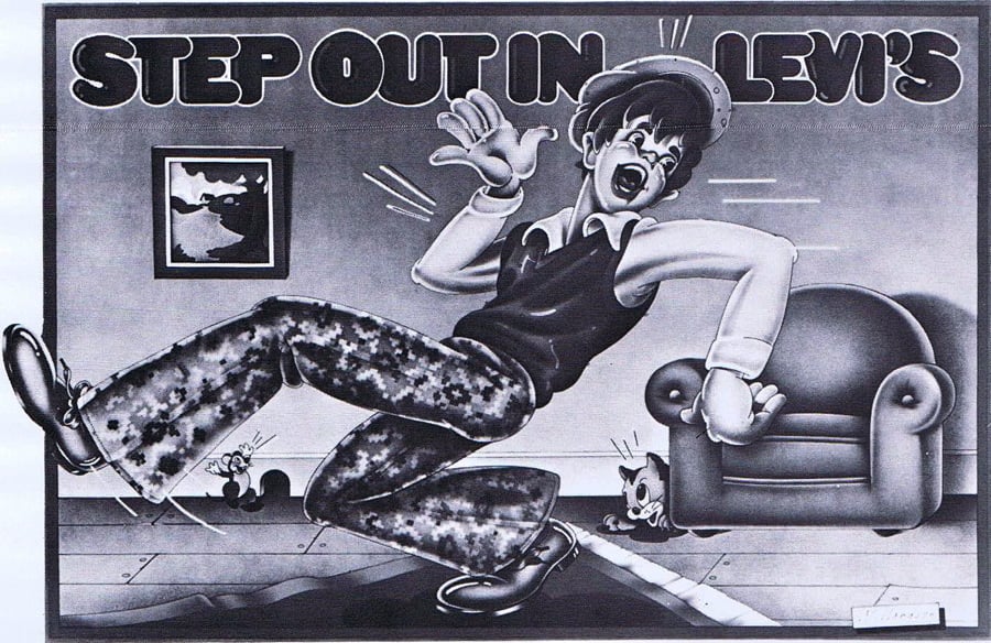
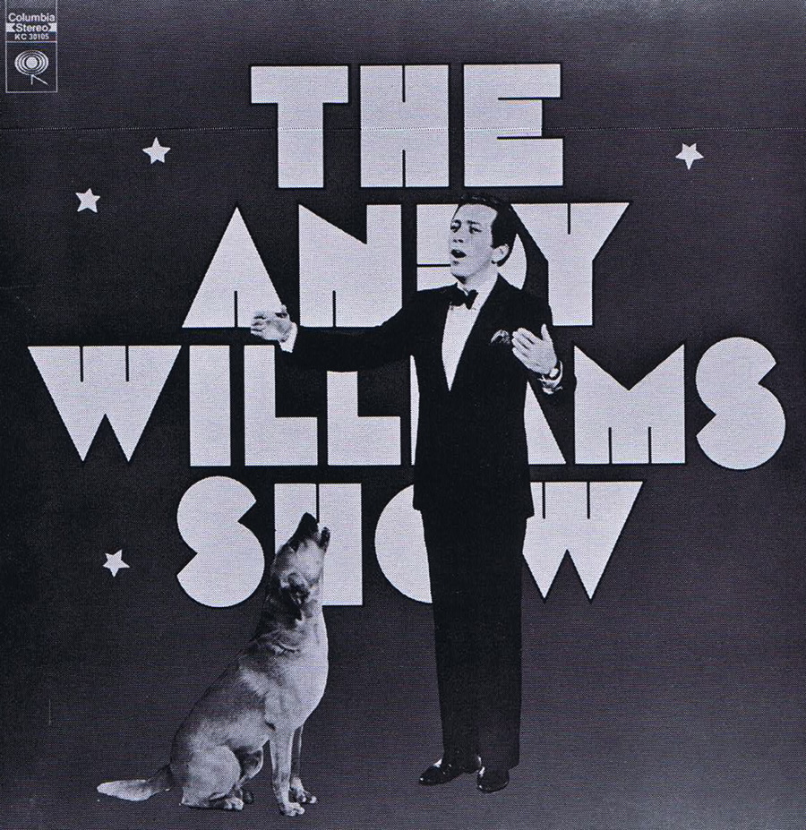
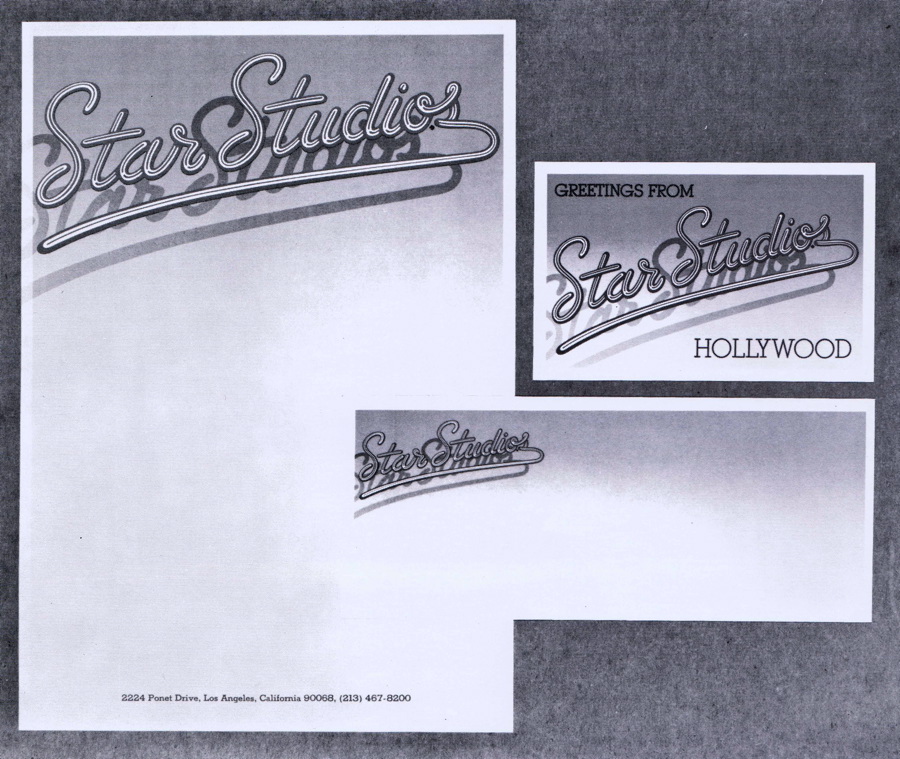
Second, type was often very ornamental, using fonts that are extremely dated by today’s standards. But I’m still a sucker for many of these over-the-top type designs.


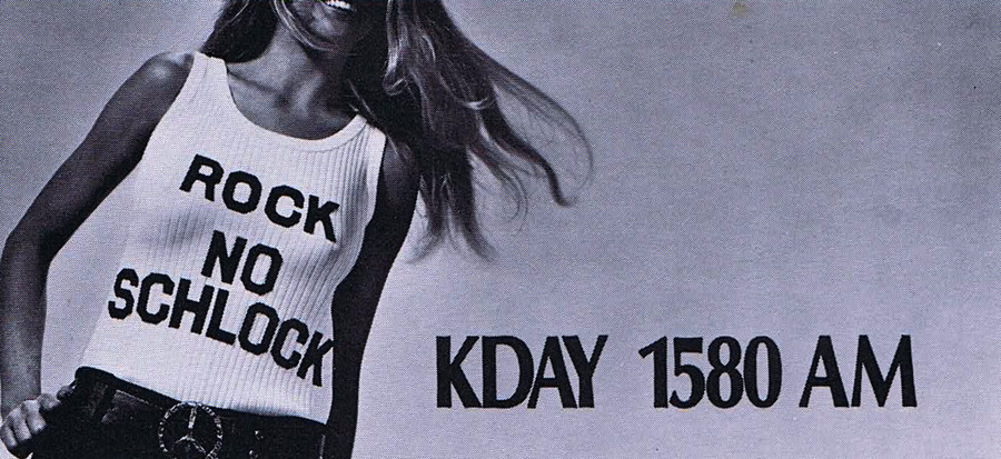
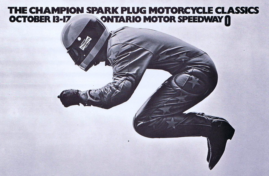
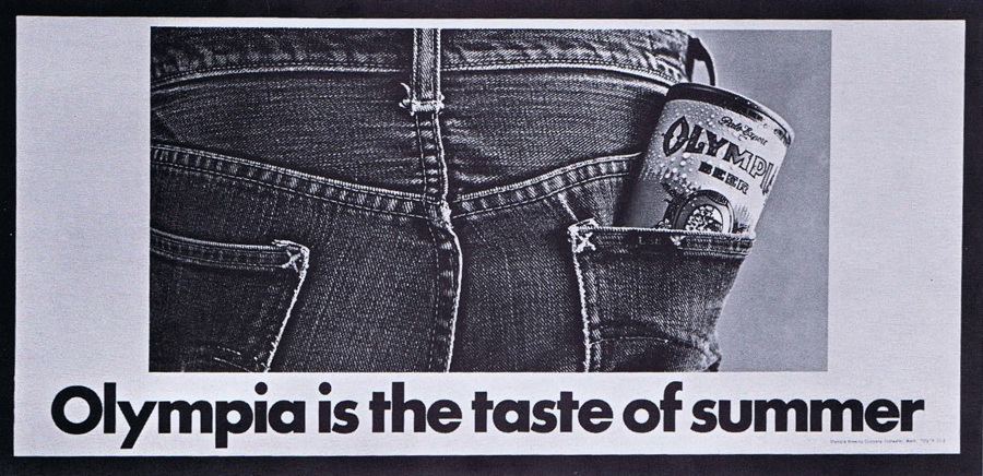
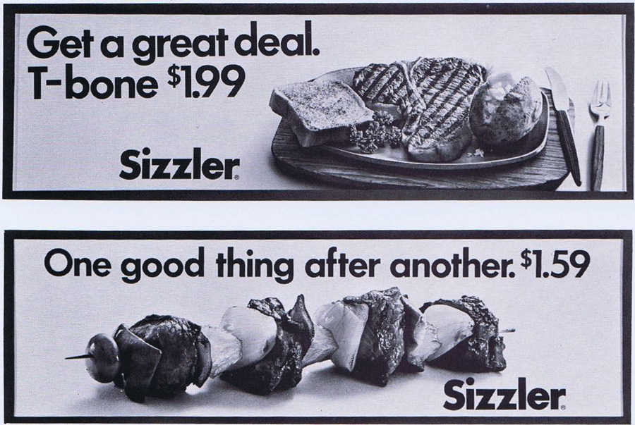
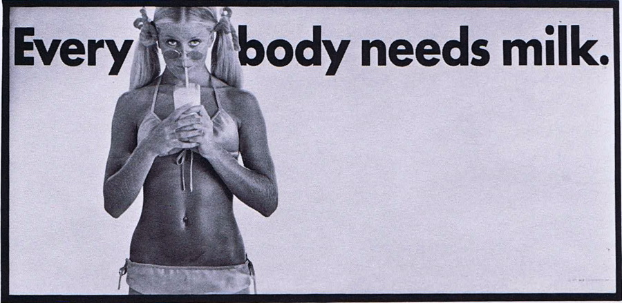
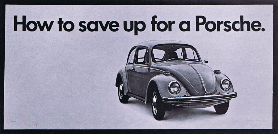
Third was the trend toward bold, simple statements. Just look at the similarity between these billboard designs, all for different products.


And fourth was the tendency toward type set very tightly. It had a lot to do with the new phototype technology, which allowed typesetters for the first time to overlap and tightly set display lettering.


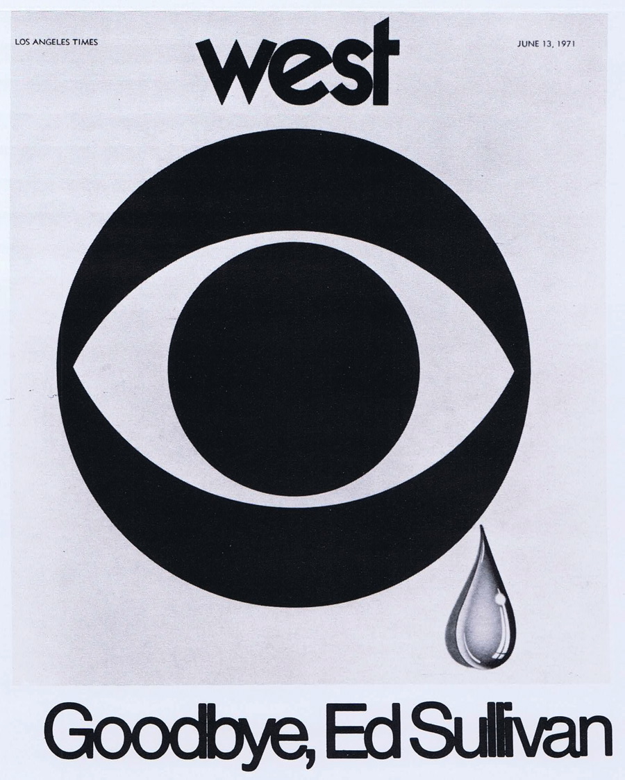
And as far as logo design goes, this was a period of bold lines and images. Again, the technology of the time had something to do with the results. Logos were mostly inked and then photo-stats were made. Getting grey screens added a level of complexity that many designers chose to eliminate. So while you see drop shadows, they’re stark and bold, not a soft grey.


While a few of these designs would work well today, most seem dated. 1970 seemed to be a year of high contrast on many levels. I find the era graphically appealing, but then I still enjoy the occasional Cat Stevens or Jethro Tull album.


Follow Gene on Twitter.

Gene Gable has spent a lifetime in publishing, editing and the graphic arts and is currently a technology consultant and writer. He has spoken at events around the world and has written extensively on graphic design, intellectual-property rights, and publishing production in books and for magazines such as Print, U&lc, ID, Macworld, Graphic Exchange, AGI, and The Seybold Report. Gene's interest in graphic design history and letterpress printing resulted in his popular columns "Heavy Metal Madness" and "Scanning Around with Gene" here on CreativePro.com.
  • Anonymous says:

    Always enjoy your taking me on trips down memory lane. Cheers!

  • ajasys says:

    I was a senior in HS that year, and had already read David Olgivy’s “Confessions of an Advertising Man”, which was a seminal influence on my lifelong interest in ads — and by extension, the graphics used to seduce consumers.

    I remember the influence of counterculture comics on advertising, especially the work of Gilbert Shelton (Fabulous Furry Freak Brothers) and R. Crumb (Keep on Truckin’, Mr. Natural, Fritz the Cat, etc.), whose graphical influence can be clearly seen in three examples Gene included: “Beans” and the two Levis ads.

    As for the logos? Ugh. I understand the technical limitations of the time, but there also seems to have been a dearth of creative thinking — at least as far as the examples used are concerned. They are blunt, and although some have some “punch”, they all lack real style. That may be why I cannot think of a single logo designed around that time that still exists in its original form.

    My interest in graphics began in those years, started sprouting over the next decade, then burst into bloom when desktop publishing became a reality and I could produce my dreams all by myself.

    That helps explain why I have been a registered member here for more than 12 years now, and keep coming back every week for more of “Scanning Around With Gene”.

    Thank you sir! May I have another?
    – – – – – – – – – – – – – – – – – – –
    Sanity is a relative concept.
    If you don’t believe me,
    let me introduce my relatives.
    – – – – – – – – – – – – – – – – – – –

  • geozinger says:

    I usually check out Gene’s work when I have a little downtime between projects. This one was particularly dear to me, as I developed my interest in graphic design in the 70’s as I was approaching the end of my high school career. I have an older brother who is also in the same field, and my growing up years were filled with his art all over our parent’s house, he would be roughly the same age as Gene.

    I remember this era of design, as it was the essence of the idea that was distilled and presented. I feel fortunate to have had this as one of my formative inspirations for my work as a designer. I think that keeping to the essence of the message is the only way to present information. Many of my pieces over the years would resemble the Oly ads, a simple but concise headline with an appropriate but usually witty photograph.

    Additionally, many of my professors and mentors during my college years were working ad and marketing people. It was great to be able to plug-in to the actual working scene. Many of us were trained in the same idiom and produced similar styles of work.

    Styles change and we all move along, but it’s nice to see artwork from this time again, as it has a certain quality we haven’t seen before or since.

  • Anonymous says:

    WOW how things have changed

  • >