Scanning Around With Gene: American Type Founders

Return to pages 2 or 1.
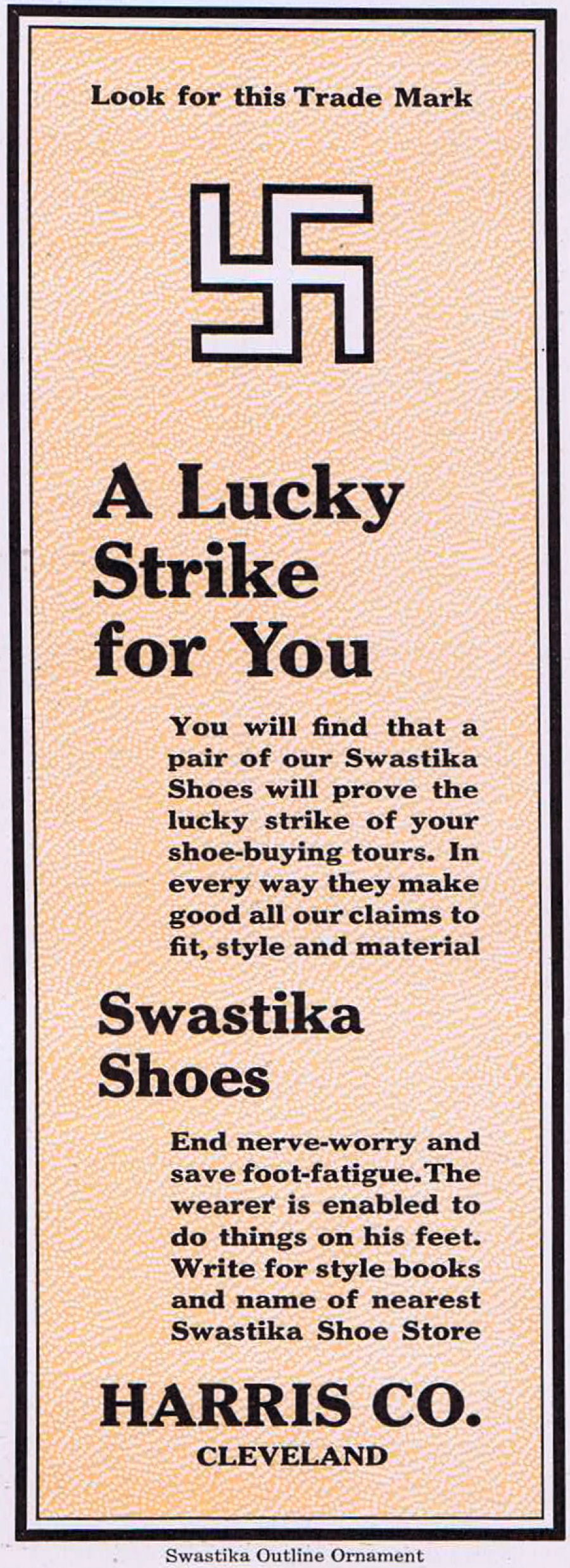
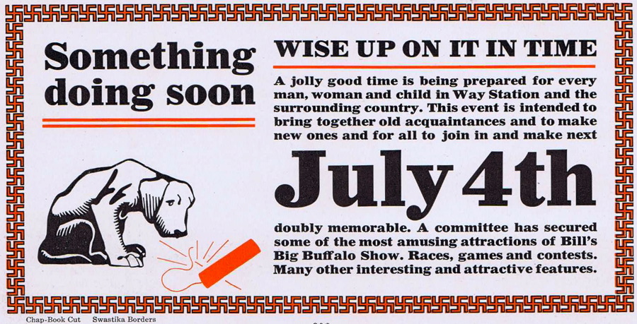
Being that this catalog was published in 1912, the swastika did not have quite the political or emotional power we associate with it today. It was just another ornament suitable for design or border use.


ATF also developed one of the early phototypesetting machines and eventually converted its type designs for more modern composition methods. But other companies like Linotype and CompuGraphic took over that end of the business and ATF faded away slowly through the 1970s and 1980s.


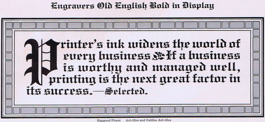
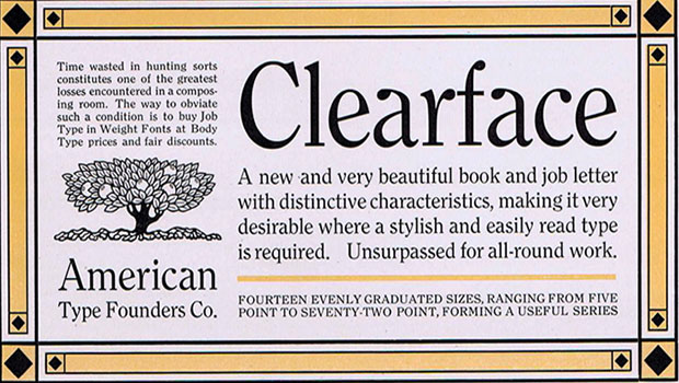
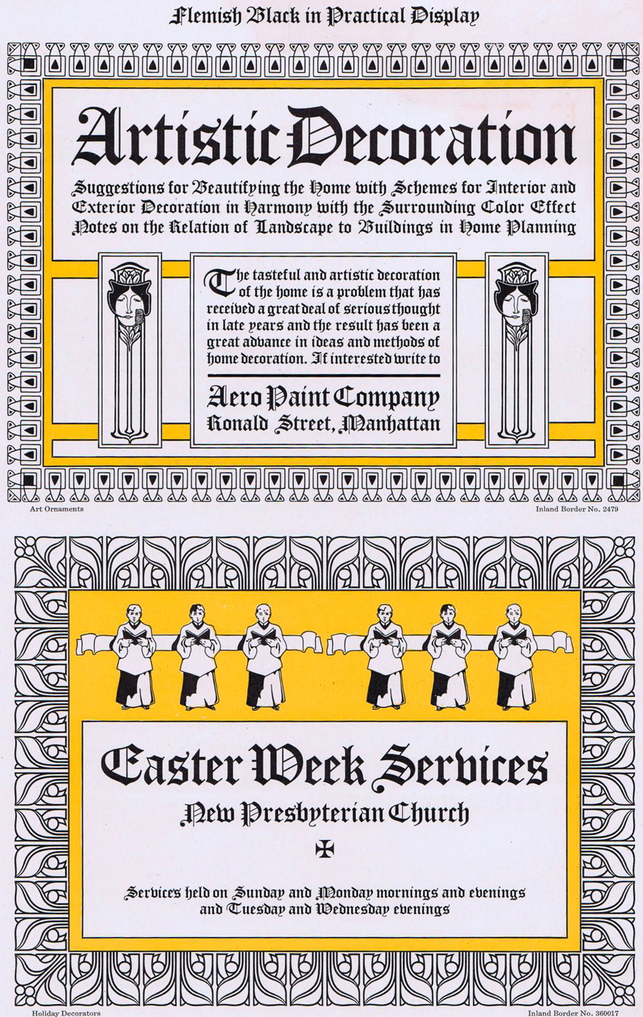
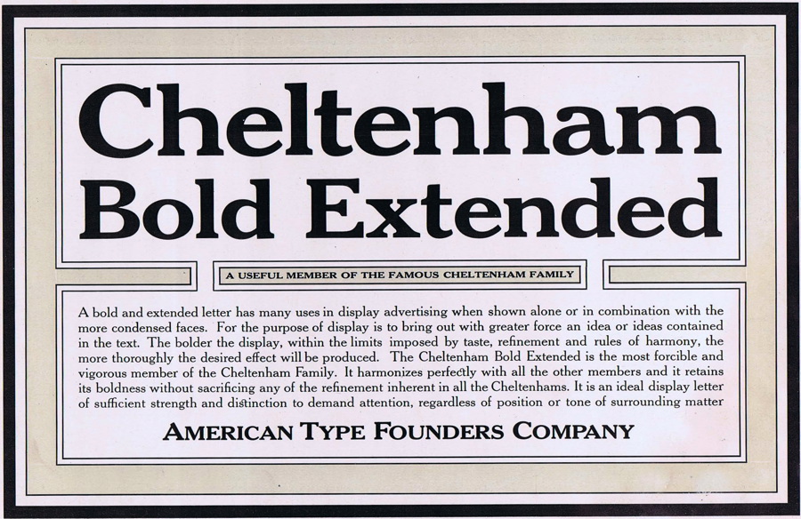
When you consider the incredible amount of time that went into hand composing these advertisements, it’s hard not to be impressed. Not only are they well-crafted and constructed, but many are well designed, too.


Hand composition and letterpress printing are alive and well today as more and more people take up the craft for both commercial and hobby purposes. But it’s sad that ATF is gone and along with it one of the most prolific collections of metal type styles and ornaments in the world.


Previous 1 2 3

Gene Gable has spent a lifetime in publishing, editing and the graphic arts and is currently a technology consultant and writer. He has spoken at events around the world and has written extensively on graphic design, intellectual-property rights, and publishing production in books and for magazines such as Print, U&lc, ID, Macworld, Graphic Exchange, AGI, and The Seybold Report. Gene's interest in graphic design history and letterpress printing resulted in his popular columns "Heavy Metal Madness" and "Scanning Around with Gene" here on CreativePro.com.
  • Anonymous says:

    Thank you for sharing your type treasure! I hope you’ll show us more in the near future.
    I own a 1927 type catalog from The Thomas P. Henry Company in Detroit. One of my mentors and friend, Dick Isbell, gave it to me in 1986. It has an embossed design on the leather cover with touches of gold leaf and is about 2″ thick. It has pegged pages so one can take out the page needed without injury to it. I also kept a 1987 and 1991 catalogs of Letraset transfer type. When I went to college in the late 70s, transfer type was all students could afford to use for headlines for design projects. A few years later learned to set type on a VGC phototypositor- the good old days!

  • Anonymous says:

    Yes, the fonts are great…the layouts are great…but I love the borders!! Very art deco — right up my alley. That book must be a gold mine. I’m sure I’d be spending many hours pouring over every page, as I’m sure you will be!

  • Anonymous says:

    Great article, but the image links to the larger scans don’t work… Any way to fix that to see more of the detail?

  • Anonymous says:

    Wow!

  • Terri Stone says:

    My apologies — that was an oversight on my part. The links to the larger versions are now functioning.

    Terri Stone
    Editor in Chief, CreativePro.com

  • Anonymous says:

    I love the scans, and the one I love most does not have the font named. Do you know which font is used on this: /wp-content/uploads/sites/default/files/story_images/20100716SAWG_fg01a.jpg

  • >