

This article was last modified on March 4, 2012
This article was first published on
Commenting is easier and faster when you're logged in!
Loading comments...

Recommended for you
Article
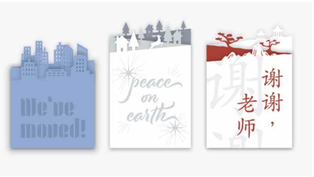
How to Make a Custom-cut Greeting Card
From holidays to birthdays, greeting cards are special gifts when they are perso...

Article
Slim Down Your PDFs
Courtesy of: Some projects are quite involved, and the finished document reflect...

Article
Heavy Metal Madness: Of Evil Witches and Dancing Pickles
If I was marooned on an island that celebrated only one holiday, I sure hope it...