
Readable by Design: Accessible Type
Typography isn’t just about looks. It’s how you talk to your audience, so make sure they hear you loud and clear.

This article appears in Issue 45 of CreativePro Magazine.
Typography usually hangs out in the background—until it doesn’t. If you’ve ever struggled to read tiny gray text on a blinding white screen or tried to make sense of a document full of overly decorative fonts, you know exactly what I mean. Typography can quietly support your message… or sabotage it.
When we talk about accessibility, the type you choose and how you style it is an even bigger deal. It’s not just about picking fonts that look nice. It’s about making sure everyone—including folks with visual impairments, dyslexia, cognitive differences, or just tired eyes—can actually read what you’ve created. If your reader can’t read it, the rest doesn’t matter.
Let’s walk through how to make typography choices that are clear, inclusive, and (bonus!) still look good. We’ll bust some common myths, cover practical design tips, and peek into current research and accessibility guidelines.
Be Intentional
Basically, accessible typography means type that works for more people. That includes:
- People with low vision or color blindness
- People with dyslexia or other reading challenges
- People who are distracted, are stressed, or read in bad lighting
When creating accessible type, your twin goals are:
- Legibility: Can readers tell one letter from another?
- Readability: Can they easily read whole sentences and paragraphs?
You get there by being intentional about font choice, size, spacing, alignment, and contrast—all the bits and pieces that make typography either a breeze or a brick wall.
Let’s Clear Up a Few Common Myths
Making intentional choices sounds easy, until the swirling fog of typography myths descends. The “rules” that “everybody knows” can limit your design options. Don’t let them!
Let’s shine a light on a few to part the clouds.
Myth #1: Serif fonts are a no-go
You may have heard that you should use only sans serif fonts for screens (like Arial or Calibri) because serif fonts (like Times New Roman) are harder to read. The truth is that both can be accessible if they’re well-designed (Figure 1).
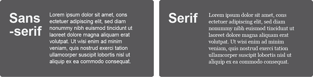
In fact, some studies say serif fonts are actually easier to read in long blocks of text. So don’t stress too much about serif versus sans serif. Worry more about whether the font you’re using is clear and comfortable to read. (See “Pick a Typeface that Plays Nice” below.)
Myth #2: All caps are always bad
Typing everything in capital letters does slow people down, especially if they have dyslexia or cognitive impairments (Figure 2).

But if you need that all-caps look—say, for a short heading—you can define a style or text effect that renders your text as all caps while invisibly preserving its original sentence case structure. And screen readers will still read it properly. Everybody wins.
It’s simple to do! Here’s how:
- In Word (or whatever tool you prefer), type your text in sentence case.
- Select your text.
- Click the Change Case icon on the Home tab (or go your tool’s similar feature).
- Choose UPPERCASE.
That’s it—your text is programmatically in the correct case but styled to look the way you prefer. Now screen readers will announce the word BALL as ball, instead of announcing it as the individual letters B-A-L-L.
Myth #3: Two spaces after a period is better
Hard as it is to believe, the two-spaces-versus-one debate still lingers from the era of the typewriter. Back then, every character took up the same amount of space, so two spaces helped separate sentences. With proportionally spaced type, extra spaces just create awkward gaps. They can also confuse screen readers and clutter Braille printouts.
Enough is enough with the debate: One space is all you need.
Myth #4: “Dyslexia-friendly” fonts work for everyone
You can find fonts, such as Dyslexie or Lexend, that are designed for people with dyslexia. Some folks love them, others don’t. Research shows that conventional fonts like Arial or Times New Roman often perform just as well—or better.
A better approach? Use a clean, well-designed font, and for digital applications, make sure you let readers adjust it if they need to.
Pick a Typeface that Plays Nice
You don’t need a magical font—just one that’s thoughtfully designed. Look for:
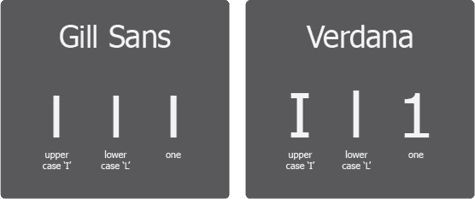
- Letters that don’t look too much alike (I, l, and 1 shouldn’t be triplets; see Figure 3)
- Comfortable spacing between letters
- Shapes that feel familiar and easy to recognize (like a simple, single-story a)
- Clear differences between similar shapes (like 0 and O)
- A decent x-height (so lowercase letters are easy to read)
- Open spaces (counters) inside letters (like e or o) that are adequately designed so they don’t blur together
Fonts with a humanist design—meaning they have more natural, varied shapes—tend to be easier on the eyes than geometric or condensed type families and typefaces. For more information on the characteristics that determine the legibility of a font, check out this article by Ilene Strizver.
Look at Type Size and Spacing
Give your type room to breathe, and everyone will be able to read more easily. Font size, line length, leading (line spacing or line height), and line length all need to work together. Here are some guidelines to help.
Font size
Is bigger really better, and how small is too small? My advice is:
- On screens, use 16 px as the minimum for body text.
- In print, stick to at least 10 pt—and bump it up for large print.
- Don’t shrink fine print so much that it’s legible only with a magnifying glass.
Line length and height
Keep lines between 45 and 75 characters. Any longer, and your reader’s eyes get tired trying to jump back to the start of the next line.
At the same time, keep in mind that cramped lines grow harder to read the longer the line of text is. Experiment with your line height: Line spacing of 1.2 to 1.5 times the font size works well.
Other text type effects
Give your characters some personal space:
- Set the default kerning (space between letters) to optical when the option is available.
- Don’t squash your letters together with negative tracking.
- Honestly, don’t change the character width with horizontal scaling unless you’re using type as a design element only.
Layout and Flow
How you set up your page matters as much as your type choices. Pay attention to:
- Alignment. Left-align your paragraphs. Don’t justify them unless you’re really good at managing word spacing. Those weird gaps (“rivers”) between words are distracting, especially for people with dyslexia.
- Headings. Use proper heading paragraph styles—not just bold text applied as a character attribute—to organize your content. This helps screen readers and makes scanning easier for everyone.
- White space. A cluttered page is a stressful page. Add some white space between elements like paragraphs, and give your readers’ eyes a break.
Let’s Talk About Color
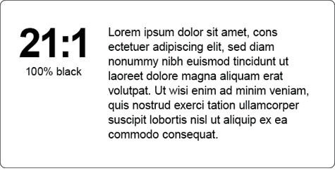
Contrast is a big deal in accessibility. But here’s the catch: Too much contrast can cause eyestrain (Figure 4)—think black on white versus charcoal on ivory. One screams, the other whispers.
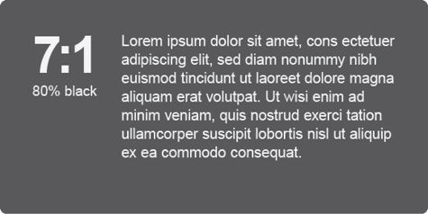
Go for contrast that’s high enough to be readable but not so intense that it blinds people (the AAA standard of 7:1 is perfect for this; Figure 5).
- Stick to a minimum contrast ratio of 4.5:1 for normal text.
- Avoid using color alone to communicate meaning. (For instance, don’t just say “the red text.”)
- Be wary of light gray on white, pale yellow on cream—you get the idea.
Quick Ways to Check Your Type
Not sure if your text is easy to read? Try this:
- Zoom out. Can you still tell what’s going on?
- Read it on a phone, a laptop, and a printout.
- Use a screen reader to test structure and flow.
- Ask someone who wasn’t involved in your project to give it a once-over.
- Run it through a color contrast checker.
Be Kind with Your Type
You don’t have to be a typography nerd to care about accessibility. You just need to be thoughtful. When you choose fonts that are easy to read, space your lines generously, keep your layout clean, and let people customize things, you’re making your content better—for everyone.
Commenting is easier and faster when you're logged in!

Recommended for you

InDesign Magazine Issue 94: Special Characters
We’re happy to announce that InDesign Magazine Issue 94 (February, 2017) is now...

The Inspired Type Designs of Sofia Mohr
Sofia Mohr has been very busy the last few years. This Brazilian architect, who...

Creating Instant Charts With Chartwell
You can create charts and graphs on the fly from live text with the ingenious fo...