Quickly Create Yearbook-like Image Spreads
Learn the fastest ways you can quickly lay out page after page of same-sized images in InDesign.

MLee wrote,
I am designing a pictorial directory (like a high school yearbook) using InDesign. Is there a way to auto fill the pics to the frame?
Technically, this e-mail has just one specific question (“possible to change Fitting defaults?”) but it’s hard to resist the real underlying question, “Is there any way to automate this nightmare?”
Sure, there’s a way to “auto fill the pics to the frame” in InDesign-provided you’re using InDesign CS3 or CS4. It wasn’t until CS3 came along that we got the Frame Fitting Options dialog box (in Object > Fitting). You can use this to preset how an image will fit an empty image frame.
So, you can drag out a bunch of empty image frames on your master page (assuming you need to do more than one pictorial page), select them all, and assign the Frame Fitting Option you want. If you choose “Fill Frame Proportionally” or “Fit Frame Proportionally,” any image you place into the frame will automatically do just that.
If this were my job, I’d configure a single empty image frame manually (fitting option, stroke, drop shadow, text wrap, etc.), use it as a source for a new Object Style, and then make sure all my pictorial frames on the master had that object style applied. That way I could easily change how all my pictures looked just by editing the object style, should I ever need to.
(Although CS2 had object styles, it didn’t include the Frame Fitting Option attribute because it hadn’t been born yet.)
Now just create enough empty document pages based on that master required to hold all your images. Go to the File > Place dialog box, shift-select all the images you want to place, and then click OK to load them up in your Place gun. In a few seconds you can just click, click, click away, one click per frame, to bring in each image and have it automatically fit as you specified.
Tip: If you zoom out to see multiple spreads, you can unload all your images, page by page, just with a rapid series of clicks.
One thing about that “click click click” … regardless of the order you select your images in the Place dialog box (perhaps you selected by Last Modified Date), as soon as they’re loaded into the Place gun, InDesign re-sorts them in alpha order by filename. In the Place gun loaded with multiple images, the thumbnail preview labeled “(1)” is the one whose filename comes first in the alpha order, even if you selected it last in the Place dialog box, thumbnail “(2)” is the next one alphabetically, and so on.
So, if you’re trying to quickly lay out a series of head shots in alpha order by last name, and you want to be able to quickly click-place row by row, make sure the filenames for your images are already in alpha order (such as Smith_John.tiff instead of John_Smith.tiff). Otherwise you’ll need to scroll to the correct location for each image before clicking to place it in its frame, or use your Up and Down Arrows to cycle through the thumbnails to get the one you want “on deck” before clicking.
Two more options for automatically placing images in pictorial layouts are DataMerge and the InDesign Contact Sheet script in Bridge (free with CS3, available for $25 for CS4). I hope you don’t mind following those links for more info, because I want to jump right into two CS4-only features that could speed this up even more.
Even Faster in InDesign CS4
One of my favorite new features in InDesign CS4 is how, when your cursor is loaded with images to place, InDesign’s new default behavior is both “fit frame to content” and “fit content proportionally.” Clicking on the page places the image at 100% with a kiss-fit frame as in earlier versions. What’s new is that dragging out a custom frame as you place results in a proportionately-scaled image that perfectly fits the frame. If you drag out a little frame, you get a little image, a big frame, a big image. But always proportional and always kiss-fit.
So, if all the images you need to place are the same size (or share the same width/height proportion), you don’t need any image frame placeholders to do the pictorial job in InDesign CS4. Just set up a guideline grid on your pages, load the cursor with the images to place, and drag out a series of same-sized image frames on the fly, snapping to the guidelines as you go.
If the images aren’t the same size or proportion, hold down the Shift key as you drag out consistently-sized frames. The Shift key lets you drag out a frame of any proportion (tall and skinny for example, even for a landscape image) while placing an image. As long as the proportions aren’t too far off, the images still look fine, because in CS4 they always come in proportionally scaled to fit the frame. You’ll just end up with a little extra frame area to the right or below the image.
For the ultimate in speed layout of picture grids, though, you’ll want to use the new Contact Sheet Place feature. You load multiple images into the Place gun as normal. But instead of dragging out images frame by frame as I just described (which could get mighty tedious), you can just drag once on each page, and InDesign creates the individual image frames for you, each one the same exact size, each containing a proportionally scaled image.
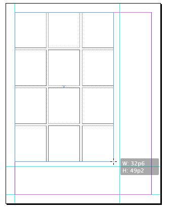
Here I’m dragging out a contact sheet of twelve images (in a 3×4 grid) onto a page:
You can’t see the images yet (they’re loaded into the cursor) but as soon as I hit that guideline intersection I’m aiming for, and release the mouse button, InDesign fills each of the image frames with a proportionally-filled image.
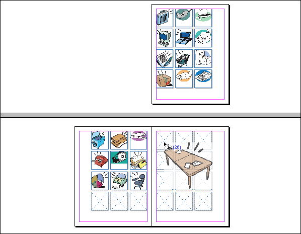
See how my cursor reverted to the normal Place gun? It shows I still have some images to place. I can just go to the next page in my document and continue dragging out contact sheets, page after page, each drag resulting in a perfectly sized grid of twelve images. Now that’s fast!
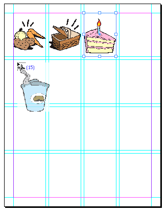
To go into “contact sheet mode” in CS4, load the cursor with images from the File > Place dialog box and then hold down the Command and Shift keys (Control and Shift on Windows). The cursor changes to a grid preview (greatly enlarged here):
Start dragging the cursor diagonally, beginning at a corner of the page area where you want the grid of images to appear, and the grid preview grows as well. Drag until the contact sheet preview covers the area you want to fill up with images. (As soon as you start dragging you can release the modifier keys; you’ll remain in contact sheet mode. But keep that mouse button down – as soon as you release it, the images get placed in whatever contact sheet arrangement is in effect. Undo if that happens by accident.)
Sometime during your drag, you’ll probably want to use the arrow keys on your keyboard to define the number of rows and columns of image frames in your grid. The Up and Down Arrows change the number of rows, and the Left and Right Arrows change the number of columns (remember, keep the mouse button held down while you tap the keys). The contact sheet preview updates to reflect your changes. The size of the image frames is completely dependent on the the number of rows and columns, the amount of space in between each image, and the size of the area you drag out. but InDesign will always put 9pt (.125″) of space between the images
By default, InDesign adds a gutter of 9 pt. (.125″ or 3.175mm) between each image in all directions, but you can adjust that while dragging out the contact sheet. Use the Page Up key to increase the measure and Page Down to decrease it. To limit your adjustments to just the horizontal or vertical spacing, use Shift-Left/Right arrow or Shift-Up/Down arrow, respectively. [You can thank the commentators on this post for these tips! –AMC]
When you’ve got the rows/column number set, finish your drag and release the mouse button. The images get placed in the frames, as shown in my example above.
To continue placing more contact sheet’s worth of images, go to the next page and repeat the Command/Control-Shift drag (assuming you still have images loaded in your cursor … if not, go back to the File > Place dialog box and grab some more). InDesign remembers the most recent settings for columns, rows and gutter measures in your contact sheets, so assuming each page should have the same number of pictures in it, you won’t have the tap the arrow keys again, and the rest of the job goes very quickly!
This article was last modified on December 19, 2021
This article was first published on February 2, 2009


Hi all, a couple of things I cant quite figure out.
The yearbook I’m working on, the content box needs to be 231.5mm wide. When I do the image catalog, this defaults to A4 with a 12.7mm margin…
Also, why does it default to points measurements instead of metric, when my settings in preferences are metric.?
Cheers
Ross
I think the image filling is really a great idea.
I accidentally pressed pagedown until the gap was 0 and pressing pageup didn’t work to increase the gap… So I was forced to use the other method (shift+left(right) arrows) and I found out that I can overlap the pictures if I want to… Useful if you ever need to feather them all..
I have a process where I need to fill tables with many images same dimensions 1 x 1 with a caption. I create the table and end up placing/pasting an image into each cell one by one. Is there any better way to do this?
Bob, thanks! Did you see the first comment (by Somerset) as well?
I updated the blog post to reflect these two great tips.
You can also change the spacing between items in a contact sheet grid. While you’re dragging out the grid, use the Page Up and Page Down keys to change the spacing between the items. On a Mac laptop, Fn+arrow key simulates Page Up/Page Down.
This is also an excellent use of scripting. I have created an AppleScript to do this, originally done in Quark and updated over the years. An Alpha release of the script is available at scriptbuilders.net under the nameA Better Contact Sheet.
I am currently working on an update for CS3 with a UI which will make it a lot more user friendly with customizable page sizes, layout, labeling, and scaling. One feature that it has at the moment that might be of particular interest is to place a folder of images (including nested folders) at 100% with a routine that “packs” them into the page to maximize the available space. It’s not perfect but it does save a lot of time.
I have not had my hands on CS4 to play around with the new features yet so I’m not sure how to make it better than the included features. I hope to get a copy of it soon to play around with.
Since I lost my job as a book designer I am hoping to polish this up into a full fledged Mac application that I hope to make some money on. If anyone is interested in this or has some feedback on what might make it work better for you please visit my web site and send me comments. If you have ideas for other things that could be automated to save time send me those as well.
@Anne-Marie: “A saving grace is that even while the Place gun is loaded with images, you can still select items (with the Command/Ctrl key held down temporarily) and choose things from panels and menus.”
Another cool thing is that even when the Gun is loaded, you can save and close your document. When you reopen it, the Gun is still loaded. (Provided you don’t do anything to unload it).
Somerset, excellent discovery! Thanks so much for that.
While I’d like to see some sort of Preference or panel control over the dimensions of contact sheet elements, what I’d LOVE to see is the ability to create a default object style for image frames themselves, as we can for text frames and “graphic” frames (content type = Undefined). We still don’t have that, and I can’t figure out why. And it’s especially important to use styles when you’re placing dozens or hundreds of images.
With image frames, you can only apply a style after the fact, after the frame is on the page. This works fine when you’re placing empty image frames on the master page; it’s just one extra step and then all the images on the document pages have that style applied automatically. But for all the other solutions I talked about, the ones where you drag out image frames on the document pages, you have to remember to go back and apply your object style to each image afterwards. Blech.
A saving grace is that even while the Place gun is loaded with images, you can still select items (with the Command/Ctrl key held down temporarily) and choose things from panels and menus. That makes it easier to include an “apply object style” step to images on the page before you go on to the next page to continue placing.
At least with the CS4 Contact Sheet feature, as soon as you drag out a contact sheet, InDesign selects all the frames of the images it just placed. A quick click on an object style name applies it to the selection, and you can go on to the next page.
Oh that’s way better than the “overlap all the images at 100%”, i.e., place all feature from Cs3.
Nice little function, and it negates the script that I was using (I think it came with cs2 and cs3?)
That is fantastic actually. Really looking forward to getting CS4 when I eventually get my way with the powers that be… nearly there.
Nice posting! Yes, the new Contact Sheet Place is splendidly efficient. And thanks to Somerset for finding those obscure Shift-arrow commands for also changing the gutters!
But of course, all this can also be accomplished with Data Merge, which gives real power also to things like well-designed caption formatting — although that first requires a database file, so it’s not a quickie method. But if I had a yearbook or a product catalog to do, with hundreds of pics and names and dates, etc., the time spent on the database creation would be worth it.
And don’t forget that once you use the Contact Sheet placement, you can then use the Label Graphics script to name all the pics.
I love the contact sheet mode. I use it all the time. I agree, however, that it would be helpful if there were some reasonable U.I. for it, including various measurements.
I just grabbed 120 images in the Place dialog box and created 6 pages with 20 images on each one in 2 minutes. No template needed. Love it!
After some experimenting, I found that you CAN change the distance between the images!
While dragging out the grid, press shift+ left or right arrows to change distance between columns and shift+ up or down arrows to adjust spacing between the rows (all without releasing the mouse button, of course).
This also seems to be a “sticky” change as the next time you try to drag out a grid it remembers the modified spacing. Too bad there isn’t someplace where it gives the dimensions so that you can be sure to get the ones you want.