


Radiating Shapes
You can easily create rays of light or radiating graphics such as the background in Figure G with the Polar Coordinates filter. To try it out yourself, create a new document that’s 3 inches by 3 inches at 200 ppi. Make a new layer and then select the Rectangular Marquee tool. Draw long rectangular selections as you can see on the left in Figure H. If you want your rays to be irregular, draw lines of varying widths. For regularity, make them all identical in size and in spacing. Then fill the selections with black and deselect them. Once you’ve done that, choose Filter > Distort > Polar Coordinates. In the re-sulting dialog box, choose the Rectangular To Polar option button and then click OK. You’ll have a radiating shape similar to ours on the right in Figure H.

Figure G: Radiating shapes can fit into a wide array of designs.
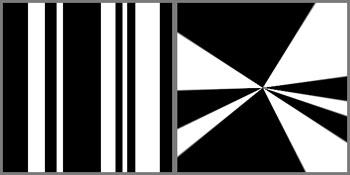
Figure H: You can transform straight lines into rays using the Polar Coordinates filter.
To complete our ray effect in Figure G, we created different radiating shapes by varying the line width and size. We then stacked them and used the Drop Shadow layer style to give them some separation. Next, we made each layer a slightly lighter shade of gray as it got closer to the top. Then, to give the rays some shine, we flattened the layers and applied the Plastic Wrap filter by choosing Filter > Artistic > Plastic Wrap. For the final effect, we applied a cyan Color Overlay. To do so, click the Create New Fill Or Adjustment Layer button at the base of the Layers palette and select Solid Color from the pop-up menu. Then select a color and click OK. Lastly, change the Adjustment layer’s blending mode to Overlay. You can see the various steps in Figure I.
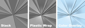
Figure I: We constructed our background by stacking different burst patterns.
Squares that are Hip
Squares are great design elements because they’re so versatile to work with as unifying elements, frames or perspective enhancers. We’ll show you two different effects you can create with filters that generate squares.
Add Perspective with Extrude
On first glance, the Extrude filter seems pretty useless, but it’s actually quite handy for gener-ating a sense of perspective, as we did in Figure J. To begin, create a new document that’s 3 inches by 3 inches at 200 ppi, and fill it with a variety of warm-toned colors. Then, choose Fil-ter > Stylize > Extrude. In the resulting dialog box, choose the Blocks option button, a Size of 40, a Depth of 255, the Random option button, and the Solid Front Faces check box. Click OK and the blocks randomly generate from the center, as you can see in Figure K.
To make the block shapes more dynamic, we outlined them with the help of the Glowing Edges filter. To do so, duplicate the Extrude layer and then choose Filter > Stylize > Glowing Edges. In the resulting dialog box, experiment with the settings until you get a nice bright outline and then click OK. To apply the outline, set the blending mode of this layer to Screen, as shown in Figure K.

Figure J: You can add depth to your graphics with the Extrude filter.
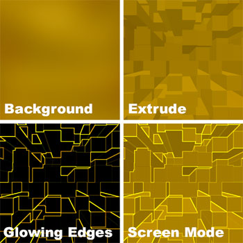
Figure K: The perspective cubes look more difficult to create than they really are.
Pixelated Effects
The basis of all digital images is the pixel, which is square. To make an image look pixelated, you only need to apply the Mosaic filter. In Figure L, you can see our original image as well as the pixelated version. Open a photographic image in Photoshop. To apply the Mosaic filter, choose Filter > Pixelate > Mosaic. In the resulting dialog box, select your cell size and then click OK. You can also apply the Mosaic filter to graphics. Or, if you want to blend from something pixelated to not pixelated, you can do so easily with a layer mask. Just make a copy of your original layer. Then apply the filter to your copied image and mask out any areas that you do not want to be affected so that the original image shows through.
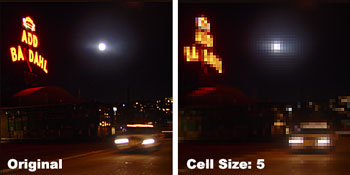
Figure L: The Mosaic filter is the easiest way to create pixelated effects.
Teched Out
Even though tech-style graphics are typically clean, using too many of the effects together can result in a Web site or a layout becoming dated very quickly. However, modifying them and in-corporating them into your own style could give you just the edge you need for your next project.

Creativepro.com readers can subscribe to Element K Journals at a discount. Click here to learn more.
This article was last modified on January 3, 2023
This article was first published on July 19, 2002
Commenting is easier and faster when you're logged in!

Recommended for you
Top Tips for Photoshop Book Now Available!
Twenty of our most popular Photoshop tutorials curated and collected in a conven...

Layer Tennis Returns Today!
As far as I’m concerned, Coudal Partner’s Layer Tennis justifies the...
Using Perspective Warp in Photoshop CC
The big news in the latest Photoshop CC update is 3D printing—at least, that’s t...