
Painter How-To: Paint with Artists' Oils
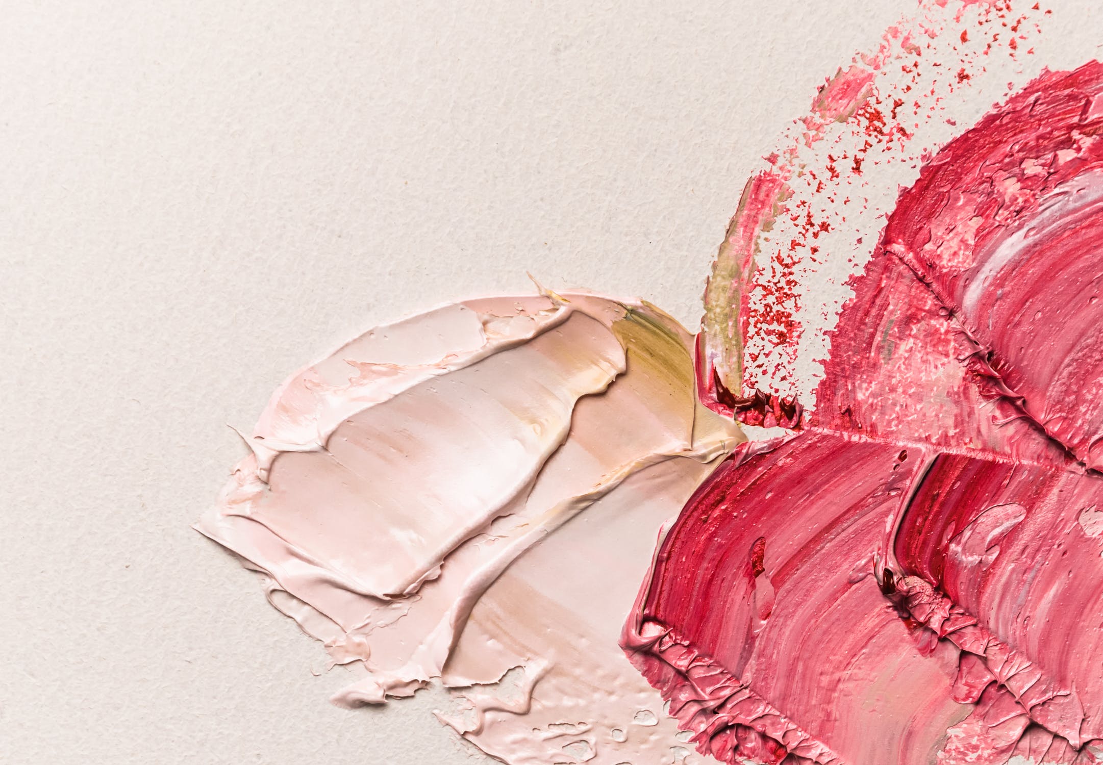
A new set of brushes in Corel Painter IX offers the most realistic painting experience yet available on the computer. These brushes, the new Artists’ Oils, provide an unparalleled look and feel of traditional oil paints.
Each stroke you make with Artists’ Oils brushes applies paint just as a real paintbrush would. Your stroke has a limited amount of digital paint that gradually fades until it ultimately runs out. The strokes you’ve painted on the canvas smear and blend with the strokes you place on top of them.
These brushes are also made to work extremely well with the Mixer. Picking colors feels just as it would if you were picking up dabs of paint from a traditional palette. There is even a new multicolor eyedropper tool in the Mixer that lets you pick up two or more colors with the brush and apply them to the canvas.
Because of the new feel and behavior of these brushes, you may want to check the descriptions of the individual controls in the Corel Painter IX user guide so that you understand what they do to your stroke. Not only is there a new set of controls just for the Artists’ Oils, there are also six new brush tips created only for these new brushes. When you become familiar with these settings, you can customize any of these brushes to suit your own method of painting.
This tutorial shows how I use these new brushes to paint an image that accurately mimics the appearance of an oil painting.
I must admit that when I first started to paint with these brushes, I was somewhat uncomfortable with their feel and how they applied the paint. Just picking any brush to create a painting did not work well for me. I recommend that you do the following when you begin to use Artists’ Oils:
- Create a new document that is about 1200 x 1200 pixels. Any size will do, but this size is convenient for working with the default brush settings, and it gives you a stroke that is big enough to show what is happening.
- Methodically select each of the new Artists’ Oil brushes, and make a stroke on the canvas. If you do this in a methodical way, say left to right and starting with the first brush in the set, it will be easier to keep track of which brush created which stroke. You will probably need to label each stroke, because some of the brushes do not apply paint but just move paint already laid down on the canvas. Figure 1 shows the example of the test canvas with strokes applied.
- As you find brushes that you like, drag them off into a custom palette for future use. In the corner of Figure 1, you can see the custom palette I created with the brushes that I found interesting.

Figure 1.
In this tutorial, I will be painting a caricature of a rather burly fellow.
To begin, I scan in a sketch from my sketchbook. The image is 2000 pixels high by 1400 pixels wide. This size provides an image that is small enough to work on quickly and large enough to get a good level of detail (Figure 2).
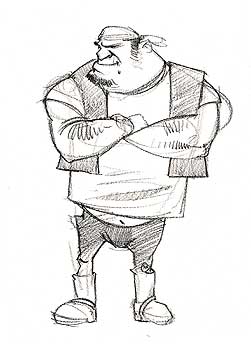
Figure 2.
I select the entire image and cut the image and paste it back into itself. I then change the composite method of the new layer to Gel or Multiply. This turns the white of the layer transparent while leaving the sketch visible. I fill the background layer with a dark brown color. I choose this color carefully to go with the colors I will eventually use to paint the image. I drop the layer onto the canvas and save the image (Figure 3).
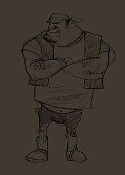
Figure 3.
I create a palette of color in the Mixer that I want to use for this image. I put thought into creating this Mixer since I will not be using the color wheel when picking colors for this image. Once the colors are chosen, I block in the major areas of color and value in the painting, just as I would if I were using traditional oil paints. In this case, I am using the Dry Brush variant of the Artists’ Oils. Figure 4 shows the initial block-in, my mixer palette, and the custom palette of brushes that I will be using throughout the painting.
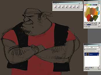
Figure 4.
I continue to block in the major areas of color. I am not worried about blending the colors at this point, nor am I worried about the fact that I am covering my original drawing. Painting is not filling in the lines. My goal is to establish the general feel for the painting (Figure 5).
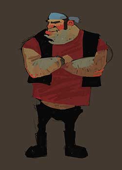
Figure 5.
I begin to blend some of the colors together. I am also particularly fond of the Artists’ Oil brushes that have the impasto feature enabled. With the Impasto Oil brush, I begin to paint smaller areas of color. Figure 6 shows this work in the face area of my character.
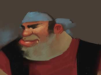
Figure 6.
I find that the shorter, choppier strokes work best for me when I start painting smaller areas of color. I also begin to paint some of the background. I love the look that the Impasto effect adds to the look of the paint (Figure 7).
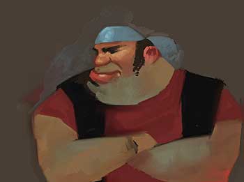
Figure 7.
I start to paint down and around the rest of the figure. Because of the way the paint is applied and how it interacts with the underlying colors, I paint the color more intensely than I think I need to — it will blend with my colors that are already applied. Notice how intensely the reds in the ear and lips are painted (Figure 8).

Figure 8.
As I paint the figure with these brushes, I try to keep my strokes painted across the form. In other words, I paint these strokes perpendicular to the major axis of the form being painted. This approach, which helps keep the form looking round, is very noticeable in the right arm of the man (Figure 9).
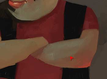
Figure 9.
As a general rule, I use only two brushes in a painting. It is usually a good idea to use only a few brushes or brushes that have very similar characteristics. Using too many different brushes produces a random and unprofessional look. In Figure 10, I start to add some of the background around the figure’s feet as well as more intense work in the shirt.
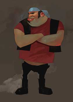
Figure 10.
I move back to the face and continue to add in details. I do additional work in the bandana around the character’s head. Notice how short the strokes are in the chin and cheek area (Figure 11).

Figure 11.
I start working down and across the figure, specifically in the shirt and vest. Notice the bright red used in the shirt (Figure 12).
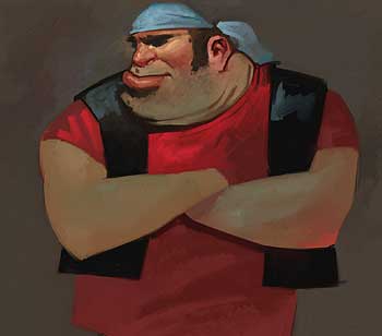
Figure 12.
Using larger brushes, I paint more color into the background. Note that I use some flesh colors in the background and some background color in the figure — this helps unify the painting. I paint the belt buckle and some dark color into the black pants. If you look closely, you can see some reds in the right side of the pants close to the belt. I am trying to keep the overall feel of a real painting. Part of doing this is not overworking the edges of individual objects (Figure 13).

Figure 13.
The painting is mostly finished at this point. As you can see, I have not tried to blend everything down to a smooth surface. This is very noticeable in the bright reds of the shirt. In other areas, I have left large strokes to indicate the forms. This is noticeable in the elbows and lower areas of the shirt. In the background, I have applied the strokes to help emphasize their dimensional qualities (Figure 14). I’ll add a few more subtle steps, and then I’ll be done.
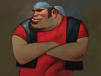
Figure 14.
I decide that I would like the brush strokes to be more defined and noticeable, particularly in the background. In Corel Painter, I can accomplish this easily, without having to repaint the image. I simply select the entire image, copy the image, and paste it back in the exact same space using Shift + Ctrl + V. This doubles the impasto effect over the entire painting and creates just the look I was hoping to achieve in the background areas. The only problem is that my image now has too much texture in the face because the impasto effect has also been doubled here. Fortunately, there is an easy solution to this problem, and that is to select a brush from an entirely different set. From the Impasto Brushes, I select the Depth Equalizer brush, and using light pressure on the stylus, I remove some of the exaggerated impasto effect on the new layer (Figure 15).
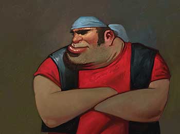
Figure 15.
Figure 16 shows the painting at this point.
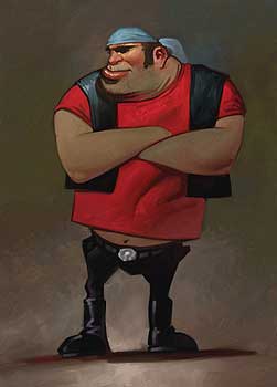
Figure 16.
There’s one last step to add a little contrast and interest to the painting. I drop the layer so that I have a flat canvas, and I apply a lighting effect. When applying a lighting effect, I make sure that the direction of the light is similar to the light direction of the impasto strokes. Figure 17 shows my completed painting.
Figure 17.
I hope this tutorial encourages you to give these new brushes a try. They take some getting used to, but the Artists’ Oils in Corel Painter IX are fantastic painting tools that can open a window to many new creative possibilities.
This article was last modified on January 3, 2023
This article was first published on September 15, 2006
Commenting is easier and faster when you're logged in!

Recommended for you
Do-It-Yourself Glitch Art
Here’s something perfect for a Friday, or any day when productivity isn...

How to Rescue a Poorly Lit Image with Photoshop’s Shadows/Highlights Adjustment
Photoshop’s Shadows/Highlights adjustment is the perfect tool for rescuing...

Better Tools for Tones: Why I Don’t Look at the Histogram
The histogram—the graph of tonal levels you see in photo-editing software—helps...