
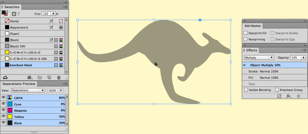
Overprinting Options
Multiply? Overprint? Darken? What’s the difference? And how do you choose the method that will give you the results you want in your print job?
This article appears in Issue 83 of InDesign Magazine.
As a prepress operator, I regularly inspect artwork supplied by clients to make sure that it’s fit to print. And I often notice that they’ve used the Multiply blending feature to make an object overprint its background, when simply applying an overprint from the Attributes panel would have done the job.
By itself, this is not a big issue, but it’s important for InDesign users to understand that the Multiply feature is not the same as the overprint attribute. The purpose of the overprint attribute is to enable an object assigned with a specific color to overprint (that is, print on top of the objects behind it without “knocking out” the colors underneath it). Multiply, on the other hand, is a blend mode that uses a mathematical formula to determine the color of an object’s contents based on the colors underneath the object.
Because It’s Convenient!
I understand that the Multiply option is convenient in certain circumstances. For example, if a logo needs to overprint, but the logo is an Illustrator file, you can’t apply the overprint attribute to it. But you can apply a Multiply or Darken blend to the image to achieve an overprint-style effect. Of course you could always open the Illustrator file and set the appropriate overprints where required, but that is time-consuming in comparison to applying a quick fix in InDesign.
In Figure 1, you can see how the Multiply setting determines that the entire graphic will overprint—including the white items depicting the mouth, eyes, and borders of the arm. In contrast, while manually applying overprints may be time-consuming, it provides the artist with more control over what should and should not overprint.
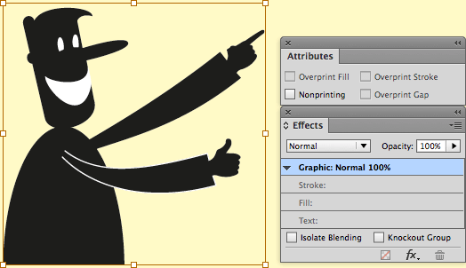
Figure 1A: An Illustrator logo placed
into InDesign. Note that both overprint checkboxes are grayed out.
1B: The same logo with a Multiply effect applied. Note that the white portions of the logo have disappeared.
Pros and Cons of Overprint
In general, I prefer using the overprint attribute rather than a Multiply blend mode. But there are pros and cons of each, so I’ve prepared a list of issues that you should be aware of.
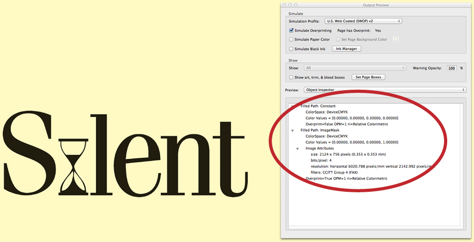
Acrobat level 4 flattening on line art may lose quality
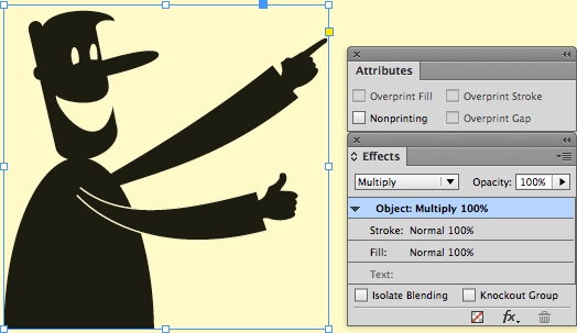
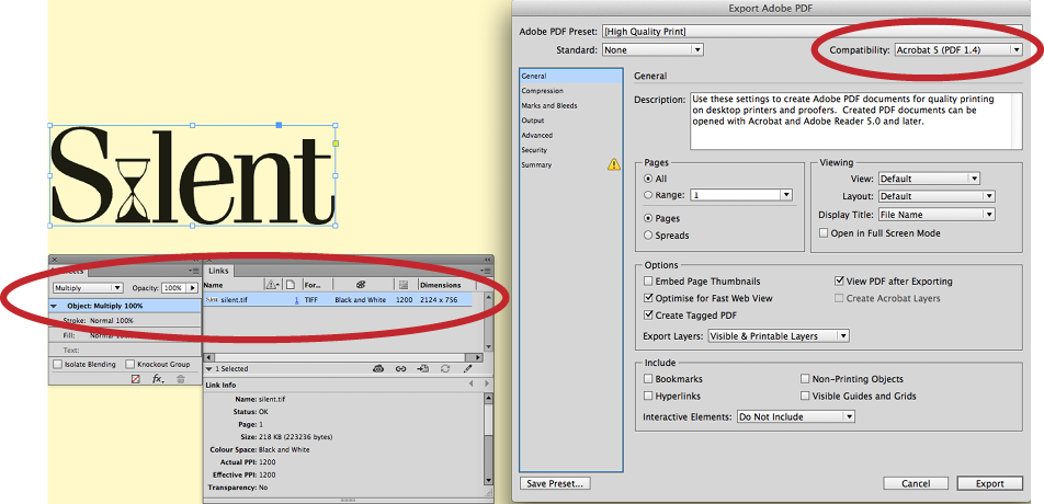
If any blend effect (such as Multiply or Darken) has been assigned to a bitmapped line art image to make it behave like an overprint, an unwanted consequence can occur if you are exporting to PDF with Acrobat 4.0 compatibility. I have written about this before, but it bears repeating: this operation turns high-resolution line art scans into CMYK scans that then get treated as halftone images in a RIP, losing any definition that was in the original high-resolution line art scan. Worse, it loses even more quality if any resampling is applied within the PDF export setting (Figure 2).

Figure 2A: multiply effect applied to a high-resolution line art logo in InDesign and a PDF export setting that will flatten the PDF.

B: The output PDF in Acrobat; the image has been downsampled and converted to CMYK.
C: Overprint-only applied to the same logo and a PDF export setting that will maintain transparency.
D: The output PDF in Acrobat; no downsampling has occurred.
(Continued on next page)
E: A multiply effect applied to a line art logo and a PDF export setting that will maintain the transparency.
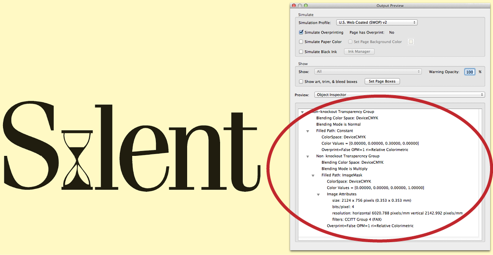
F: The output PDF, with no loss of resolution in the image.
Considering that print workflows based on the latest Adobe PDF Print Engine can process PDF/X-4 jobs natively without flattening artwork or converting to PostScript, this should not be a widespread issue. However, it is worth noting that two of the six default PDF export settings in InDesign—PDF/X-1a: 2001 and PDF/X-3: 2002—do use Acrobat 4.0 Compatibility and will resample these kinds of images.
The two functions compete—and both lose
While it is possible to apply both an overprint and a transparency setting to the same object… just don’t. Doing so can create colors that shouldn’t be there. Take the example of a red solid meant to overprint a 30% yellow background (Figure 3). Everything is fine until the red spot-color visibility is hidden in the separations preview, and suddenly the 30% yellow background has increased to 51%.

Figure 3A: A spot-color vector within InDesign with both an overprint and Multiply effect applied above a 30% yellow background. Note the position of the cursor and the separations preview values.

B: The same image, with the spot-color channel hidden; a denser yellow appears, instead of a consistent 30% yellow background.
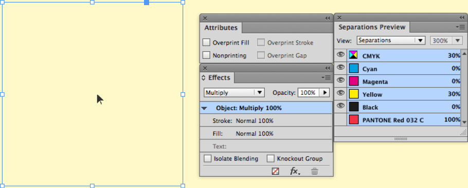

C and D: The same image when overprint or multiply is turned off.
This is because a Multiply effect and overprint are applied at the same time. If the multiply effect is removed, the color returns to normal. Likewise, if the multiply effect remains but the overprint is removed, the color returns to normal.
Default Black Overprint can create colors that weren’t intended
This issue is similar in nature to the previous one. Here, the 50% black box has to overprint the 30% yellow background. Several instances using different variations on colors, blends, opacities, and tints have been created, and in most instances the methods all worked. An exception was where the color of the 30% yellow increased to 41%. Why? The Attributes panel shows no overprints present, so the earlier behavior of Multiply and overprint being applied at the same time isn’t happening, right? Well, no… One look at the handling of black within the Preferences dialog box reveals that the [Black 100] color is set to overprint (Figure 4).

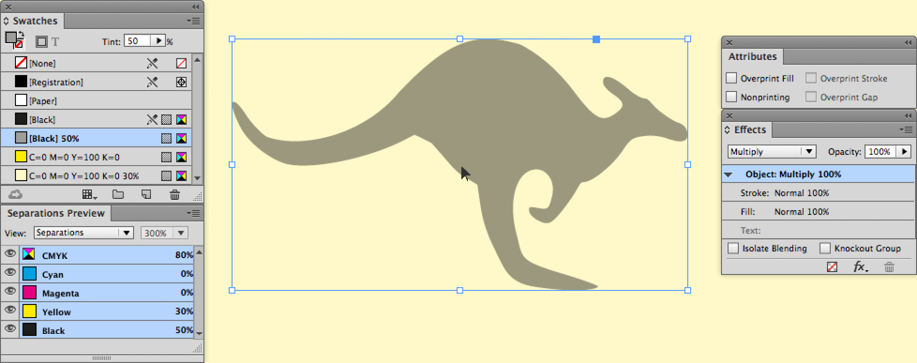

Figure 4: A–C, the desired output, using three separate methods.
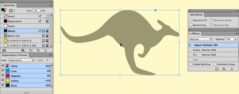
D: Notice the unwanted higher yellow component in the separations preview.
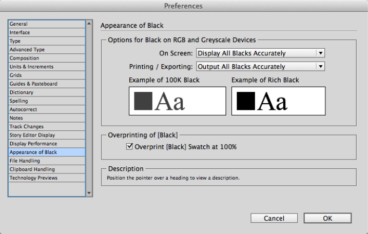
E: The Appearance of Black panel in the Preferences dialog box.
F and G: The solution and outcome
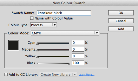
To maintain the Multiply effect but fix the increased yellow background in this example, there are two solutions: either turn off the Black Overprint option in the Preferences panel, or make a new black swatch with a different name (for example, “knockout black”).
More information on the “knockout black” workaround can be found here.
Use Darken instead
Darken is another blend mode that can behave in a similar way to both the Multiply blend mode and the overprint attribute. It does have one important difference: when applied to an object above another object, the color will change to the darkest elements of both objects but go no further. Take the maroon box and gray boxes in Figure 5. The gray box needs to be 40% where the two boxes overlap. The maroon color has a 40% black within the color breakdown, whereas the gray is a 20% black. If the overprint attribute is applied to the gray box, the red in the overlap is unexpectedly lighter, at 20%,—not the desired result! However, if the overprint attribute is removed and the Multiply blend effect applied, the maroon now becomes darker, but again, that is not the desired result—the maroon should stay the same color. To achieve this, the Multiply blend effect is removed and the Darken effect is applied, and suddenly the overlap matches the maroon box, as intended.
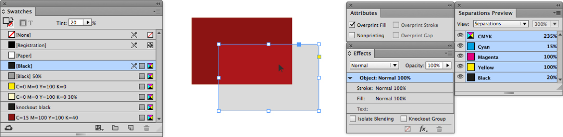
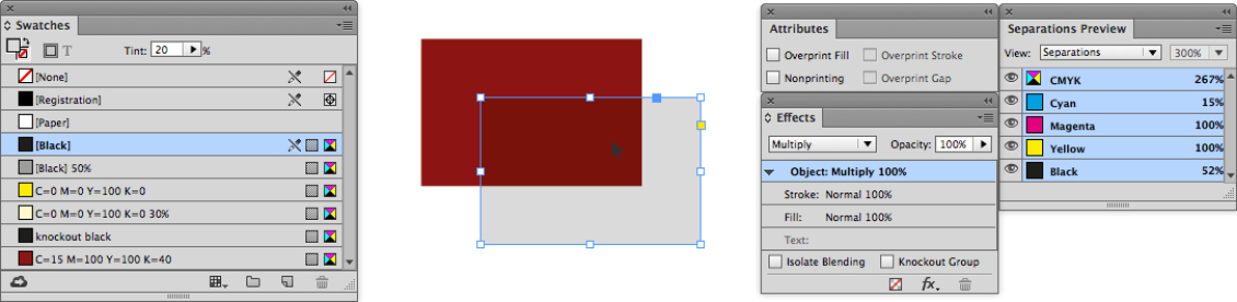
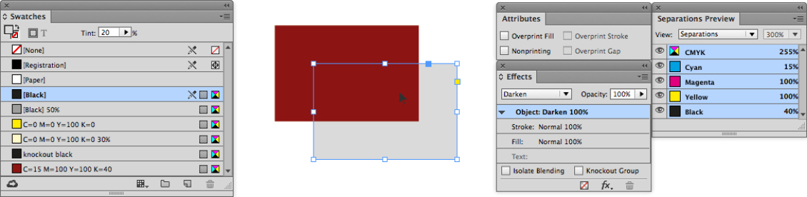
Figure 5: An overprint in this instance will lighten the color (top), Multiply will darken the color (middle), Darken achieves the desired color (bottom).
In situations such as this, where the overprint attribute cannot be applied or yields an unusual result, then the Darken blend mode may be more appropriate.
Blend opacities make a difference
Using the last example, the gray color is a tint of the [Black]. However, if the gray is made of 100% Black and the opacity of the Darken effect is turned to 20%, the gray is 20% but the overlap now mimics the Multiply effect (Figure 6). To make sure it isn’t an earlier “black overprint” issue, the fill is changed to the “knockout black” color, but the result is the same.

Figure 6: Reduced opacity and the Darken blend mode achieve a similar effect to using the Multiply blend mode and lowering the tint value of a swatch (as shown in Figure 5).
The math can be confusing
Take two objects with the same Multiply opacity of 100% and fill of 50%. If these two images are overlapped, what is the resulting color? The Separations Preview panel indicates 75% (Figure 7a). Assuming that InDesign is taking the 50% fill from the object on the bottom, and then adding 50% of the 50% fill of the object above to give 25%, therefore creating 75%. Using that logic, if both of the 50% values are changed to 40%, the fill color of the overlap should be 56%… but the Separations Preview panel says it is 64% (Figure 7b). So that observation for working out the overlap color is incorrect.
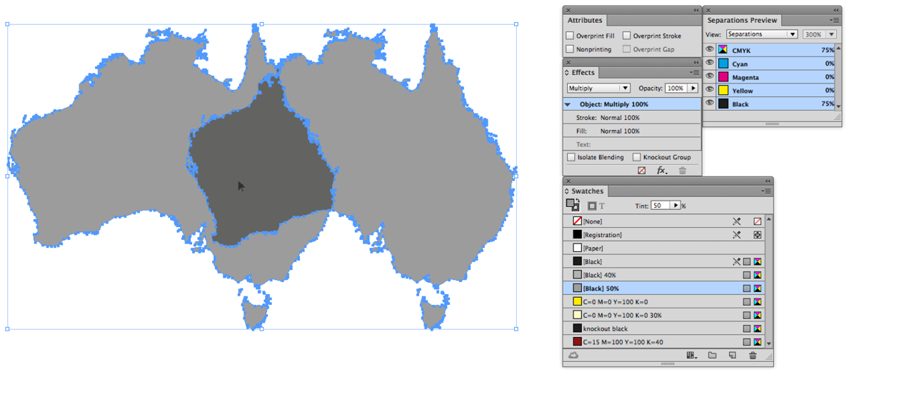

Figure 7: Both objects have a multiply effect, but the mathematics to determine the overlap color value are inconsistent using an initial observation.
The correct formulas to determine all blend modes can be found here. Be warned, it is not for the faint of heart.
It is worth highlighting this because it is not uncommon for designers to create logos using Multiply effects to generate overlap colors. However, if color precision is key, it is worth creating the colors from known swatches rather than using the blend effects. This is especially true if the logo is to be made from spot colors… and this provides a segue to the next issue.
Multiplying spot colors
David Blatner has written about InDesign’s problems displaying spot colors involved with overprinting or transparency effects, and how the high-resolution preview does not necessarily provide an accurate representation of what a finished printed product will look like. Instead, turning on Overprint Preview is the key to getting a more accurate onscreen representation.
Figure 8 demonstrates this phenomenon in action. It features a solid spot background with the same spot color used for the type. The type has a Multiply blend effect applied, and when viewed with the high-resolution preview, the type can be seen. However, when the separations preview is turned on, the type disappears, and this is how the end result would appear as a PDF.
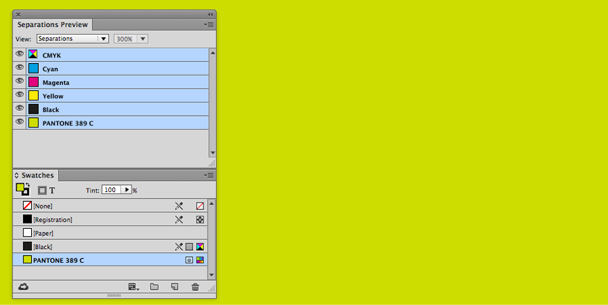
Figure 8: The high-resolution preview (top) makes it appear possible to multiply a solid fill of a spot color above a solid fill of the same spot color. With Overprint Preview (or Separations Preview) turned on (bottom) you can see how it will print or export to PDF.
Overprint Preview also shows other features that are not necessarily visible in high-resolution preview, such as blend effects that do not work with spot colors.
Unexpected intervention from RIP software
Despite all best intentions of creating the artwork carefully, sometimes issues may arise when a third party is printing the artwork.
Some Raster Image Processing (RIP) software used by printing businesses to impose and prepare printers’ plates or digital prints can override the blend and overprint settings in PDFs created using any software, including Adobe InDesign. So it is very important to communicate with your printer and have a clear understanding of how overprints will be handled. If you get proofs, make sure to ask if they accurately reflect the overprint settings used in the final job.
What to do
The purpose of this article is not to try and force users to stop using Multiply when an overprint attribute would work just as well, but rather to highlight the issues that can arise by using Multiply for a task it was not intended to do. Here are a few takeaway points for you to remember:
- Try to use the overprint attributes instead of Multiply or Darken where appropriate.
- If a transparency blend effect is required, use either the blend effect or overprint; do not use both at the same time.
- Be conscious of unwanted colors produced by InDesign’s black overprint preference.
- To make a color lighter, know that adjusting its opacity directly influences the colors underneath the adjusted color.
- Rely on the Overprint Preview rather than the high-resolution preview.
- Clearly communicate with your print provider to determine how PDFs need to be prepared for their purposes.
With those rules in mind, you’ll be far better prepared to create well-built color documents, ready to print.
.
Commenting is easier and faster when you're logged in!

Recommended for you

Creating Light and Shade in Photoshop with Levels Adjustment Layers
Learn a great technique for making the subject match the background lighting in...

Free Webinar: InDesign Long Documents Tips and Tricks
Join us Friday, March 15 at 10 am Pacific for our 75-minute free webinar to disc...
