


Metamerism
The broadband response of our eyes’ cones is what makes color matching possible: It’s much, much easier to achieve samples that yield the same CIE XYZ values than to duplicate precisely the same spectral distribution. But this broadband response also contributes to a phenomenon that has plagued color professionals since there has been such a thing: metamerism. Metamerism is the phenomenon by which two color samples appear to match under one light source but differ under another.
The best way to grasp metamerism may be to consider an example. Figure 6 shows the spectral response curves of two color samples that appear to match quite closely under a D65 light source: The D65 source contains little energy at the longer wavelengths of the visible spectrum, where the sample reflects radiant energy the best, so the biggest apparent difference between the two samples is easily dispensed with.
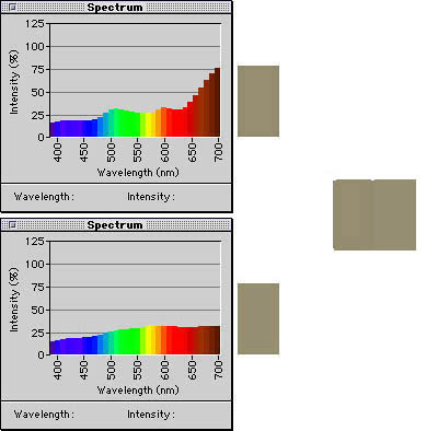
Figure 6: The samples represented above appear identical under a D65 light source, which contains little light in the longer-wavelength end of the visible spectrum.
Figure 7 shows the same color samples plotted in Figure 6 as they would appear under incandescent room lighting. Incandescent light contains more energy at the longer wavelengths and less at the shorter wavelengths than does D65, so the first sample (which reflects more of the longer wavelengths than the second) appears redder under this lighting.

Figure 7: The same samples shown in Figure 6 as they appear under incandescent room lighting.
Like it or not, virtually all the color matches we create are metameric in nature: They are dependent on the light source. The metameric nature of color matching is the main reason color proofing is typically performed using controlled lighting — usually D50 in the United States and D65 in Europe. It’s also the main reason color matches in reality are often less successful than theory would predict.
The artificial light sources used in proofing booths typically produce the correct XYZ values for D50 and D65, respectively, but the spectra of these light sources are almost invariably less smooth than that of true D50 or D65 daylight. Other artificial light sources, such as the incandescent and fluorescent lamps we typically use for indoor lighting, usually produce very different spectra from either true D50 or D65 daylight, or the artificial equivalents we use for proofing. A printed piece that looks good under proofing lights may not nearly as good when you hang it on your living room wall.
Additionally, papers and inks that employ fluorescent compounds can create problems, because most spectrophotometers use light sources with no appreciable ultraviolet component. The fluorescent compounds used in inks and paper are excited by UV radiation, and emit visible light in response. As a result, they may appear substantially different to the eye than they do to the spectrophotometer when viewed under light sources that contain UV.
Enough Already
It’s easy to get bogged down in theory and terminology when exploring the physics behind color. For the purposes of getting a better handle on color management, however, you’re doing just fine if you keep a few simple facts in mind. Most important, remember that color is something that happens in our heads, and that we cannot truly measure color. We can only measure the stimulus to which color is our response.
Second, bear in mind that practical, real-world color matching is highly dependent on the light source under which the match is judged. If you know your work will appear under lighting conditions that differ dramatically from the typical proofing lights used in the graphic arts industry, you need either to make adjustments or to be prepared for disappointment.
Third, the science on which color management is based is by no means a complete description of human color perception. We still have a great deal to learn, and the models we use today may on occasion produce results that our senses tell us are unacceptable. Tools such as spectrophotometers and color-management software can help us control and predict our color, but when the tools tell us one thing and our eyes tell us another, we should let our eyes be the final judge.
This article was last modified on July 18, 2023
This article was first published on April 25, 2001
Commenting is easier and faster when you're logged in!

Recommended for you

The Best Method for Outlining Fonts
If you must convert fonts to outlines for your print job, this is the best metho...
Update to PDFClerk Pro
SintraWorks is delighted to announce PDFClerk Pro 3.7, an update to their very p...
Making InDesign Work Like Illustrator: Multiple Artboards on One Large Pasteboard
Some people are used to the way Adobe Illustrator works and get frustrated with...