

During the recent Seybold Seminars, one of the few topics on which pundits and practitioners agreed is that Adobe Photoshop’s soft-proofing mechanism is broken. It is possible to produce accurate soft proofs in Photoshop, but the means of doing so aren’t particularly intuitive, and normal users are unlikely to stumble across the correct settings by chance.
One of the major misconceptions foisted upon the unwary by early proponents of color management is that it will make the colors of your printed output match your monitor. Unfortunately, this is physically impossible-your monitor can display many colors that CMYK offset printing can’t reproduce. If you want that gorgeous 0R-0G-255B blue that you see on your monitor to appear in print, the only way to get it is to mix a custom ink, apply it to paper, then wait a week or so for it to dry.
So the bad news is that color management can’t violate the laws of physics, which is what it would take to make your printed output match your monitor. What color management can do, and do very well, is soft proofing–which is simply a fancy term for making your monitor show you what your job will look like when printed. That way, you can make the job look as good as possible within the limitations of your printing process. This is actually the whole point of soft proofing, and it’s possibly one of the most valuable capabilities that color management has to offer.
Intent to Render
The problem with the way Photoshop handles color is that it uses the settings in the CMYK Setup dialog box both to convert RGB to CMYK (when you choose CMYK from the Mode menu), and to obtain the RGB values it sends to the monitor when you display CMYK files-the monitor is an RGB device, so there always has to be some conversion back to RGB to make a CMYK file display on screen. Ideally, we need separate settings for making CMYK files out of RGB files, and for displaying CMYK files in RGB on our monitors. Specifically, we need to use different rendering intents and different Black Point Compensation settings for making separations and for viewing them.
Rendering intents are simply different ways of handling out-of-gamut colors-those colors present in the source image that the target output device can’t reproduce. When we convert RGB images to CMYK for printing, we’re almost invariably going from a large color gamut to a smaller one. Hence we generally use Perceptual rendering when we make color separations, because Perceptual rendering compresses the gamut of the source space into the gamut of the target space in such a way that it preserves overall color relationships, and hence, we hope, the overall appearance of the image.
But when we view images that are already saved as CMYK files, we typically don’t want to use Perceptual rendering, or anything else that compresses the gamut further. At this point you may ask why, if the RGB gamut is larger than the CMYK gamut, would any gamut compression take place when you used Perceptual rendering to display CMYK?
Well, it’s true that the RGB spaces built into Photoshop (even Monitor RGB, should you be daft enough to use it) have a larger gamut than any CMYK space, but CMYK spaces generally contain some colors that are outside most RGB gamuts, especially pure cyan and the greens and blues that lie adjacent to it. If you use Perceptual rendering, the CMYK gamut gets compressed to fit those colors into the RGB gamut. The result is that your display of CMYK is quite misleading.
Relatively Absolute
Instead, for viewing CMYK we use either Relative Colorimetric or Absolute Colorimetric rendering. Colorimetric rendering reproduces in-gamut colors precisely, and clips out-of-gamut colors to the nearest reproducible hue, sacrificing saturation and possibly lightness. Relative Colorimetric rendering scales source white to target white, which means that paper white gets translated to monitor white. Absolute colorimetric tries to reproduce the exact white of the paper on the monitor.
From this, it might seem that you should always use Absolute Colorimetric rendering to view CMYK files. In practice, though, many people find that Relative Colorimetric rendering gives a more accurate display unless they’re proofing a very non-white, dull stock such as newsprint. (Discussions of why this is so quickly lead to questions like “Which $2 million, 1-nanometer spectroradiometer is really correct?” and “How many color scientists can dance on the head of a pin?”)
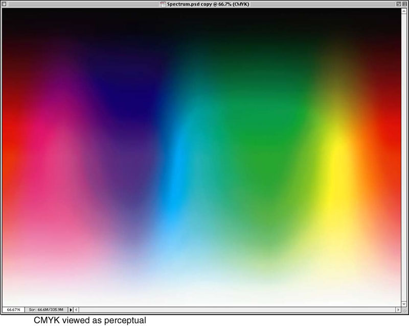
Figure 1
Figure 1 shows how a full-spectrum RGB file converted to CMYK might look when CMYK Setup is set to Perceptual rendering. Figure 2 shows how it might appear with Relative Colorimetric rendering instead. The Perceptual version often looks better, but the press sheet will almost certainly look a lot more like the Relative Colorimetric version than it will the Perceptual one.
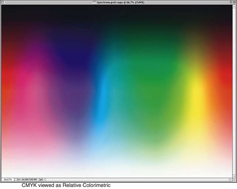
Figure 2
Do It Yourself
If you want to experiment with these settings yourself, you can make a spectrum file very easily in Photoshop, as follows.
Create a new RGB file, and use the Gradient tool with the Gradient Options set to Spectrum to fill the image with a spectrum gradient running from left to right.
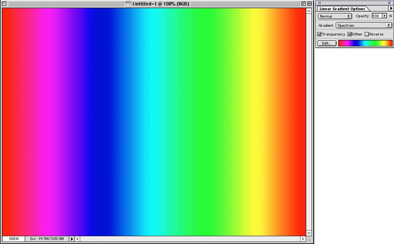
Figure 3a
- Add a new Layer, then use the Gradient tool with the Gradient Options set to Foreground to Background (and the Foreground and Background colors set to black and white) to make a vertical gradient from black to white.

Figure 3b - Set the Blending mode of the black-to-white Layer to Hard Light. Optionally, flatten the file.
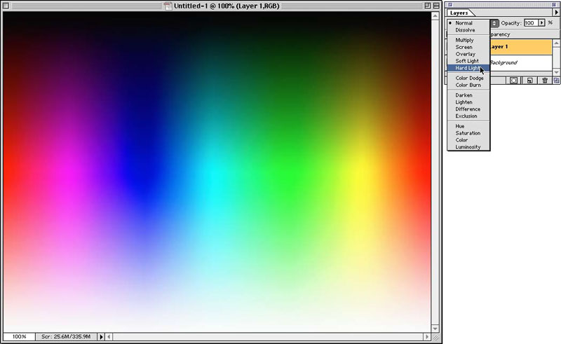
Figure 3c
You now have a file that contains pretty much all the RGB colors. Duplicate it, then convert it to CMYK using Perceptual rendering, with Black Point Compensation on, as shown in. You now have a file that contains pretty much all the colors you’ll be able to print. Go back into CMYK Setup, turn off Black Point Compensation and change the Rendering intent. If you have the Preview checkbox checked, you’ll see the display change as you change the rendering intent. You should, of course, also test with real images, but the spectrum has the advantage of showing you all your colors.

Figure 4
The Blackest Point
Black Point Compensation is a Photoshop-specific feature that’s designed to fill a hole in the ICC profile specifications. Without going into exhaustive detail, what it seeks to do is to make sure that transformations use the entire dynamic range of the output profile. When you’re creating separations, you always want this feature turned on, but when you’re viewing separations, you generally want to turn it off, because when it’s on, your CMYK black will always be displayed as the blackest black your monitor can show. If you’re creating output for a good sheetfeed press on coated stock, this might not matter, because the press black is probably darker than your monitor’s black anyway, but if you’re working with a print process that produces weaker blacks-uncoated stock, or newsprint, for example-you need to turn Black Point Compensation off to get a true picture of the relatively washed-out blacks that will appear in print.
No More Separation Anxiety
The upshot of all this is you need different settings in CMYK Setup to make separations and to view them. Of course, it’s a pain to have to constantly go into CMYK Setup and change from one setting to the other. One workaround is to record a pair of Actions that make the appropriate settings-you could call one “Create separations” and the other “soft proof” for example-and run the “create separations” action immediately before converting an RGB file to CMYK, then run the “soft proof” action as soon as you’ve done the conversion.

Figure 5
Figure 5 shows the settings for creating separations-load the profile for your output process, then set the Intent to Perceptual, and turn Black Point Compensation on.
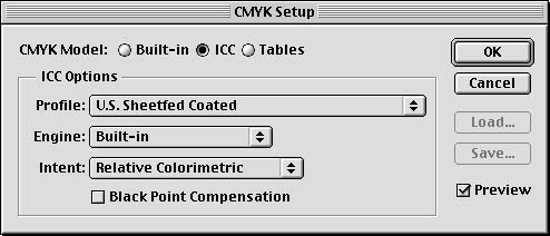
Figure 6
Figure 6 shows the settings for soft proofing-again, load the profile for your output process, then set the Intent to Relative Colorimetric (or Absolute Colorimetric if you want to simulate the paper color), and turn Black Point Compensation off.
An alternate method (there’s always more than one way to do something in Photoshop) is to leave your CMYK Setup set to the soft-proof settings shown in Figure 6, and use Profile-to-Profile to make your RGB-to-CMYK conversions using the settings shown in Figure 7. If you choose this method, the From: profile should always be set to RGB Color and the To: profile should always be set to the profile you’ve set in CMYK Setup.
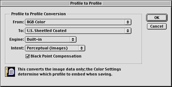
Figure 7
If you’ve been following all this, you’ve probably realized that Photoshop’s CMYK Preview feature is necessarily inaccurate, because it always uses the same rendering intent in both directions. The CMYK numbers on the info palette will be accurate, but if you use Perceptual rendering the display will typically be more saturated and contrasty than the actual print. Hopefully a future version of Photoshop will allow us to preview our CMYK conversions more accurately.
This article was last modified on January 2, 2023
This article was first published on February 21, 2000
Commenting is easier and faster when you're logged in!

Recommended for you

Heavy Metal Madness: Propaganda and Insight One Frame at a Time
Even the purest attempts at education and guidance carry with them an agenda of...

Super Simple Swatch Creation from Hailpixel
For a new and easy way to experiment with color and generate swatches, check out...
Do-It-Yourself Glitch Art
Here’s something perfect for a Friday, or any day when productivity isn...