


By now, it’s pretty clear that Adobe Photoshop 6.0 is an impressive upgrade, with Adobe’s revived attention to color management ranking at the top of my list. One of the coolest new features in Photoshop 6, in my opinion, is the ability to preview, or soft proof, any output for which you have a profile — accurately and with a minimum of hoop jumping.
Photoshop 5.5 had two serious problems when it came to soft proofing. One of these problems is pretty straightforward: Version 5.5 had no facilities whatsoever for soft proofing RGB output, such as to a film recorder or inkjet printer.
The second problem was a bit more involved. When you preview output, you need to make two color conversions — one from the image’s color space to the space of the device you’re previewing, and another from that device’s space to your monitor — and Photoshop 5.5 used the same settings for each.
The image-to-output-space conversion is almost always done with Perceptual rendering or with Relative Colorimetric rendering using Black Point Compensation which ensures that black in the source gets converted to black in the output space, so you use the entire dynamic range of the output. But neither of these rendering intents is appropriate for the output-to-monitor conversion. A Perceptual rendering to the monitor would compress the gamut, while a relative colorimetric rendering with Black Point Compensation would shift the white point and exaggerate the blacks on most output processes.
We really need separate controls for each transformation, which is exactly what Photoshop 6 provides.
Now You See It
The magic lies within the Proof Setup > Custom command on the View menu. (Proof Colors, also on the view menu, functions identically to the old CMYK Preview: It gives you a somewhat accurate preview of the file you’d get if you did a Mode change to CMYK. The new, Custom Proof Setup is much more useful for CMYK output, and it’s the only game in town for RGB output.) When you choose Proof Setup> Custom, the Proof Setup dialog box appears, as shown in Figure 1.

This deceptively simple little dialog box packs a great deal of power once you understand how to unlock it. Let’s look at the individual controls.
The Setup menu simply lets you load saved proofing setups stored in the appropriate folder (Program Files/Common Files/Adobe/Color/Proofing on Windows; System Folder/Application Support/Adobe/Color/Proofing on the Mac.) Setups saved in this folder also appear at the foot of the Proof Setup submenu.
The Profile menu is where you choose the profile for the output that you want to simulate on screen. You can choose a profile for almost any device, but some scanner and digital camera profiles have the good sense to make themselves unavailable, given that soft proofing an input device doesn’t make a lot of sense. You can choose a profile for an RGB, CMYK, or Grayscale printer; a monitor; or a working space. However, Windows users who print to Epson inkjets should read this cautionary note.
The Preserve Color Numbers checkbox is designed to show you what would happen if you sent your unconverted document to the output specified by your choice of Profile. It’s only available when your document and your output profile share the same color mode — an RGB document and an RGB output profile, or a CMYK document and a CMYK output profile. It’s particularly useful for showing you how CMYK files prepared for one printing process will work on another: It lets you decide if you need to convert or edit the files to make them work on the selected output. When you check Preserve Color Numbers, it grays out the Intent menu, because you are in essence telling Photoshop that you don’t want to convert the image and, hence, no rendering intent applies.
The Intent menu lets you choose the rendering intent you want to use in the conversion from document space to the proof space. It lets you see at a glance how different rendering intents will affect your image. The menu selection always defaults to the profile’s default rendering intent (usually but not always Perceptual) so it pays to get into the habit of checking it each time you make a Custom Proof Setup.
Undergoing a Conversion
The remaining controls apply to the rendering from the proof space to the monitor. By default, both Ink Black and Paper White are turned off. In this state, Photoshop performs a Relative Colorimetric rendering with Black Point Compensation from the proof space to the monitor. This is the same behavior as in previous versions of Photoshop. It’s reasonably accurate except for two things: It doesn’t show the effect of the paper color on the image, and it doesn’t show the dynamic range compression that will take place on the print.
Relative Colorimetric rendering scales the white of the source (in this case, the white of the proof space, which for printed output is paper white) to the white of the destination (in this case, the monitor). Black Point Compensation scales the black of the source (in this case, the printer black) to the black of the destination (in this case, the monitor). In many cases the monitor white is both brighter and bluer than paper white, and the monitor black is darker than the printed black, particularly if you’re printing on a matte paper.
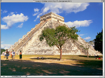
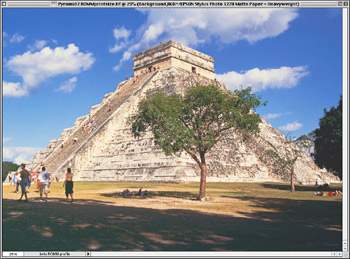
Figure 2 shows an original image, and the same image soft proofed to the Epson Stylus Photo 1270 using Epson Heavyweight Matte paper, with both Paper White and Ink Black turned off. The two images appear almost identical save for a slight reduction in saturation on the soft-proofed version.

Checking Ink Black turns off Black Point Compensation. As a result the blacks get lighter, as seen in Figure 3. This takes a little getting used to, because the immediate effect is that your image suddenly looks worse than it did, with washed-out shadows. But it gives you a much more honest picture of what will happen to your shadow detail on the print. Unless I’m concentrating solely on shadow detail, though, I tend not to use this setting: It displays the shadows accurately, but it doesn’t show the color shift and highlight compression that the paper will introduce.
Checking Paper White makes Photoshop perform an Absolute Colorimetric rendering from the proof space to the monitor. When you check Paper White, Ink Black becomes dimmed, because Black Point Compensation doesn’t apply to Absolute Colorimetric rendering: It’s Absolute, so whatever the print black is, that’s what gets displayed on the monitor. Absolute Colorimetric also shows both the influence of the paper color and the dynamic range compression that the print will introduce, as shown in Figure 4.
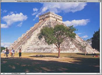
This is the most accurate preview of the printed output, but again it takes some getting used to. When you check Paper White, the image seems to die before your very eyes due to the dynamic range compression. The effect is quite unsettling and can cast doubt on the result. One technique I’ve found useful for dealing with this is to look away from the image when I click the Paper White checkbox. If I don’t actually see the change taking place, it’s much easier to accept the soft proof.
I use this soft proofing mode to allow me to optimize the image for the specific output process I’m soft proofing, which usually involves making adjustments to tone, to saturation, and sometimes to hue as well. I usually do this using Adjustment Layers, which I then group into a Layer Set named for the output for which the optimizations are intended. That way I can use the same master file to go to different outputs by simply turning the appropriate Layer set on and the others off.
Hard Printing
We’ll look at printing from Photoshop in detail in a later column, but given that the introduction of the Proof Setup space in the Print dialog is a potential source of confusion, a quick explanation is in order.
When you’re printing to the actual device you’ve been soft proofing, you don’t want to use the Proof Setup space as the source. Use the Document space, and set the Print Space either to the profile you chose in Proof Setup (in which case you must make sure that all color conversions in the print driver are turned off), or to Printer Color Management (in which case you need to make sure that the color conversion is turned on in the printer driver).
You’d use the Proof Setup space as the source only when you want to make some other output device simulate the output you’ve been soft proofing, such as making an inkjet printer simulate final press CMYK. To do that, you’d soft proof the press CMYK, then use that Proof Setup space as the source when you print to the inkjet printer.
Once you’ve mastered soft proofing in Photoshop 6, you’ll find that you get far fewer output surprises. It may even save you some paper!
This article was last modified on July 18, 2023
This article was first published on November 29, 2000
Commenting is easier and faster when you're logged in!

Recommended for you

Celebrating a Decade of Camera Raw
It’s time to dig in the fridge for a slice of leftover cake and wish a happy bel...

Remove.bg: A Worthy Alternative to Photoshop’s Select and Mask
Get to know this web-based app that performs instant photo cutouts with a remark...

The Digital Art Studio: 5 Favorite Illustrator CC Features
If you’ve ever experienced a power outage, you’ve also likely found yourself ref...