


In my last column, I addressed the question, “How can I get Photoshop to make my prints match what I see on my monitor?” — and broke the sad news that neither you, I, nor anyone else can actually do that. Monitors can display colors that are either not reproducible in print, or are only reproducible by using spot inks on a press. Color management can’t change the physical limits of your printing process. What it can do, though, is to get your monitor to show you how your print will appear, and let you take any corrective action necessary to optimize the appearance of the image on the print.
Photoshop’s Proof Setup feature is capable of providing very accurate previews of your prints. But (there’s always a “but”) to do so it needs profiles that describe the behavior of your monitor and your printer accurately (more on this later). I’ll assume that you’ve already obeyed the exhortations in my aforementioned last column to calibrate and profile your monitor, and to set your color management policies correctly in Color Settings, so that you know you have images whose on-screen appearance is satisfactory. This column looks at getting the images from the screen into hard copy, whether the hard copy is being printed on a desktop printer or on a press.
Print Prediction through Proof Setup
Photoshop’s Proof Setup feature offers a very powerful and flexible way to preview prints, whether you’re printing to a grayscale, RGB, or CMYK printing process. (Desktop color printers that don’t have a Postscript RIP have to be treated as RGB printers even though they use CMY, possibly K and possibly light cyan and light magenta inks.) Proof Setup lets you control the way the image color is converted to the simulated printing space, and also lets you control the way that simulation is rendered back to your monitor. By default, it’s set to simulate your CMYK working space. If you’re printing to something other than your default CMYK, you need to create a custom setup, and even if you’re printing to your default CMYK, you may want to create a custom setup to use some of the more advanced controls. Here’s how:
Choose Proof Setup>Custom from Photoshop’s View menu. The Proof Setup dialog box appears (see figure 1). Let’s look at the various controls it offers.
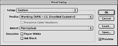
Figure 1: Photoshop’s Proof Setup dialog box gives you a powerful way to preview prints.
The Setup menu, which shows “Custom” when you first open the dialog box, simply lists saved Proof Setups for easy recall (they also appear at the foot of the Proof Setup submenu).
The Profile menu is where you choose the profile for the printer or print process you want to simulate on screen.
The Intent menu lets you choose the rendering intent you want to use to go from the image’s color space to the printer’s color space. Even better, since Proof Setup offers a live preview, you can see the effect of each rendering intent on the image (see figure 2).
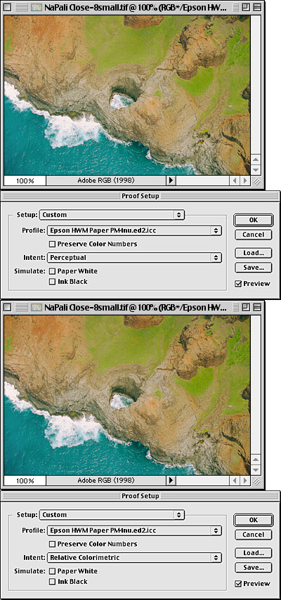
Figure 2: Proof Setup lets you preview the effect of different rendering intents, such as Perceptual rendering (top) and Relative Colorimetric rendering (bottom).
Lurking in between the Profile and Intent menus is a checkbox labeled “Preserve Color Numbers.” Normally, you want to leave this unchecked, if it’s available. When checked, it shows you what the image would look like if you just sent it to the device whose profile you chose without doing any conversions. (Checking it also dims the Intent menu, because since you’re not doing a conversion, rendering intents don’t apply.) It’s only enabled when you choose a profile from the Profile menu that uses the same color mode as your image — if your image is RGB, the checkbox is only available when you choose an RGB printer profile, and with a CMYK image it’s only available when you choose a CMYK profile.
In the case of RGB printers, “Preserve Color Numbers” typically just shows you why you need to convert the image to the printer profile’s space. With CMYK images, it can be useful in helping you determine whether or not an image that was prepared for one printing process may or may not be usable on another.
The Profile and Intent menus let you control how your image gets from the space it’s in to the print space you’re simulating. The remaining two controls, in the Simulate section of the dialog box, let you control how that simulation is rendered back to your monitor.
When both Paper White and Ink Black are unchecked, Photoshop uses Relative Colorimetric rendering with Black Point Compensation to go from the simulation to your monitor. What that means in English is that the paper white is mapped to your monitor’s white, and the printer’s black is mapped to your monitor’s black. If you’re printing to a bright glossy stock, this view is probably the most accurate. But if you’re printing to a matte paper it may give you an overly optimistic view (see figure 3).

Figure 3: Leaving Paper White and Ink Black unchecked gives you the best simulation for printing on bright, glossy stock.
The Ink Black checkbox turns off black point compensation in the rendering from the simulation to your monitor, and attempts to show you the actual black that will appear in print. If you’re simulating printing to a glossy paper, you’ll probably just see a very slight lightening of the shadows. If you’re simulating printing to watercolor paper, newsprint, or an uncoated stock that produces relatively weak blacks, the shadows will likely lighten a lot when you check Ink Black. This setting is useful for fine-tuning shadow detail, particularly on stocks that produce weaker blacks (see figure 4.)
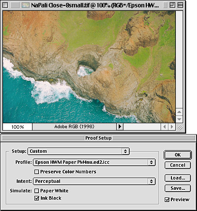
Figure 4: With Ink Black checked, which turns off black point compensation, you can more easily fine-tune shadow detail.
The Paper White checkbox makes Photoshop do an Absolute Colorimetric rendering from the simulation space to your monitor. It attempts to show you the influence of the paper color and also the true black (when you check Paper White, it automatically checks, and dims, Ink Black). But to do that, it has to dim all the colors — to change the color of white, it has to reduce the values in one or more of the channels that it sends to the monitor, because the only way to change the color from RGB 255,255, 255 (your monitor’s white) is to turn something down. As a result, your first reaction when checking paper white may be that your image just died before your eyes. I’ve become accustomed to looking away from the monitor when I check Paper White so that I don’t see the change happen. This simple trick makes it a lot easier to accept the paper color displayed on the monitor as a true white.
A second trick is to view the image in full-screen view with the menu bar and the palettes hidden. That way, you ensure that the paper white is the brightest thing on the screen, and your eyes have a chance to adapt to it as the true white: If you have white user interface elements appearing on screen, the paper white will seem visibly dim and tinted (see figure 5.)

Figure 5: The simulation with Paper White checked appears dimmer than with it unchecked. In this case, it also shows the slightly bluer white of the paper.
An obvious question is, which of these three simulations is correct? The truth is, all of them are, and none of them are. No proofing system has ever provided a perfect match to the final product: We learn to interpret proofs, and therefore, like any other proofs, you have to learn to interpret the soft proofs offered by Photoshop. Each one tells you something slightly different about the way the image will appear in print. A handy rule of thumb, though, is that for glossy stocks, the default view with Paper White and Ink Black unchecked will be the closest, while for uncoated stocks, the view with Paper White checked will generally be the most accurate.
The Proof Setup simulation is “live” so you can work inside it. One technique I find effective is to use adjustment layers to optimize the image for a particular print process while working with the soft proof simulation turned on. I then save the adjustment layers in a layer set that’s named descriptively for that print process. This allows me to make different optimizations for different print conditions, and turn them on and off as needed.
This article was last modified on July 18, 2023
This article was first published on January 9, 2002
Commenting is easier and faster when you're logged in!

Recommended for you
Creating Tilt-Shift Effects in Photoshop
The Tilt-Shift effect makes aerial views of landscapes look like model villages....
Changing Image Focus with Photoshop CC 2018
Dual-camera iPhones like the iPhone 7 Plus, iPhone 8 Plus, and the iPhone X have...

Creating "Hobbit" Type in Photoshop and Illustrator
Unless you’ve been living under a rock the size of a cave troll, you...