

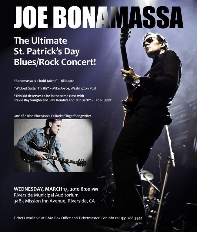
The phone call and the email arrived together. “We’ve reserved a full page ad in the next edition of [big regional entertainment weekly]. Ticket sales are slow, and we need to promote the [redacted] out of this show! The email has the copy, and the approved publicity shots. They’re all we have. The deadline is 5 o’clock. Can do?”
It was a little before 4, and my coffee was about to get cold. You’ve been there, too, right? What’s little adrenaline among friends?
The artist was the awesomely talented Joe Bonamassa, and the shots his management had provided were, as is often the case when you work with clients in the entertainment business, less than perfect for the job. But “they’re all we have.” Even if they weren’t, there was no time to ask for alternatives.
To make an big enough impact on ticket sales, the ad would have to make a high-energy impact on the reader. It had to be something nobody could miss. No pressure. Right.
The Assets
One was an album shot. Nice enough in its own way, but a horizontal layout, already cropped, and too static for a concert ad. No sizzle. If that weren’t enough, it was 1350 × 900 pixels. That wouldn’t work for a 10” × 11.75” ad. Hey, at least it was a TIFF.

Unfortunately, this was the press shot for the tour, so it had to be in the ad. Why people who ought to know better would think that a 4.5 × 3-inch image meets all possible needs is one of the Great Mysteries of graphic design.
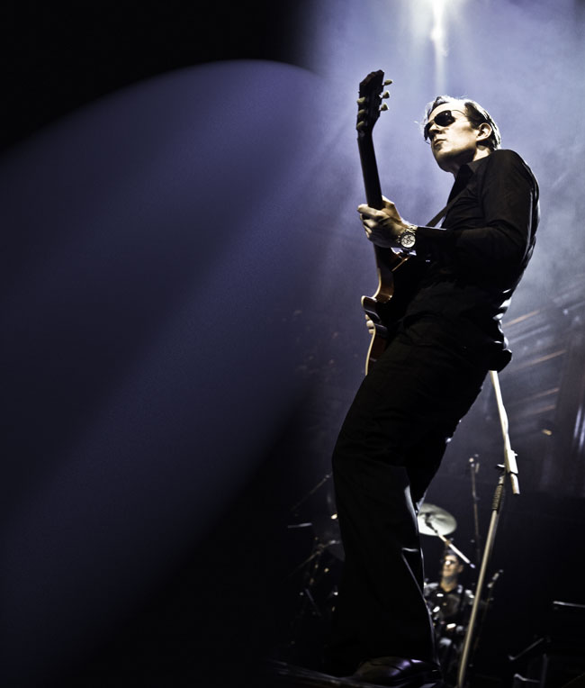
The other shot was more promising:
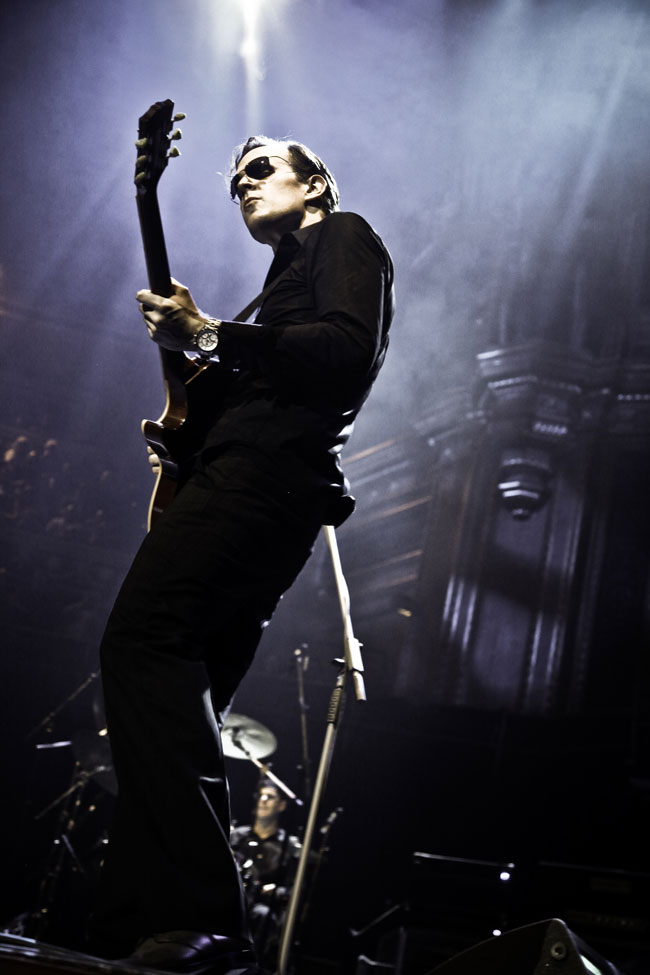
Now we’re getting somewhere. This one was 3744 × 5616 and only lightly compressed, the file weighing in at more than 9MB.
You can see the problem right away: it’s a great shot, but the open space is on the right. He’s looking out of the frame.
A Job for Photoshop
Photoshop is my favorite InDesign plug-in for good reason. In this case, it was going to let me extend the scene in front of Joe, and place him on the right of the ad.
The first step was to create a new Photoshop document the size I needed: 10 × 11.75 @ 300 ppi. The hero shot was over 18 inches tall at that resolution, so I had room to play with. Then I placed the hero shot on the canvas where I needed the artist to be.
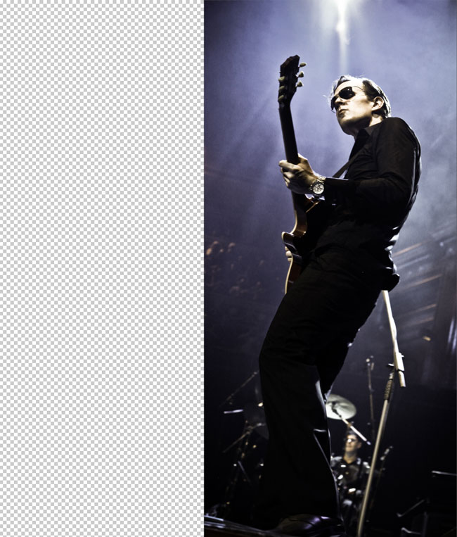
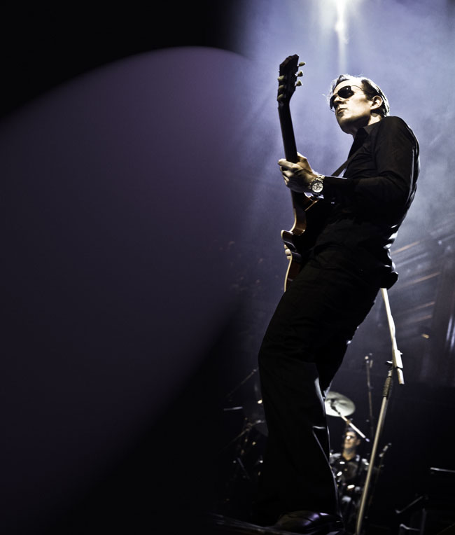
The western-educated eye scans from left to right, and tends to stop when it gets to a strong image. No way the eye is going run off the edge of this page, but we’re still left with that ugly hard edge. I didn’t want to make a boring 50/50 vertical split: too static, wrong for a dynamic musician. As far as possible, I wanted to fill the page with concert, to make the magazine’s readers feel they were already at the show.
The space around the artist is dominated by purple background and glare from the stage lighting, so the first step in creating some extra room was to eyedropper the purple and create a background layer, adding Gaussian noise (Filter > Noise > Add Noise) to match the graininess of the original.
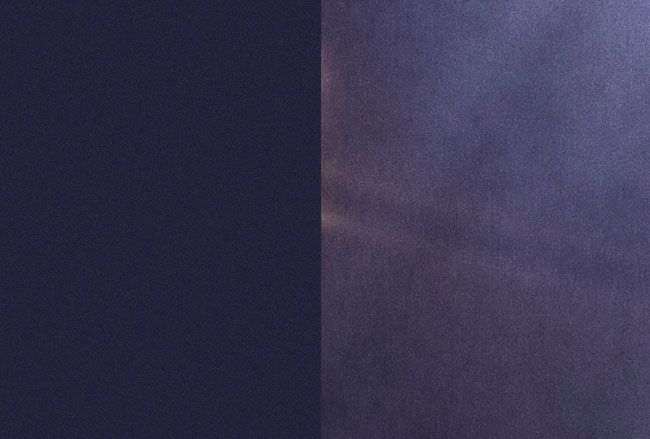
Adding a mask to feather the edge allowed the image and the background to merge, but there’s still a big visual disconnect created by that hard edge.

Better, but flare from stage lights doesn’t stop like that, and illumination falls away toward the bottom, so the new background must do the same.
I added another layer above the background, filled it with near-black eyedroppered from another part of the image, put it in Overlay Mode and added a lighting effect (Filter > Render Lighting Effects): a spotlight at roughly the same angle as the stage lighting, again adding some noise to the layer to match the actual photograph.
Better, but what about those cool shafts of light? On a new blank layer in Overlay Mode, I painted in some “shafts” of white with a very soft, large brush, again added noise, and reduced the opacity until I had effect I was looking for.

Now the color is a bit off, so it needs a Hue/Saturation layer to bring things back into line.
I wanted his name to dominate the ad. Joe has a very loyal fan base, so I wanted to be sure none of them would miss it. Normally I’ll switch to InDesign to add type, but that wasn’t going to work here.
The light and dark of the background meant I had to split the type color, light over the dark area, dark over the light area, and add the same kind of noise as in the rest of the image: hard to pull off in InDesign, but dead easy in Photoshop. First I added the dark headline, giving it some noise with a dark solid layer in Multiply Mode, clipped to the text. The font is Impact.
Then I followed up with a copy of the same text in white, and masked it to match the angle of the lighting.
Meanwhile, Back in InDesign…
I had my drop-in background for the InDesign layout. It had the copy space I needed, in the right place, and the organic curve of Joe’s pose in the photograph was a perfect guide for ragged text. The album publicity shot almost placed itself.
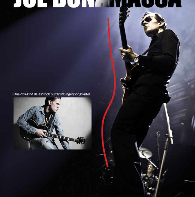
All I had to do then was arrange the bits of copy in the right order to match that nice curve, and I was done.
It was 4:57 pm when I sent the PDF to the publication. Client was happy, the magazine folks were happy, and I finally got back to my coffee. Yes, it was cold, but the adrenaline was still doing its thing, so I hardly noticed.
I went to the show, courtesy of the grateful promoter. It was awesome, as expected.
And the place was packed.
This article was last modified on January 11, 2016
This article was first published on January 11, 2016
Commenting is easier and faster when you're logged in!

Recommended for you
Sometimes a Logo Is Just a Logo
The recent hubbub surrounding Quark’s new logo has raised several question...

Scanning 101: No More Moiré
In your career as a graphics pro, sooner or later you’ll encounter a moiré...
How to Create a Long Shadow Effect in Photoshop
See a quick way to apply realistic cast shadow effects to type, or any other Pho...