
Nonfiction Design
Designing nonfiction texts can be a lonesome quest, but you can dodge the design demons by following the right path.

This article appears in Issue 123 of InDesign Magazine.
“I had no idea,” an author recently said to me, “that there was so much involved in designing a book!”
“Nobody does until they’ve done it.”
It’s a conversation I’ve had many times, usually about halfway through a project, always when I’m working on a nonfiction title.
Maybe a better term would be non-narrative: works that contain complex information that doesn’t follow a simple, straight story line. (And no, I’m not talking about James Joyce). The design elements you might use in these kinds of publications can be as varied and complex as life in a tropical rainforest—and just as hard to tame.
Nevertheless, no matter the content, the fundamentals of good book design and production apply. Nigel French has covered these in a comprehensive article in issue #105 of InDesign Magazine, so I won’t reiterate those basics here. If you haven’t read it, do that now. I will assume that you know how to clean up the manuscript, choose a page size, set margins, and all that.
Instead, I’ll focus on how to unravel the complexities of a nonfiction book, white paper, or other long document; why it has design requirements that are different from simple narrative typesetting; and how to use InDesign to smooth the path for you and your readers.
Variety Is the Spice of Life
A non-narrative title has both a hierarchy of information—some things are more important than others—and different classes of information in addition to the main text: tables, supplementary information, commentary, citations, footnotes, endnotes, and so on. These interrelated elements can be complex and are sometimes hard to keep track of. This is where InDesign’s rich set of style features helps out.
Styles speed up your work by eliminating decision points.
Every time you have to make a decision, you pause. A style is a decision you make once, then use over and over again without pausing.
Hierarchy: Some paragraphs are more equal than others
A visual hierarchy guides the reader through the page, from one idea to the next.
Subheads mark the boundaries between sections, making it clear when the subject changes. In a dictionary or glossary, entry words are boldface to make them easier to spot. Lists have different levels of indentation.
Paragraph styles, nested styles, and object styles are your friends in making the visual hierarchy match the author’s intent.
Categories: A quotation isn’t a warning
Different classes of information need different visual treatments. Just as you wouldn’t put vitamins and rat poison in identical containers (well, I hope you wouldn’t), your paragraph style for important warnings should be different from your style for pro tips. If classes of information on a page are different, they should also look different.
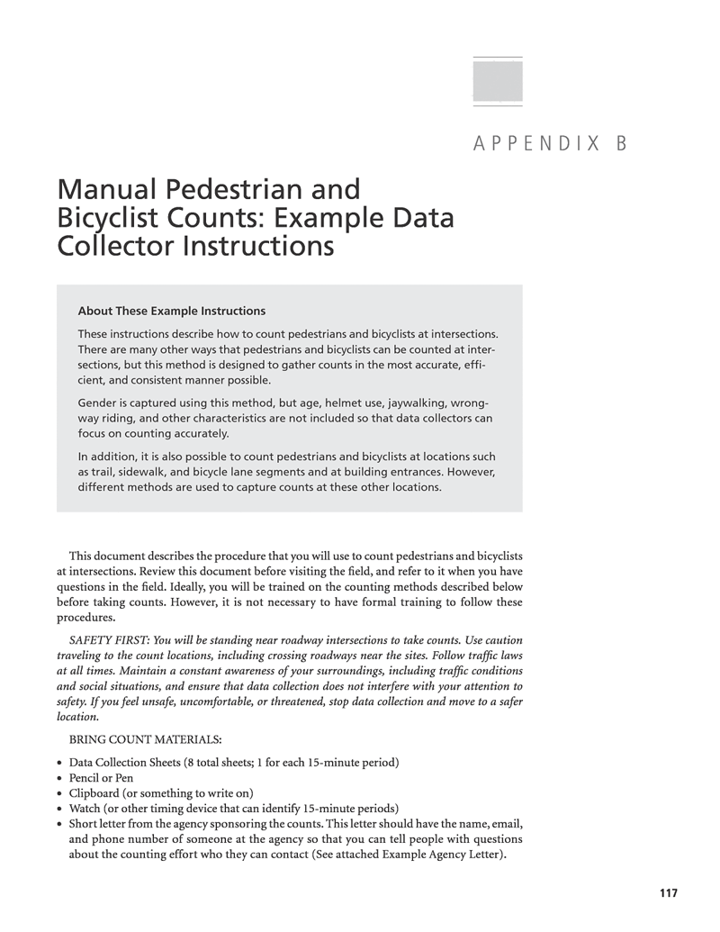
Figure 1
Figure 1, from a guidebook issued by the National Cooperative Highway Research Program, is a great example of how you might differentiate several kinds of information on a single page. There are seven type styles on the page (eight, if you count the folio), clearly separating the various classes of information without looking cluttered.
The introductory “About” text is obviously different from the safety warning and the bullet list, while all of these are differentiated from the body copy. You can see they are different without reading the text. Every chapter of the guidebook uses these styles consistently and features the same kinds of information in the same places with the same looks. Try to imagine how grim it would be trying to read it without those style cues!
In the same way, quotations, code samples, and other key data should stand apart from the main text so that the reader can see they are different. In designing a new translation of Sun Tzu’s treatise (popularly known as The Art of War, although Sun Tzu didn’t title it), I used one style for the translator’s text (Figure 2) and a different one for the Sun Tzu’s original words (Figure 3).
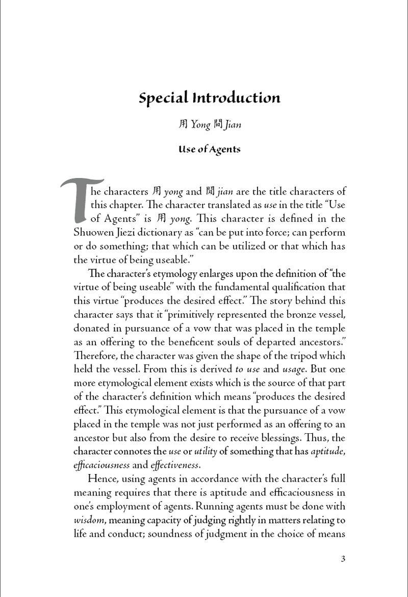
Figure 2
Figure 3
Paragraph, character, and object styles are your friends.
Before You Begin
There is no substitute for reading the manuscript. Let me repeat that: There is no substitute for reading the manuscript. All the way through. Thoroughly. At least twice.
This isn’t a step you can skimp. If you don’t know what the author is trying to say, you won’t know how to make it look. The whole project will inevitably bog down, leaving you with hours of fix-up and redesign.
I strongly advise that you don’t even think about opening InDesign until you’ve done this.
Technical text
The manuscript may be hard to understand or filled with terminology that is hard to wrap your head around, but you must try to make sense of what you’re reading. Dictionaries and Google are standing by to help.
This is another step you can’t skimp (far less skip!) If you do, you will end up typesetting in a mental fog, which guarantees mistakes. Typography is best done in a calm, intelligent frame of mind, so make your peace with the manuscript before you start to design.
Deep Tech
An exception to the “be sure you understand what you’re typesetting” rule is complex mathematics or scientific formulae. If you aren’t familiar with the math, just tell yourself “It’s a math formula,” treat it like an illustration (which it basically is), and leave it at that. You’re going to use a plug-in to set these anyway; just be aware that you will lean heavily upon the author or editor to ensure no mistakes creep in.
When the manuscript is awful
Some manuscripts, alas, are written by subject experts who have never learned how to string a coherent paragraph together and weren’t smart enough to get a good editor. In this situation, try phone calls, videoconferences, or sit-down meetings with the author(s) until you have a solid grasp of what they are trying to say. Occasionally, I have even recommended that an author hire a professional editor or rewritten an occasional paragraph myself with the author’s approval (once I’d established what he meant). Having a good editor in your corner is a huge asset.
Know your reader
Try to get a clear picture in your mind of who will read the book. You should also know if this book’s audience needs or even expects a book on this topic to have a certain look. A publisher or corporate marketing department may have house style guidelines that you are obliged to follow, as well.
Think through any special scenarios you might have to design for. A recipe book should have type large enough to read when the book is propped up at the back of a kitchen counter, out of the way of the eggs and milk. A repair manual might have to be read in dim light under a large piece of equipment. You get the idea. If you aren’t sure what a specialty text might need, visit a large bookstore or your local library and find a few similar books to get a feel for the genre.
Courage, Grasshopper!
If all this seems tedious or a little daunting, take heart. You don’t have to, and probably won’t, become a subject-matter expert to design and typeset a specialist book, but by the time you’re done you will have at least added to your repertoire of topics for conversation starters and factoids to impress your friends.
Page Layout Matters
How the publication will be produced (digital, offset, letterpress) and how it will be used influence the size and proportions of the paper, the main text area, size of type, and even the size and placement of page “furniture” (running heads, footers, folios, and other recurring graphic elements). The production budget may require that you keep within a certain number of pages, and that, too, has a bearing on what margins, type size, and leading you can use.
Your decisions on these points can make your job easy or arduous, and the reader’s experience seamless or headache-inducing, so take the time to experiment if you have the freedom to choose. Two books (that you should have in your library if you’re serious about design) serve to illustrate the point.
James Felici’s classic The Complete Manual of Typography is beautifully designed for easy navigation and reading (Figure 4). The main text block allows for a generous margin for sidebar examples and illustrations, and the type is well-spaced. Even the folios and running heads are where you can see them easily as you quickly flip to specific chapters or pages.
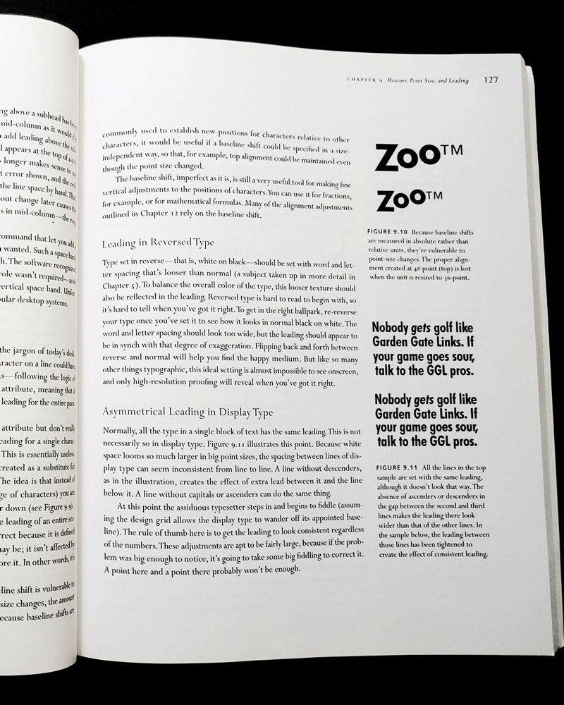
Figure 4
By contrast, Grid Systems in Graphic Design by Josef Müller-Brockmann almost goes out of its way to be hard on the reader, with its body copy set in 9- and 7-point Helvetica (not a good text face at the best of times), page numbers low on the inside(!) margin, and each column a sea of undifferentiated text without so much as an indent to distinguish one paragraph from the next (Figure 5).

Figure 5
I Got Rhythm…
Speaking of grids, I’ll be categorical for a moment: Always use a grid. Why? Rhythm, baby!
When you listen to a piece of music, its beat is the predictable framework within which the music happens. A band that plays flat can be hard to listen to, but you can still dance to it if its rhythm and tempo are spot-on. Our response to rhythm is visceral, instinctive, inescapable. This is obvious in music, but is just as true in design, architecture, painting, or photography.
Of all the things that connect your readers to the page, rhythmic predictable placement of text and graphics is one of the most important. The rhythm of the grid tells the eye where to find things.
If your leading varies unpredictably, if your margins are erratic, or if your placement and sizes of photos or illustrations are arbitrary, your pages will look uninviting and messy. Rhythm quiets the page and lets the reader concentrate on the content, undistracted.
Baseline grid
The most fundamental tool for creating that all-important visual rhythm is a baseline grid. Use a grid that’s half the leading value of the main body text, to give some flexibility for subheads and lists. Use a multiple of the leading value for the height of the primary text frame.
Figure 6 shows the setting for a page that uses 10.5-point type on 14-point leading.
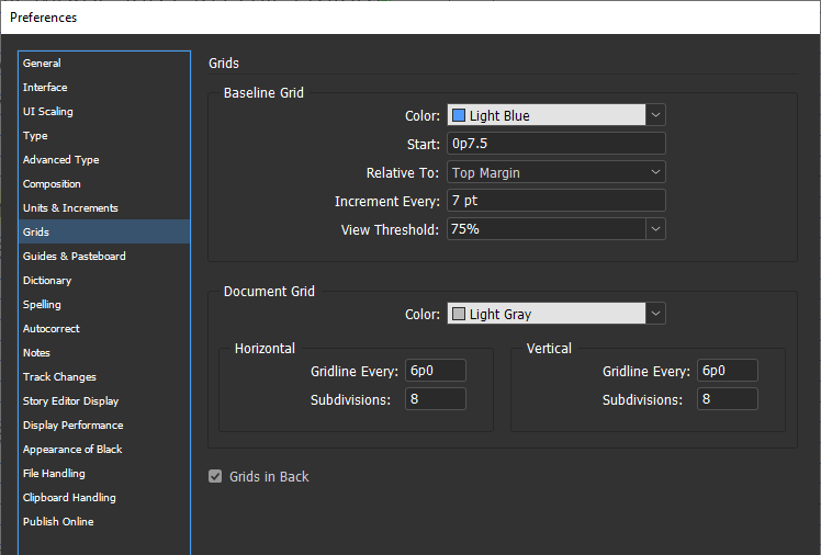
Figure 6
Avoiding the Baseline Blues
Add an extra point to the top and bottom of your primary text frame so they are not exactly on the baseline grid. With some fonts, InDesign won’t allow text on the top line of the frame unless there is a little headroom above the grid, and it has a nasty habit of occasionally refusing to put text on the bottom line unless there is a little space in the frame below the last baseline.
Page grid
Set up your page grid so that it is versatile enough to accommodate all the variations of illustrations, examples, or photographs that you expect in the layout. Build your page grid into your master pages so it will always be consistent on your document pages.
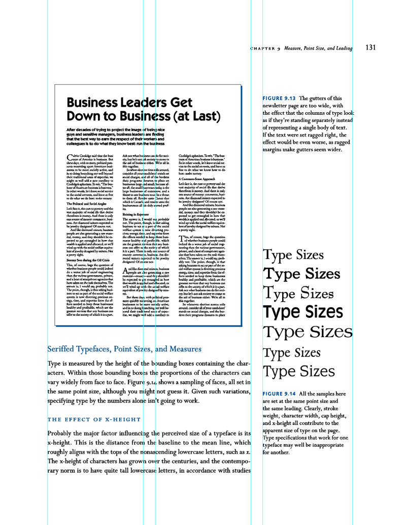
Figure 7, two pages from The Complete Manual of Typography, shows how even a simple grid keeps illustrations, captions, and text under control. The reader never has to decode the layout to know what’s what; everything is “where it should be.” And while you lay out the pages, you don’t have to wonder where to put things.
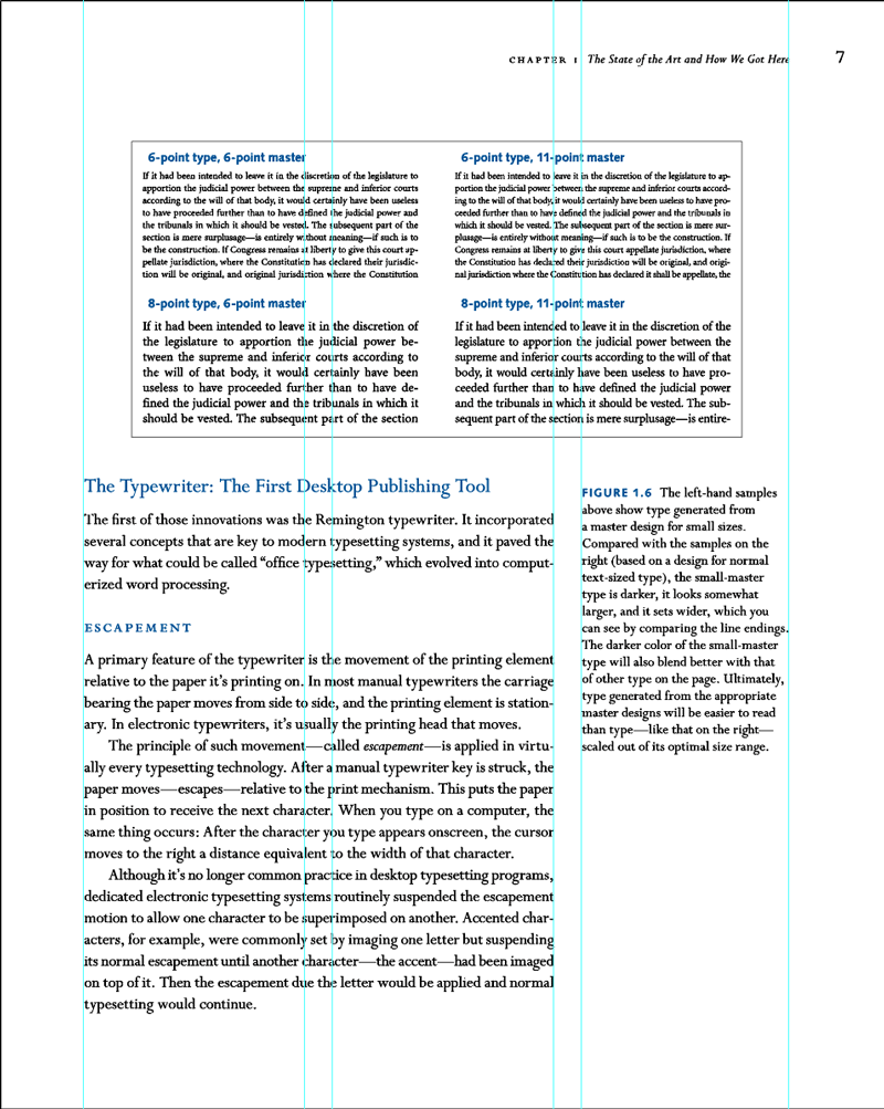
Figure 7
Style All the Things!
Invest the time to build paragraph, character, object, and—if applicable—table, and footnote/endnote styles right from the start. Import a representative chapter—one that has most of the different content types—and use that as a testbed to build your styles. (You’ll be able to choose one easily, because you’ve read the manuscript all the way through, right? Right!)
You’ve heard it over and over, “Styles save you time in the long run.” So, too, do master pages and grids. But the savings run deeper than just having a one-click way to format a paragraph. Every time you have to decide, you stop doing; the flow of your work is interrupted. Paragraph styles, character styles, and object styles are decisions you make once, so you never have to pause, or break concentration, while you’re working.
“Always” styles
Some styles show up in every project, so I recommend creating a dummy document or InDesign template with these “always” styles. You can (and should) change the fonts, sizes, leading, and so on to fit each project, but the dummy gives you a good starting point.
This is another example of making a decision once so you don’t have to make it again and again in the future. I have a personal set of stock style names that I use in every book project. That way, when I open a project from four years ago to make revisions, I don’t have to spend any time wondering what the style names mean: they’re the same ones I used in the project I finished yesterday.
Figure 8 is an example of what a skeleton set of styles might look like. There’s a lot going on here, so let me break it down in the following sections.
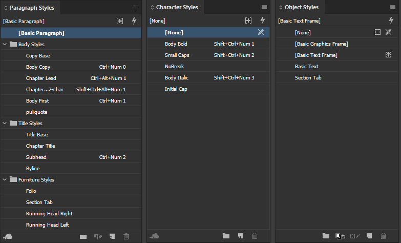
Figure 8
Paragraph styles
A long document project is probably going to have more paragraph styles than any sensible person would want to deal with, so organizing them in folders is a precaution against premature hair loss and chewed rugs. I start with something like the folders shown in Figure 8 and add another one for TOC styles later in the project.
Copy Base is the style on which I base all the body copy styles, bullet lists, numbered lists, table text, and often even the pull quotes. Using a single base style helps you quickly compare the look of different fonts and leading values. Plus, if your client wants to see a selection of styles before making a final decision, using a base style means you can produce a new set of type specimens in only a few minutes.
In many cases you will use a special paragraph style for the beginning of a new chapter, which may include a drop cap or a line style or both. My naming convention for this is Chapter Lead. Because a drop cap is sometimes preceded by either a quote mark or a hair space, I also use a Chapter Lead 2-char style that specifies two drop-cap characters rather than one.
Because my Body Copy style normally uses a first-line indent, I have a Body First style without the indent to use right after a subhead.
Title Base acts like Copy Base, but for titles, subtitles, and headings.
If your folios (page numbers) and running heads use the same font family as your copy or titles, edit these styles so that they are based on either Copy Base or Title Base.
Train Your Fingers
Notice the keyboard shortcuts in Figure 8? Make your life easier by using a keyboard with a numeric keypad, essential for style shortcuts, and applying the same shortcuts to the most basic styles in every project you do. My paragraph styles use Ctrl (Command) with a number, character styles use Ctrl+Shift (Command+Shift) with a number, and object styles are Ctrl+Alt (Command+Option) with a number. Body Copy is always Ctrl+NumPad 0, the no-indent first paragraph style is always Ctrl+NumPad 1, and so on. Setting up a simple set of standard shortcuts like this will save you endless time once your muscle memory is grooved in.
Style groups
Organizing styles into groups named Body Styles, Title Styles, TOC Styles, and so on helps in more ways than one. If a new paragraph style arrives in some imported legacy text, or for some other reason, it will show up outside of the style groups. That brings it to your attention so you can eliminate it or move it to the right group, but it also helps to ensure you don’t miss a maverick style that crept in uninvited.
Chaining styles
Your text will have style sequences that hardly ever change, and InDesign’s Next Style feature can save you a great deal of time if you use it.
Figure 9 shows the Subhead style’s options with Next Style set to Body First. For Body First, I specified Body Copy for its Next Style option.
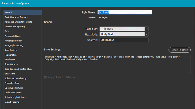
Figure 9
By chaining styles like this, you can easily apply all the basic styles for a section of text in one go (Figure 10). For example, with the subhead and the two following paragraphs selected (this feature appears only when multiple paragraphs are selected and the first one has a Next Style option defined), I right-click Subhead (the first style in my chain), and then choose Apply “Subhead” then Next Style.
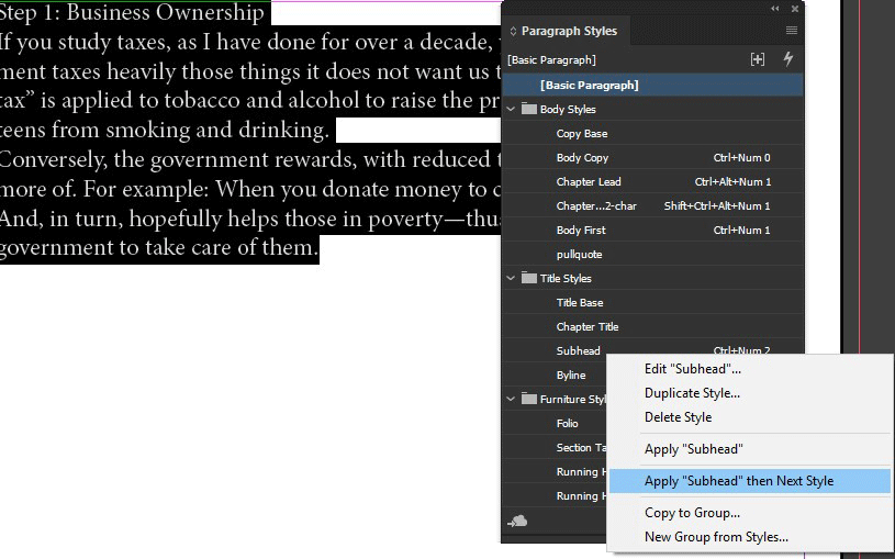
Figure 10
In the same way, Chapter Number, Chapter Title, Chapter Opener, and Body Copy can be applied to the beginning of each new chapter with one click. As you go through your manuscript, note any opportunities to take advantage of the Next Style feature and build it into your paragraph styles. (To learn more about setting up and using the Next Style feature, check out Erica Gamet’s great video on InDesign Secrets.)
Essential GREP styles
If the thought of GREP makes you feel slightly seasick, fear not! There are two absolutely essential GREP styles that you should build into your body style so you never have to think about them (Figure 11).
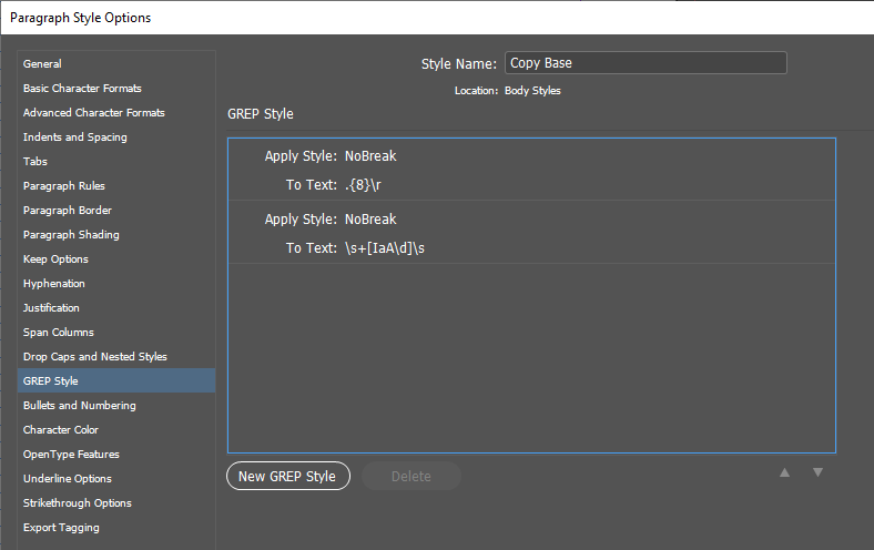
Figure 11
They will save you clean-up time at the end of the project when you are fine-tuning the typography. Both require a No Break character style that has only one parameter set: the No Break checkbox is selected (Figure 12).
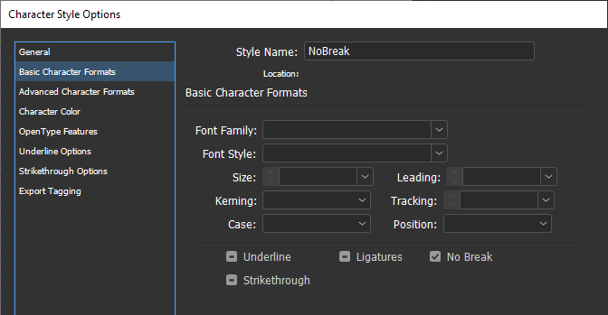
Figure 12
The first GREP style tackles “runts”—tiny words tacked onto the ends of paragraphs—that look messy and can be distracting to the reader. The GREP expression .{8}\r means “any 8 characters” (the dot followed by {8}) “followed by a paragraph return” (\r). It applies the NoBreak style to the last eight characters of any paragraph, including the final period. The number you choose depends on the size, spacing, and first-line indent in the body copy, but I recommend applying your NoBreak style to at least 6 characters.
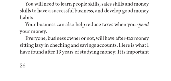
Figure 13
You never want I as in I have to be the last character on a line in your text, as in the second-to-last line in Figure 13. The same goes for the indefinite article a or A or any single digit. The second GREP style in Figure 11 is more complex: +[AaI\d] applies NoBreak where a, A, I, or a digit is preceded or followed by a space. Here’s how the expression breaks down:
means “any white space”
+ means “one or more”
+ means “one or more white space characters”
[ ] (brackets) are GREP’s way of saying “pretend there’s an or between each of these characters”
\d means “any digit”
So, the whole thing means “A or a or I or any digit followed by white space.” The NoBreak style ensures that none of these will ever appear at the end of a line. Figure 14 shows this GREP style in action.

Figure 14
There are other places you might want to apply NoBreak, such as phone numbers, email addresses, or URLs. This can get complicated, but in the case of phone numbers you have a handy resource to help you out. In the Find/Change dialog box, you’ll find some useful searches already pre-programmed by the nice folks at Adobe, and one of these is Phone Number Conversion (Figure 15).
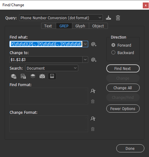
Figure 15
Unless you have a reasonable grip on GREP, don’t try to decipher it. Just know that this expression will find any phone number in your text, no matter what format it’s in. Copy the Find expression, then paste it in as a new GREP style in your base copy paragraph style (Figure 16). And if you do want to get a grip on GREP, check out issue #59 of InDesign Magazine. For an even deeper dive, grab a copy of Peter Kahrel’s book, GREP in InDesign.
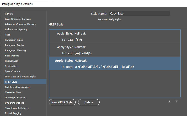
Figure 16
Glossaries and indexes
Helping the reader find her way around a glossary or an index is important in any reference or “how-to” work. Nested styles and text variables are your allies here.
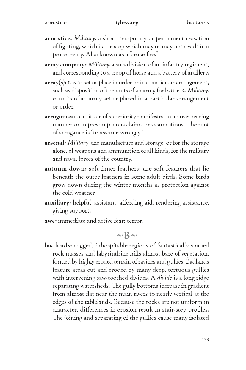
Figure 17
Figure 17 shows a typical glossary page with guide words in the header to indicate the first and last entries on the page. It relies on the Bold character style nested in the Glossary Entry paragraph style (Figure 18).

Figure 18
I set up text variables for the first and last occurrences of the Bold character style (Figure 19) and used those for the running heads on the glossary master page.

Figure 19
Very long entry “words” in the glossary won’t fit in the running head. For those instances, do it manually (Figure 20).
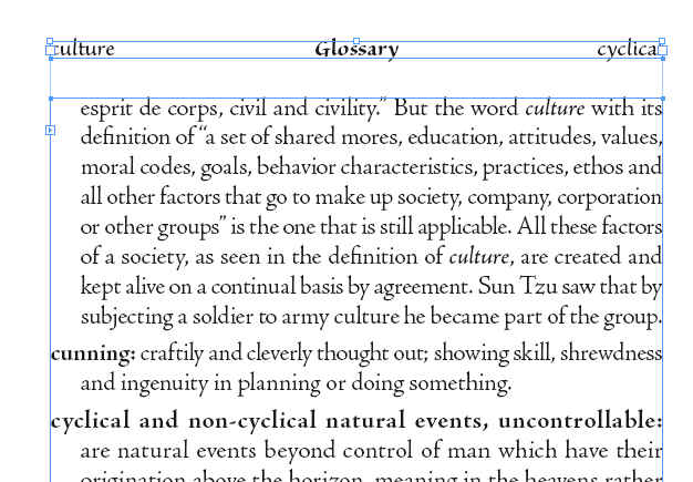
Figure 20
Object styles
The skeleton set includes an object style called Basic Text. Always use a named style for your primary text frame, so that if you need to make any modifications, you’re not changing the default. Other pre-defined object styles might be for sidebars or images, depending on the project.
Navigation and Markers
Shading, borders, type changes, colors, and icons are some of the ways you can help the reader get around in the text. Consider some examples.
Figure 21 shows a spread from a financial advice book.
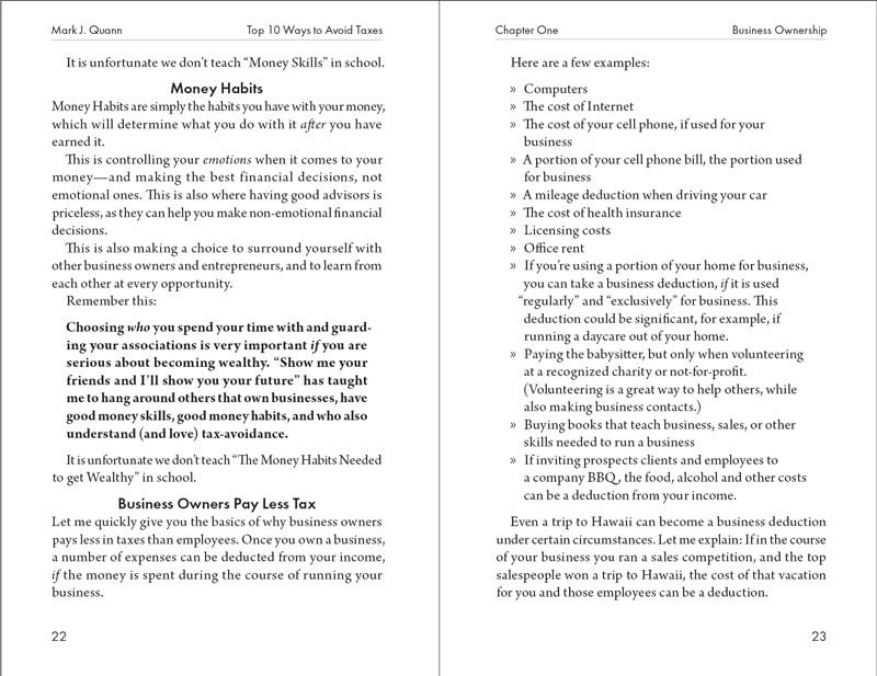
Figure 21
The important maxim on page 22 is boldface, the bullet list is clearly a list, and the subheads break up the text as well as indicating the topic. Yes, reading so many different page elements in rapid succession is difficult, but you’re given the manuscript you’re given!
Figure 22, from a set of executive training manuals I designed some years ago, is an example of how to make different types of information stand out on the page.
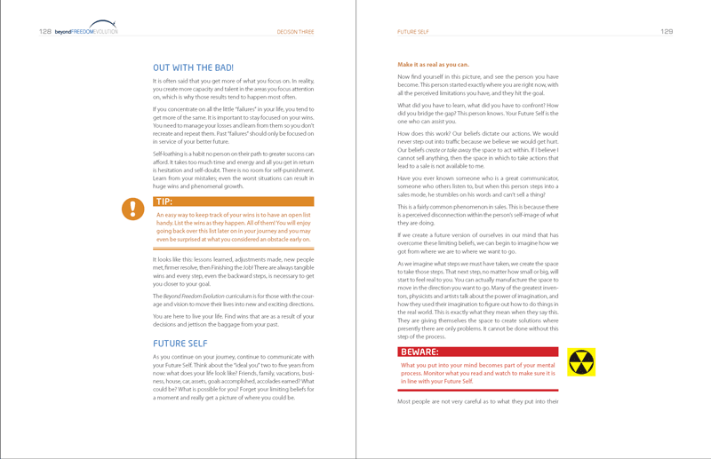
Figure 22
Readers can have little doubt which item is a tip and which one is a warning! Built in the days before InDesign had a dedicated paragraph shading feature, the paragraph styles for these splashy sections use the Rule Below feature to achieve the colored heading backgrounds (see this 2014 article on CreativePro for details). The icons are anchored objects. In this case, the anchored object options specify a position away from the spine, so that it doesn’t matter whether the object is placed on a right- or left-hand page, and all this is recorded in the Icon object style (Figure 23).
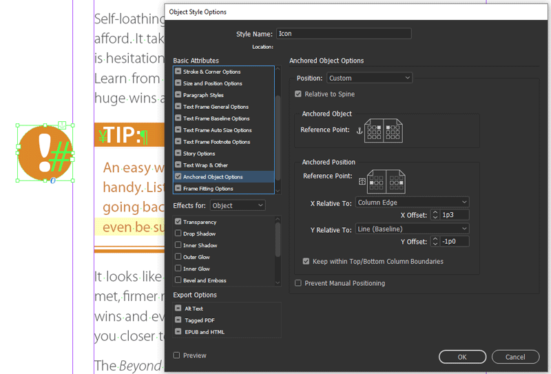
Figure 23
Some TOC Tips (and Bugs)
A good table of contents is essential for any long document. How to build one is well covered by Nigel French in Issue #105 of InDesign Magazine, so I won’t reiterate the process here. You should, however, be aware of a few wrinkles.
Colorful Navigation
In many reference books, you’ll find a subtle but useful way to help the reader navigate the text: a bleed to put a visible marker on the edge of a page. This visual cue is surprisingly easy create, but it’s not one you might think of when you’re looking at the layout in InDesign. (To apply the bleed I used the Section Tab object style you may have noticed in Figure 8.) John McWade’s Before & After design books use this to great effect. In the Table of Contents (Figure 24), squares of color mark each section.

Figure 24
Figure 25
Beware local formats and character styles
InDesign will carry any character styles or local formatting that you’ve added to a chapter title or heading into a table of contents unchanged. They will override your TOC styles, creating mayhem and dismay every time you use Layout > Update Table of Contents. You’ll find the workaround for this problem is in this article on CreativePro. One change since that article was written is that you can now tell InDesign to throw away any forced line breaks you used to break up a heading in the original text (Figure 26).
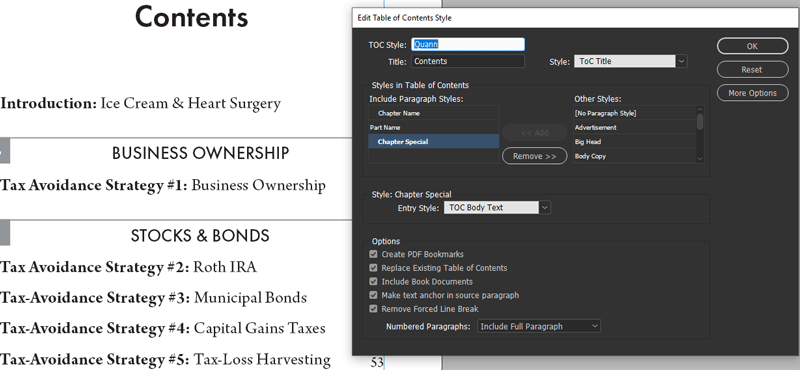
Figure 26
Unfortunately, there is a bug that causes InDesign to deselect this checkbox when you sync styles from the Book panel, so be alert to that possibility if you are using the book feature for your project.
Vanishing TOC styles
A horrible gotcha showed up a few versions ago in InDesign that hasn’t been fixed. It shows up only when you are working on a book (an INDB file) and synchronizing styles across the chapter documents, but it’s painful.
When you first set up your TOC, any paragraph styles you set up, including the default TOC Body are not yet synced to any other document in the book. This shouldn’t make any difference, but if you then sync the book styles using any other document as the sync source, your TOC definitions will be erased in the front matter document that contains the TOC.
The workaround is to sync styles across the whole book using the TOC document as the sync source at least once. This adds redundant TOC paragraph styles to every other document of the book, but it’s better than having to rebuild your TOC styles definitions from scratch.
The Base Line
Your job is to connect the author and the reader as effortlessly as possible. You are in the communication business first, last, and always, so design with the reader constantly in mind. You must also eat, so anything that gets the most work done in the least amount of time is a Good Thing. (Never charge by the hour. Never!)
Grids and styles don’t just make your life easier, they make a big difference to how easily the reader can navigate and assimilate the text. And that’s what it’s all about, isn’t it?
.pc-upsell { background-color: #dd3f26; padding: 20px; color: #ffffff; } .butt-on { background-color: #ffffff; padding: 7px 10px; color: #dd3f26; }
Commenting is easier and faster when you're logged in!

Recommended for you

Tip of the Week: Viewing Document History
Sign up for the InDesign tip of the week to get a new tip, roundups of new artic...

Tip of the Week: Halting Hyphenation Without Forced Line Breaks
This InDesign tip was sent to Tip of the Week email subscribers on April 18, 201...

Rotating Text with a Character Style
Learn the trick for applying character rotation with a style, something that's u...