
Press release
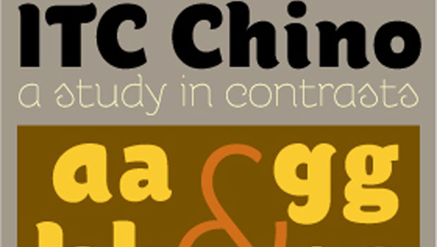
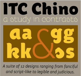
The ITC Chino typeface family is a study in contrasts: a suite of twelve designs that range from fanciful, script-like, display fonts, to typefaces with a decidedly judicious demeanor drawn for text composition. The result of collaboration between designers Hannes Von Döhren and Livius Dietzel, the ITC Chino family typeface is lighthearted, and yet uncomplicated. “We combined straight stems with soft curves,” recalls Von Döhren, “to give the design a feeling of playfulness combined with thoughtful clarity.”
Von Döhren and Dietzel live and work in Berlin, and wanted to represent their urban environment in ITC Chino, while still giving the design a sense of humanity. “We sought to make Chino emotional and have a big city flavor at the same time,” says Von Döhren, “our challenge was to combine these divergent qualities in one design.”
ITC Chino Pro Display is a friendly, but focused, design intended for setting few words in large sizes. Its two weights of Thin and Ultra are good-natured typefaces made of soft curves, contrasting straight vertical strokes and playfully structured terminals. The Thin is a chic monoline melding of script and sans serif character traits while the Ultra is a more whimsical – and more substantial – interpretation on this theme. Even though at counterpoint to each other, the two designs serve as perfect complements to the text typefaces of ITC Chino Pro.

The text side of the family contains five weights of roman, each with an italic companion. Ranging from Light to Black, ITC Chino Pro provides a rich typographic palette. Slightly condensed character shapes and squared-off transition strokes have replaced the soft full curves of the display design. While the lowercase benefits from a two-storied ‘a’ and bowl-and-loop ‘g’ as aids to legibility, and the playful aspects of the display design are incorporated as soft background melodies, ITC Chino Pro was drawn with “simplicity” as the design mantra. “We drew the text fonts from scratch,” says Dietzel, “reducing the characteristics of the display fonts to create optimal readability.”
Available as OpenType® Pro fonts, in addition to providing for the automatic insertion of ligatures, old style figures and small caps, ITC Chino also offers an extended character set supporting most Central European and many Eastern European languages.
This article was last modified on January 18, 2023
This article was first published on November 10, 2009
Commenting is easier and faster when you're logged in!

Recommended for you

TypeTalk: To Everything, Kern, Kern Kern…
Q. What does the word “kerning” mean? A. The term kern originated as...

Linotype's New Serif, Script, and Stencil Fonts
Malabar For the next 30 days, all customers who purchase any font licenses at Li...
Love Helvetica? Love Card Games?
If you want to show your game-night buddies how much you love Swiss design, don...