
The New Rules for Printing
Claudia McCue brings you up to date on how to get the best results in your print projects.


This article appears in Issue 82 of InDesign Magazine.
You don’t get your messages from a beeper, or carry your files on floppies, so stop preparing your print files like you did in the 1990s!
At the advent of desktop publishing, way back in the last century, powerful tools were placed in the hands of people who had no experience whatsoever with the actual process of printing. To say that chaos reigned would be an understatement. Suddenly, printers were being given files built by designers who had no concept of spot colors, bleed, resolution, or even cyan. Printers scrambled to educate neophyte production artists, dictating stringent rules for file submission: No RGB! No JPEGs! No TrueType fonts! Thou shalt submit only TIFFs and EPSs! Thou darest not use Microsoft Word! But now… Welcome to the 21st century! Times are different, and while many people are still following 20-year-old guidelines, the truth is that many of the old rules have changed (well, not that Word thing). Let’s take a look at some modern approaches that might convince you to change some old habits.
Trim and Registration Marks
When we used to output a separate piece of film for each printing ink color, we needed to be able to align those pieces of film on punched clear carrier sheets in order to register the colors for platemaking. To facilitate that process, when we set up jobs for output, we made sure to include registration marks, which are little target-like crosshairs imaged on each piece of film. In addition, we had to include trim marks, indicating the corners of the file’s trim area so that the films could be positioned correctly for platemaking and subsequent bindery work. Boy, have things changed. I can’t tell you the last time I saw film; the industry quickly moved to direct-to-plate imaging over 20 years ago.
When files are submitted for platemaking, they’re imported into an imposition program, which controls the position of each file along with other files for most efficient printing. Imposition software doesn’t rely on trim marks to determine the edges and dimensions of a file; that information comes from internal references in a PDF file or PostScript file. Thus, as long as you build your work to the correct trim size, the PDF itself will inform the imposition software. Including trim marks doesn’t usually present a problem, so long as the additional area generated around the document edges is uniform, allowing the PDF to be correctly centered in its slot on the imposition. But trim marks are rarely required anymore. Unless you’re generating art for silkscreening, there’s no reason to include registration marks; ask your silkscreen printer if they’re necessary. When work is imposed for offset platemaking, the final conglomerate image includes auto-generated color bars and registration marks that provide feedback for computerized print monitoring on press; they’re not used by humans to position film output.
RGB vs. CMYK
The Great Color Acronym Wars of the 1990s have passed. In the olden days, the RIPs (Raster Image Processors) which ran imaging devices did a truly lousy job of converting RGB to CMYK. Consequently, submitting RGB content could merit your output provider giving you a strong talking-to (and billing for the conversion). In the 21st century, modern RIPs perform perfectly good conversions to CMYK, so it’s no longer an issue. However, your printer may still insist that you send CMYK images; if so, you’ll have to perform the conversion yourself. Tip: If you’re asked to provide PDFs, just keep using your RGB images, and then choose a CMYK destination target in the PDF Export options dialog box (Figure 1).

Figure 1: To convert RGB content to CMYK during export to PDF, set Color Conversion to “Convert to Destination (Preserve Numbers)” and set the Destination to the appropriate printing environment. If the printer provides a custom profile, import that and use it as the target.
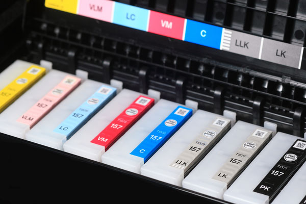
Figure 2: More inks mean you can get a wider gamut of colors out of a modern printer.
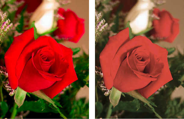
Figure 3: The vibrancy of an RGB image (left) is substantially subdued when the image is converted to CMYK (right). Don’t throw that gorgeous color away prematurely—talk to your printer about keeping your images in RGB. Their digital press may be able to print the fuller range of tones available in RGB.
Trapping
If a printer asks you to submit a trapped file, check a calendar. Does it say “March, 1984”? Do you hear the Carpenters’ “Close To You” playing in the background? You may be caught in a tachyon bubble in the space-time continuum. Or you’ve encountered a printer who’s using antique coal-powered equipment and has Always Done It That Way. What should you do? Push the printer to explain why they haven’t been out of the cave in the last two decades. Tell them that disco is dead, too. Run. Find another printer. Software for trapping has been around for over 20 years, so there’s no reason you should have to do anything special in InDesign or Illustrator to compensate for registration issues. In-RIP trapping is the norm now, and has been for many years. It’s a process that rarely needs any human intervention to tweak some settings, and then only in exceptional cases involving metallic inks or complex gradients interacting with multiple underlying colored objects. In fact, printers with digital presses don’t even worry about trapping anymore. We live in wonderful times!
Offset versus Digital
Early digital presses were little more than glorified laser printers, and the quality was no competition for traditional offset printing. In the 20-plus years since the appearance of digital solutions, that gap has disappeared. While the speed and versatility of offset is still a driving force in printing, the quality of output on digital presses such as the HP Indigo rivals that of offset, and the flexibility of short runs can make digital printing a preferred choice. The rise of large-format inkjet output further extends the reach of digital printing. Most printing companies are no longer solely devoted to offset work; to better serve a wider range of customers, many have incorporated digital solutions in their offerings. What does this mean to you? Paper Choices: Because digital presses such as the Xerox iGen and HP Indigo have smaller footprints than giant offset presses, they also have smaller paper size capabilities. The Indigo 5600 and 7800 digital presses can take 13″ × 19″ paper, but the Indigo 10000 has a 29″ × 20″ maximum sheet size. The Xerox iGen 150 can take 14.33″ × 26″ paper. Wide ranges of stock are available for digital presses but, because of texture and humidity requirements, you may find that the 200-lb glitter stock you have your heart set on is not appropriate for digital presses. Spot colors on digital output devices: Most digital presses and large-format inkjet devices don’t have spot inks. The HP Indigo and Xerox iGen have some limited spot toner offerings, including opaque white, commonly used PANTONE colors, and some metallics, but you’ll find that not all print providers have chosen to invest in those add-ons. However, there’s good news: because of the extended gamut of the pigments used on digital devices, there’s a good chance that spot colors will be more faithfully rendered. Lookup tables (LUTs) in the RIPs for PANTONE colors generate optimized values for imaging spot colors. They may not be bang-on, but rendering is likely to be far closer than is possible with the gamut of offset printing inks. If you’re incorporating spot colors in your work, leave them defined as PANTONE colors rather than converting them to CMYK (or even to RGB), and let the device handle the rendering. (There’s one exception to this: see the later section on transparency and digital presses.)
File formats
In the early days of desktop publishing, the limitations printers placed on image formats were based on the sensitive digestive tracts of the RIPs (Raster Image Processor; the computer that converts incoming print information to a language that an imaging device understands). Even something as innocuous as an LZW-compressed TIFF could bring a RIP to a halt, and an overly complex vector piece could prompt the dreaded LimitCheck error (translation: You expect me to process 31,567 points? No way!). We live in enlightened times, and current RIPs have much more capable craws. Native formats: If you’re an InDesign user, you’ve probably long since elected to use PSDs and AI files as artwork. But if you’re still scarred by printer lectures from long ago (“always use TIFF and EPS,” they liked to say), just know that it’s really okay to use the native formats. You can even place a native InDesign file as a graphic in another InDesign file! InDesign knows how to absorb them and squirt out healthy print files. Besides—if you’re submitting PDFs for print, it’s all melted together anyway, with no memory of origin; it’s just all pixels, text, and vectors at that point. Speaking of native files, there’s no need to flatten! (Well, if you have a gigahuge Photoshop file, maybe squish it a little bit.) Both InDesign and Illustrator are fine with live layered Photoshop files. Don’t deprive yourself of the flexibility afforded by layered files. If you’re fearful that a client or printer might mess up your files (or discover your secret recipe for retouching), at least keep a live, unflattened working version in addition to the flattened version. The same goes for Illustrator files; they won’t become any more petite, file size-wise, if you flatten them to a single layer. You’ll still have the same number of objects, and the same number of anchor points. Leave ‘em floating, for cryin’ out loud. JPEGs are not (necessarily) evil: Put down the pitchfork! A JPEG which has been saved only once, using a high-quality (low compression) setting, is just fine (in addition to being petite). If you were to open a healthy JPEG, view it without any editing, and then resave it with a maximum quality setting, it would still be fine. And remember, once it’s baked into a PDF for submission to the printer, it won’t matter how it began life. However, fear of JPEGs is not entirely unfounded: a JPEG that is repeatedly edited and aggressively squished will soon show signs of wear (Figure 4).

Figure 4 A: Original PSD. B: First-generation JPEG, using Low Quality. Note rectangular artifacts, especially in eye, as well as some color shift. C: JPEG “B,” resaved with same Low Quality setting. D: JPEG “C,” resaved with same Low Quality setting. Note extreme rectangular artifacts.
Image Resolution and Transparency
The Holy Grail of Resolution has long been 300 ppi at final size. In other words, don’t take a 3″ × 2″ image that’s 300 ppi and blow it up to 400% in InDesign; its effective resolution is then reduced to 75 ppi (because you made the pixels four times as wide and tall). But there is more leeway than we’ve traditionally insisted, especially when it comes to digital printing. If your hero shot is just 250 ppi at final size, you’re probably OK. In fact, if the image in question is just an accent shot (such as a ghosted-back picture of clouds), you can get by with going as low as 150 ppi or so. This brings up another fun party topic (at least at the parties I attend): Should you scale in InDesign, or Photoshop? Given that you’re bound to encounter small images that must be “embiggened,” you’re going to be forced to grit your teeth and scale them up. My rule of thumb: If you’re scaling up to 125%, you can do it in InDesign. If you have to exceed that value, then do it in Photoshop so you can take advantage of the Smart Scaling features. What about scaling downward? I’d suggest that it’s OK to downsize in InDesign if you’re not going below 75% of the original image size. If you’re going below 75%, do the scaling in Photoshop so you can use the Bicubic Sharper option to introduce a bit of edge sharpening to compensate for the loss of pixels. Clipping paths: Because InDesign (and even PowerPoint!) will accept native PSDs with transparency, there’s rarely any reason to carve out old-fashioned clipping paths. However, I have a few clients whose catalog work involves digital asset management systems, and those DAM systems require that images are stored as EPSs. (EPS files cannot support transparency.) Because many of their products are silhouetted, they’ve found it more cost-effective to outsource that process, and the files come back to them as EPSs with clipping paths. (I envision workers chained to the keyboard, their hands permanently attached to the mouse, clicking their days away. Shudder.) By the way, when it comes to clipping paths, some people wonder: what is flatness? Well, RIPs actually approximate curves with a series of short straight segments, too small to be seen by even the most discerning eye. In Figure 5, you can see flatness exaggerated to illustrate the concept—don’t worry, you’d never actually never see the tiny segments. But because some in the past have overreacted to the notion of flattening, it’s given birth to a persistent old wives’ tale.

Figure 5 Left: Original curved path as drawn in Illustrator. Right: Exaggerated illustration of flatness.
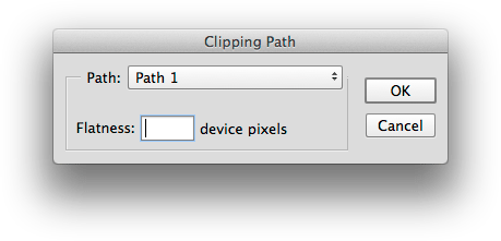
Figure 6: If you must use a clipping path, leave the Flatness field blank. This allows the RIP to optimize the flatness as it generates raster information.
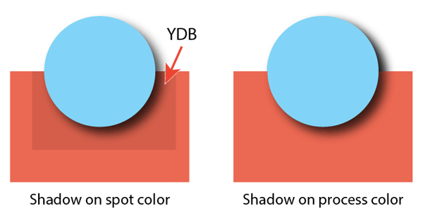
Figure 7: Yucky Discolored Box Syndrome. The RIPs for many digital devices treat transparent areas (such as that surrounding a drop shadow) differently, resulting in an inconsistent appearance. Bummer.
Proofing
For many years, printers created contract proofs—color representations of the final printed piece, accomplished by using output film to expose photosensitive color overlays on a carrier sheet (3M ColorKey), or pigments bound to a photosensitive base (Dupont Cromalin and Kodak Approval systems). Now, contract proofs are commonly generated on high-end Epson or HP inkjet printers, displaying color that matches the final print job, including halftones. Many printers these days just provide PDFs to clients for signoff. While this facilitates quick (and cheap) delivery, it’s at the expense of color fidelity—there’s no way to guarantee that a client’s monitor is profiled and calibrated to correctly display color. And PDFs provide no reliable representation of halftones on press, so it’s impossible to predict whether image subjects such as clothing might exhibit moiré when printed. There are digital alternatives: Kodak’s INSITE solution, for example, is considered a reliable representation of press outcome when used on such displays as the Apple Cinema 30-inch monitor or Eizo ColorEdge—reliable color isn’t cheap. But neither is reprinting a job because of disappointing results. If you fear that onscreen proofing isn’t reliable for a particular high- profile job, ask if your printer can provide a physical contract proof.
Advice that hasn’t changed
While equipment and workflows may have become more sophisticated, there is one time-honored rule that still holds true: Talk to your printer! Every printer uses slightly different solutions, and thus may have slightly different requirements for submitted files. Some just want PDFs (and they should tell you what kind of PDF); some want original application files, too. Some support RGB, some don’t. Some welcome live transparency; some don’t. There’s no such thing as too much communication! Open the conversation with your printer early in the life of a print project, and keep up the dialog until the job is out of the bindery. Then you’ll both be happy with the results! …
Commenting is easier and faster when you're logged in!

Recommended for you

Streamline Design Team Workflows with LinkrUI
Meet a solution that automatically synchronizes assets between Adobe CC apps to...

CreativePro Week Conference Speaker Spotlight: Chris Converse, Designer and Coder
Welcome to our Speaker Spotlight series, designed to highlight some of our Creat...
Building Accessible EPUBs with InDesign
Learn how to build ebooks with a strong foundation to reach more readers.