

It’s time to reveal the solution—and the winner—for this month’s InDesignSecrets contest!
This time, the mystery involved a font change that was happening automatically as someone typed in a text frame.
The change was not due to a nested style, GREP style, etc. In fact, it was happening because of a preference: Missing Glyph Protection. You can find Missing Glyph Protection in InDesign’s Advanced Type preferences. It’s also found in Type preferences in Illustrator and Photoshop.
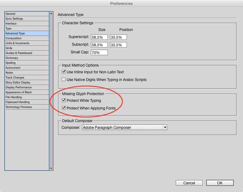
With it enabled, if you type a character that doesn’t exist in the current font InDesign will automatically switch to the default font Minion Pro.

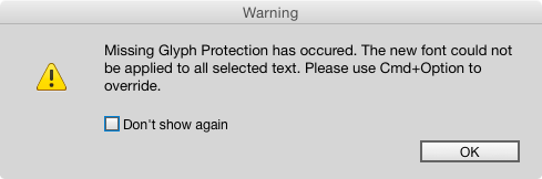
If you apply a font that doesn’t contain the character, the font applied to that character will not change.

The benefit is that you’ll never have the dreaded pink empty space where the character should be.

The downside is, you might not want (or notice) mixed formatting.
However, by default, Missing Glyph Protection is turned off, and if you enable it, you will get a warning when it is used.
So you’d probably have to set it and forget it (or work at an unfamiliar machine) for it to happen without your knowing it. In any case, now you know why the font was changing without any apparent cause.
And the winner the contest is…
David Popham
David wins a Personal Activation Code for FrameReporter from Rorohiko!
This awesome tool allows you to add an ‘info label’ to any currently selected page item(s). Check it out!
Thanks to everyone who entered, and be on the lookout for another contest with a new great prize next month!
This article was last modified on July 25, 2019
This article was first published on June 25, 2015
Commenting is easier and faster when you're logged in!

Recommended for you

The Crazy Column Contest Answer and Winner
Solve this InDesign mystery for a chance at winning a great prize.
The Case of the Failed Find Contest Answer and Winner
The solution to our latest InDesign mystery revealed.
The Mystery of the Phantom Fill and Stroke Contest Answer and Winner
Solve this InDesign mystery for a chance at winning a great prize.