
Multilingual Design
Learn how designers meet the challenge of creating meaningful communication in multiple languages.

This article appears in Issue 25 of CreativePro Magazine.
As a French-Canadian freelance designer based in Ottawa, Canada, where English and French are official languages, bilingualism is more than just a buzzword to me. I’ve always been surrounded by the intricacies of bilingual design. However, it wasn’t until I delved deeper into the subject that I realized how fascinating and complex the logistics of designing in multiple languages can be.
Surrounded by English and French in my environment, I’ve developed a natural knack for bridging linguistic gaps through design. As a freelance brand designer and studio owner, my workload has shifted. While I used to work on bilingual designs every day, now they are about 50% of my projects. Most clients prefer brand guidelines in English only, but there are instances when bilingual designs are requested, especially from clients operating in multiple languages or within nonprofit and governmental sectors.
In this article, I’ll share some key concepts for multilingual design and present examples and insights from some fellow designers who do this kind of thing every day.
Meeting the Challenges of Multilingual Design
One of the first things you’ll have to grapple with when designing for multiple languages is text expansion. This occurs when the target language (the one you’re translating into) takes up more space on the page than the source language. It’s a simple concept, but in practice it can feel like trying to corral a majestic unicorn into a tiny teacup. It’s just a fact of life that certain languages require more words to convey the same message due to differences in grammar, sentence structure, and the whimsical ways terminology is used across languages.
For example, let’s consider the magnifique French language. English text translated to French expands by a jaw-dropping 15% to 30%. This
is precisely why proper planning is crucial in the realm of bilingual design. As designers, we must grasp the full scope of the work right from the beginning of a project. Otherwise, you might find yourself scrambling to rearrange elements so you can fit all the text where it needs to go. Text expansion varies across different genres. Literary translations may expand significantly, while technical or legal texts may experience a more modest inflation.
Here’s another challenge: Direct translations can sometimes strip away the style and intent of the original text, leaving us with lackluster results missing that certain spark. That’s why it’s critical to work with experienced translators who can sprinkle their linguistic magic and preserve the essence of the message. You need to find someone who is comfortable with all the variables, including grammar, tone, writing style, syntax, word usage, terminology, and sentence structure. It’s like a symphony of language harmonies that we must conduct during the conceptualization phase.
Insights from Fellow Designers
To shed more light on this topic, I sought the perspectives of four fellow designers who specialize in multilingual design. At first, I assumed they’d all say the same thing, “Start with the longest text, mon amie!” A logical assumption, right? However, I found that each designer, driven by their unique work environment, focuses on different aspects and dances to the beat of their own creative process. Some approach the task with precise calculations; others embrace an experimental mentality and feel their way through the process.
Let’s hear what they had to say in their own words.
Ariane Bédard: Graphic Design Manager at Canada Post
Cultivating captivating designs that bridge languages and cultures is my daily mission.
Design by Ariane Bédard
Every day, I work on multilingual designs. Honestly, about 95% of the design projects I’ve ever worked on were bilingual. I started my career at the University of Ottawa, which is a fully bilingual university, and now I’m at Canada Post, a Crown corporation. Every project we work on needs to be in English and French, and occasionally we need to incorporate indigenous languages as well.
When designing for multiple languages, there are several considerations. For long-form content, we create separate versions for each language, just like a website, so users can read in their preferred language. This is also important for accessibility. Another approach is to create double-sided designs for print materials like postcards or brochures.
When we have multiple languages in the same layout, a key consideration is the order of languages. At the university, French always had to come first, either above or to the left of English. At Canada Post, the requirements vary depending on the audience. For example, we have French-first designs for the province of Québec and English-first designs for the rest of Canada. We also prioritize designs where both languages are side by side to ensure equality.
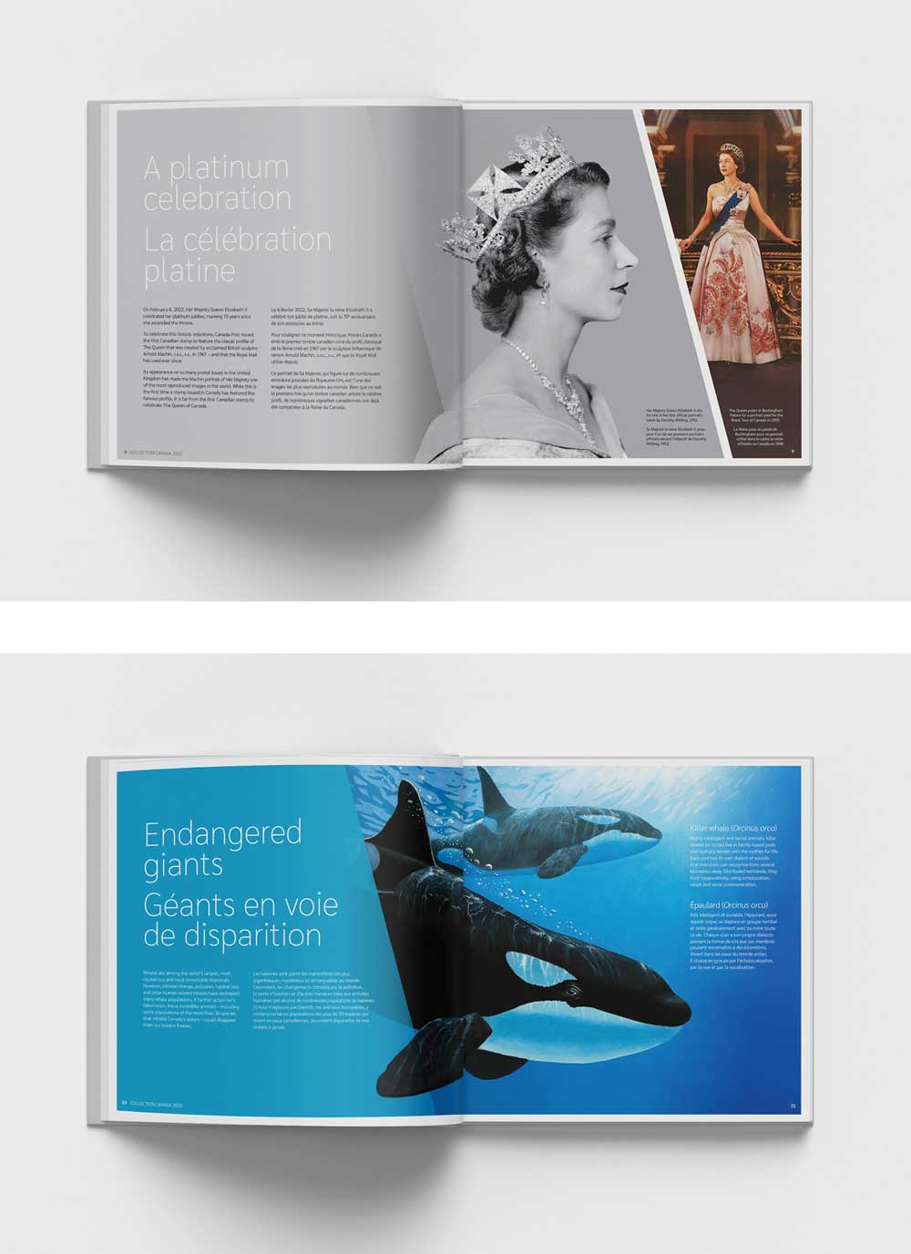
With Canada Post, I manage a yearly publication called Collection Canada, where our in-house design team handles the entire design process. It’s a collectable coffee-table book that showcases all the stamps published during the year, along with related historical information.

Design by Ariane Bédard
To begin, we present three initial concepts for the overall look and feel of the book. Once a direction is approved, we meticulously design each story. During this process, we draft only English text while the French translation is in progress, using placeholder content for French to ensure we reserve enough layout space for the additional ~30% length that French often requires.
One of the challenges we face with Collection Canada is creating that wow factor on every page. This year, we encountered a specific challenge with historical signs. As you can imagine, historical documents aren’t always bilingual. If we include one in our layout to support the story, we have to ensure the translation is included without disrupting the design. It’s a careful balance between sharing these crucial artifacts and maintaining the integrity of the page design. To tackle this, I always incorporate plenty of white space to avoid overwhelming the page.
One of my go-to strategies for multilingual designs is laying out the French content first whenever possible because it tends to be longer. That way, I can ensure that the English text fits nicely within the design. Second, breaking up the message is essential. Sometimes, we fall into the trap of keeping all English content together, followed by all French or vice versa. To create a more impactful design, I encourage designers to break it up into sections. Therefore, with these considerations, we can create engaging and inclusive experiences for all audiences.
Bev Hyatt: Creative Director and Partner at Cinnamon Toast
By prioritizing hierarchy, accommodating character variations, and employing expert translators, we create visually pleasing and impactful designs that resonate with diverse audiences.

Design by Bev Hyatt
At our agency, Cinnamon Toast, approximately 75% of our projects involve multilingual requirements, so it’s a big part of what we do.
When we design for multiple languages, language hierarchy and the difference in character lengths between languages are both important factors to consider. Legal requirements for language display can sometimes play a role in our design process. We also include font packages and special characters to support the linguistic needs of each language for our clients.
Translating content can be quite a challenge. Sometimes, catchy phrases or wordplay that work in one language just don’t have the same impact when translated. We must also know the unique language nuances in different regions and sectors. That’s why we rely on translators with expertise in the subject matter or specific regions where our designs will be seen.
Our approach to multilingualism depends on the audience sizes and client resources. Sometimes, we use tools like Google Translate to offer multiple languages on websites. In other cases, we create fully translated duplicate sites to ensure accuracy. Brand recognition is also important, especially when dealing with logos with English, French, or both languages.
Recently, I worked on a product launch campaign for the Dynamic 9 helmet by TRUE Hockey. The challenge was to capture the essence of TRUE’s branding while highlighting their technology partner, Mips (Multi-Directional Impact Protection System). Motion played a crucial role in educating consumers about the technology, and the design had to work seamlessly for both static and dynamic elements.

Design by Bev Hyatt
One of the specific challenges we faced in this project was coming up with a campaign slogan that held its meaning in both English and French. The content was highly technical, so we had to ensure that each translation included terminology consistent with our technology partner’s verbiage—and resonated with our audience. For digital assets, we were able to separate the English and French versions, simplifying the design process by focusing on similar text sizing and spacing. However, for print assets like packaging, we had to include both languages in one design. To make it user-friendly, we strategically created separation between the languages using color and italics to enhance readability.
One trick I’ve learned for working on multilingual designs is that understanding the audience and context of the design is key to making informed decisions. Also, white space is your friend! It helps reduce reader fatigue and creates a more visually pleasing design. Lastly, it’s important to make audiences feel equal, regardless of the language they’re reading.
Christine Plourde: Graphic Designer and Multimedia Officer at Canadian Nuclear Safety Commission (Fr)
Collaborating with editors and translators, I make tweaks and adjustments to ensure clarity, legibility, and visual appeal.
Bilingual designs are a part of my everyday work. At my workplace, every single design requires English, French, and/or bilingual versions. It’s essential to cater to both (Canadian) official languages.
When designing for multiple languages, the available space is always a major consideration. If things look crowded or overwhelming with too much text in English, it’s almost certain that it’ll be even worse in French. That’s why we often recommend cutting down on text, especially for single visuals like social media cards. We want the message to be instantly clear in our designs.
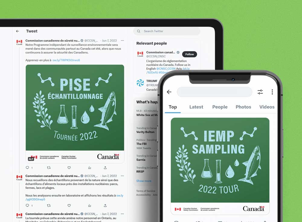
Design by Christine Plourde
In a recent project I worked on, I received English and French text to incorporate into the visual. For a social media visual, I always request the caption or post to gather more context and draw inspiration for the design. With this project, I tweaked the English text to fit the design style better and make it punchier. This naturally led to adjustments in the French text to ensure it aligned with the English layout.
One of the challenges I faced with this design was the ordering of words in French. The word sampling is significantly longer in French as échantillonage. Thankfully, I have a close working relationship with our editing and translation teams, and we were able to collaborate to find a solution that worked better for the design.

Design by Christine Plourde
In cases like this, where space is limited, I often have no choice but to make the text smaller. For the rock band T-shirt version of this design, I made a design choice to have the text in all capital letters, creating a bold and eye-catching look that aligned with the clean, straight visual aesthetic. However, the need for accents in French posed a visual challenge, as they disrupted the straightness of the capital letters. Specifically, for the word Tournée, the accent got a little too close to the artwork, making things look busier. To achieve better balance, I used small caps instead.
When working on bilingual designs, making slight adjustments to text kerning or leading can help the French text fit better. Sometimes, I shift or remove visuals to create more space. Cutting down on text or suggesting alternative words or phrases that are shorter also comes in handy. Instead of designing around the content, I find that playing with the content as I design yields much better results.
Félix Laveault-Allard: Freelance Designer
Simplifying designs and visually capturing the essence of language fusion, I enjoy exploring the connection between concepts and words.
Although most of my projects don’t end up being bilingual, I often consider the possibility of what they would look like with elements of the other language included. Luckily, many people interested in my work have a solid grasp of both French and English, so it feels like my metaphorical sandbox is a lot bigger. I absolutely love it!
When designing for multiple languages, I tend to simplify my designs. Since bilingual projects often require longer sentences to convey the French-English dynamic, I make sure to create designs that are extra easy to digest.
One bilingual design I worked on for fun is this lyric graphic. I’m a big fan of Quebec rap music, where both languages are often mixed due to our cultural heritage and the origins of the hip-hop movement. One day, while listening to a freestyle session among a few rappers, a particular phrase caught my attention: faire un tabac.
The French expression faire un tabac translates to to make a hit or to be a great success. It’s often used to describe a situation where something or someone becomes incredibly popular or well-received. Adapting rap music to static graphic images can be tricky, especially when it comes to capturing the tempo visually. To overcome this challenge, I decided to use a comic strip layout that would separate the concepts and the words, providing a visual representation of the link between them. It’s like having the necessary pasta and cheese, but the sauce is what truly connects everything.

Design by Félix Laveault-Allard
By juxtaposing the phrase with the image of smoking cigars, it symbolizes a sequence of events. The first step is achieving tremendous success or making a big impact (represented by faire un tabac), and the second step is to celebrate and savor the fruits of that success (depicted by smoking cigars).
I find that taking a stroll in bilingual cities like Ottawa or Montreal is a great way to fuel my creative and multilingual mind. I try to mentally switch out each word I see with its counterpart in the other language, adjusting spacing and rhythm to ensure a harmonious balance.
Working with multilingual designs is an exciting journey that allows me to explore the fusion of languages and cultures. I’m always striving to create visually captivating designs that resonate with audiences in both English and French.
La créativité est le nom du jeu
As I (Izzy) delved into the experiences and insights of my fellow designers, it became clear that the world of bilingual/multilingual design is a dynamic and intricate realm, filled with unique challenges and creative solutions. The importance of maintaining style and intent across languages underscores the need for a meticulous and comprehensive approach to designing for multiple languages.
The Indispensable Editor
In my personal experience, I’ve grown to recognize the indispensable role of an editor in this multilingual universe. A recent bilingual project I worked on, where the project manager spoke only English, presented quite the linguistic puzzle. Typos and grammatical errors lurked within the text that I needed to bring to life through design. Needless to say, the revision process faced some hiccups due to organizational mishaps. Untangling the web of confusion became a task in itself.
Design by Izzy Poirier
This experience highlighted the importance of having a fluent editor, dedicated to reviewing translations, both before they enter the design phase and after they have been laid out. These folks are the guardians of linguistic tidiness, catching those tiny-but-mighty edits while ensuring accuracy and cultural sensitivity. Take, for instance, the mischievous French quotation marks that delight in sliding onto the next line when you least expect it, due to the added space, like this: « Bonjour! ». To combat this, I have made a habit of using of nonbreaking spaces (Ctrl+Alt+X/Command+Option+X) in my text formatting. However, even with my vigilance, having an editor who spots these nuances is absolutely necessary.
Embrace Innovation
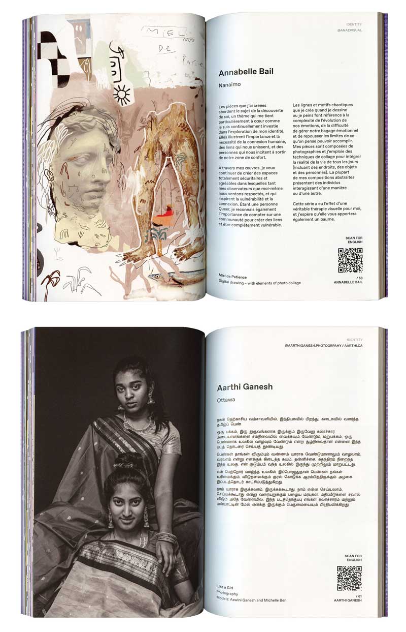
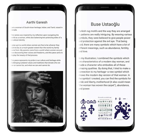
Among the bilingual design projects I’ve worked on, one particular endeavor stands out: a zine I produced in collaboration with Ariane Bédard. Our fourth zine, centered around the theme of Origins, aimed to celebrate artistic journeys, weaving diverse cultures, traditions, and identities. The call for submissions surpassed our expectations, drawing interest from global creatives from China and Australia to various European countries.
Curating the submissions brought forth an intriguing challenge. Some artists provided explanations of their artwork in their native languages, including French, Turkish, and Tamil, the official language of such South Asian countries as Singapore and Sri Lanka. Our desire to honor and preserve the authenticity of their voices and artwork was paramount. However, incorporating translations without compromising the zine’s design integrity proved to be a balancing act. In our pursuit of innovation and interactivity, we embraced a bold and unconventional solution: QR codes.
These codes invited readers on a multisensory journey, seamlessly blending the visual allure of the spreads with access to English translations through a simple scan on their smartphones. This interactive experience not only bridged the language barrier, but also heightened engagement and excitement during the reading process. The project taught us the power of thinking outside the box and embracing innovative design solutions to navigate the complexities of multilingual communication.
Design by Izzy Poirier
Join the Party
Santé! Let’s raise our creative glasses and toast to the captivating world of bilingual/multilingual design! Through shared experiences, we’ve learned the importance of text expansion, linguistic nuances, and the vital role of translators. Collaboration with editors ensures accuracy and preserves the essence of the message. With careful consideration of grammar, tone, and design elements, we create visually captivating designs that engage audiences across languages and cultures. Cheers to breaking barriers, unleashing our imagination, and letting bilingual/multilingual design spark endless possibilities as we dance with words!
Commenting is easier and faster when you're logged in!

Recommended for you

Understanding Web Design, Hand Coding, and WYSIWYG
Web Design is very intimidating for quite a few people. For just over two decade...

InDesign How-to Video: Reset Tracking and Kerning
In this week’s InDesignSecrets video, Mike Rankin explains how to reset any cust...
How to Use Photoshop’s Automatic Face Selection Tools
Learn how to make adjustments to a model’s headshot using Photoshop’s Object Sel...