
Mixing Type and Graphics
Mixing type and graphics to choose the right font for the job every time


This article appears in Issue 86 of InDesign Magazine.
According to the ’50s Sinatra hit, love and marriage go together like a horse and carriage. The same is true for type. The right type adds harmony to a layout—like drinking a chilled Sancerre alongside a meal of Dover sole. Yet despite this relationship, designers often struggle finding fonts that play nice with the graphics on a page. And who can blame them? Go to any type resource and you’ll be blinded by the number and variety of available choices. It’s dizzying. To borrow another musical oldie from Lloyd Price: type’s got personality. Let’s take Helvetica as an example. True to its Swiss pedigree, Helvetica is cool, calm, and collected (Figure 1).
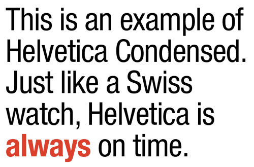
Figure 1: Helvetica Neue LT Std Condensed and Condensed Bold. I’ve tracked this type at –15 points and reduced the leading between lines to help pull it all together.
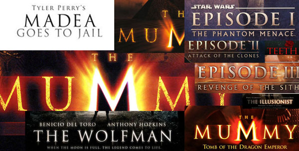
Figure 2: Trajan is a font that’s been so popular that it’s now overused as the go-to movie title font.
always be black? Is Comic Sans always a no-no? What about Times Roman? Head starting to spin? If so, you’re not alone, my friend. Fortunately, finding the right font for a graphic is often easy, if you first consider how both “feel.” Often, common sense is all it takes to make a good match of text and imagery. Here, for example (Figure 3), is a recent cover of Real Simple magazine.

Figure 3: Cover of Real Simple magazine. Clean type combined with the apple image on a pure white background adds up to a layout that’s true to the magazine’s name: real and simple.

Figure 4: Real and simple can also add up to boring, like in this fictitious example. Apples are symmetric, type placement is symmetric, type weights and styles are too similar. Yawn.

Figure 5: This mockup is bad for other reasons. Many other reasons. Never, ever, ever set a script font in All Caps. Never.

Figure 6: Perhaps there’s unintented irony in using fonts named Rockwell and Antique for a book about classic country music.
Mixing Type Successfully
If figuring out which typeface to pair with a particular image weren’t hard enough, designers must often decide how to make multiple fonts work together on a given page or screen. Here are a few rules which I’ve found helpful through the years: Limit the number of fonts to two: If you find yourself reaching for more than two (or three) different typefaces per page, chances are you’re headed for typographic trouble. Although there are always exceptions to this rule, generally and when in doubt, less is more (Figure 7).

Figure 7: In this poster I used only two fonts: Archive Antique Extended (headline, subheads) and Helvetica Neue Lt Std Bold Condensed (bullet points).
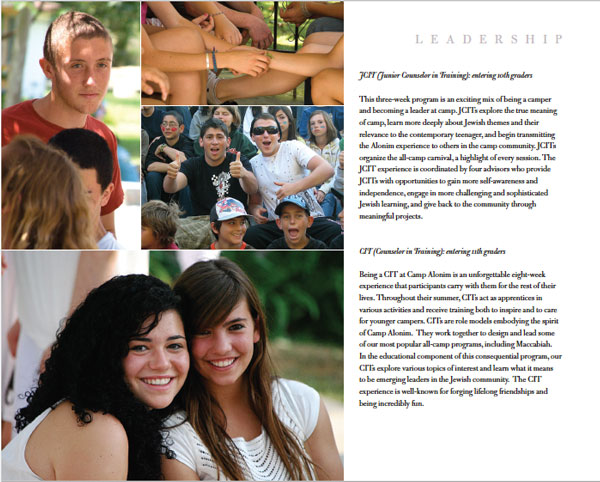
Figure 8: In this page from a sales booklet I designed for a Los Angeles day camp, I used only one typeface, Bulmer MT. By varying its size, style, and tracking, I was able to create variety and design cohesion all at the same time.
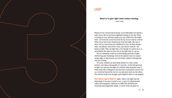
Figure 9: In this spread from David Blatner’s book Spectrums, I chose Swift for the body text and various styles of Franklin Gothic for everything else.

Figure 10: The opening spread I designed for a feature article about Syrian refugees fleeing to the Greek island of Lesbos, with the headline set in the font Hermes.
A Layout in Need of a Typeface
So how does a designer go about finding a font appropriate for the layout? The answer lies in a combination of a little bit of knowledge and a little bit of luck. For the Rewriting A Greek Tragedy article, I began my search at MyFonts.com. If you’ve never been to MyFonts.com, prepare yourself. This website is among the best places to see and try out a dizzying number of typefaces. Fortunately, the people behind MyFonts.com have done an amazing job of creating a user-friendly site that caters to all typographic whims. In my particular MyFonts.com search I used the word Greek as a starting place. I also typed in the phrase Rewriting A Greek Tragedy, so I could see how it would look when MyFonts.com finished its search. Among the many suggestions the site offered were lots and lots of typefaces that contained Greek characters, as one would expect. What I didn’t expect was stumbling onto the Hermes font, whose name is based on the Greek god of commerce (Figure 11).

Figure 11: The right font for the job is revealed with a little help from the search function at MyFonts.com.

Figure 12: You can enter your own custom text to see how it looks in a variety of Typekit fonts.
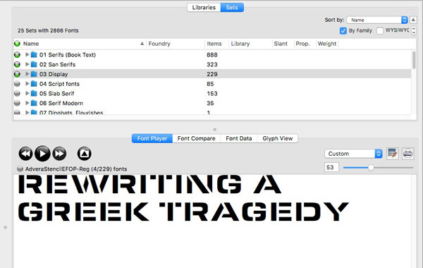
Figure 13: FontAgent Pro’s Font Player is a handy feature for quickly previewing a large number of fonts. Click the button on the right to add a font to a Font Player set that can be saved and reviewed later.
’Cause You’ve Got to Have Pers-o-nality
As you can see, choosing the right font for the job can often be approached in a systematic way. First and foremost is understanding the content and the context in which the type lives. Sometimes the answer is clear. A frilly font for a macabre murder mystery probably won’t work well (although there are exceptions!). But if we think of type as having personality, then the task of pairing the right font for the job becomes suddenly not only logical, but more manageable.
Commenting is easier and faster when you're logged in!

Recommended for you

Creating a Word Cloud in InDesign
Want to make a tag cloud in InDesign of your story or document? It's easy and fa...

The Unexpected Rebirth of Adobe DNG
The Adobe Digital Negative (DNG) format started out as an open file format for s...

Building Presentations in InDesign
Mark Heaps shows how to craft presentations in InDesign that are both beautiful...